The Brand Monograph
Hotel Regina brand identity by Dennis Studio
↗Dennis Studio's identity for Hotel Regina shows how a century-old hotel can update itself without sanding off its character. The Barcelona landmark needed a brand that honored its long history and still spoke to guests today, and the studio found its answer in the building's own records. Working with strategist Carla Ibañez Barquet, it shaped a platform that treats change as the thing that keeps a place timeless.
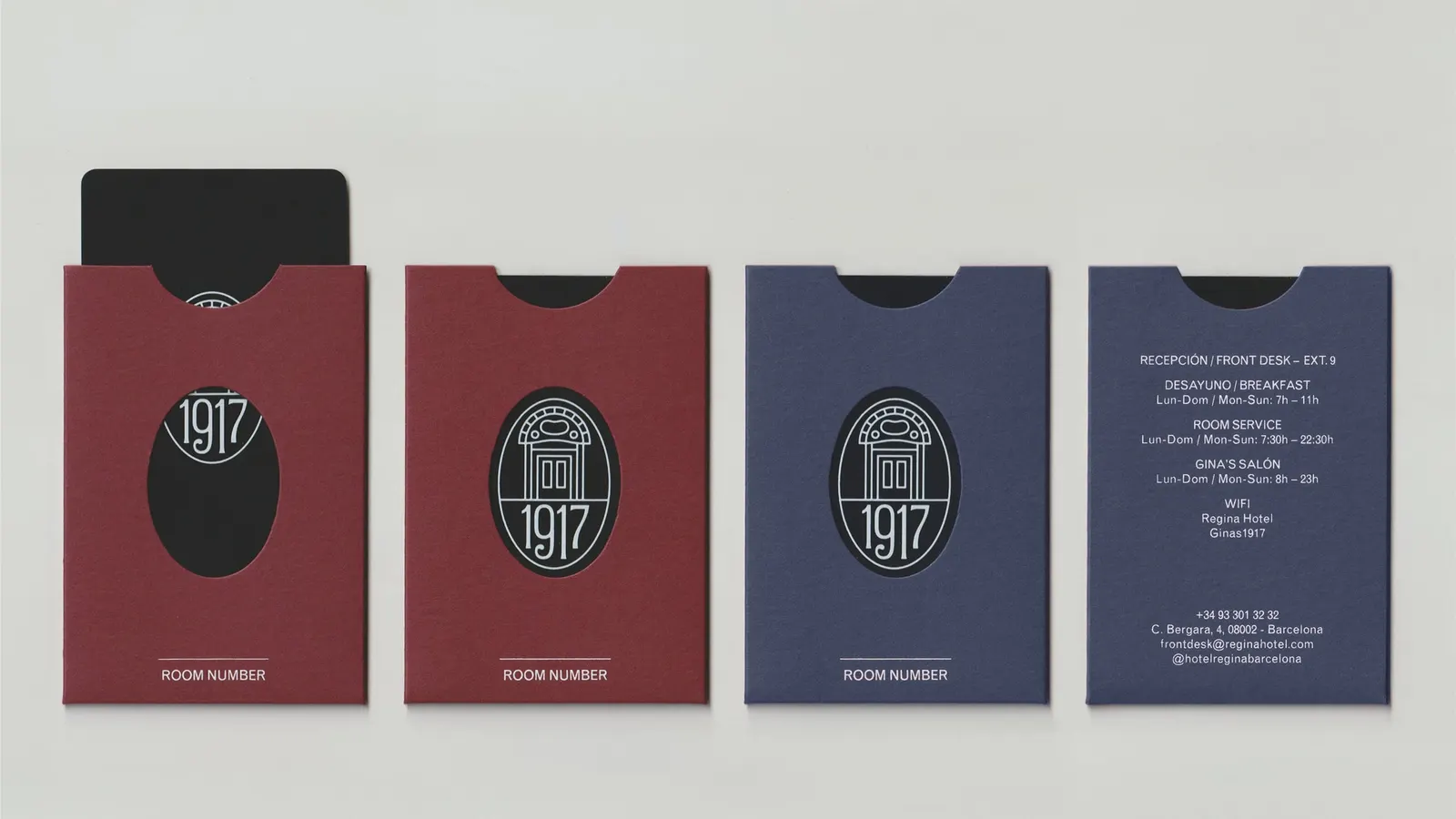
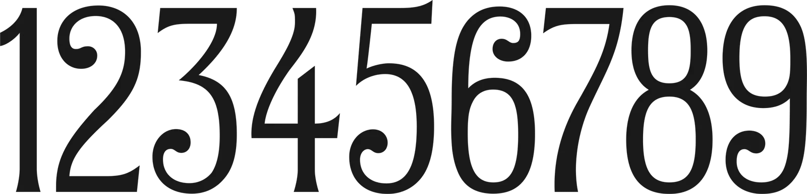
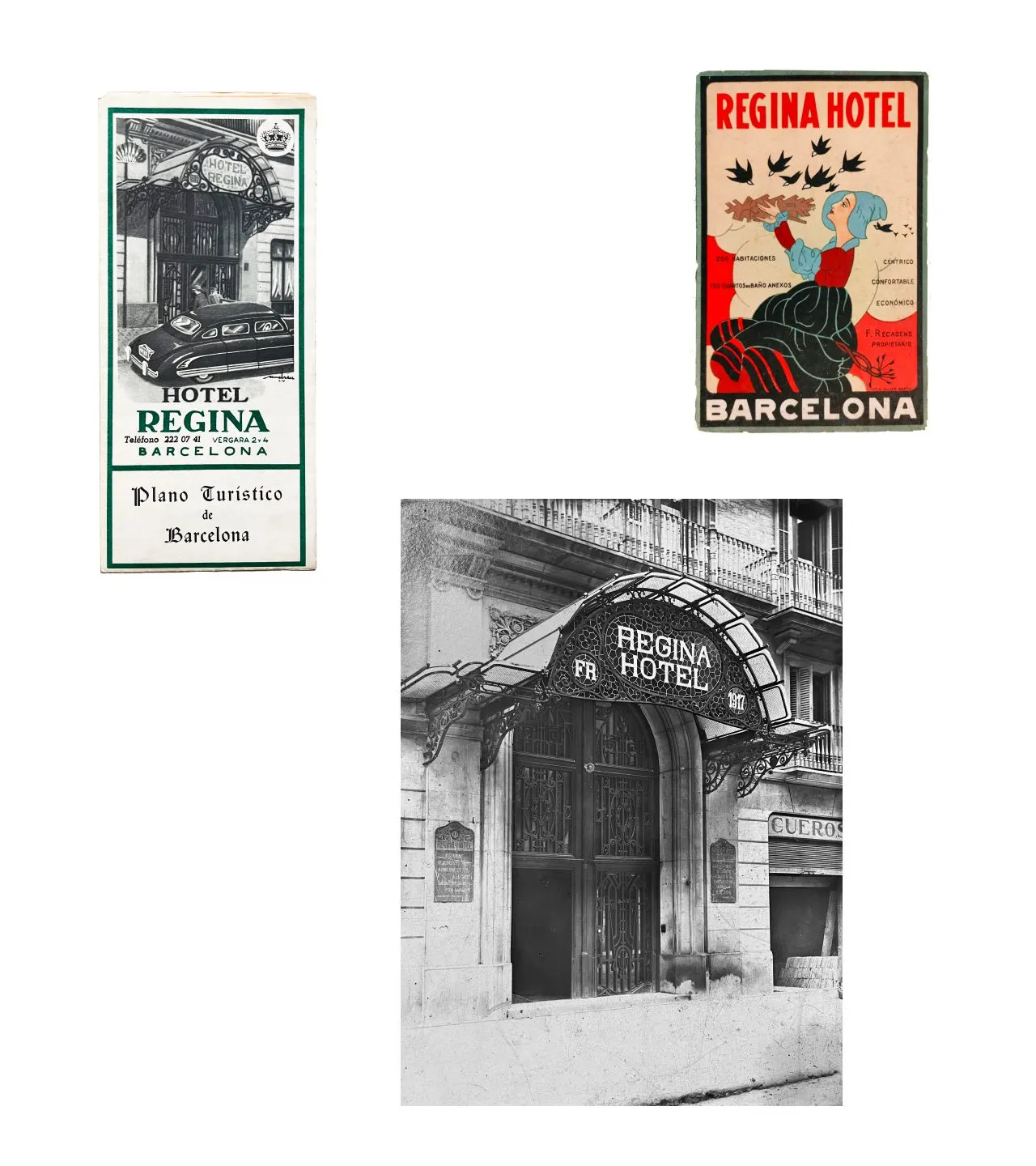
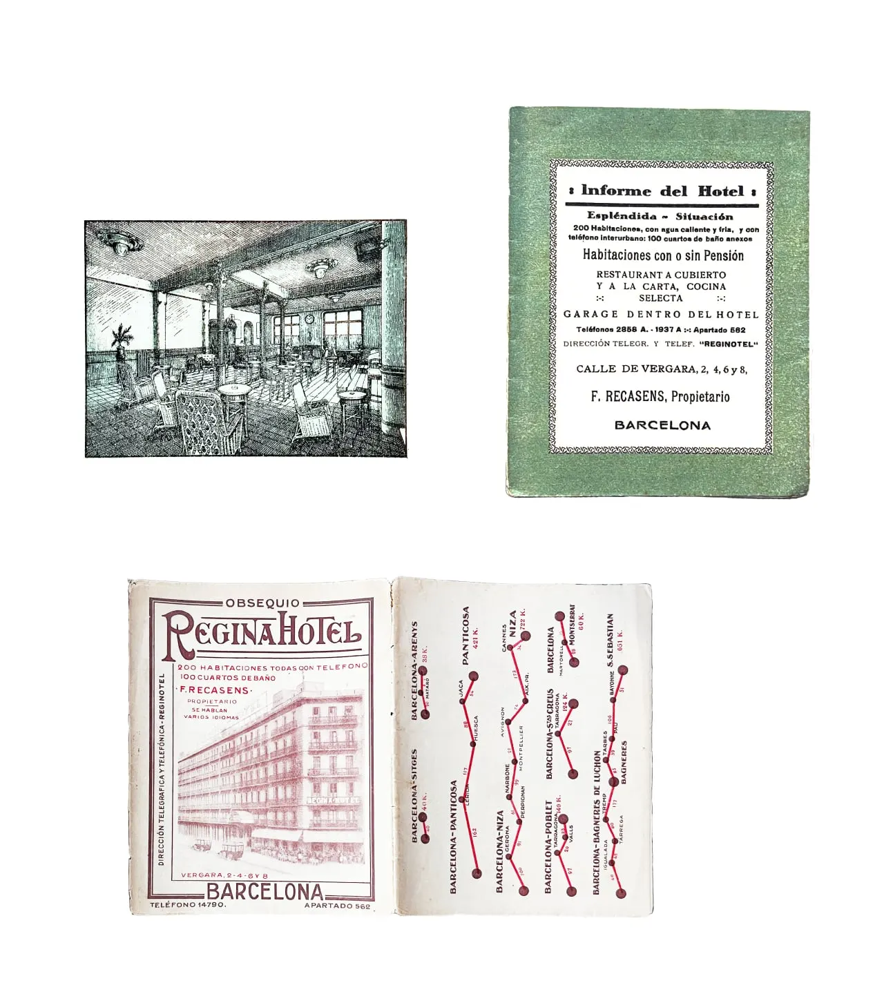
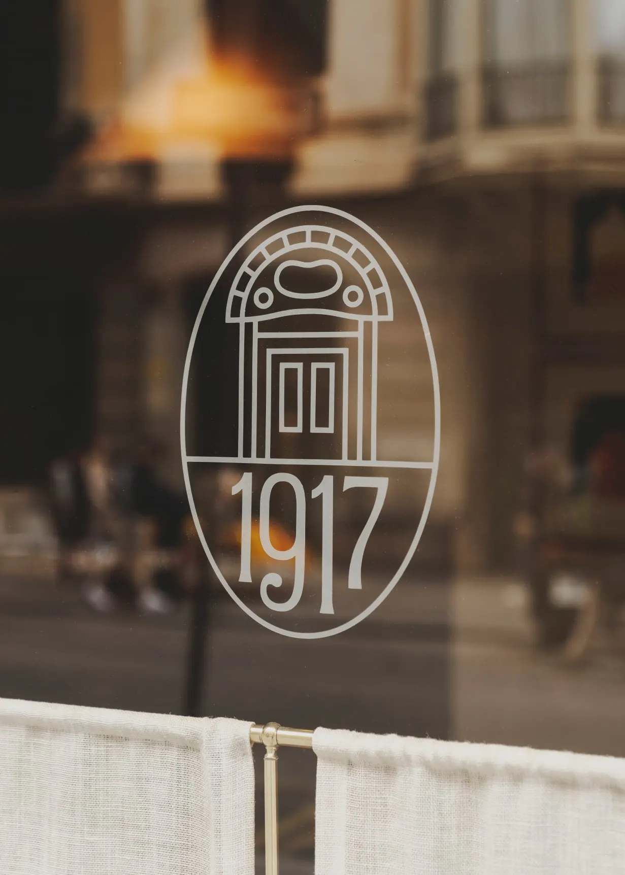
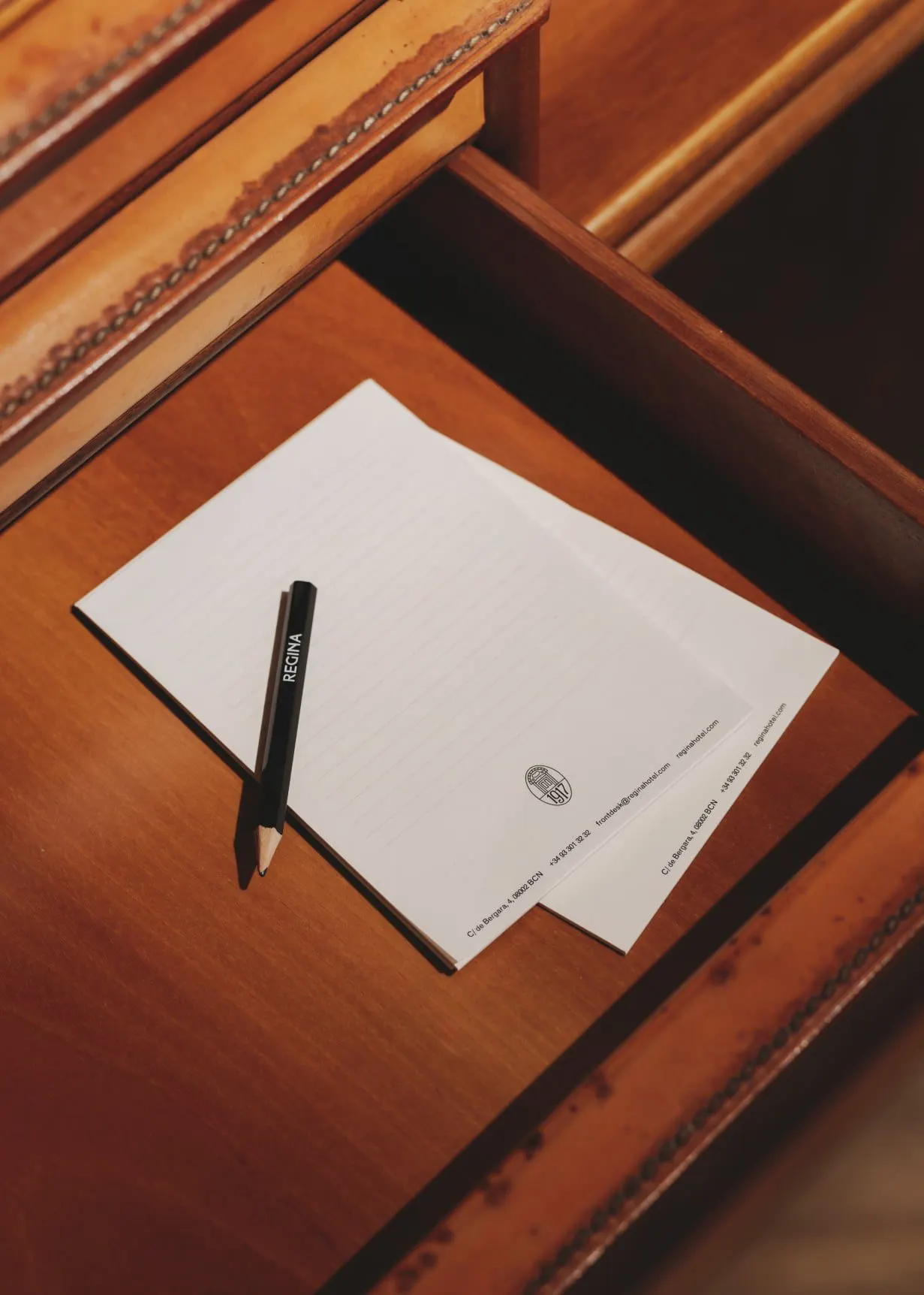
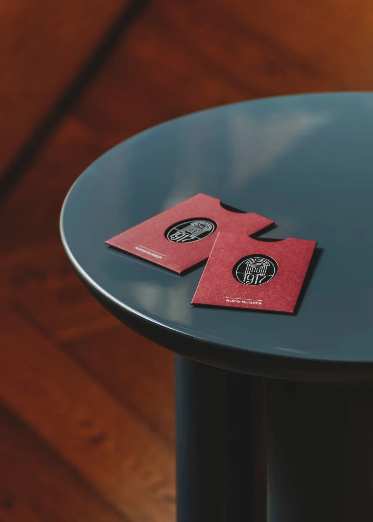
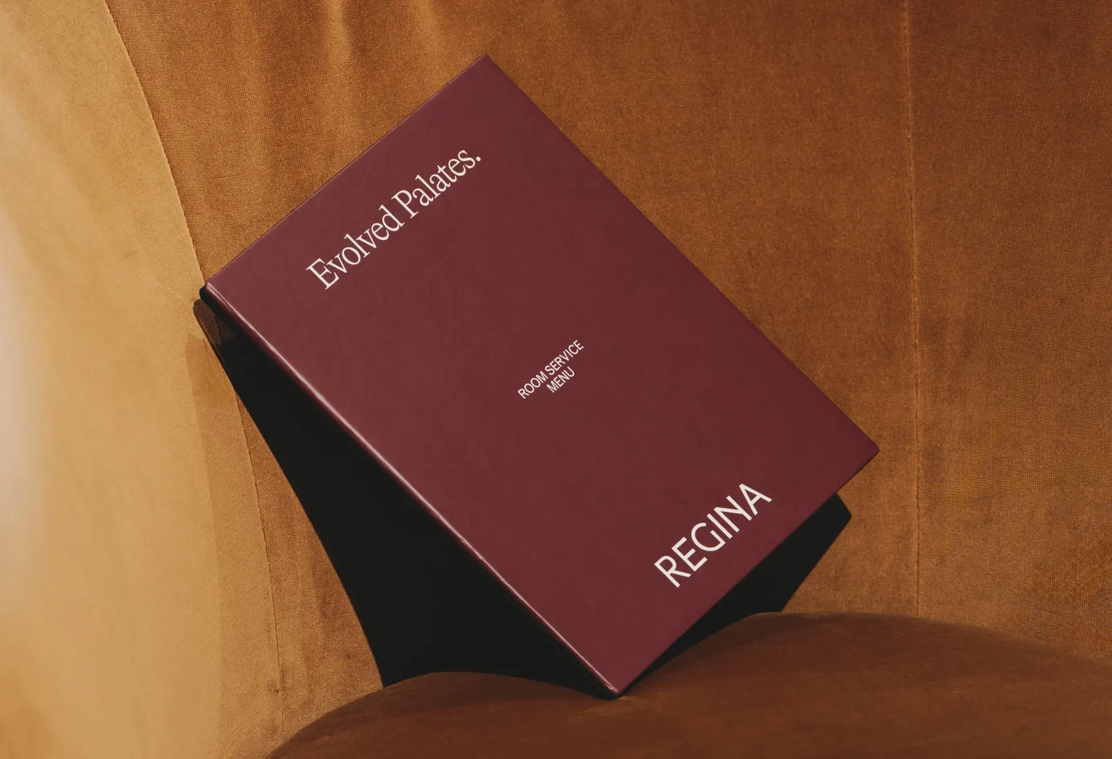
The archive turned up an earlier logo, which the studio pared back into a clean, modern wordmark, paired with a symbol based on the hotel's façade. Designers Allie Heesh and Marina Coll built the system with typographer Alan Levett, who drew custom numerals for signage and wayfinding that echo those on the building. A classic palette keeps the look calm, and Alfie Hayward's copy carries the idea through every touchpoint. Gina's, the lobby bar, gets its own identity built from more archive finds, aimed at locals as much as visitors.
Why it works
Heritage hotels often fall back on generic luxury cues, and this identity avoids that by borrowing only from Regina itself. The façade symbol and numerals are things no competitor can claim, and they make the building memorable in a way a monogram wouldn't. Turning wayfinding into brand expression is a smart use of a functional touchpoint, since every guest meets it. A simple wordmark and quiet palette leave room for personality in the copy and in Gina's, which gives locals a reason to walk in.
Applications
Typography
Images and video from dennis.studio, by Dennis Studio.