The Brand Monograph
Museu Nacional brand identity by Manufatura
↗Few buildings are as recognizable as a Niemeyer dome, and Porto Rocha's identity for Museu Nacional da República in Brasília treats that shape as a graphic asset instead of something to compete with. Invited by Manufatura to lead the rebrand, the studio took on a free public museum that wanted more visitors, collaborations, and revenue, and wanted to feel less closed off.
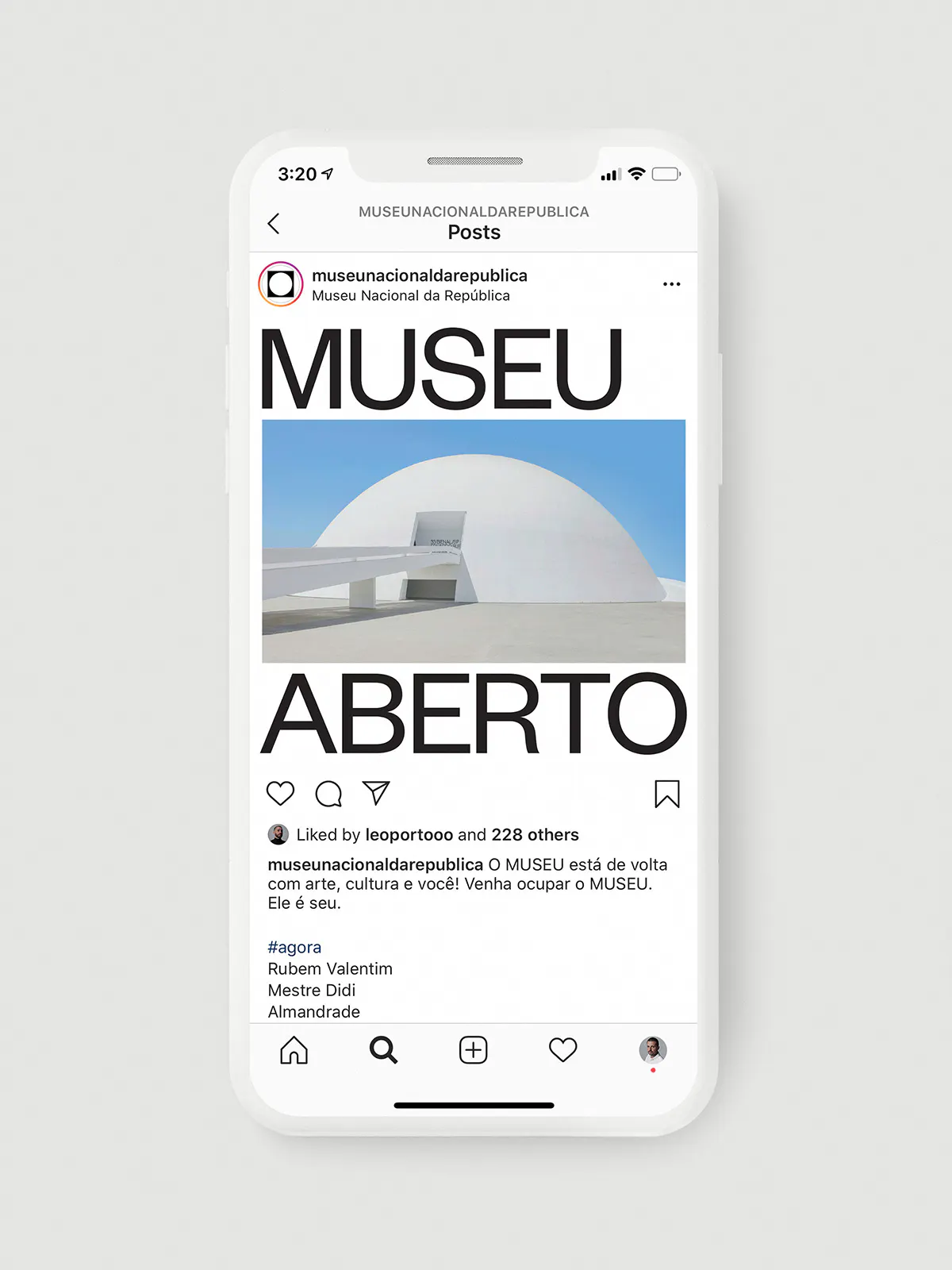
The symbol pairs a circle with a square to echo the dome seen from above, and the circle doubles as a frame for photography, art, architecture, or video. Founders Grotesk, from Klim Type Foundry, brings round letterforms and a nod to early Brasília. The system stretches from web and digital to signage, uniforms, stationery, merchandise, and packaging, with copy by Bruna Moreira and Manufatura's "SEU MUSEU" wordplay, which means "your museum," setting the voice. Motion work came from Estúdio Arco and Fionn Breen.
Why it works
The frame is the smartest decision here. A museum's content changes constantly, and a simple circle-and-square mark gives every exhibition, artist, and photograph the same container without the identity competing with the art. The mark also comes straight from the building, so locals can read it without explanation. Plain, utilitarian type and direct copy lower the barrier in a category that often leans on hushed formality, and "Seu Museu" turns an institution into an invitation. The rigor stays in the system while the warmth lives in the language.
Applications




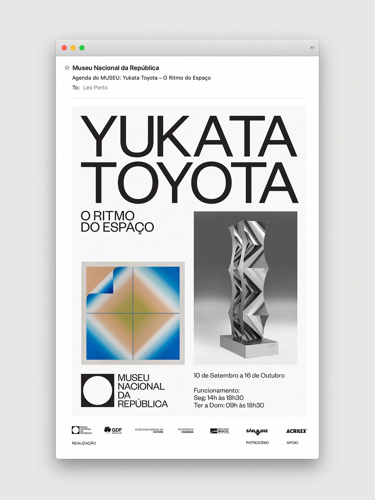
Images and video from portorocha.com, by Manufatura.