The Brand Monograph
Electric Sky brand identity by Porto Rocha
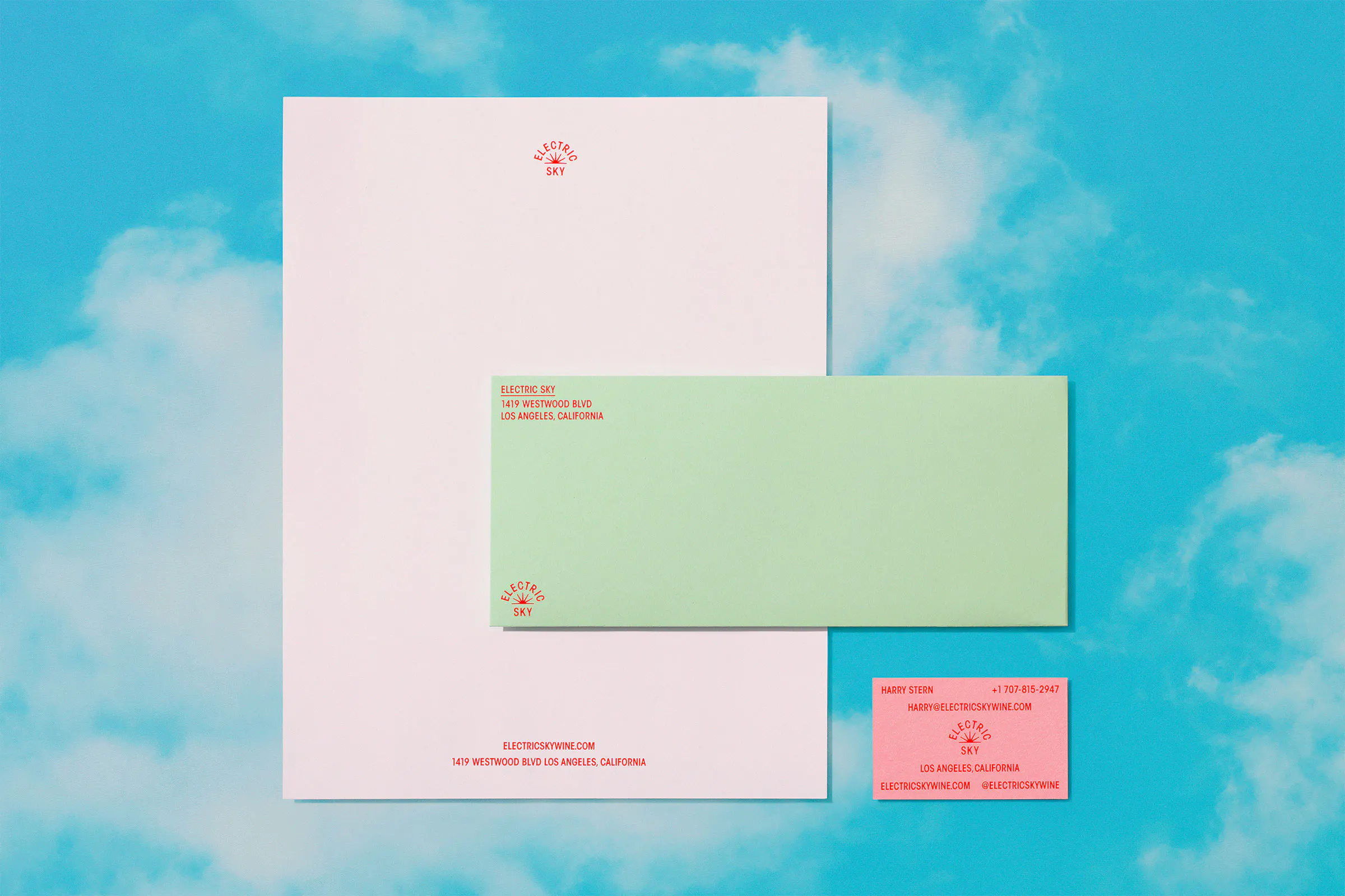
↗Electric Sky is a Los Angeles wine brand sold in cans, four-packs, and bottles, and Porto Rocha made it look like nothing else on the shelf. Building on research and strategy from YÖNE, the studio designed the packaging, website, and retail approach around soft, glowing color fields and a sun symbol that can read as either sunrise or sunset.
Type and information are handled with restraint. Avant Garde Condensed, a face from 1974, carries the labels, and a clear hierarchy keeps each wine easy to identify. Around that core, illustrators and artists including Ben Sanders, KangHee Kim, Paul Windle, and Kenesha Sneed, photographers Luca Venter and Corey Olsen, and musician Leven Kali pushed the system in different directions. Cursor Studio handled development, and Pedro Veneziano contributed motion and 3D.
Why it works
Wine packaging usually signals seriousness through muted palettes and heritage cues. Porto Rocha reverses that by letting color do the talking. Gradients give each wine its own mood while keeping the range recognizable, and a single sun mark is simple enough to hold up on a can or a bottle. The typeface is the smartest move. Its geometric, slightly retro confidence adds credibility without stiffness, so a relaxed brand still feels like it knows its wine.
Applications




Images and video from portorocha.com, by Porto Rocha.