The Brand Monograph
Bonde brand identity by Porto Rocha
↗Porto Rocha's identity for Bonde suggests Brazil through restraint rather than decoration. Bonde started in 2017 as a platform for Brazilian art and design, then grew into a New York conference with 350 attendees, 10 speakers, 80 publications, and two pop-up exhibitions. The brief called for a brand that could hold a wide range of work without competing with it.
The studio's answer is a single yellow borrowed from the trams behind the name, paired with Marr Sans Condensed, a typeface that recalls vintage Brazilian newspaper ads, street pamphlets, and magazines. Porto Rocha developed the typography with Commercial Type and the motion with Luke Guyer, while photography by Hick Duarte and Mari Juliano keeps the people and the work in front. The result is a compact system that stays flexible from print to screen.
Why it works
Design events tend to be loud, each one competing to be the most memorable thing in the room. Bonde's identity does the opposite, and that is what sets it apart. One yellow is enough to make every poster, post, and screen recognizable, and it works as a neutral stage for very different work. The condensed type is sturdy and economical, so headlines can run large in tight spaces. Because Brazilian design has no single look, an identity that doesn't force one feels honest to its community.
Applications


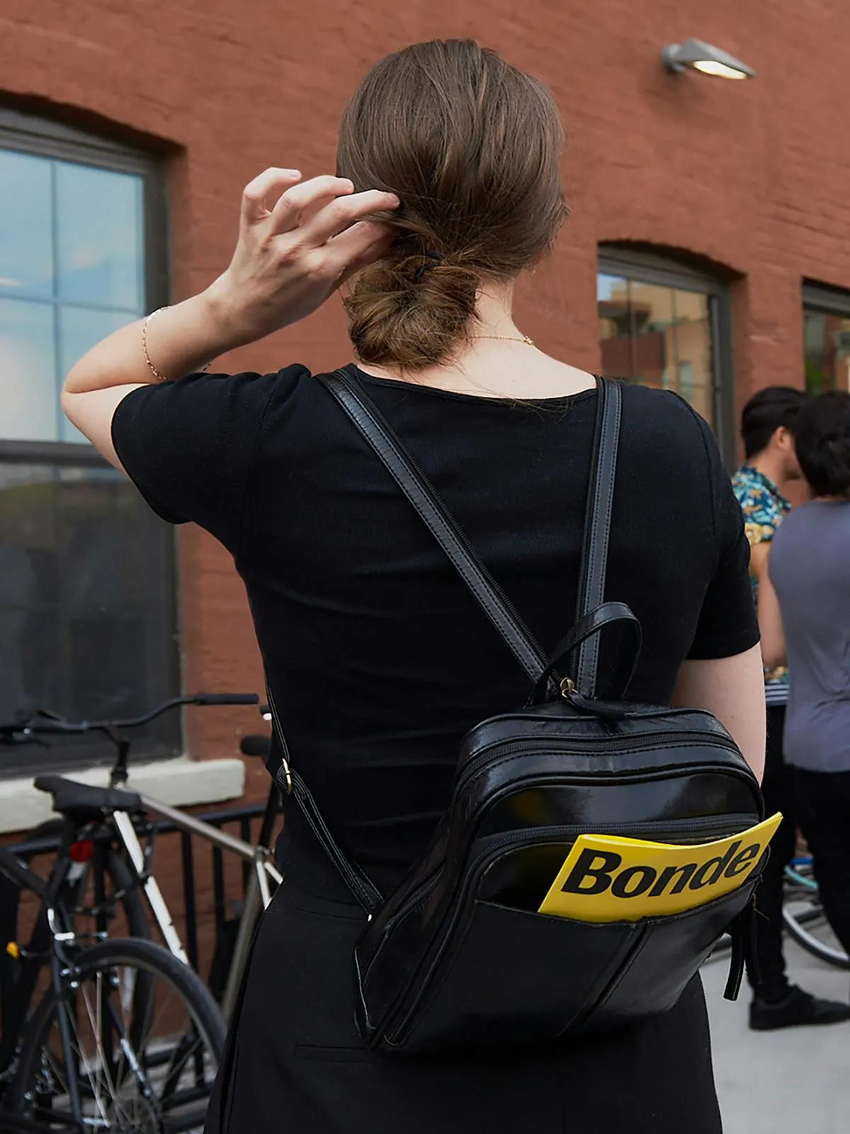




Images and video from portorocha.com, by Porto Rocha.