The Brand Monograph
YAGA brand identity by Porto Rocha
↗Porto Rocha's identity for YAGA looks made to be shouted from a club doorway. The festival is an independent gathering for queer and trans communities in São Paulo, and it opened days after Jair Bolsonaro won the presidency. The studio gave it a stretched, heavy four-letter wordmark and a saturated red that people were already wearing in protest.
Porto Rocha worked with Estúdio Margem on design and with Production Type and Swiss Typefaces on typography, adapting the letterforms from the typeface BRRR. It set the red against dusty purple-greys and green-browns that reflect the city's grit. The lineup lists every artist without ranking them, and glossy applications sit beside rough phone selfies. Fionn Breen handled motion, and Julio Nery, Mari Juliano, and Victor Valery contributed photography.
Why it works
The wordmark's extreme width gives a short name real physical presence, so it holds its own on a poster or a phone screen. The red works because the audience already owned it as a signal, and the murky neighbors make it burn hotter. Most festival identities lean on polish and a clear pecking order. Here, a flat lineup and imperfect selfies make YAGA feel like a scene rather than a product. The rough images also keep the loud type from turning slick, which suits a community defined by its own presence.
Applications


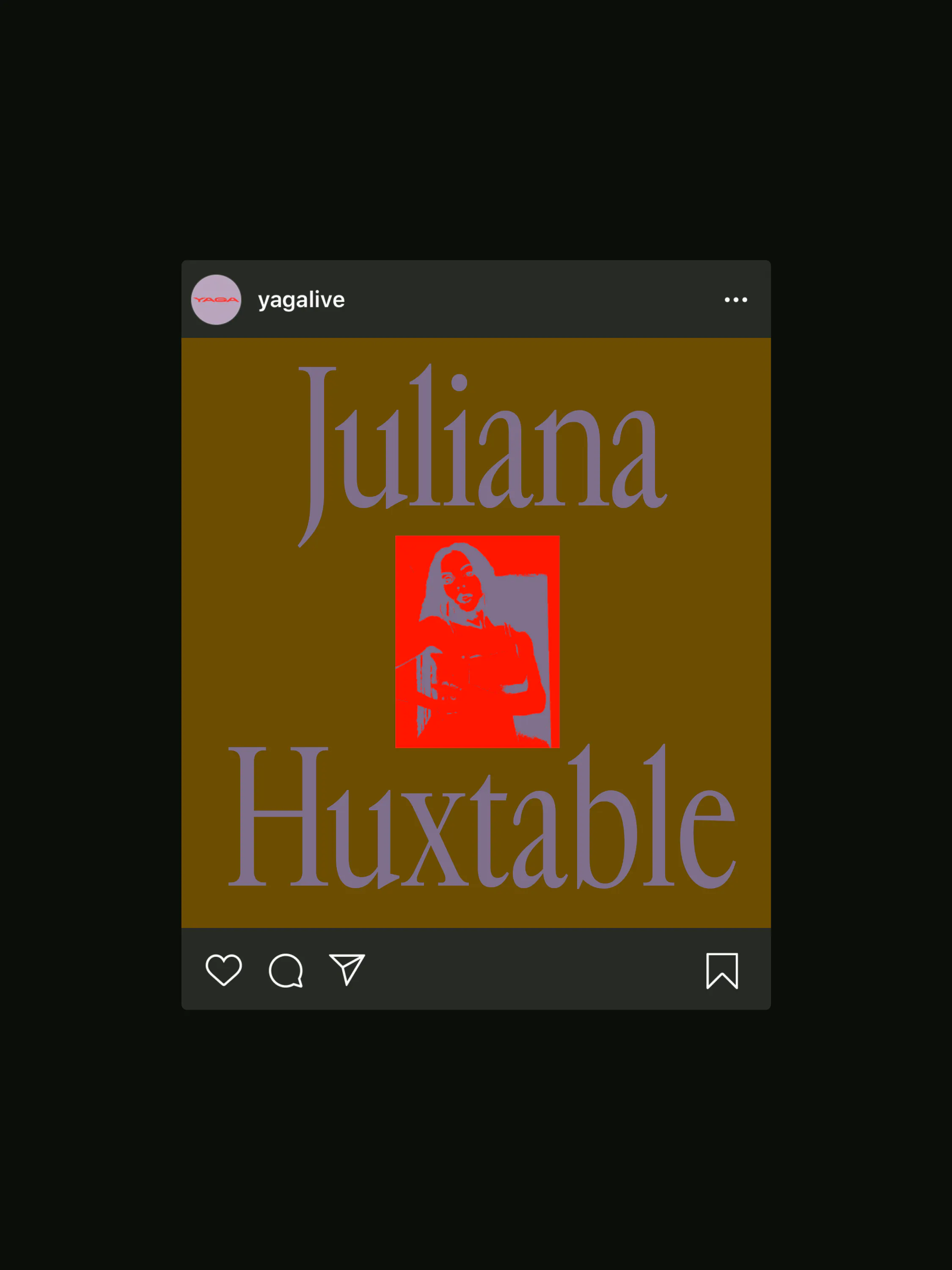


Images and video from portorocha.com, by Porto Rocha.