 The Brand Monograph
LEC brand identity by Further
↗Further's LEC identity stands out because it refuses to look like sports television. When Riot Games brought the studio in on its European League of Legends championship in 2018, the audience was already huge, but the broadcast leaned on anchors, suits, and desks borrowed from traditional sports.
After immersing itself in pro-gaming culture, Further built the brand around the humor and passion of fans and shoutcasters, and gave the league its short name, LEC. The mark is a burst of celebration split into two halves, one per team, sharing a single arena. Commercial Type contributed the typography, and the system runs from broadcast package to stage, trophy, film, motion, and sound. Each season finals gets its own concept, from Athens' protest graphics to Montpellier's mash-up of stone columns and a flying crab.
Why it works
The mark does two jobs at once. Its symmetry tells the story of a match, and its burst shape reads as a reaction, which is exactly what this audience comes for. It is simple enough to animate and sit on a stage screen without losing character. Because the core stays fixed, the finals can swing from rebellion to absurdity each year and still feel like the same league. Most of all, the brand speaks in the fans' own register, playful and in on the joke, which sets it apart from categories that default to polish.
Logo
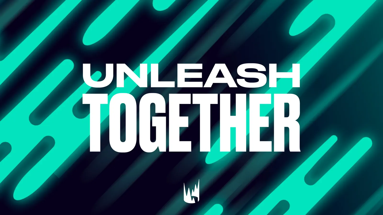
Graphic elements

Applications

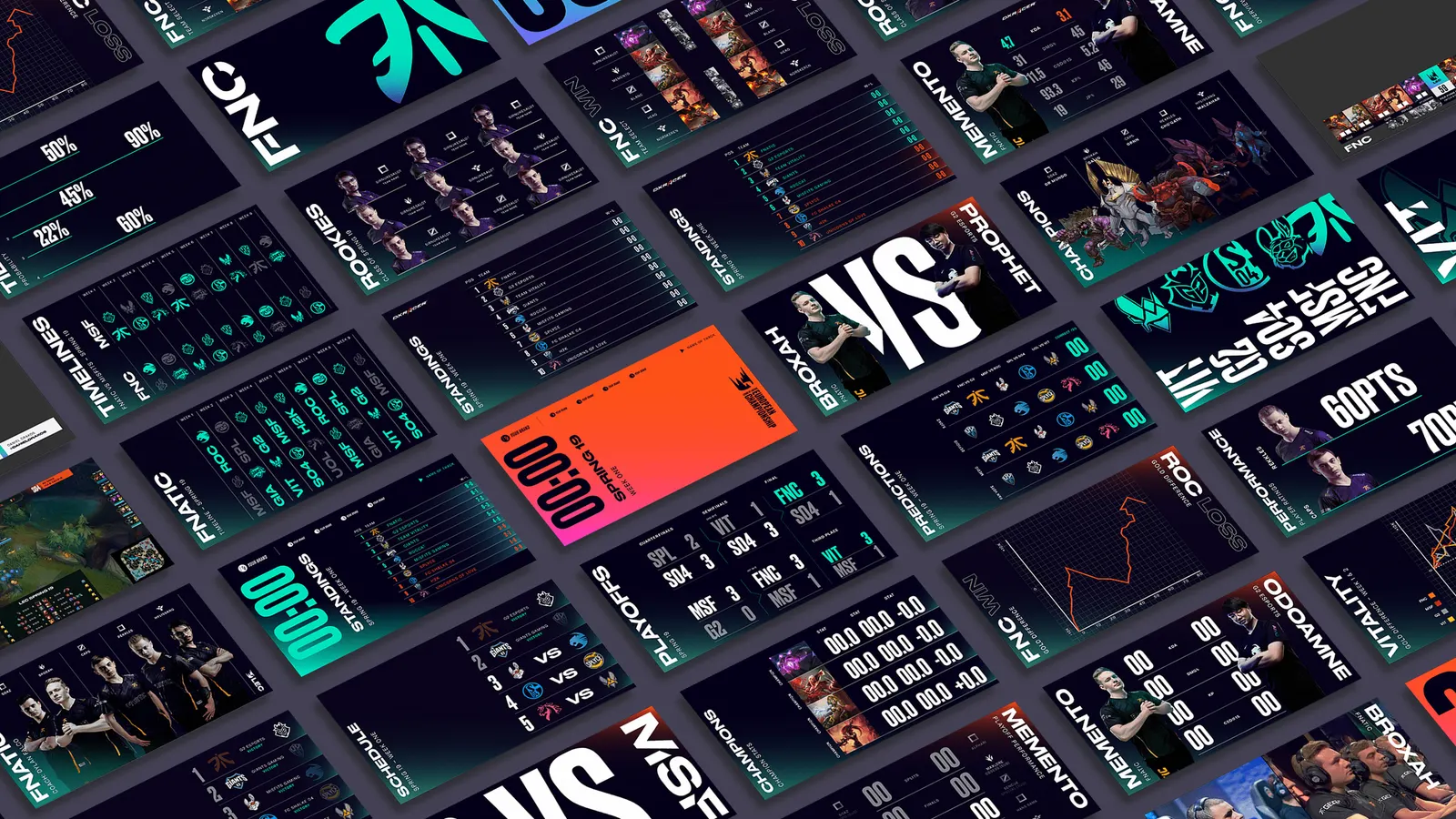
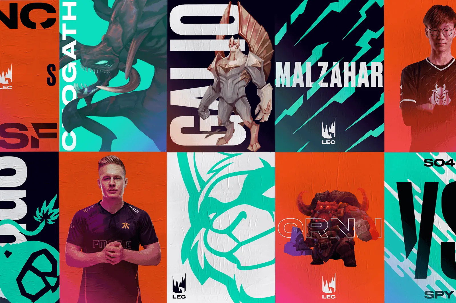


Images and video from further.group, by Further.


