 The Brand Monograph
Dropbox brand identity by Collins
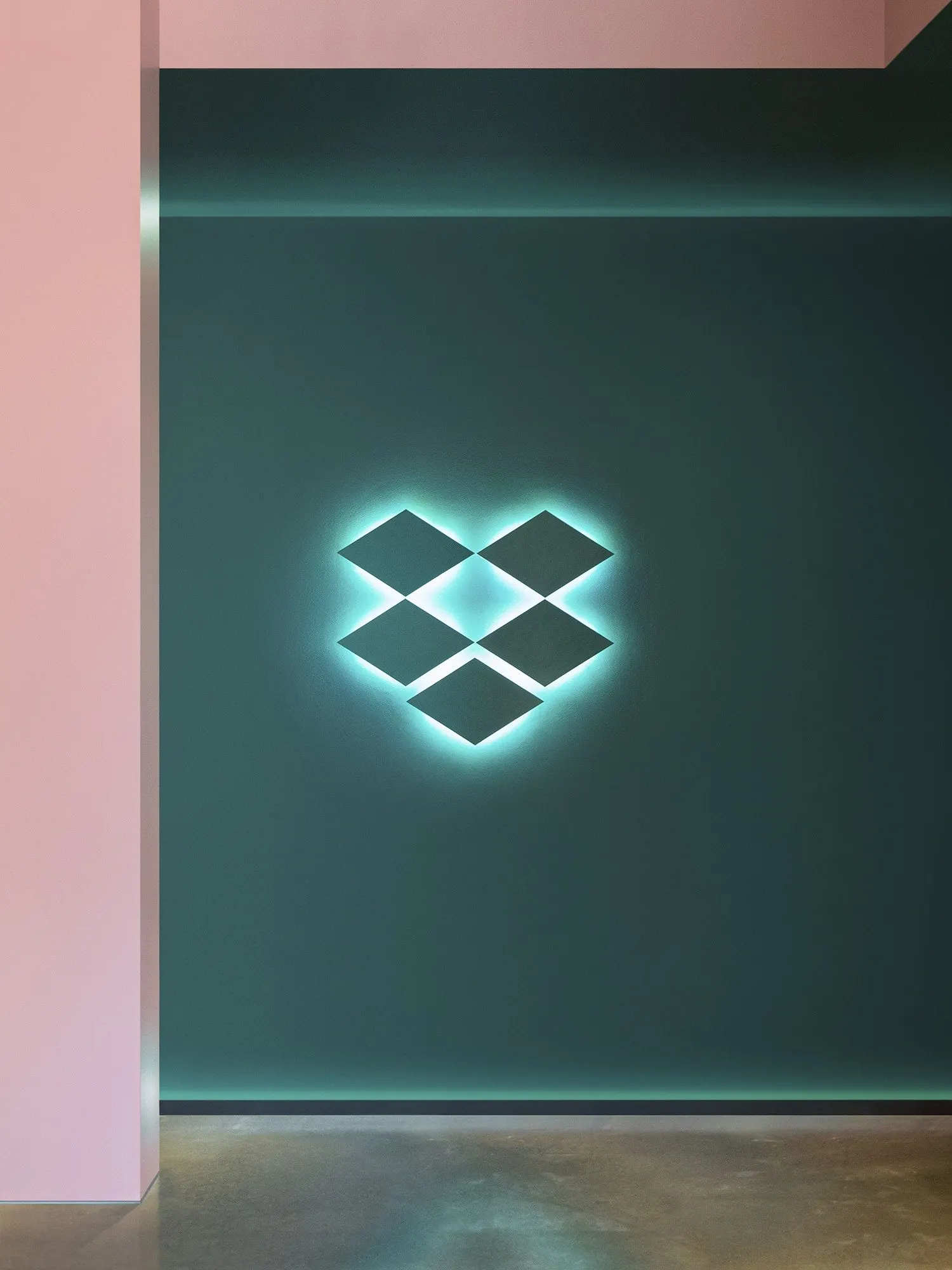
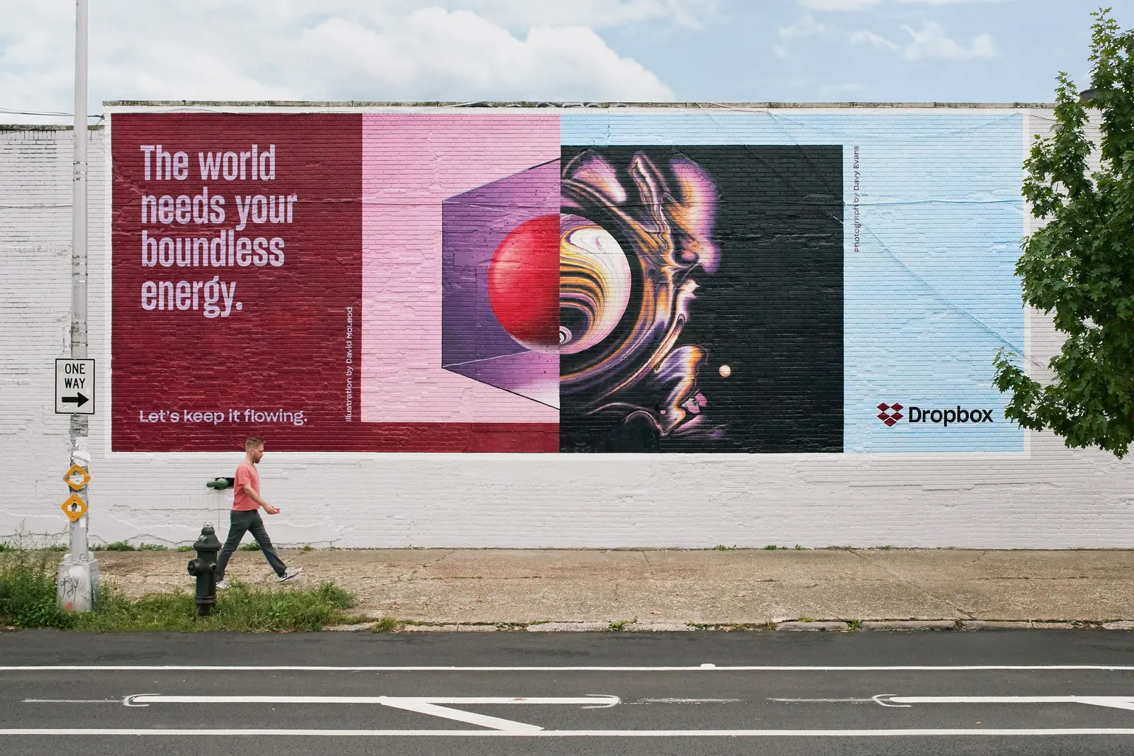
↗Dropbox is a utility most people use without thinking about it, which makes this identity a bold swing. Ahead of the company's IPO, COLLINS gave it the energy of a creative studio's pinboard instead of a storage locker. Leadership wanted to win over creative professionals without losing existing customers, so the studio looked to the product's best-loved trait and found a bigger idea inside it.
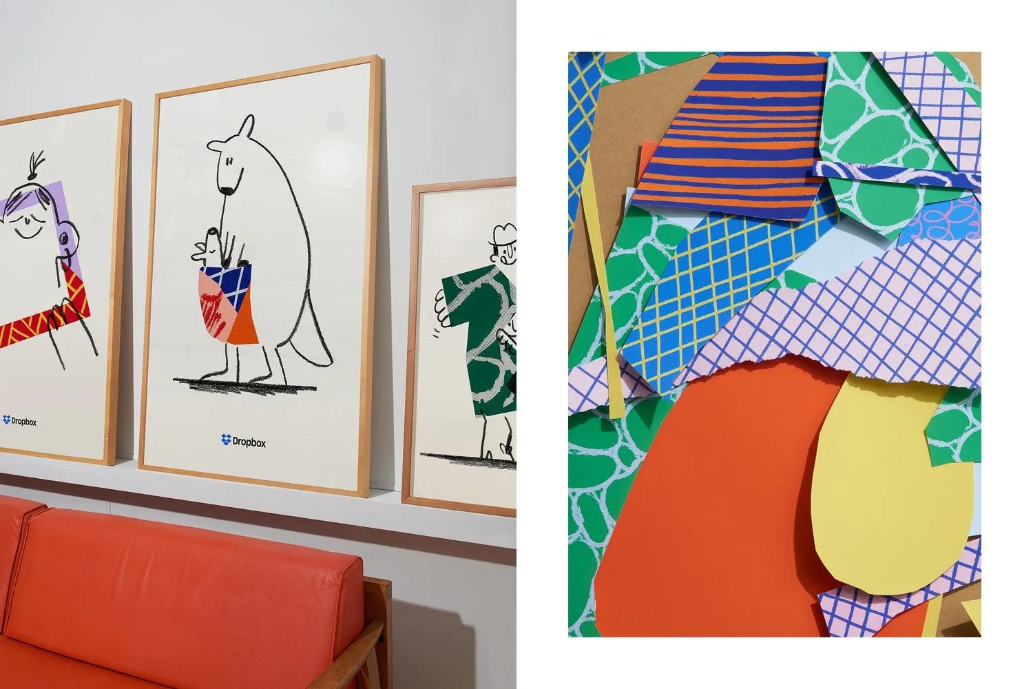
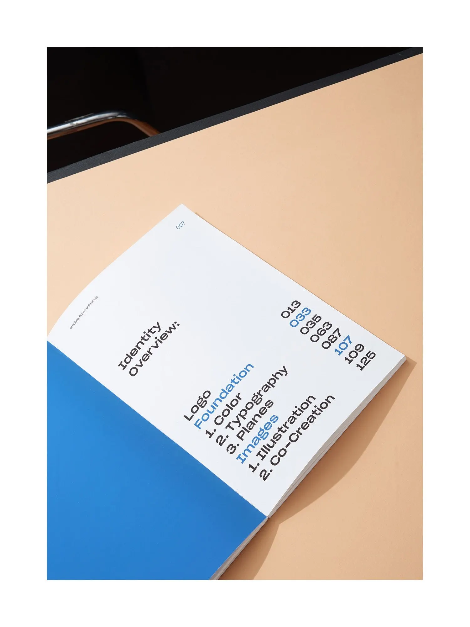
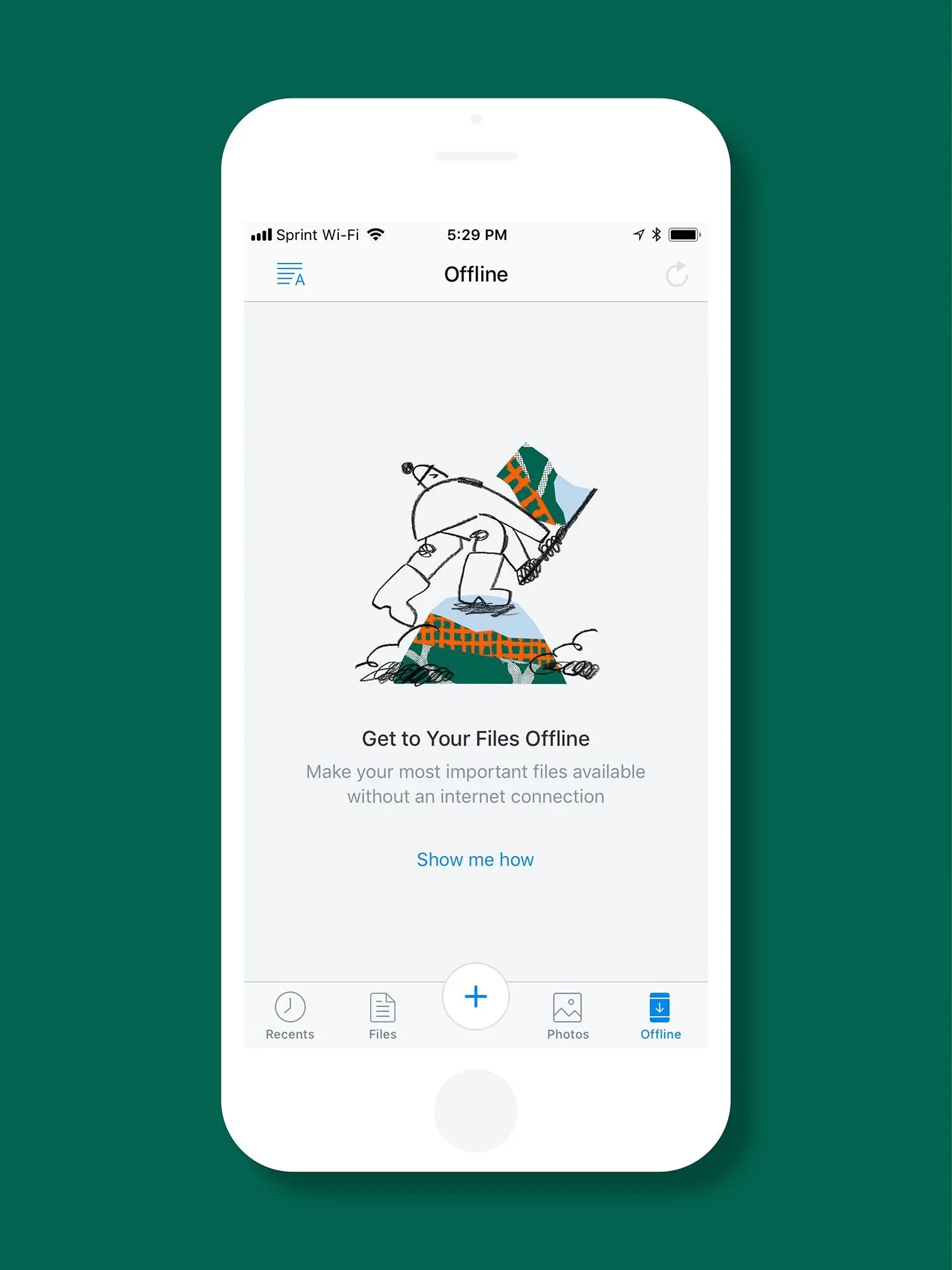
The studio framed Dropbox's real job as keeping people, files, and tools in step as projects grow messier, a problem well beyond design teams. The identity expresses that as a kit of parts: color, typography, art, illustration, and photography pushed together in pairings built to keep changing. Sharp Type handled typography, Animade motion, and Instrument development, with 72andSunny on strategy. Dropbox's IPO rose 35% on its first day, and the platform reached 700 million users in 2020.
Why it works
Most file storage brands signal reliability and little else. This system does something harder: it demonstrates the product's promise by pulling many voices into one recognizable brand. Because the rules govern how things combine rather than fixing a single look, the identity can stretch from a business buyer's presentation to a freelancer's portfolio without changing its logic. It also leaves room for other creators to contribute, which suits a product about collaboration. The risk with a system this loose is drift, and typography, developed with Sharp Type, is the obvious place for it to stay anchored.
Applications
Logo
Typography
Graphic elements
Images and video from wearecollins.com, by Collins.


