The Brand Monograph
RTIC brand identity by Red Antler
↗Red Antler's work for RTIC Outdoors shows how a brand can grow without getting slicker. RTIC earned its following selling performance gear directly to customers. Moving into big-box retail meant standing on a shelf between bargain options and premium names with bigger reputations, and the studio had to give the brand a point of view that could hold up there.
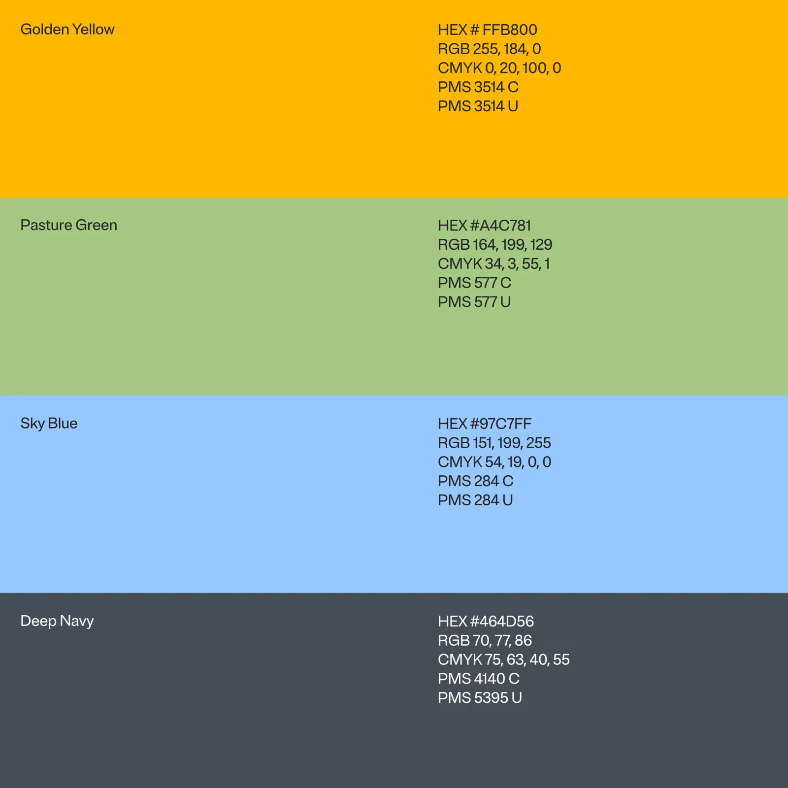
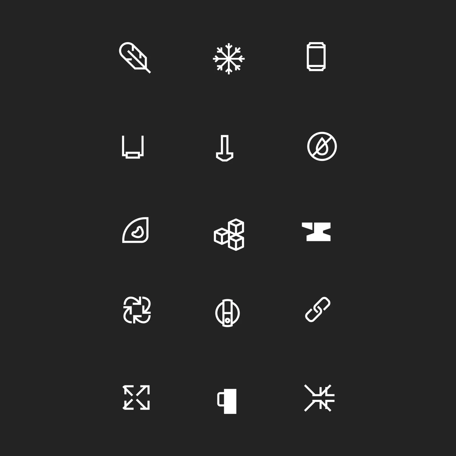
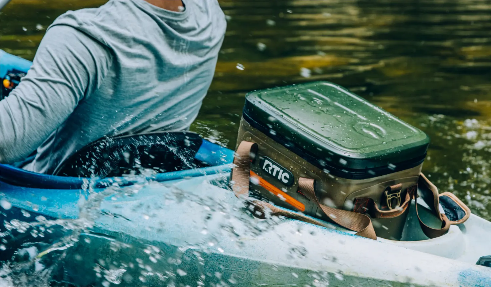
That point of view is a platform called Real Life Stuff. It puts durability and everyday use first, while leaving room for product innovation, personalization, and performance. Red Antler refined the existing RTIC logo instead of replacing it, then reworked ecommerce, packaging, typography, and illustration around it. Color is drawn from the products themselves, lifestyle photography shows the gear getting used in many different ways, and the writing is wry and plainspoken.
Why it works
The smartest decision here is restraint. Refining the logo rather than starting over protects the recognition RTIC built with loyal customers, while the sharper system works harder in a store aisle. Taking color from the products lets packaging and gear read as one family at a glance. The "real life" idea also finds a gap in the category: premium competitors lean on aspiration and budget brands on price, while RTIC sounds like something you would actually take outside.
Applications

Logo
Color


Images and video from redantler.com, by Red Antler.