 The Brand Monograph
Songtrust brand identity by Order
↗Order's work for Songtrust takes a subject most people find dull, collecting publishing royalties, and puts the songwriter at the center of it. Working with strategist Adam Beal, the studio shaped a brand story around two ideas held together: each writer is an individual with their own path, and each is part of a wider community that Songtrust serves.
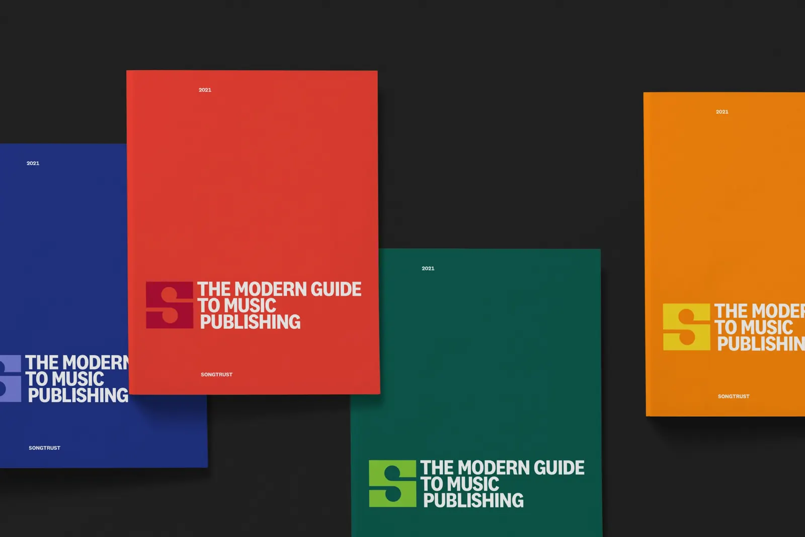
That duality shows up in the mark, where two music notes combine to form a letterform. Around it, Order set the system in Klim Type Foundry's National 2 and built a grid from the structure of music, with blocks that can hold photography, type, or color. Ebru Yildiz contributed photography, Garrett Corcoran and Jesse Reed designed, and a custom icon set derived from the primary mark carries the look into the product.
Why it works
The strongest decision is making the logo do the conceptual work. Two notes forming one letter says individual and community without needing a slogan, and because the pieces are modular, the brand can speak quietly in a product interface or loudly in a color-filled grid. National 2 keeps things clear and steady for a service built on trust and paperwork, while the vivid palette keeps Songtrust from looking like the cautious financial tool its category often suggests.
Logo

Typography

Color

Graphic elements

Applications


Images and video from order.design, by Order.
