The Brand Monograph
State of Vermont brand identity by DNCO
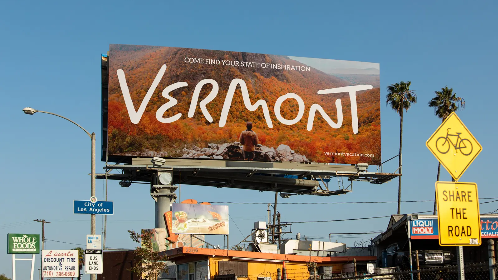
↗Most state tourism brands sell a view. DNCO's work for Vermont sells a change in the visitor, and it does so with a wordmark that looks like it was painted by someone down the road.
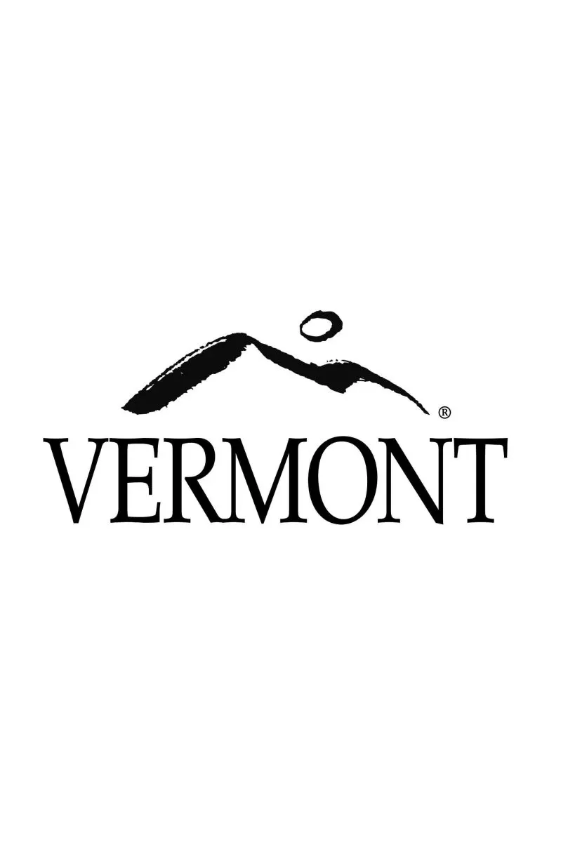
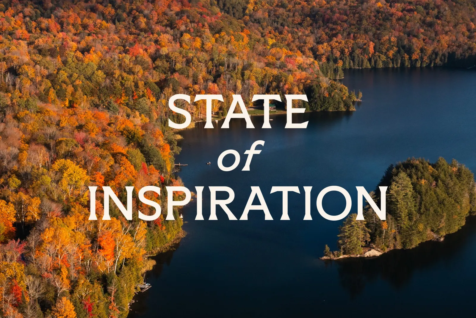
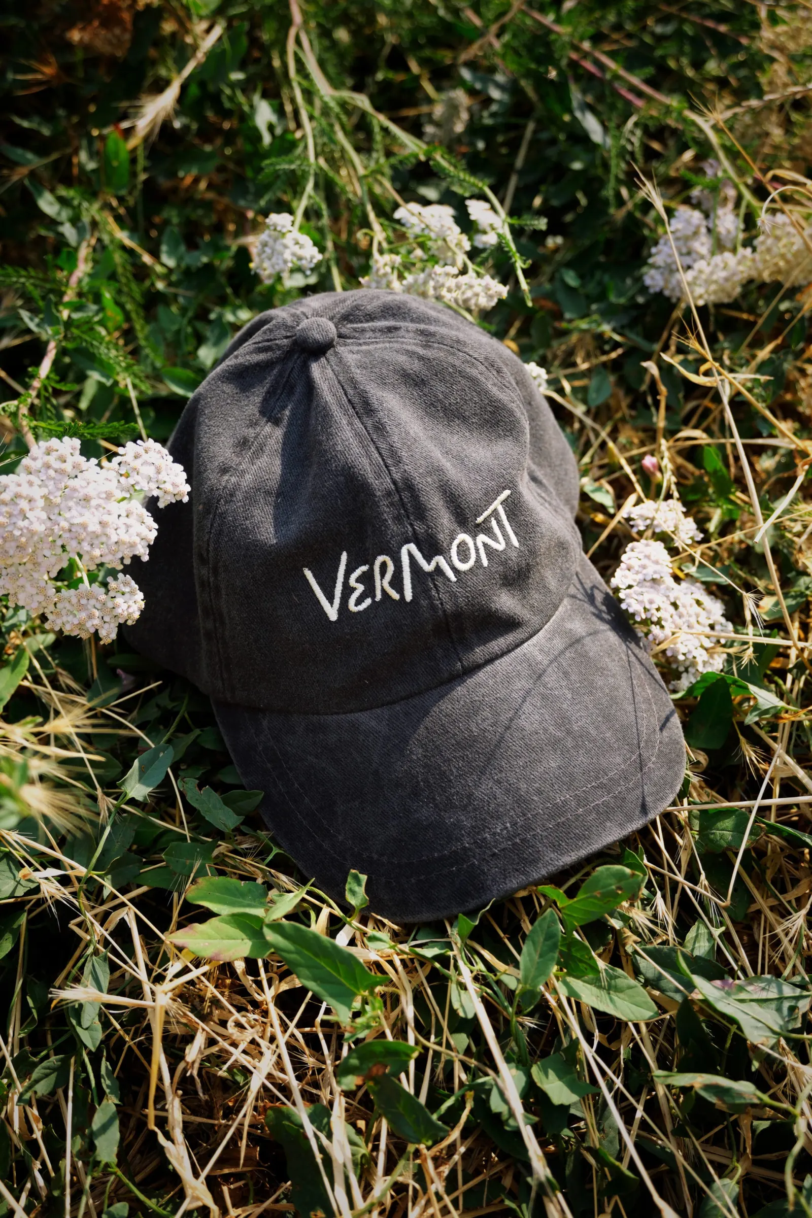
For the Vermont Department of Tourism and Marketing, the studio drove more than 400 miles through 14 towns and talked with visitors and stakeholders before landing on "State of Inspiration," the state's first dedicated consumer brand. The name plays on "state" as both a place and a frame of mind. Lettering artist Rob Clarke refined the wordmark, which tucks a road, hills, and a moon over mountains into its letters. A single typeface in multiple weights moves from serious to playful, the palette follows the seasons, and Alyssa McCabe's illustrated icons range from food to Champ, the Lake Champlain "monster." Guidelines and partner workshops support the rollout.
Why it works
The strongest decision is specificity. Hand-painted lettering ties the mark to a real Vermont habit, the roadside sign, so it reads as local rather than generic New England charm. The hidden details reward a second look, which suits a brand about curiosity. One typeface keeps the system disciplined enough for many partners to use, while the weight changes leave room for personality. The icons, Champ especially, add a humor that scenic category imagery rarely allows. Together they make Vermont feel like somewhere you do things, not just photograph.
Applications
Logo
Typography

Images and video from dnco.com, by DNCO.