The Brand Monograph
Tourisme Abitibi-Témiscamingue brand identity by LG2
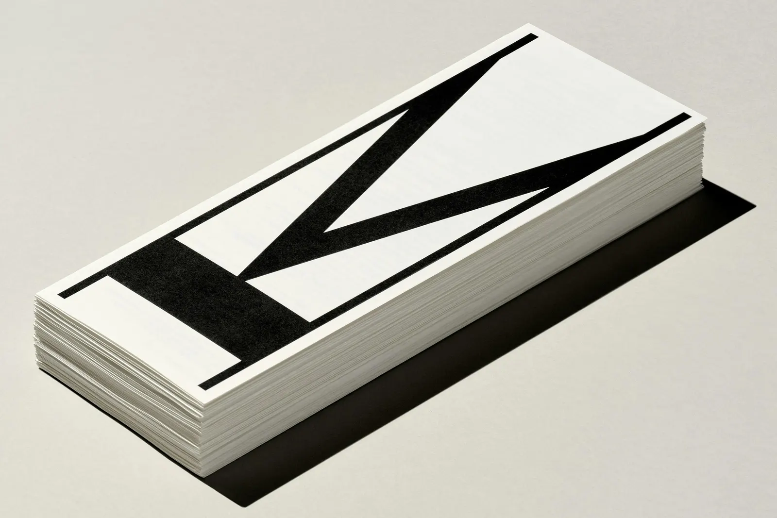
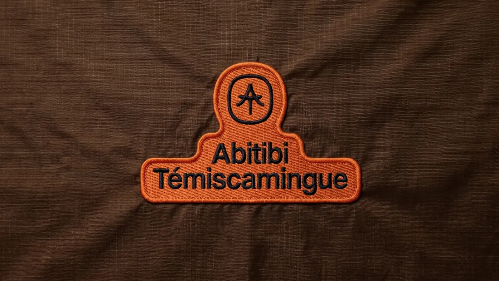
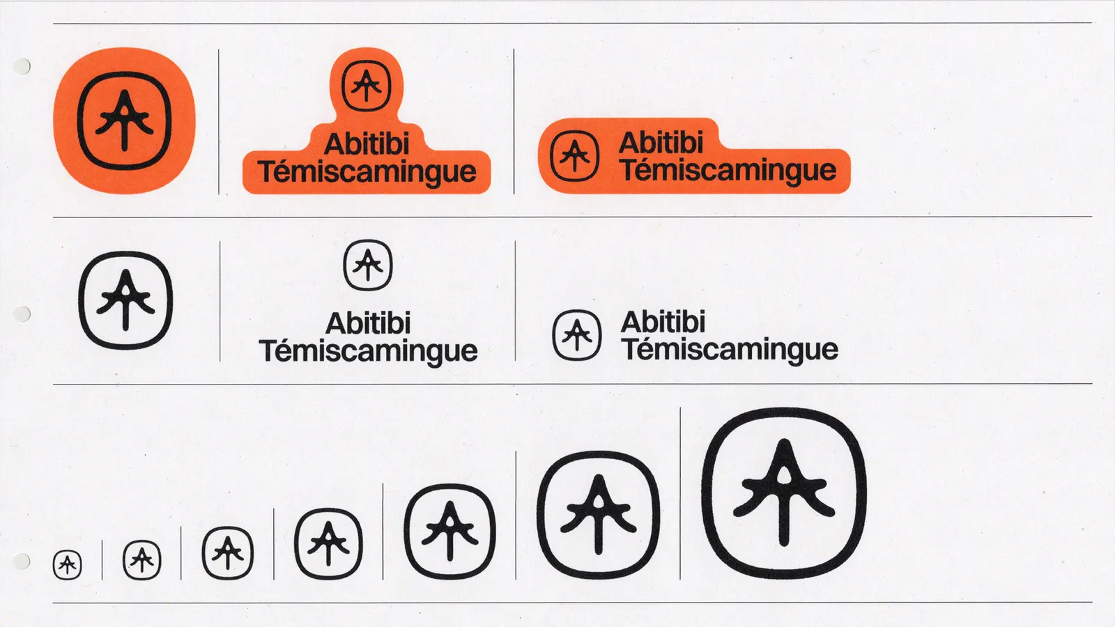
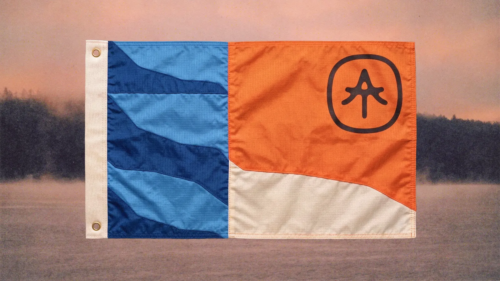
↗Few tourism identities get this much out of a pair of letters. For Tourisme Abitibi-Témiscamingue, LG2 fused the A of Abitibi and the T of Témiscamingue into a single symbol that reads as a conifer, so the region's initials and its boreal landscape arrive as one shape.
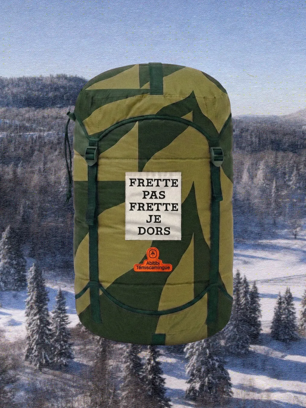
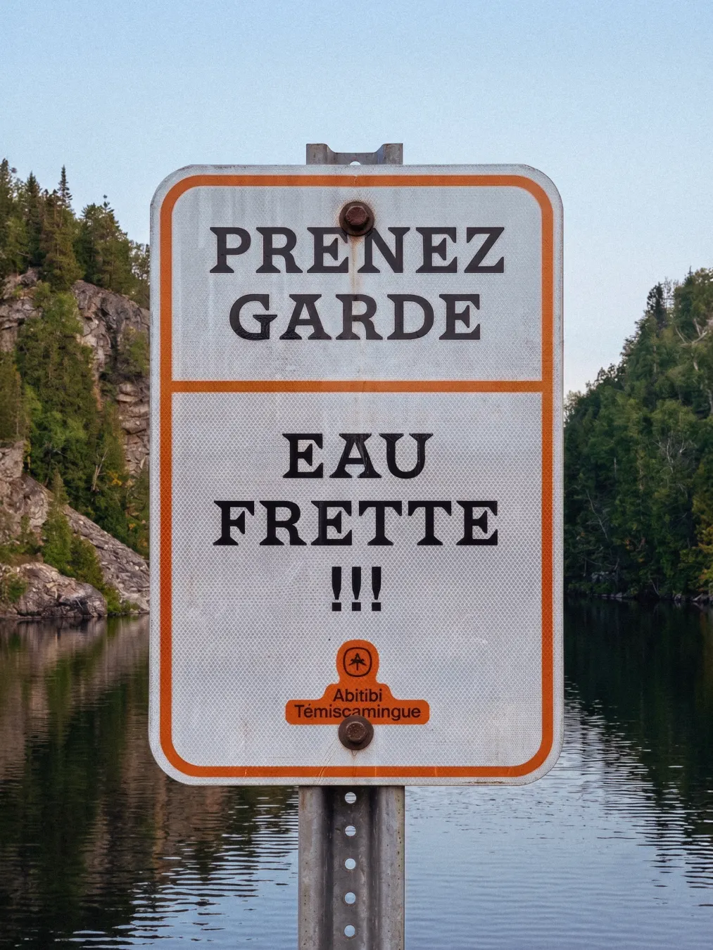
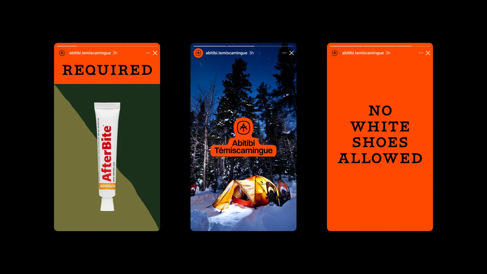
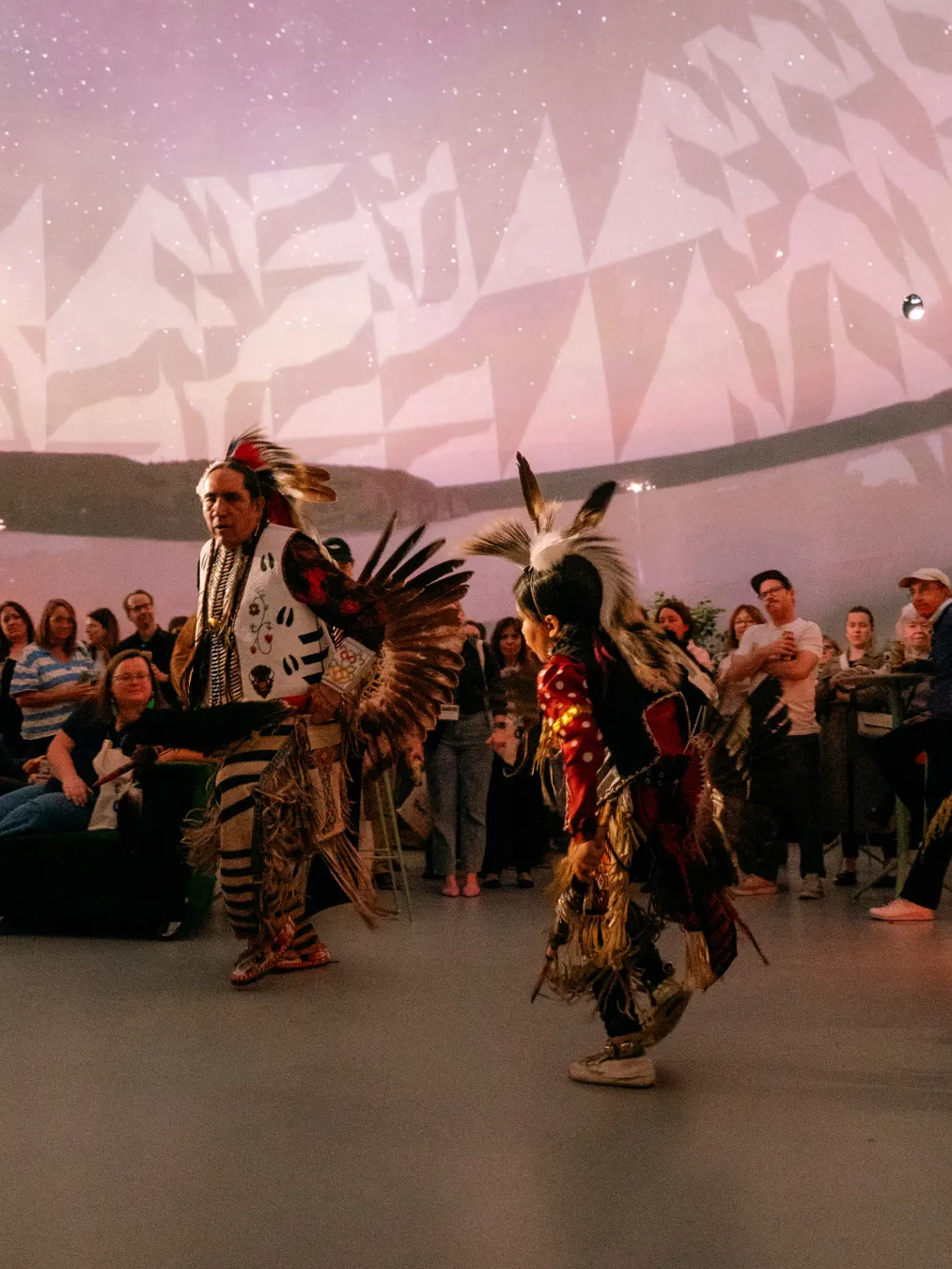
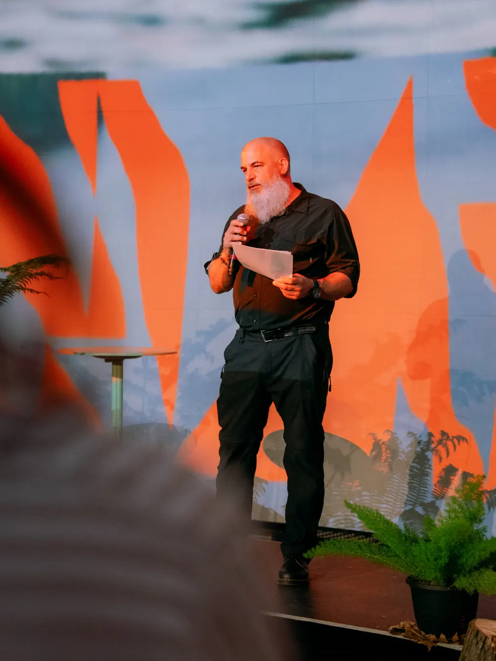
The brief was to get the region noticed farther afield, draw better-matched visitors, and give residents something to be proud of. LG2 rebuilt the strategy first, then the visual system: patterns drawn from land and water, and a sunset-inspired orange as the signature color. The identity runs across signage, print, merchandise, and motion design. The reported results are website visits up 50%, visits to SEPAQ parks up 17%, and off-peak stays up 7%.
Why it works
The symbol is a monogram and a landscape cue at once, so it can stamp a sign, a sleeve, or a tote bag without needing a caption. The orange is the sharper choice. Nature destinations tend to default to forest green and lake blue, and a sunset hue gives this region a warmer, more energetic signal that suits travelers who want something less polished than a postcard. The land-and-water patterns add texture without becoming scenery, which keeps the system flexible and recognizable wherever it appears.
Applications
Logo
Images and video from lg2.com, by LG2.