 The Brand Monograph
Trivago brand identity by Further
↗Trivago's new mark packs two ideas into one lowercase t: a checkmark for the smart search and a smile for the good result. It's a logo that carries the brand's whole argument in a single letter.
Further was brought in to sharpen a well-known brand in a crowded category, where awareness alone wasn't guaranteeing choice. The studio distilled the proposition into one promise, then built the system around it. Savvy Grotesk, a custom typeface developed with Studio Feixen, covers several hundred languages. The tone of voice is conversational, and Niceshit's loose hand-drawn illustration draws on Hank, the door-hanger character. Photography focuses on the moment of landing a good deal. Branded traffic grew after launch, and conversion rates were substantially higher than the previous quarter.
Why it works
Both halves of the t are symbols people already read without translation, which matters for a product used in dozens of markets and backed by type that follows it into each language. The category is full of price grids that look interchangeable, so hand-drawn illustration and a recurring character give trivago a human texture competitors lack. The mark, type, and tone all point to the same feeling: relief at having found the right place without the legwork.
Logo
Typography


Applications


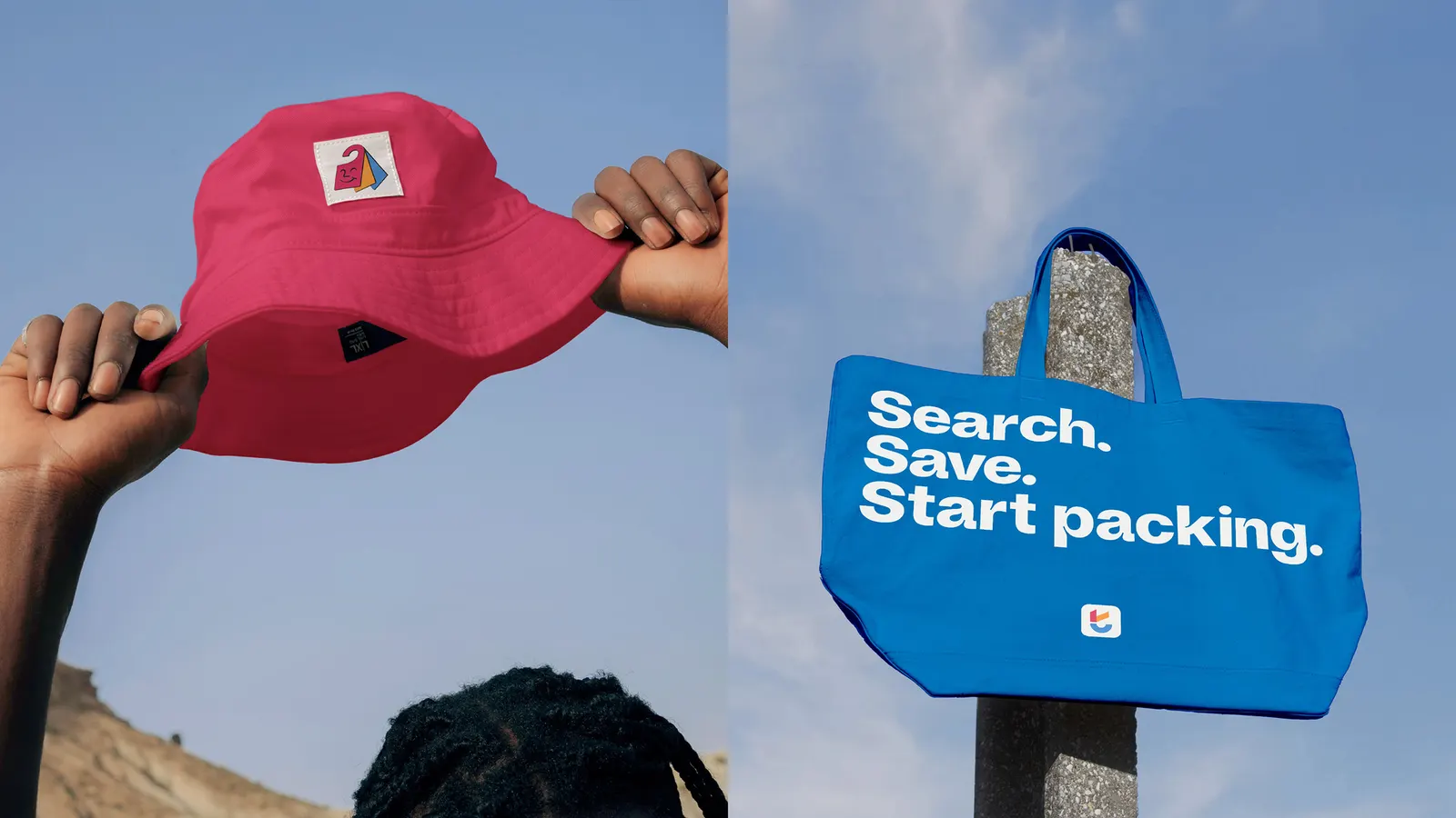
Images and video from further.group, by Further.
