The Brand Monograph
Winnedumah Hotel : CLUB brand identity by CLUB
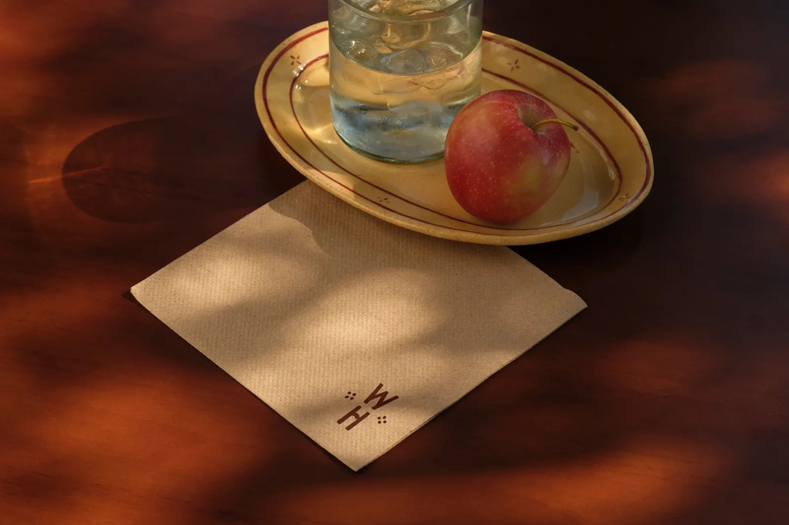
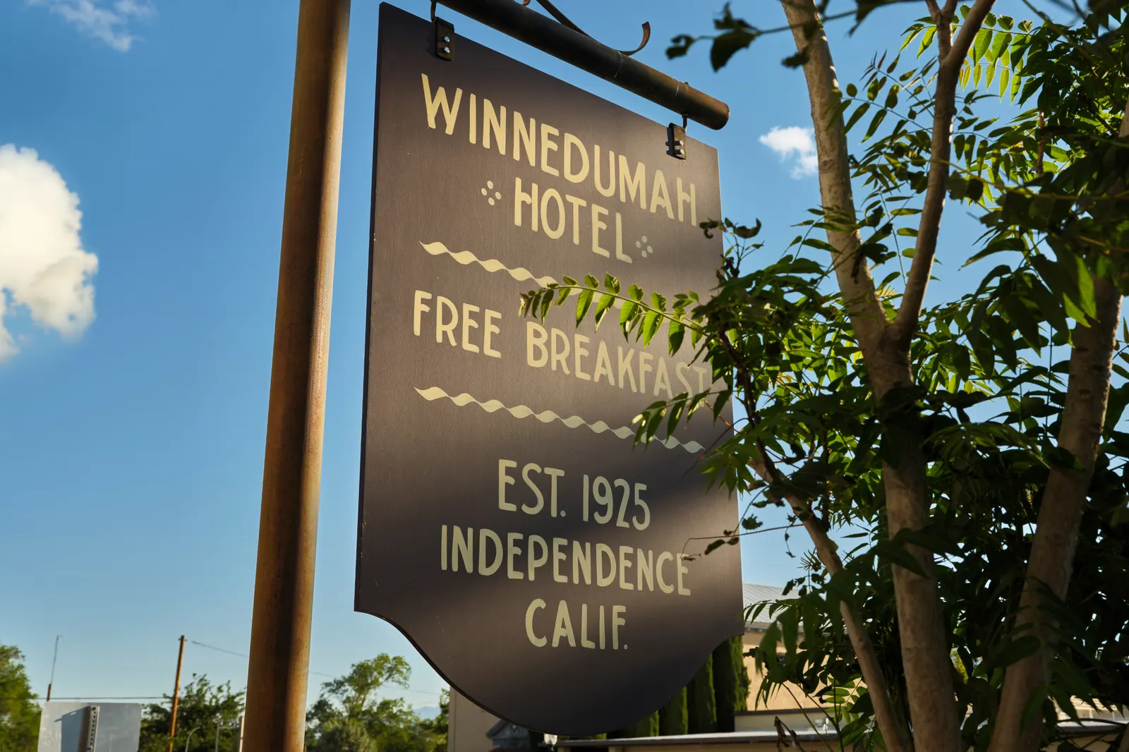
↗Few identities start with a discarded object, but CLUB's work for the Winnedumah Hotel in Independence, California, does. When the hotel changed owners, its old sign turned up damaged and abandoned, and its plain-looking lettering proved to be fully custom, with delicate micro-serifs. The studio redrew it as a logotype that works on screens and on physical signage. It took the palette from the hotel's old matchbooks and darkened it with volcanic tones from the Eastern Sierra.
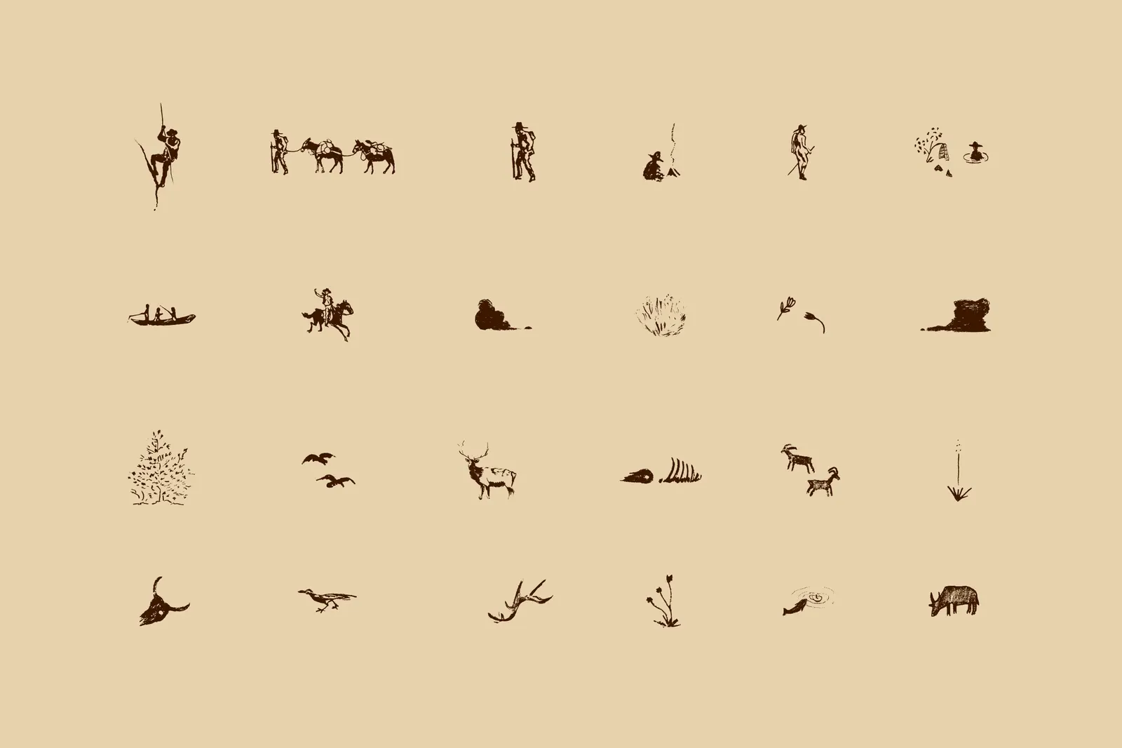
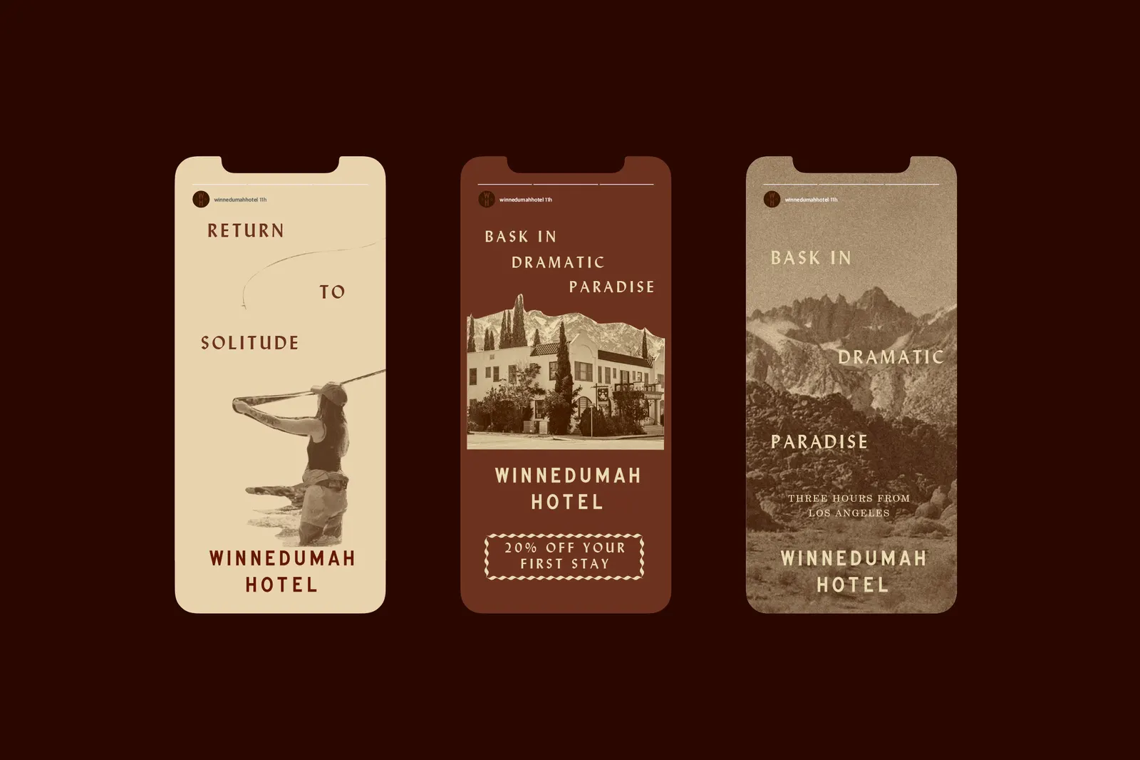
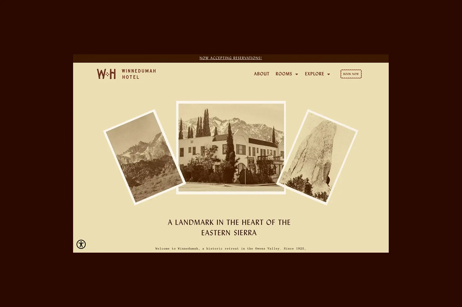
From there, CLUB built a system around the valley's boom years: a display face that recalls hand-painted hotel signs, a monogram nodding to the original Independence Hotel, and secondary pieces rebuilt from found ephemera. Lydian is paired with Century Schoolbook, and the illustrations draw on petroglyphs, folk art, and marks left by train hoppers. Drew Martin and Owens Valley History contributed photography, and Stayner Architects also worked on the project.
Why it works
The logotype is inherited, not invented, and that gives the hotel something rivals can't copy: an origin story guests can see. The micro-serifs add warmth without fuss, so the mark stays legible and human at small sizes. Matchbook colors keep the palette grounded in the period, while the volcanic darks stop it from feeling like nostalgia. Pairing a characterful face with a plain, familiar workhorse keeps the typography from turning into costume, and the rough, handmade illustrations suit travelers who come for quiet.
Applications
Images and video from workof.club, by CLUB.