The Brand Monograph
Osmo brand identity by Red Antler
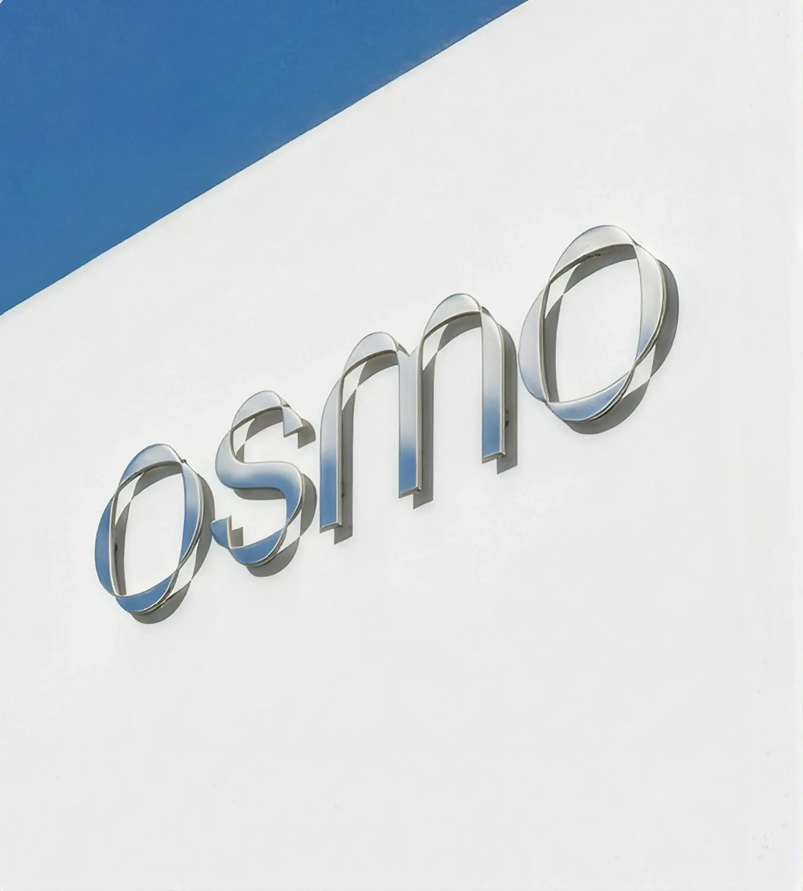
↗Red Antler's identity for Osmo makes the science of scent visible without losing the pleasure of it. Osmo is a platform that helps any brand develop a custom fragrance in a matter of weeks, using AI, neuroscience, and perfumery expertise. That puts it in direct opposition to the established perfume houses that have long decided who gets to make scent.
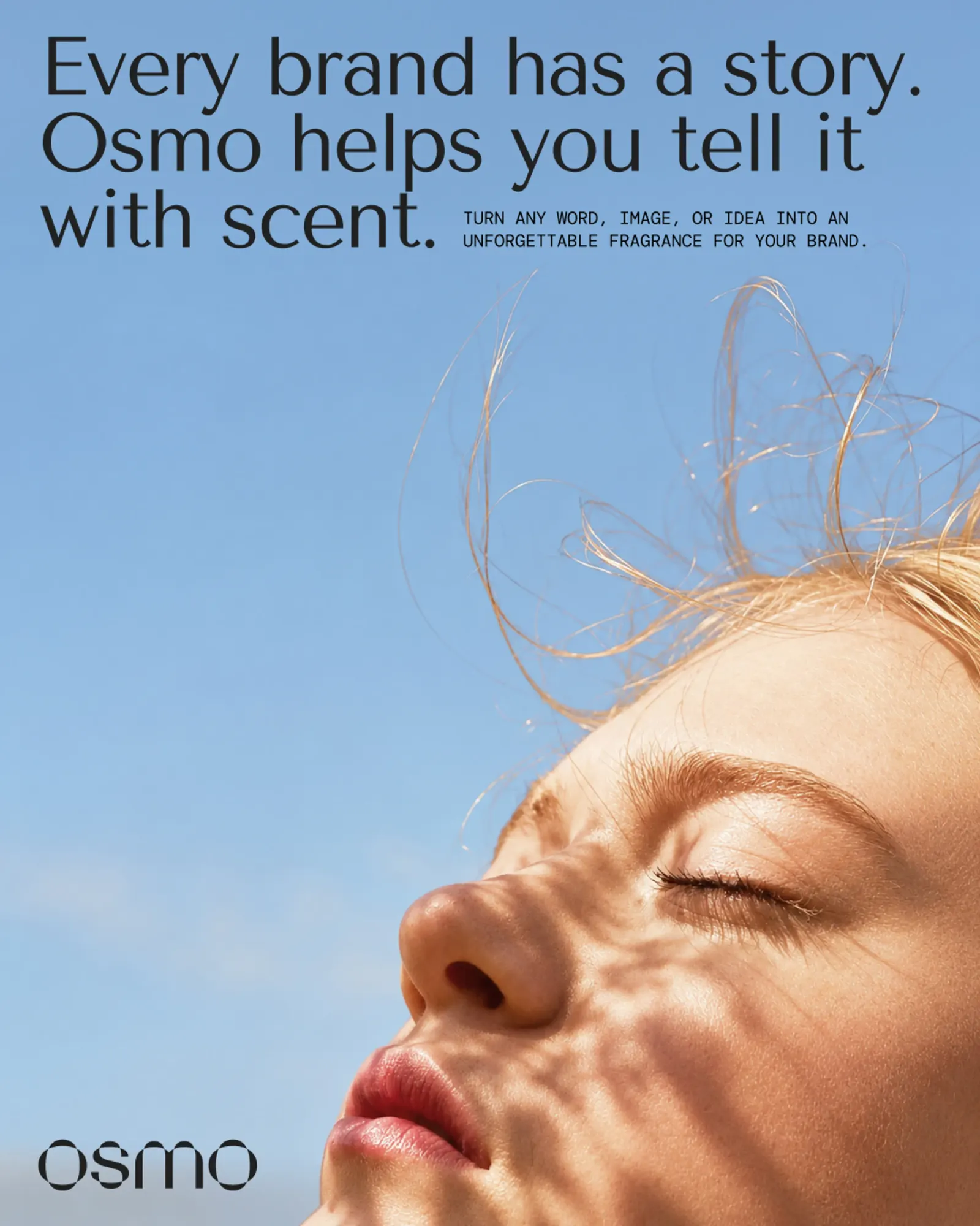
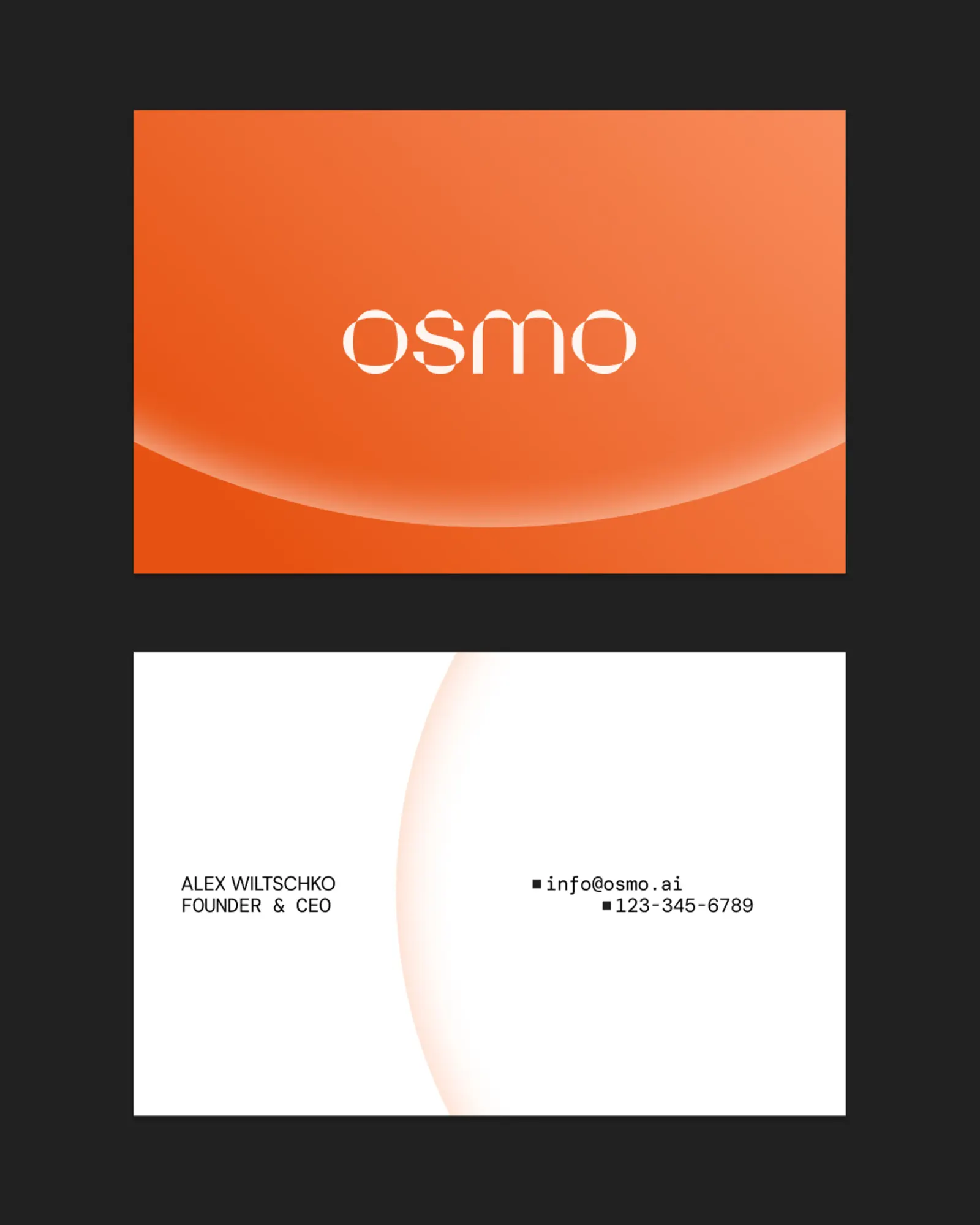
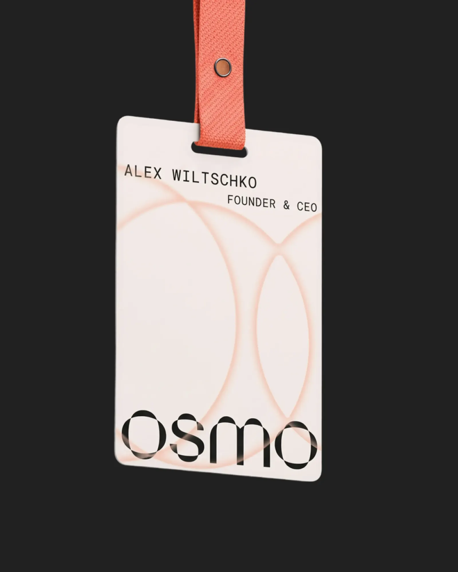
The studio's strategy casts fragrance as something brands can shape, not just buy into. The identity pairs a wordmark that nods to molecular structure with technical typography, then sets both against imagery that gives individual scent notes a tangible, sensory presence. Interface details give the Olfactory Intelligence technology its own visual language, and a warm orange runs through the system to keep it human.
Why it works
The tension is the point. A purely clinical identity would make Osmo look like software, and a purely romantic one would make it look like another perfumer. Red Antler's mark and type signal precision to the founders and marketers who need to trust the process, while the imagery keeps the result desirable. The orange does the most distinctive work. Next to the restrained palettes many fragrance brands favor, it gives a tech platform real warmth and makes Osmo easy to recognize in a crowded category.
Applications
Images and video from redantler.com, by Red Antler.