The Brand Monograph
Archer brand identity by Red Antler
↗Flying-vehicle branding often defaults to sci-fi gloss. Red Antler's work for Archer goes the other way, making an electric vertical take-off and landing aircraft feel like a plausible part of a weekday. The brief was to build anticipation for a launch expected in 2025-6 while making the promise concrete for people outside cities, who could cover in 10-15 minutes a trip that now takes an hour or more.
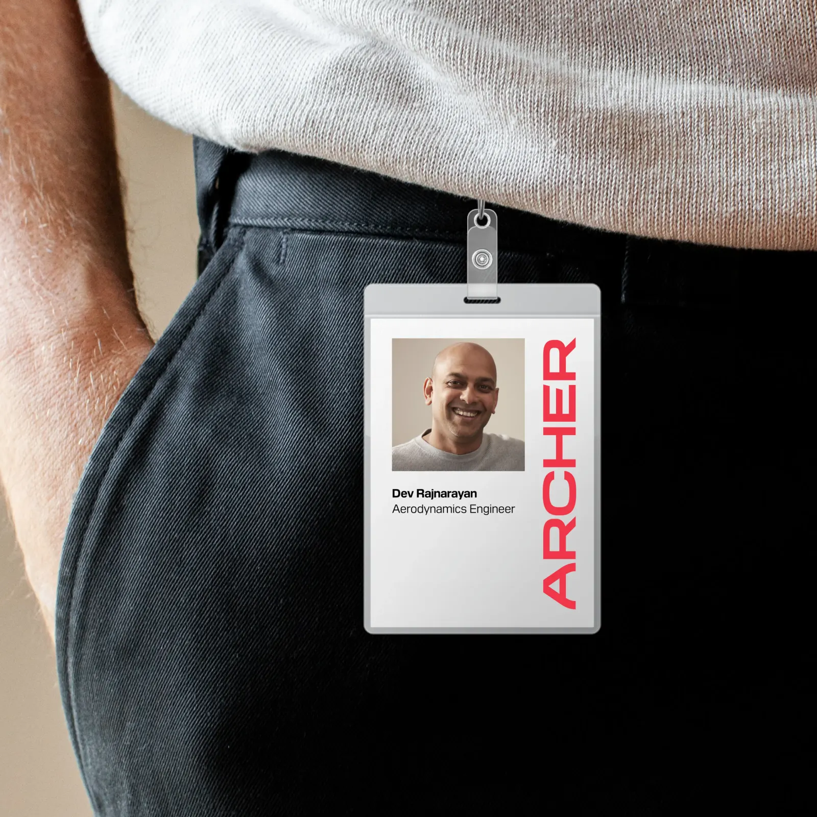
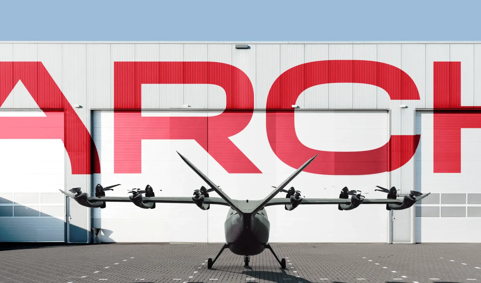
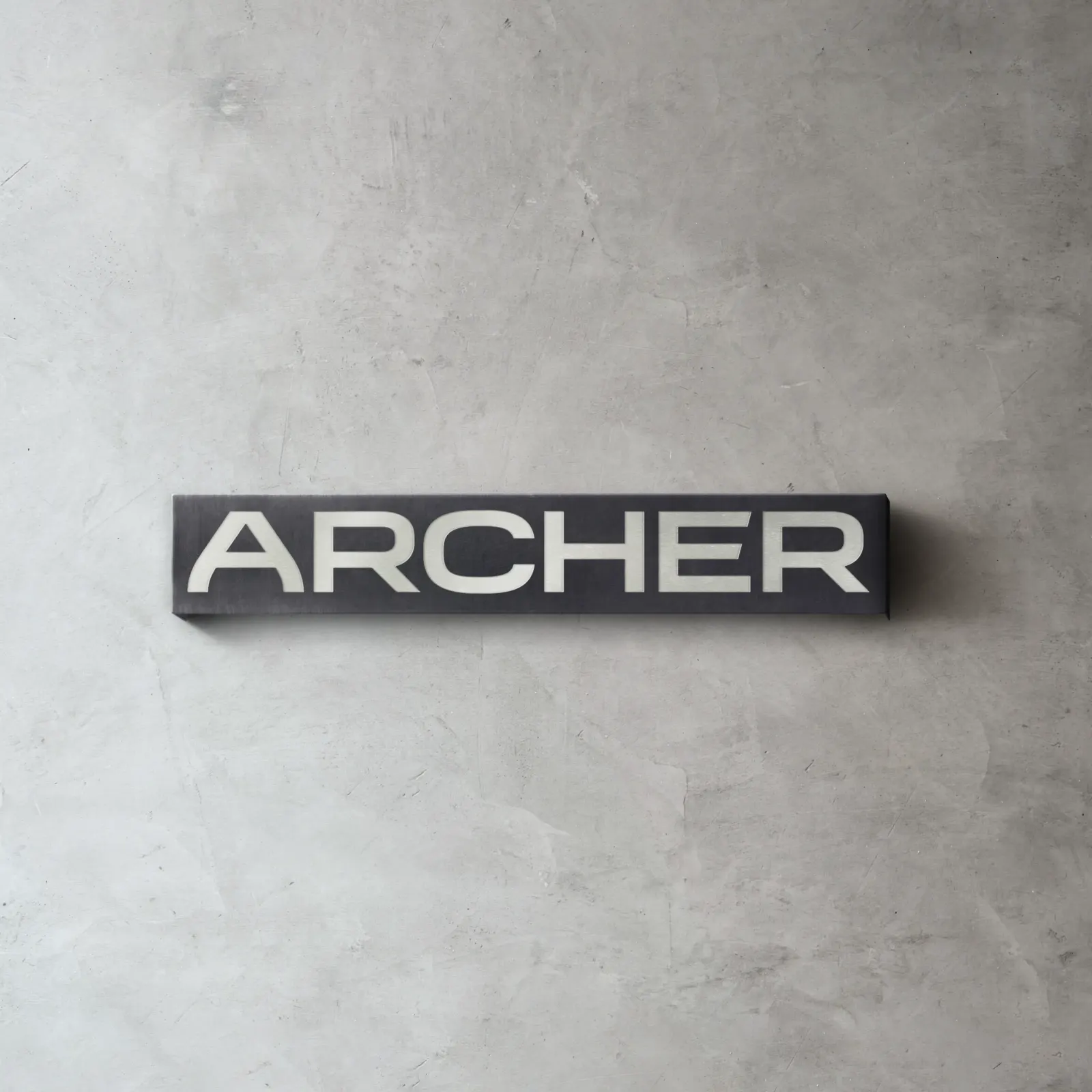
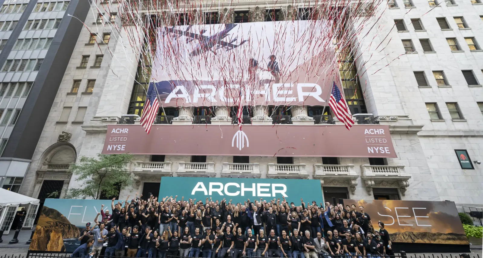
The studio built the identity around motion. A sporty wordmark carries momentum, an earthy palette keeps the look rooted, and conceptual illustrations repeat into patterns drawn from elevation, speed, and propulsion. Punchy, dramatic copy supplies the voice. Andrew Gabriel (AndrewTechful) handled development, and the brand now sits alongside a United partnership and a $1 billion aircraft order.
Why it works
The palette does the most strategic work. Aviation and mobility tech tend toward cold blues, chrome, and neon, so earthy tones make Archer look like a service you'd actually use rather than a gadget to admire. The sporty wordmark pairs well with them, signaling performance and speed instead of private-jet formality, which suits commuters more than collectors. The illustrated patterns turn abstract engineering ideas into friendly, ownable graphics that can stretch across many surfaces without needing a photograph of the aircraft to carry the story.
Applications

Logo

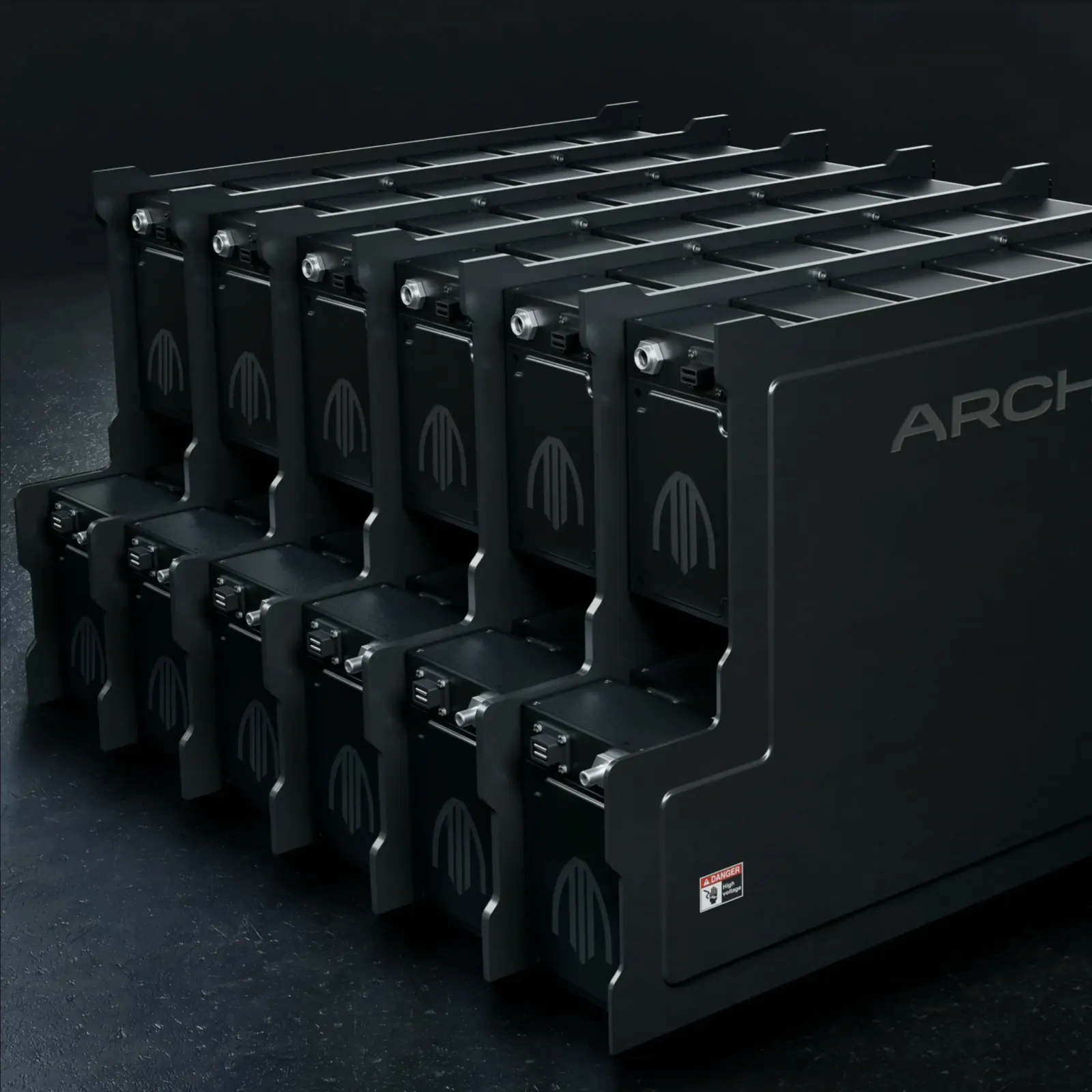
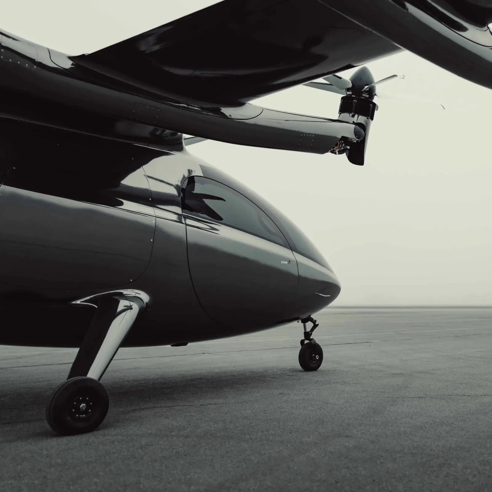
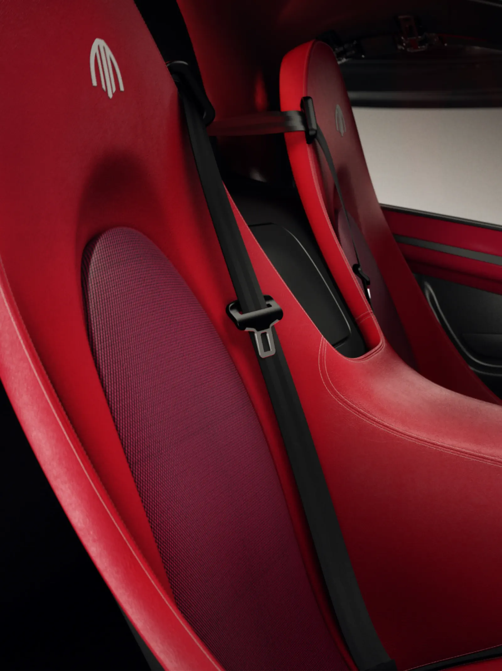
Images and video from redantler.com, by Red Antler.