The Brand Monograph
AutogenAI brand identity by Kiss
↗Most AI brands try to earn trust by looking friendly. For AutogenAI, a bid-writing platform that had grown past 170 people and won global blue-chip customers, Kiss went the other way and chose structure over charm. The studio read the category's cartoonish warmth as a liability with the people who actually sign off enterprise contracts.
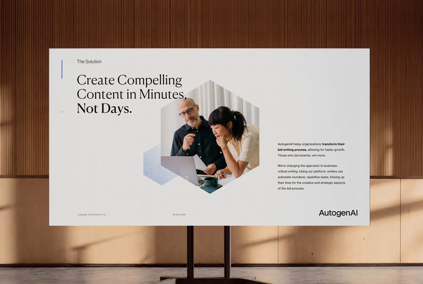
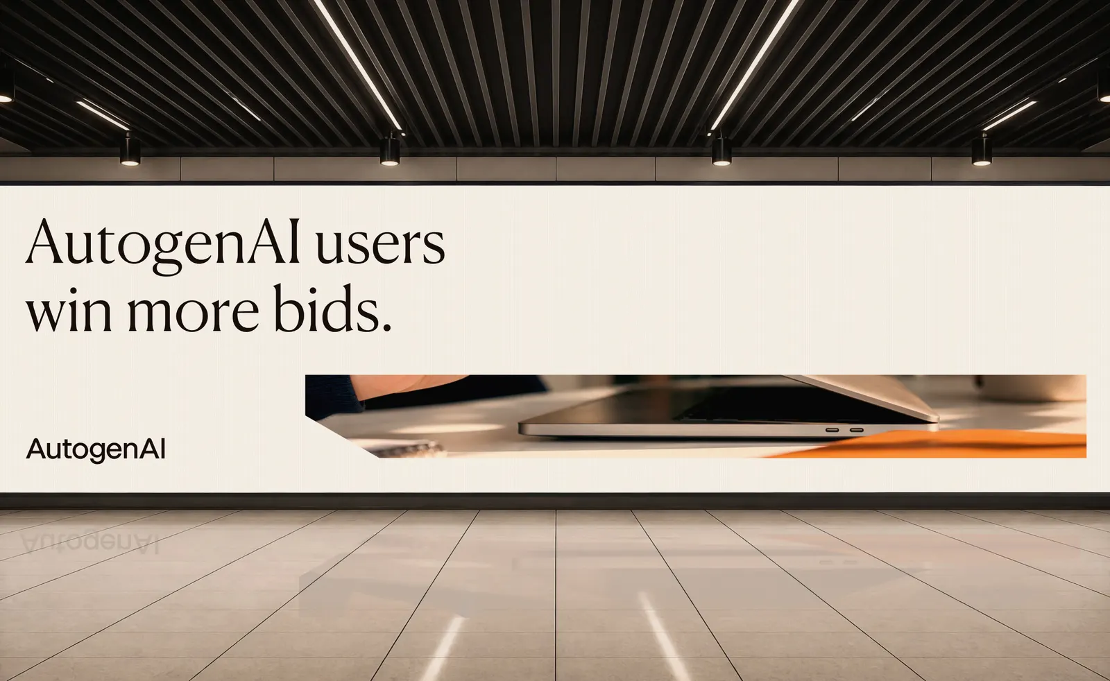
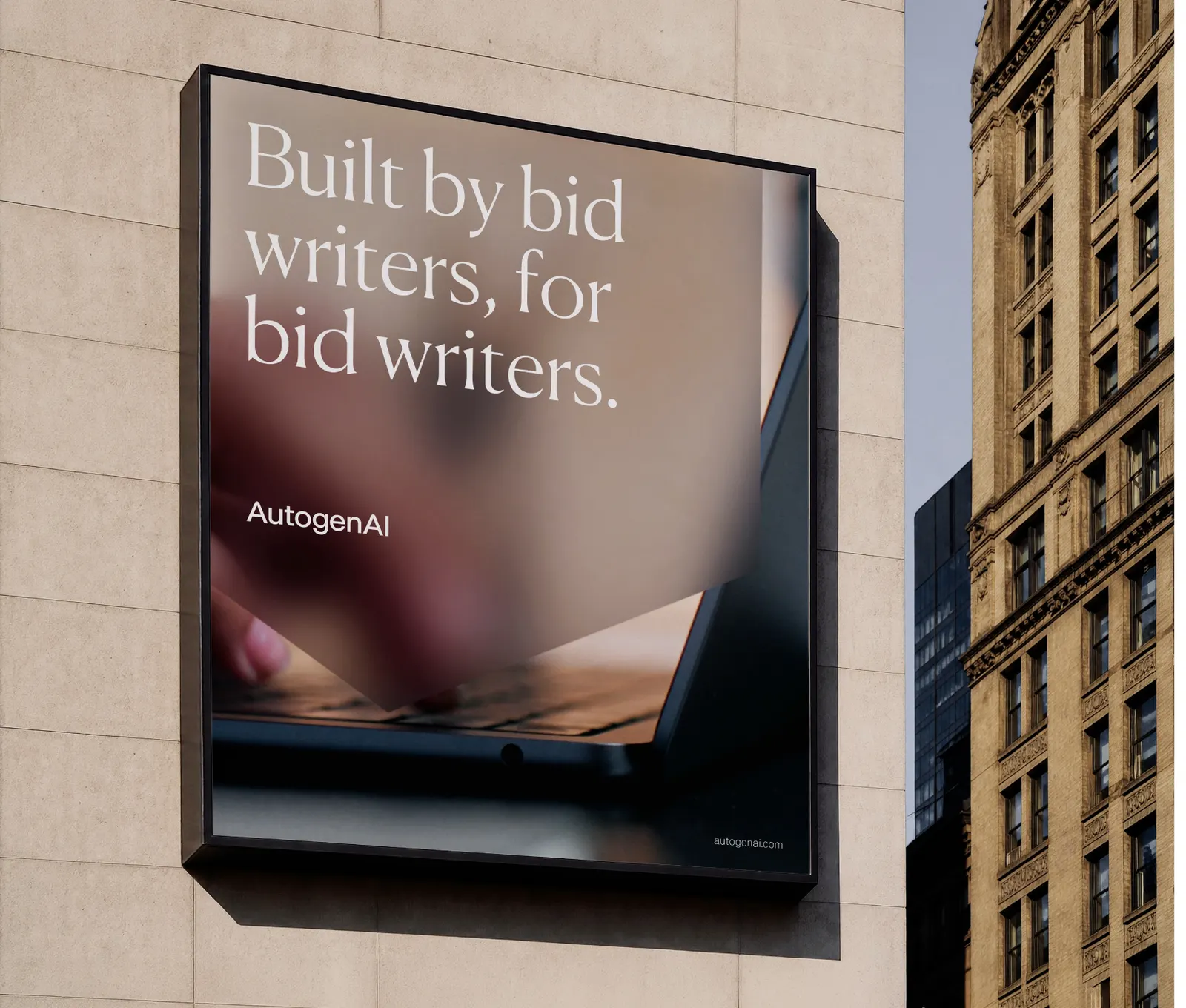
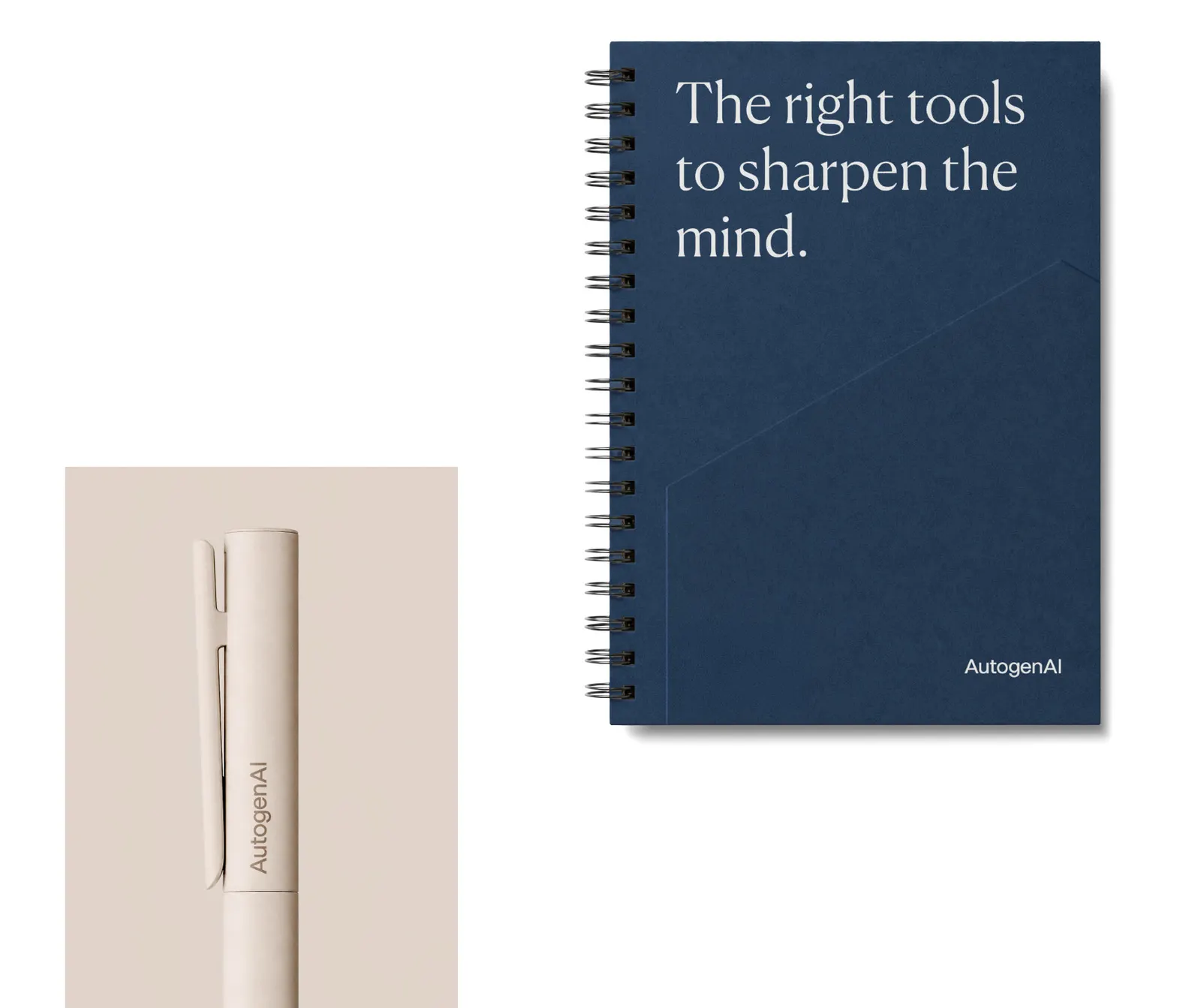
Kiss built the identity around the outcome rather than the technology, which gave one brand a way to speak to executives, technical buyers, and the bid writers who use the product daily. AutogenAI's existing language-engine form was kept and enclosed into a cube, which shifts between technical construct, pictogram, graphic device, and window. An architectural typeface and a restrained, structured palette carry the tone. The system is built to take on new products and markets, including US federal work.
Why it works
The smartest move here is the cube's origin. Kiss didn't discard what AutogenAI already had; it gave the old form a container and a job, so the new identity feels earned rather than imposed. A rigid, geometric shape also sets the brand apart from a field of rounded, friendly marks at a glance. Because the cube can be a window or a pictogram, a large team gets a flexible tool without drifting off-brand. The type and palette then read as institutional in the right way, closer to the world of the buyer than to the world of software.
Applications
Logo
Images and video from kissbranding.co.uk, by Kiss.