The Brand Monograph
University of East Anglia brand identity by rbl Brand Agency
↗Universities tend to sound alike, so it's refreshing to see rbl Brand Agency build the University of East Anglia's identity around a trait the institution already had instead of one invented for it. After consulting 100 stakeholders and more than 800 voices, the studio concluded that the existing brand was muting UEA's independent streak, and that earlier attempts to fix it had never taken hold.
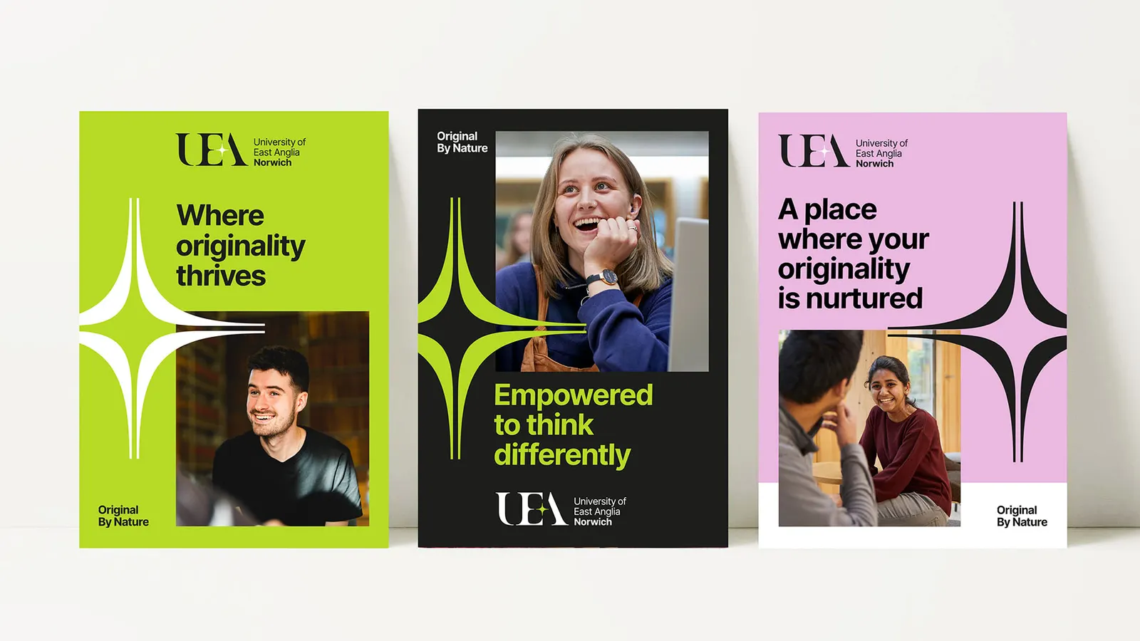
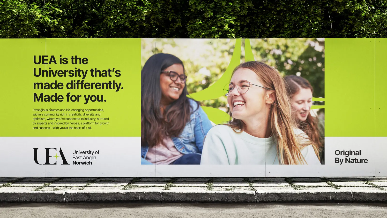
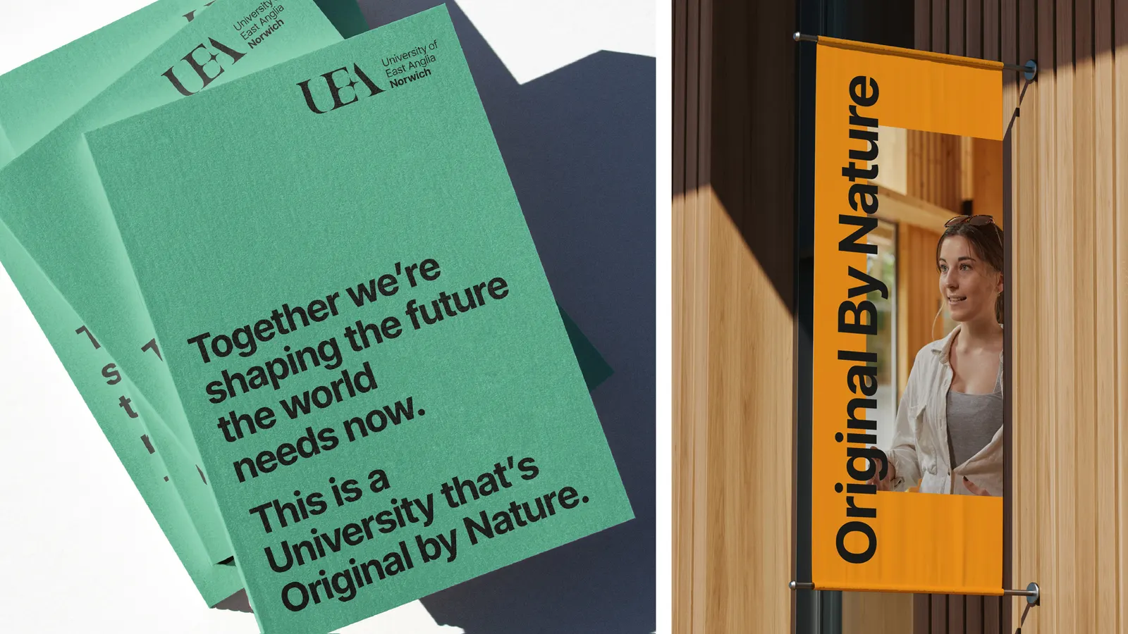
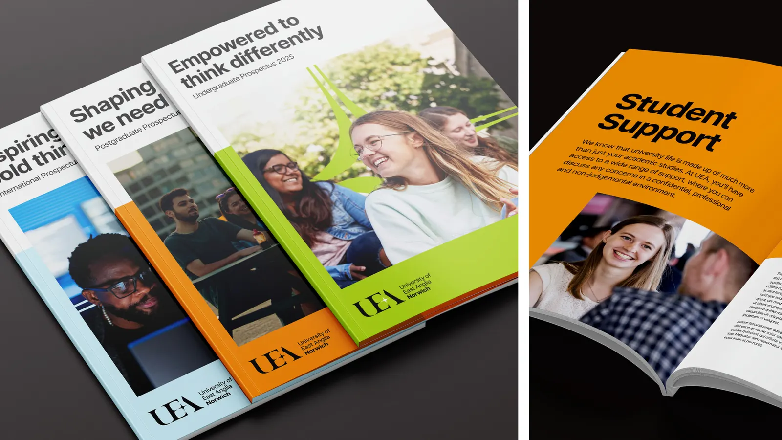
The answer is Original By Nature, a platform that swaps instruction for character and ties the university to Norwich and its landscape. Working with Ark on design, rbl added the city's name to a refreshed logo, grew the glint into a fuller beacon graphic, and paired Bulrush Green with the Inter typeface and spare layouts. Four voice pillars carry the idea into writing, and the system stretches across recruitment, research storytelling, and internal communications.
Why it works
The restraint is the smart part. Inter and uncluttered layouts leave the beacon and the green to do the distinguishing, which feels quietly confident in a sector that often leans on crests and busy imagery. Putting Norwich in the logo gives prospective students a place to picture themselves. A green with a regional source gives the university a color of its own. Keeping the glint, rather than discarding it, adds continuity while the new curves raise the level of finish.
Applications
Color
Typography
Images and video from rbl-brandagency.com, by rbl Brand Agency.