The Brand Monograph
Carlton Parade brand identity by Frost*
↗Few identities hand themselves over as readily as the one Frost* created for Carlton Parade. The strip of independent shops beside Carlton Station in Sydney's southern suburbs had a visibility problem: nearby residents rarely crossed the tracks, and some retailers admitted they had found the place by accident. Working with Bayside Council, the studio built a place brand from the street's own name, then made it simple for the people trading there to use it.
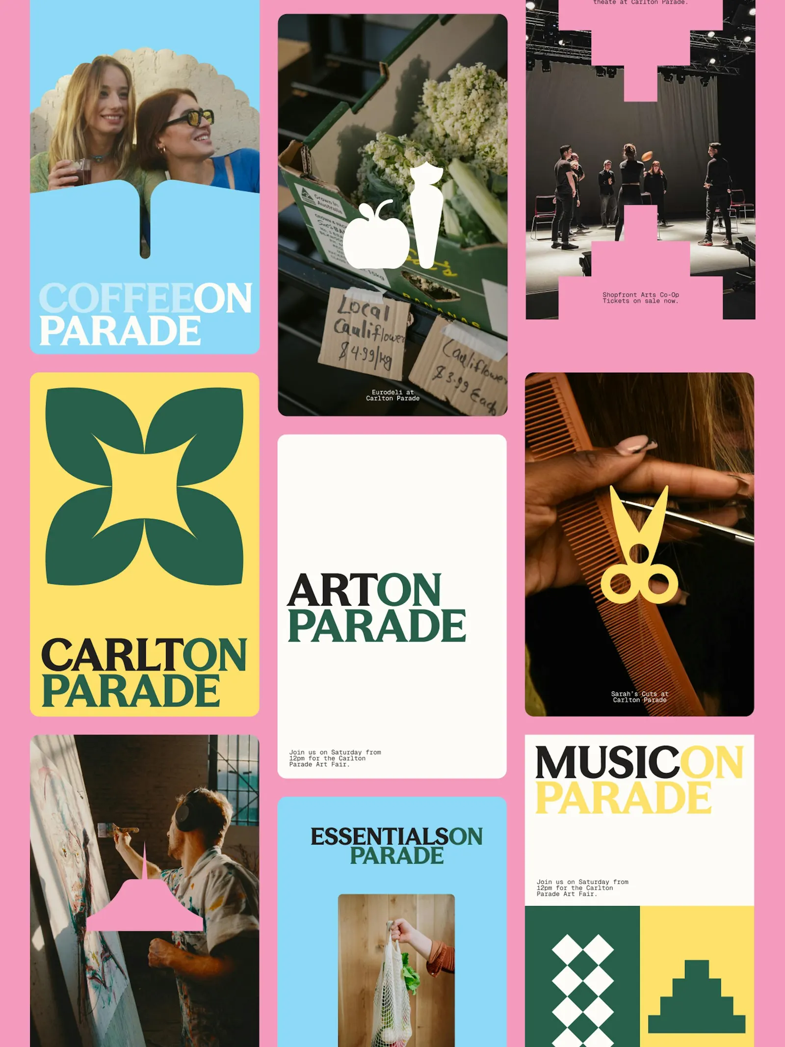
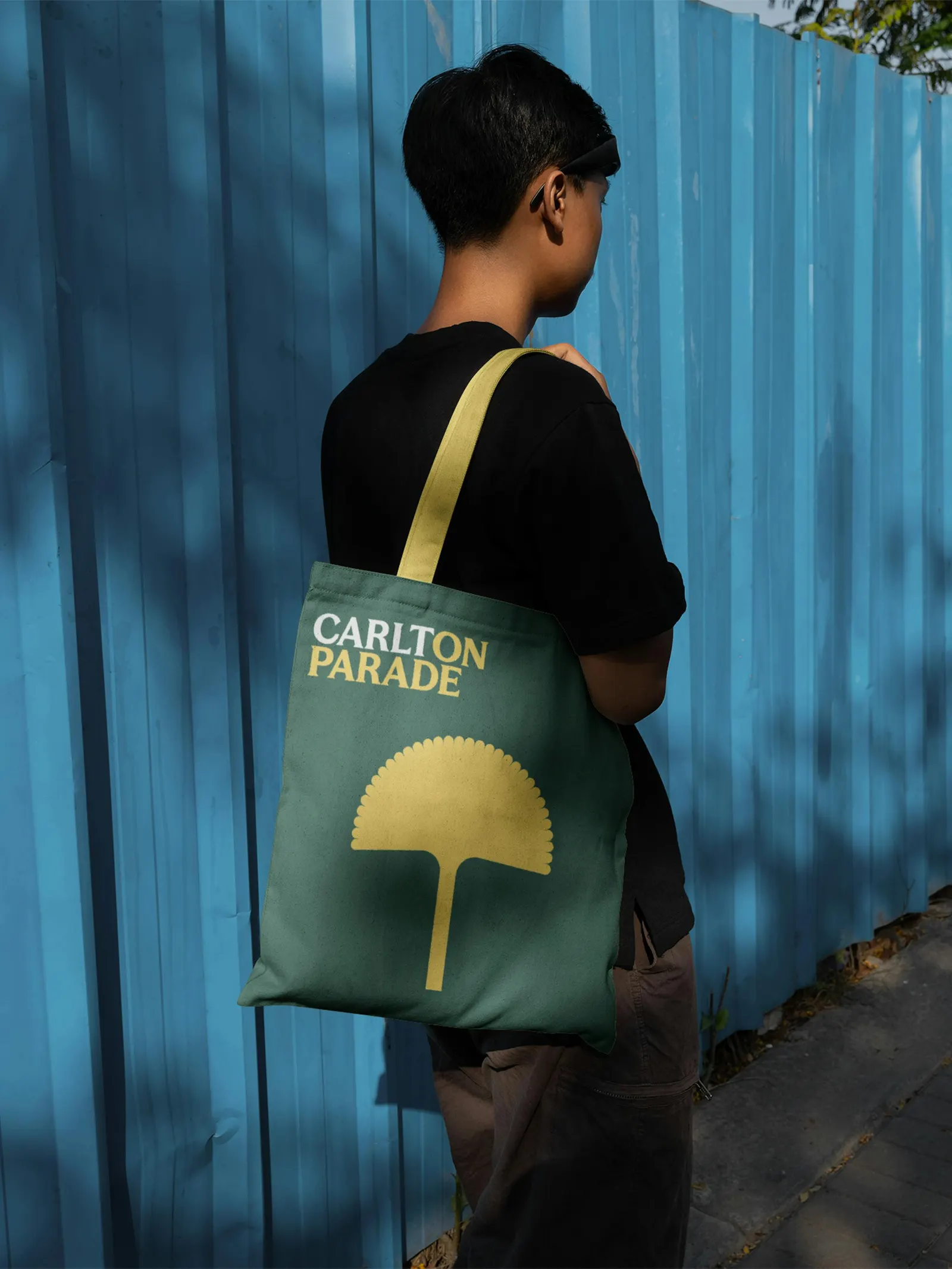
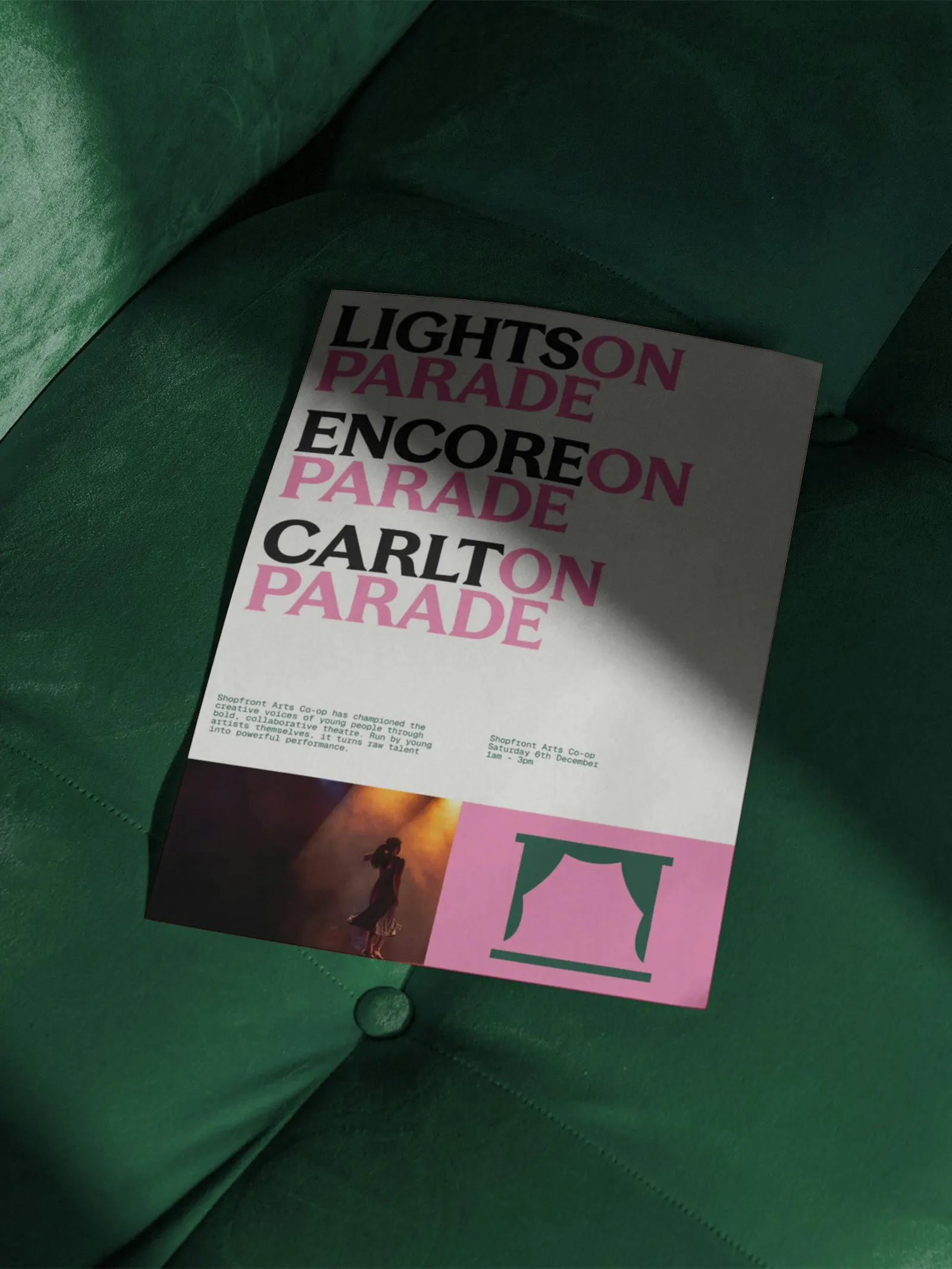
The word "Parade" does the heavy lifting. It becomes a flexible wordmark format, so each shop can claim its own line, such as Art on Parade or Lunch on Parade. Illustrated icons come from objects found on the strip, including scissors, a painter's palette, and a greengrocer's produce, while the colors take their cues from the art deco facades. Frost* shaped the direction through a retailer workshop, a survey, and a read of online sentiment.
Why it works
The name is the smartest asset here. Turning it into a template gives a mixed group of businesses a shared voice without flattening what each one sells, because the trade stays the headline. Illustration is the right register for a street prized for texture: drawn objects feel like they belong to the shops rather than to a council campaign. A palette lifted from the facades roots everything in what visitors can already see. Because the parts are simple enough for a shopkeeper to apply to a window, the brand lives where the street does.
Applications
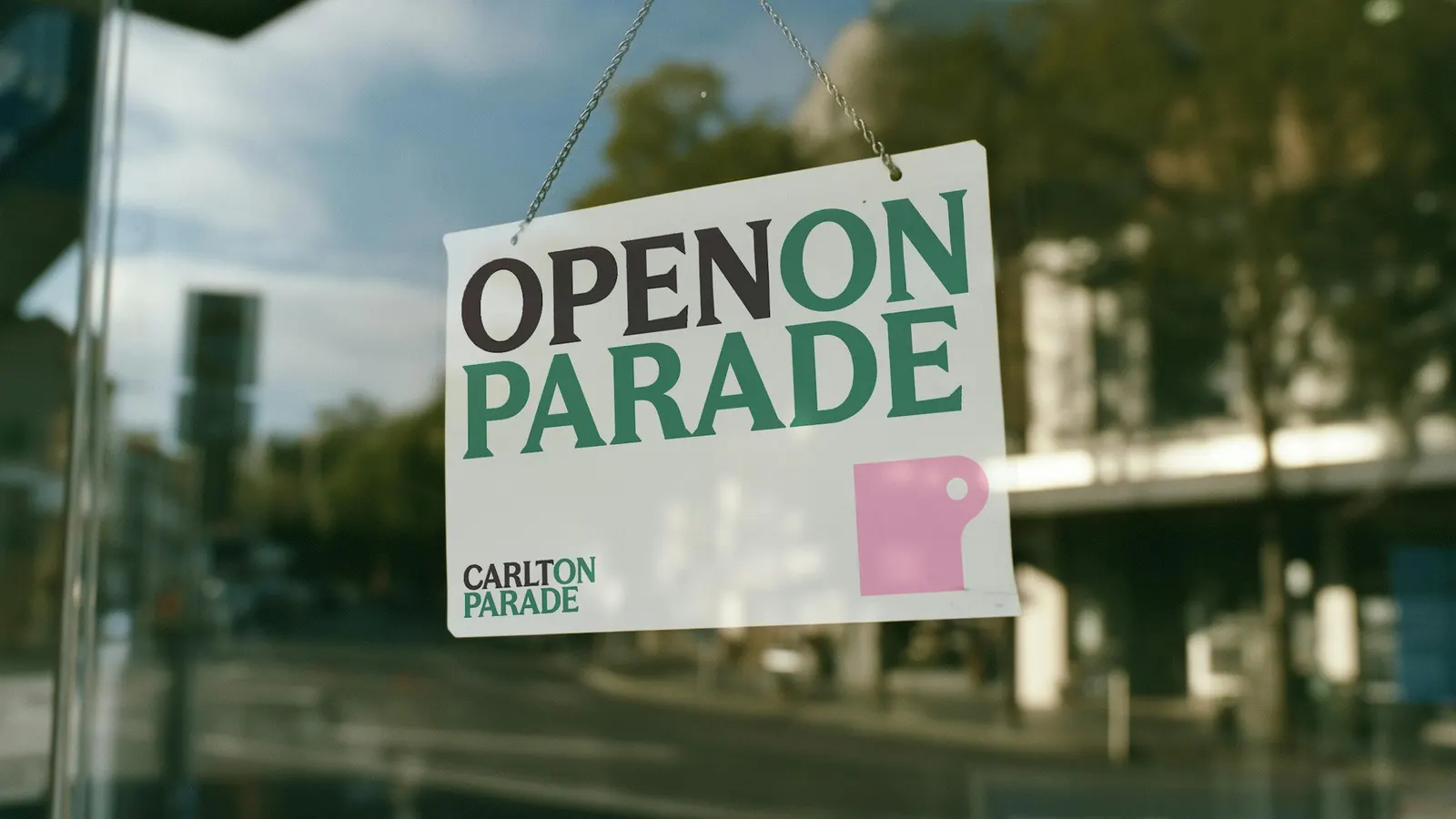
Logo


Images and video from frostcollective.com, by Frost*.