 The Brand Monograph
Biennale of Sydney brand identity by Base Design
↗The typography does the heavy lifting here. For the 23rd Biennale of Sydney, Base Design worked with Virgile Flores to turn a printed garalde into letterforms that bleed into one another, as if ink had pooled and pulled each character toward its neighbor. The lettering across the program behaves like the exhibition's subject: water, and the way it connects things.
The brief covered identity, communications, signage, and a national launch campaign for rīvus, curated by José Roca. Base Design ran posters and billboards in Melbourne and Brisbane before reaching Sydney for the opening, putting waterways in the frame as participants. Alongside Zolo Press, the studio also supported the 572-page "A Glossary of Water," built from leftover paper stocks of varying weights, so the book's materials carry the theme too.
Why it works
Biennials often default to a neutral sans that steps aside for the art. Starting from a classical serif gives this identity warmth and a bookish authority, and the ink connections make it recognizable and hard to imitate. Because the idea lives in the letterforms rather than in a logo or an illustrative motif, it scales from billboards to wayfinding to a thick book without needing a second device. Even the paper choices reinforce it, which makes the system feel considered rather than decorated.
Applications
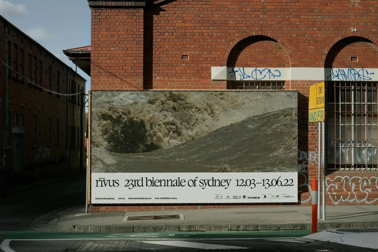


Images and video from basedesign.com, by Base Design.


