The Brand Monograph
Burger King brand identity by JKR
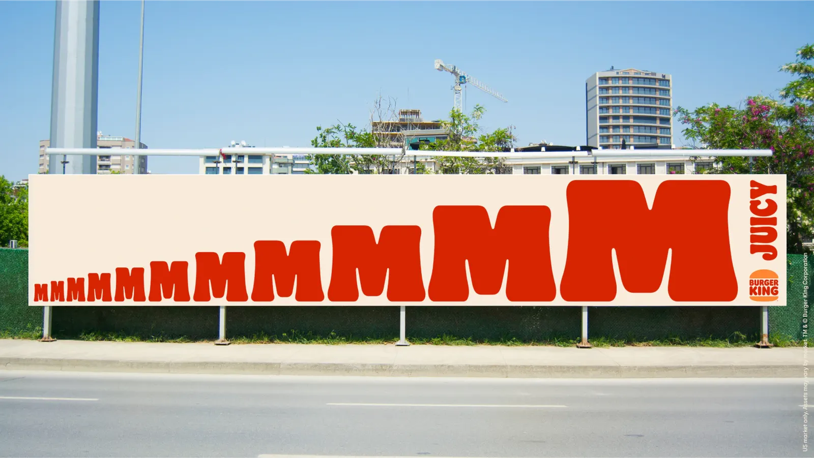
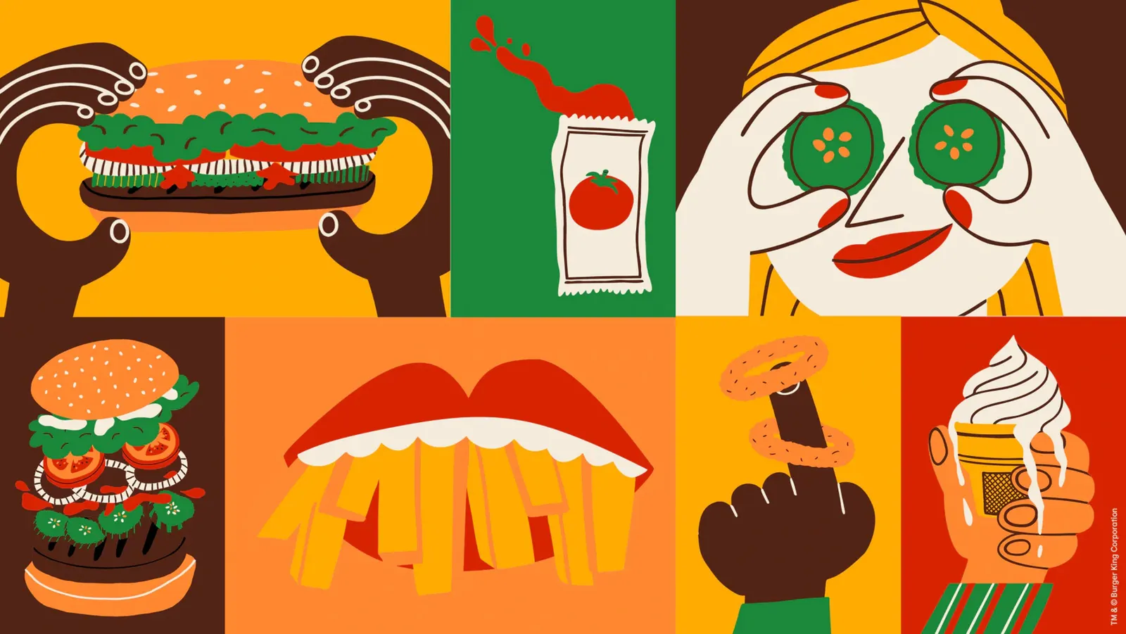
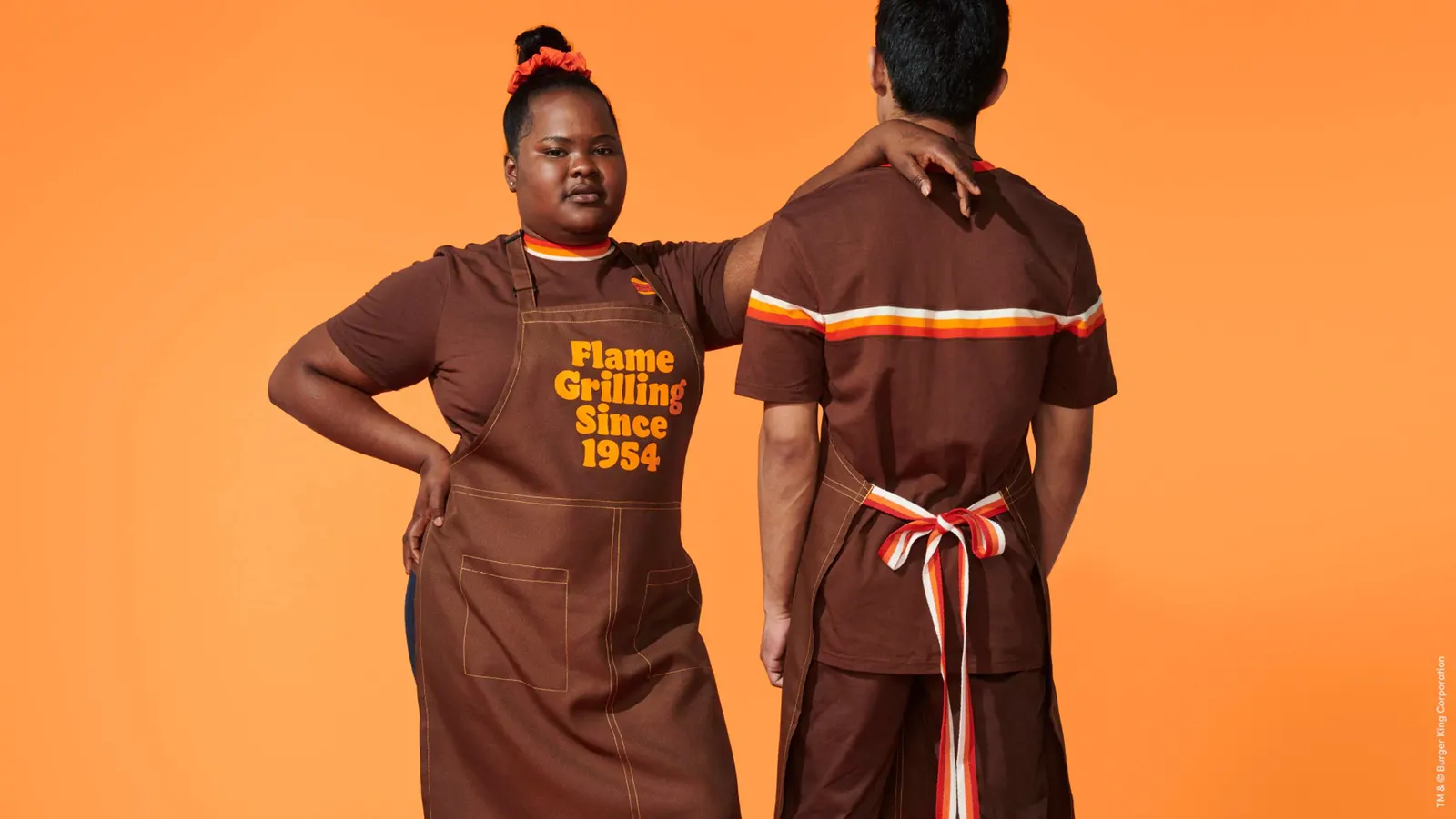
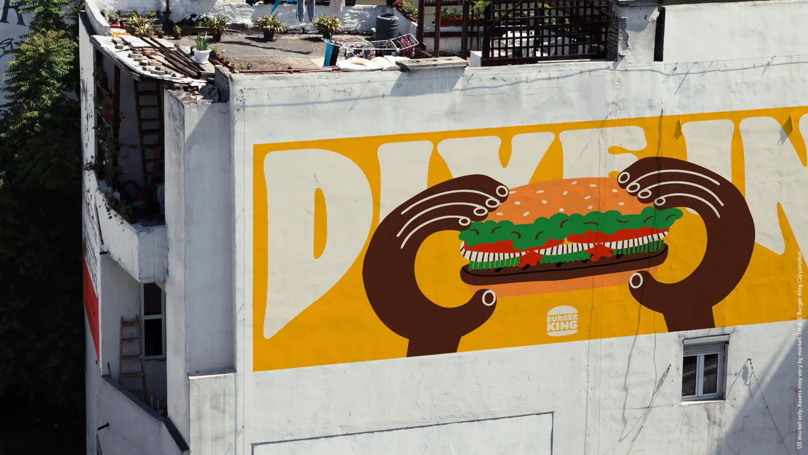
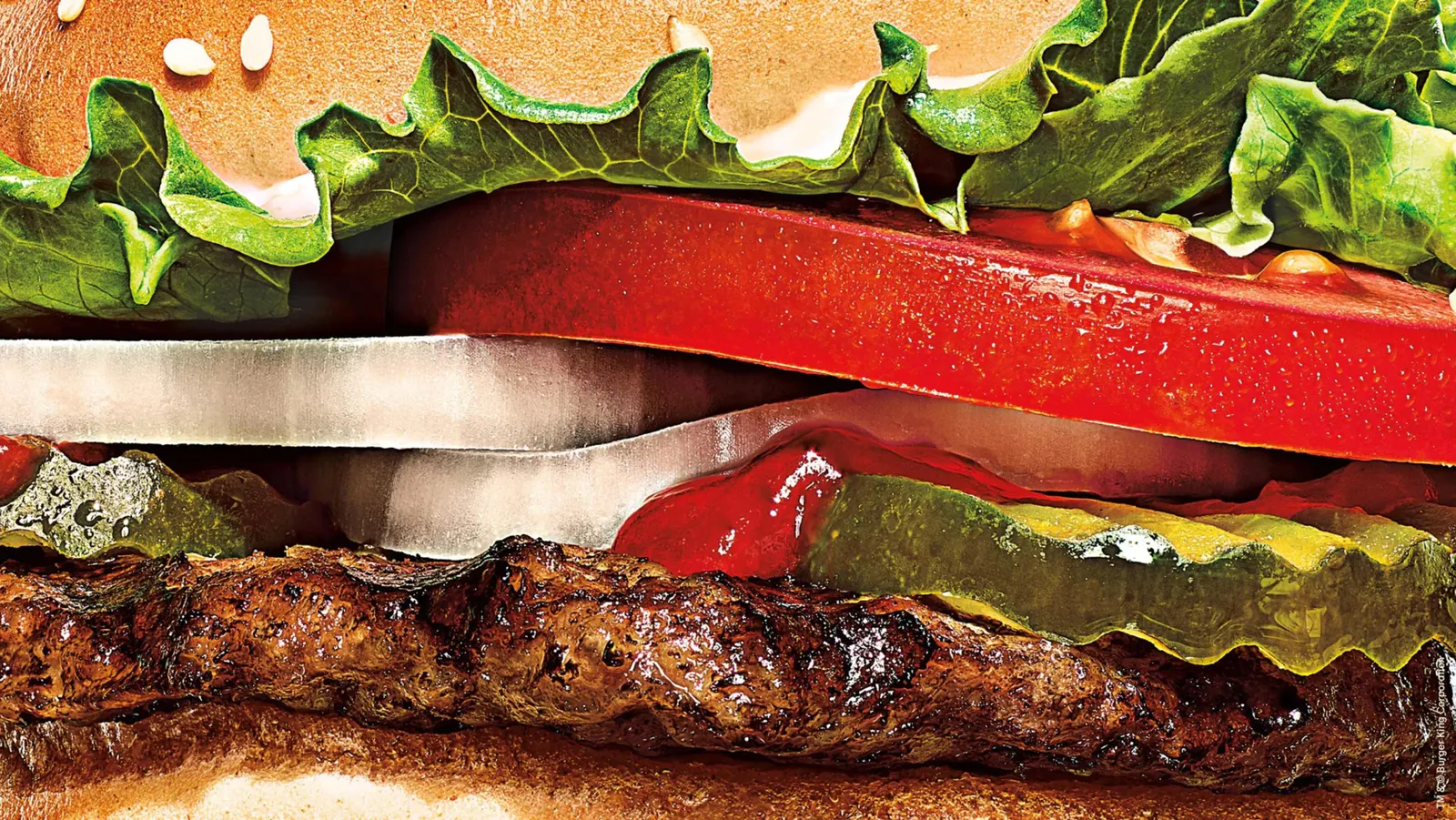
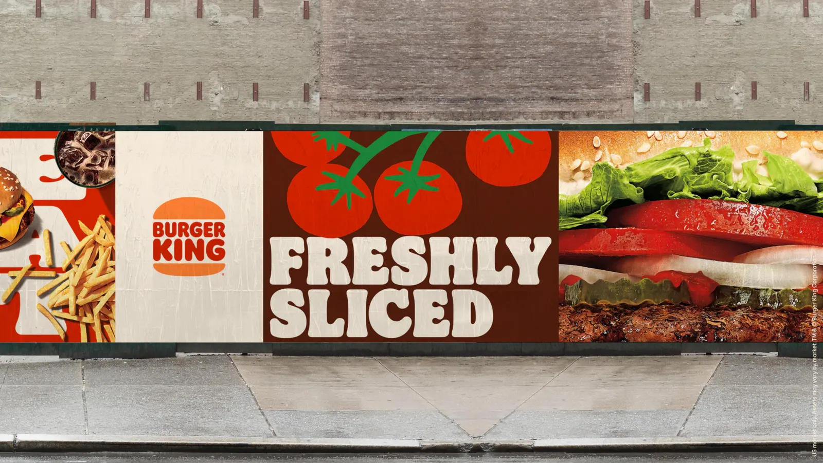
↗Few fast food rebrands feel this closely tied to the product. JKR's work for Burger King is built around appetite, and the photography, illustration, and typography all push the food to the front.
The brief was a mismatch. Burger King had overhauled its food quality, sustainability, and restaurant experiences, but its visual identity still looked stuck in the 2000s. JKR's answer, "Your Way, Way Better," pulls the brand up to the level of the business behind it. The studio worked with Miles Newlyn on design, BurkleHagen on photography, Cachetejack on illustration, and Colophon Foundry on typography, with Bryce Barnes also credited. The numbers suggest it landed: the stock rose 7.8%, and people were 66% more likely to choose BK over McDonald's.
Why it works
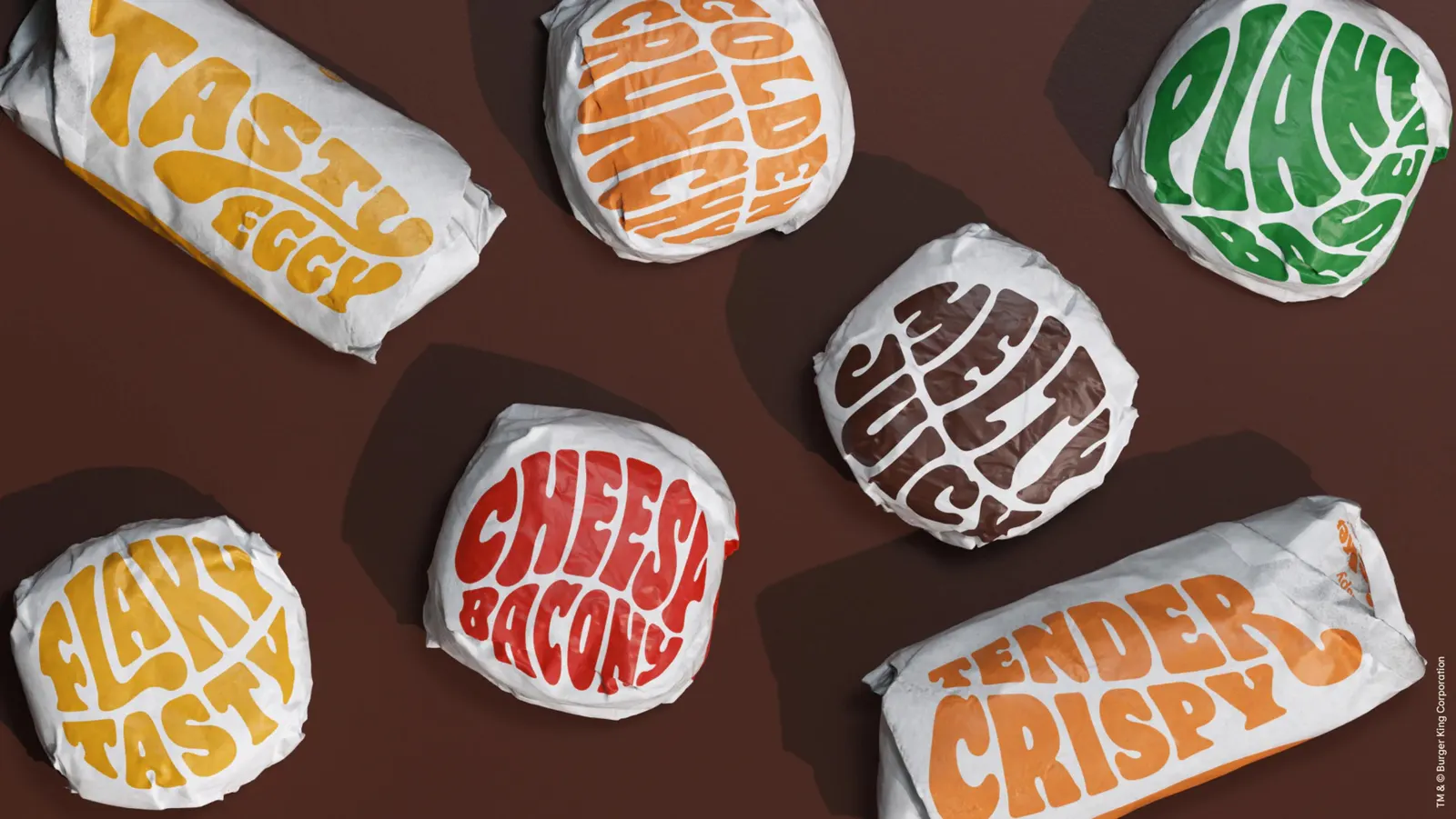
The identity closes the gap between what Burger King serves and what it shows. Photography and illustration do the persuading, so the food leads and the branding supports it. A dedicated typographic voice from Colophon Foundry gives the brand a recognizable tone in a category full of shouty, interchangeable packaging. The line also builds on the brand's long-standing appeal of personal choice, now backed by better craft. The 66% preference figure over McDonald's suggests the look is changing minds, not just pleasing designers.
Applications
Logo
Typography
Images and video from jkrglobal.com, by JKR.