The Brand Monograph
M brand identity by M — N Associates
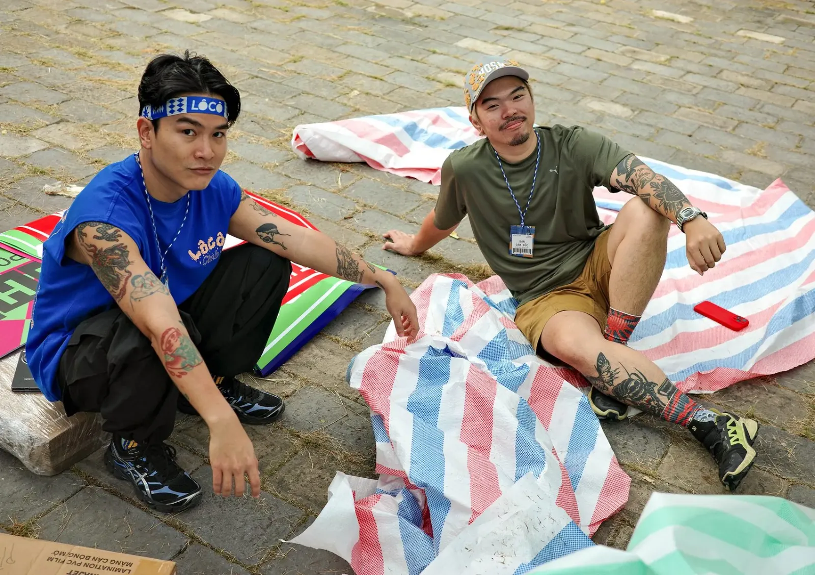
↗Most art markets borrow the language of the gallery. M — N Associates went to the loading dock instead. For the first collaborative summer edition of LÔCÔ Art Market in Ho Chi Minh City, the studio treated each participant's work like a product moving down a line: finished, but still scuffed from its trip to the audience.
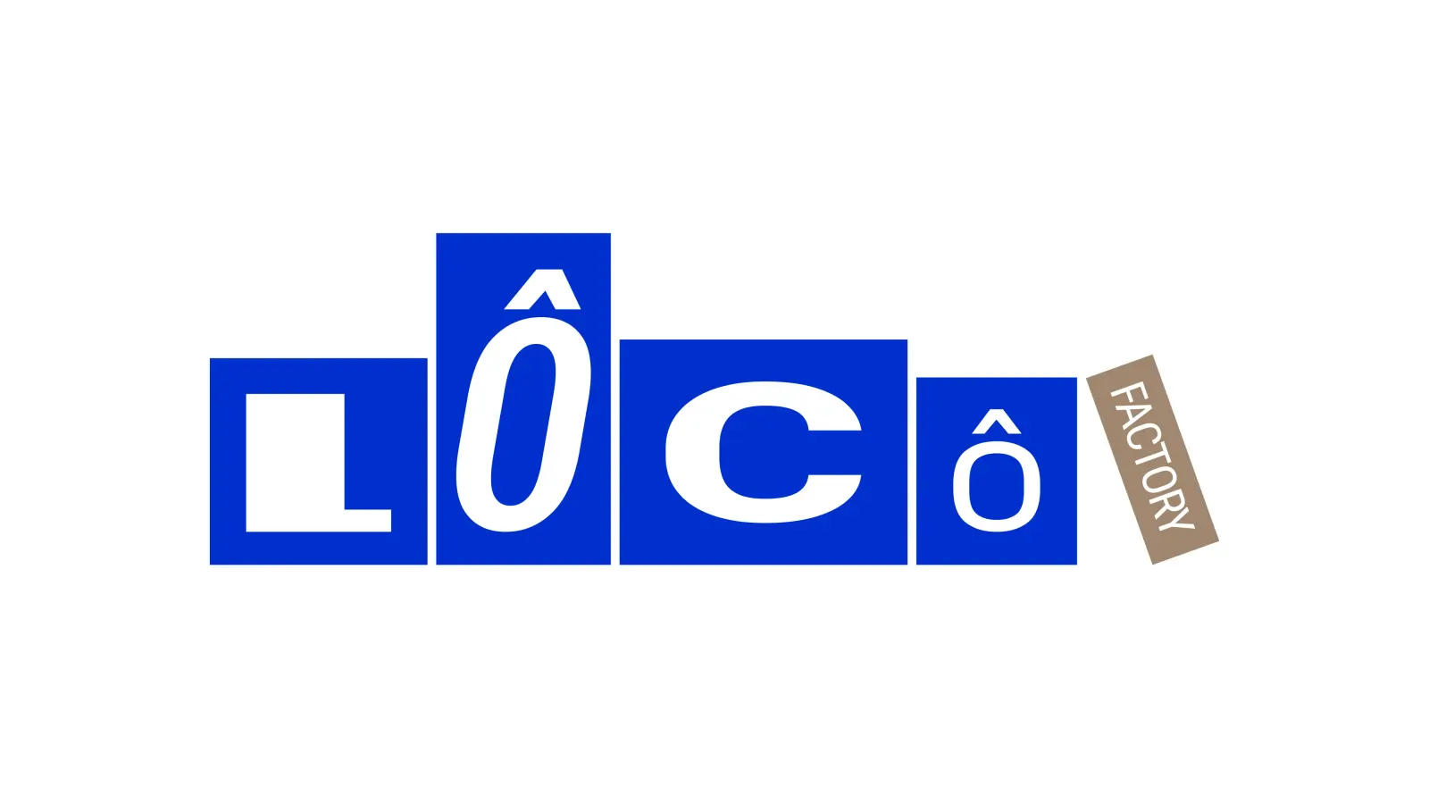
The logo stacks letterforms like cartons, each one tilted and resized. Two monospaced typefaces, Roboto Mono and VT323, sit beside an adapted Roboto Flex and handwritten Caveat. An internal Glyph Box Generator let the studio and the client team build matching compositions. Tape, grooved board, and shipping labels became modular graphics in high-visibility logistics colors, carried into stickers and signage with copy from NoEyeDeer and SAC, and produced by evergreen.
Why it works
Packaging is a shared visual language, so visitors can get the joke without explanation. That suits a market built on openness. The loud safety colors set LÔCÔ apart from the muted palettes of typical art fairs, and the monospaced type reads like printed labels, which gives the tilting logo a structure to push against. Caveat adds a personal touch where the system could feel mechanical. Because the parts are modular, many contributors can add to it without breaking it.
Applications
Logo
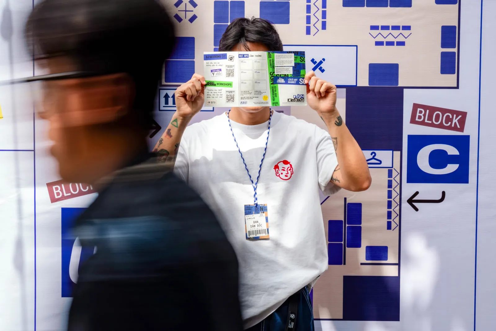
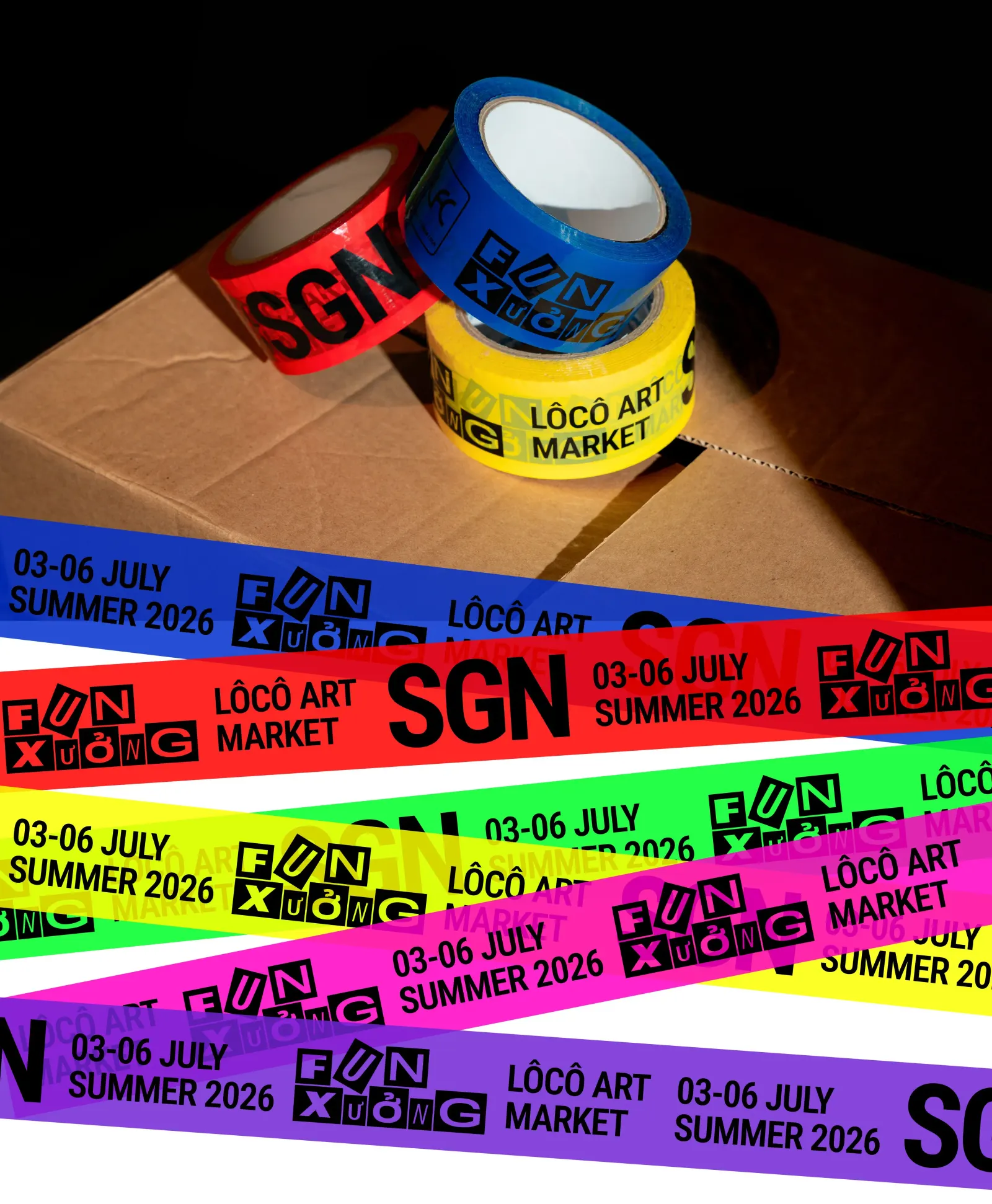
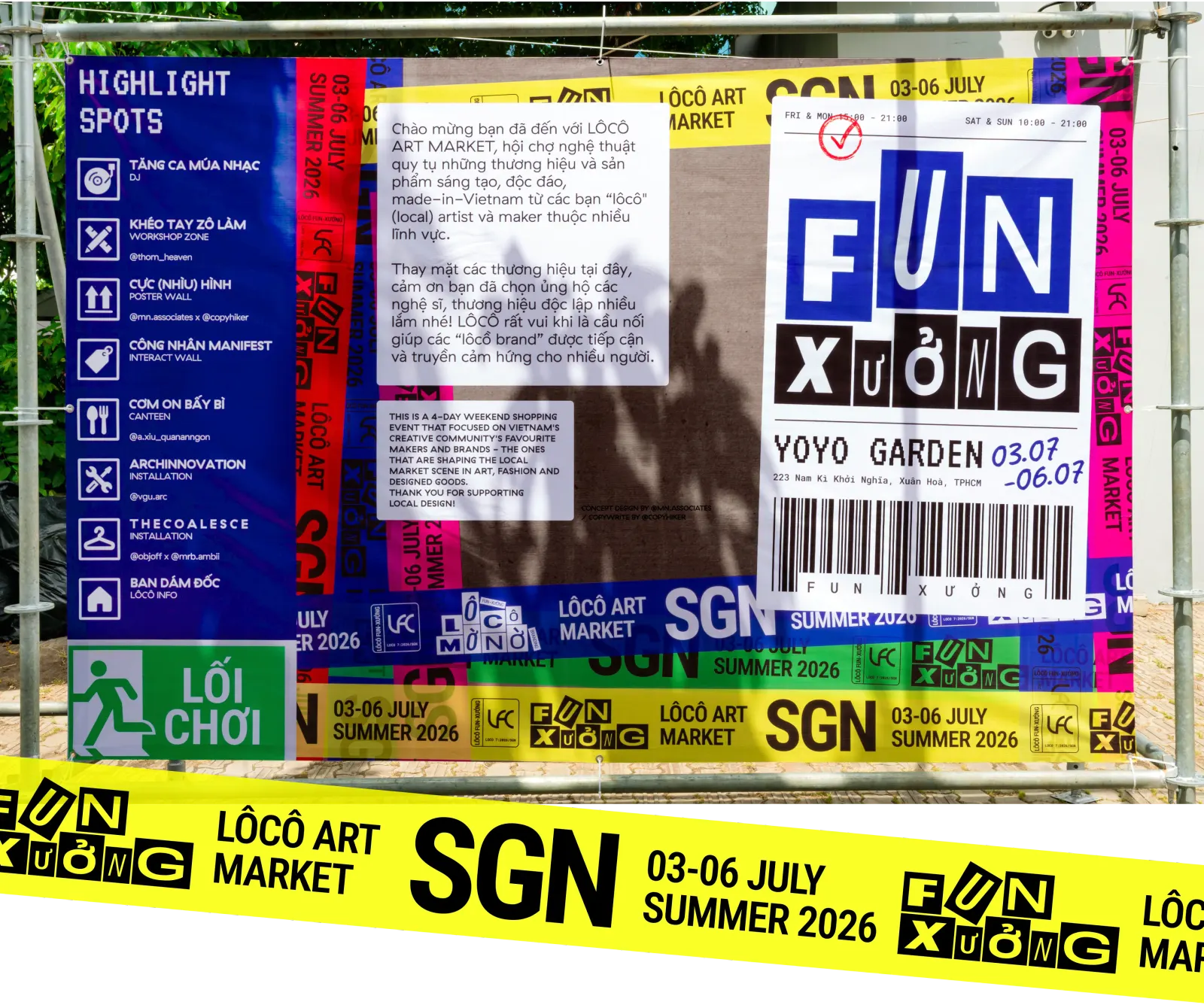
Images and video from m-n.associates, by M — N Associates.