The Brand Monograph
Delisweet brand identity by Nemesis
↗Few brands have a better problem than Delisweet. The Brussels pastry shop had already won over locals, and then influencers and a younger crowd made it a regular presence on social feeds. The visual identity simply hadn't kept pace with the praise.
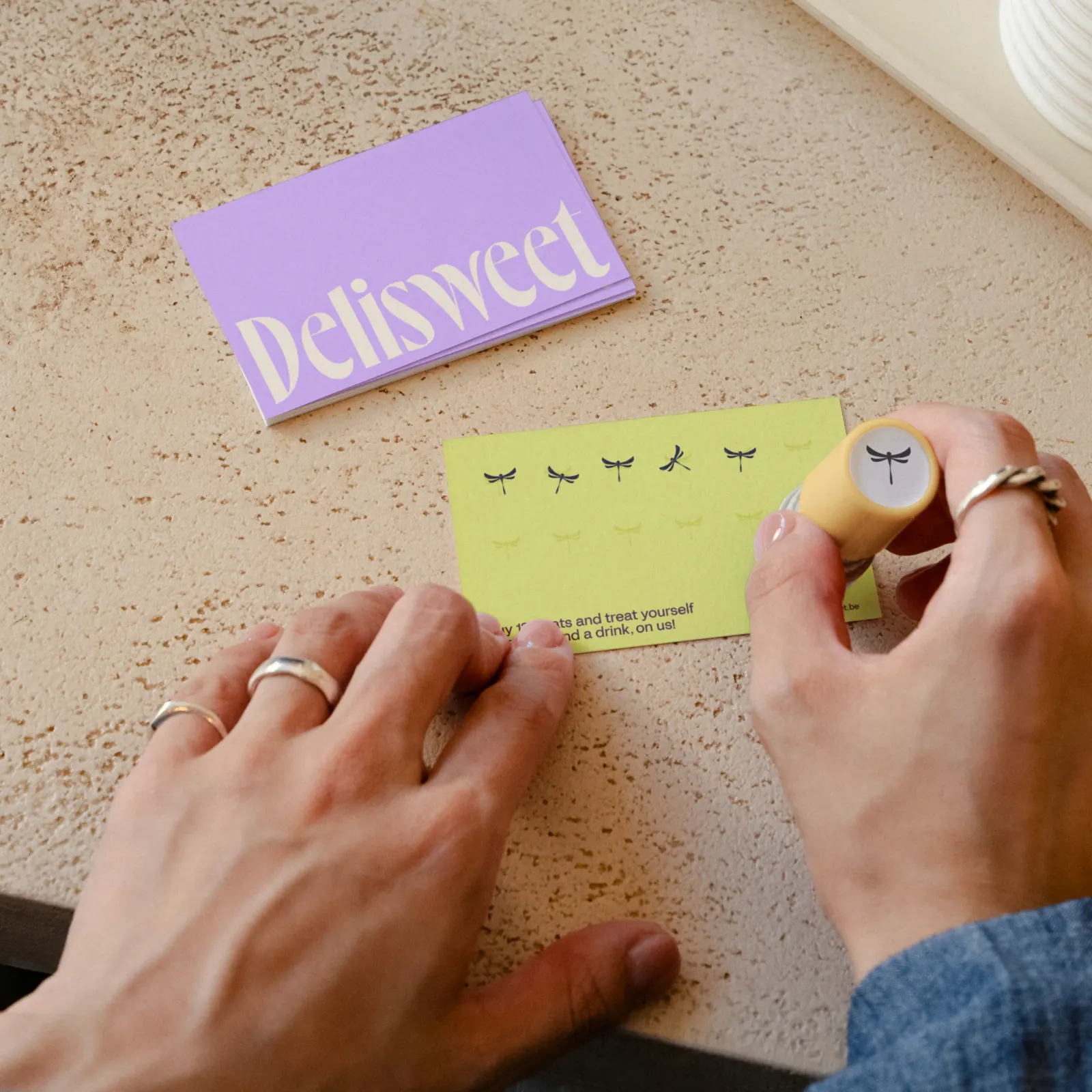
Nemesis took on the job of closing that gap, working directly with the two founders to rebuild the brand around the quality customers were already talking about. Typography is central to the craft. The studio developed it with Dinamo Typefaces and Newglyph, two foundries known for distinctive, contemporary letterforms.
Why it works
Pastry is an impulse category, and Delisweet's newer audience often meets it through a feed before they ever walk in. In that setting, type does a lot of the work, because it's what people see and screenshot first. Drawing on two respected foundries gives the brand a voice that feels chosen rather than defaulted, which helps it stand apart from the generic bakery look. Building it with the founders also keeps the update personal, so the shop gains confidence without losing its character.
Applications
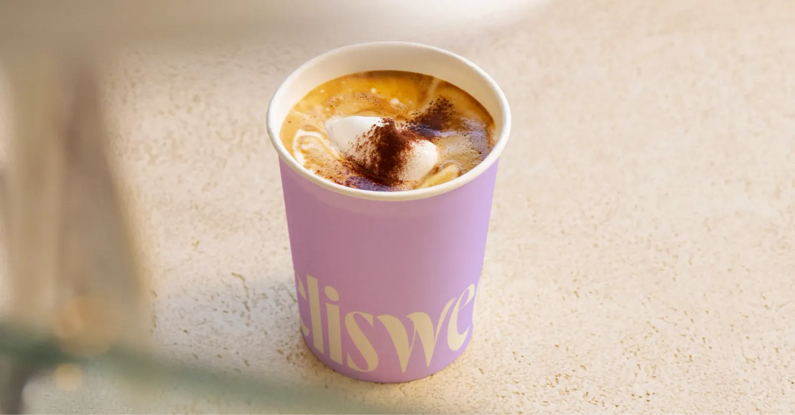
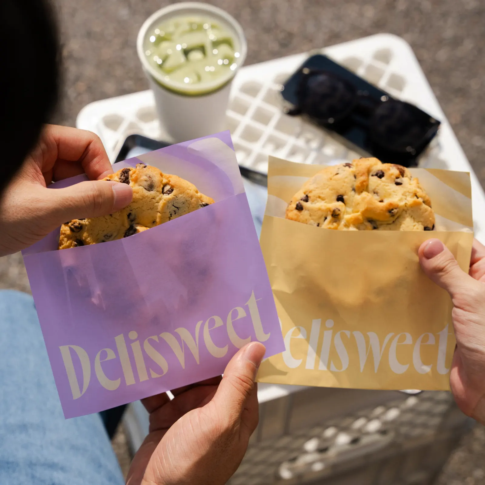
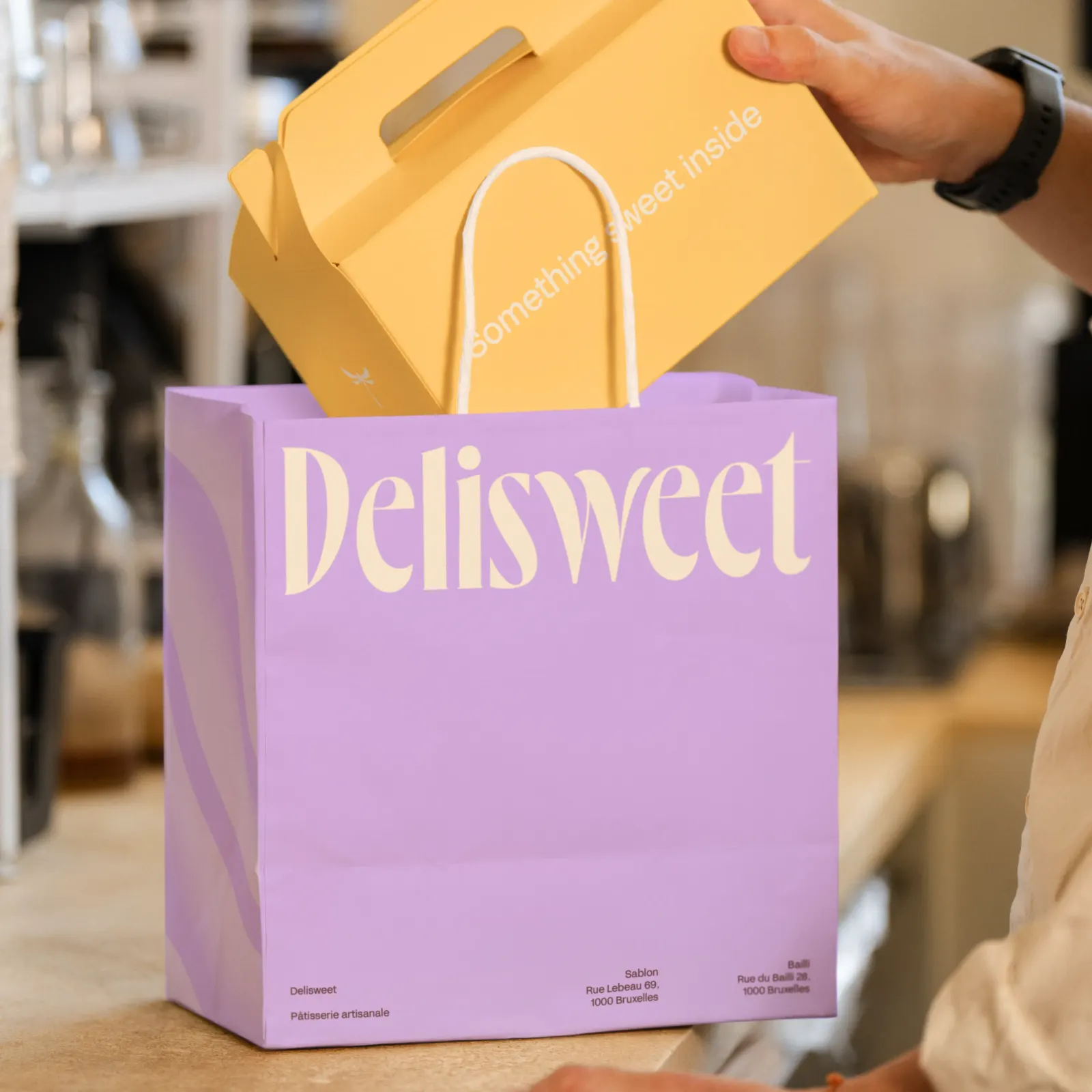
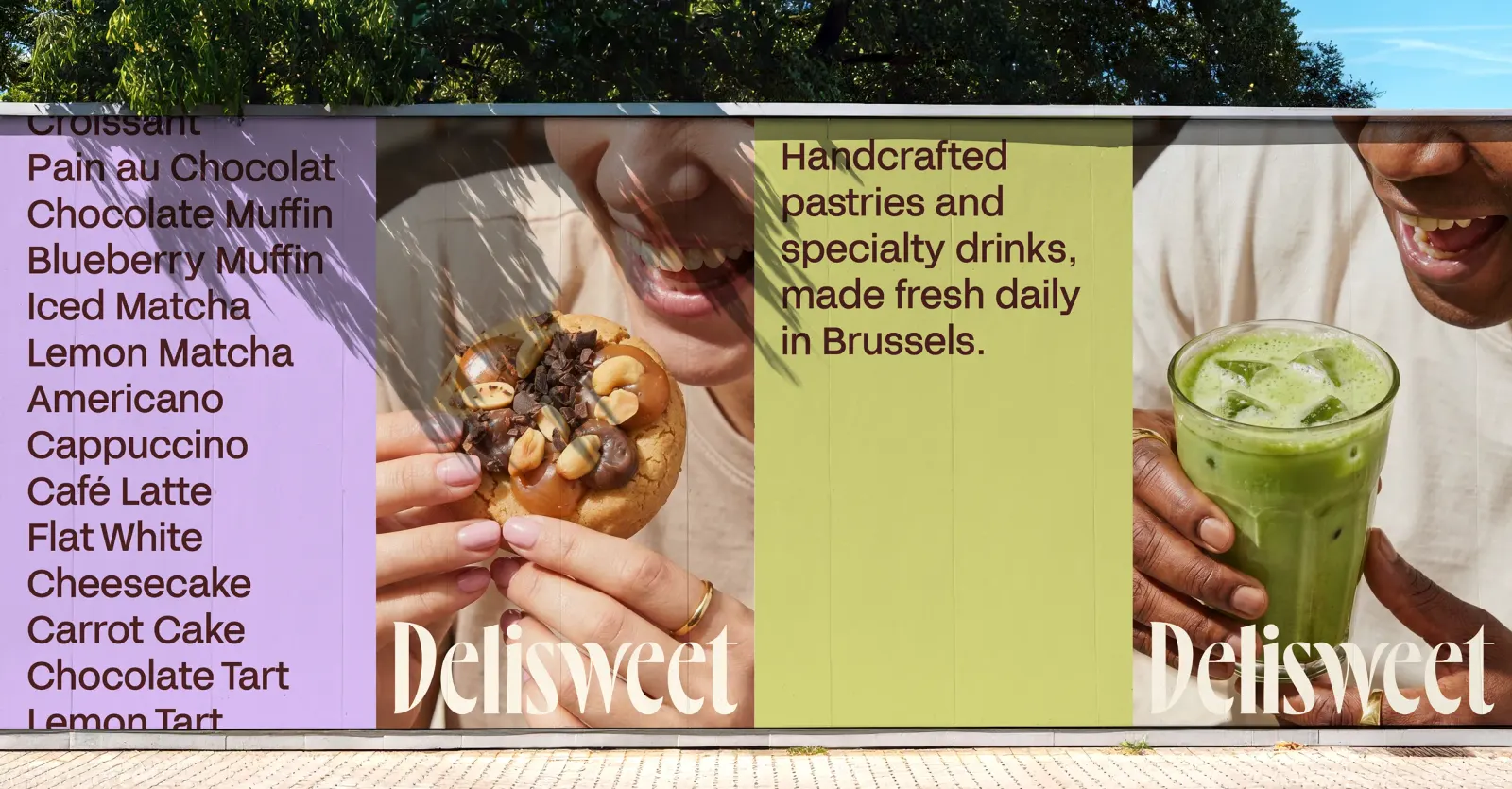
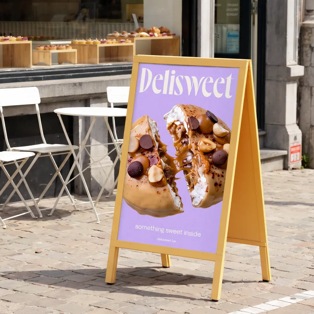
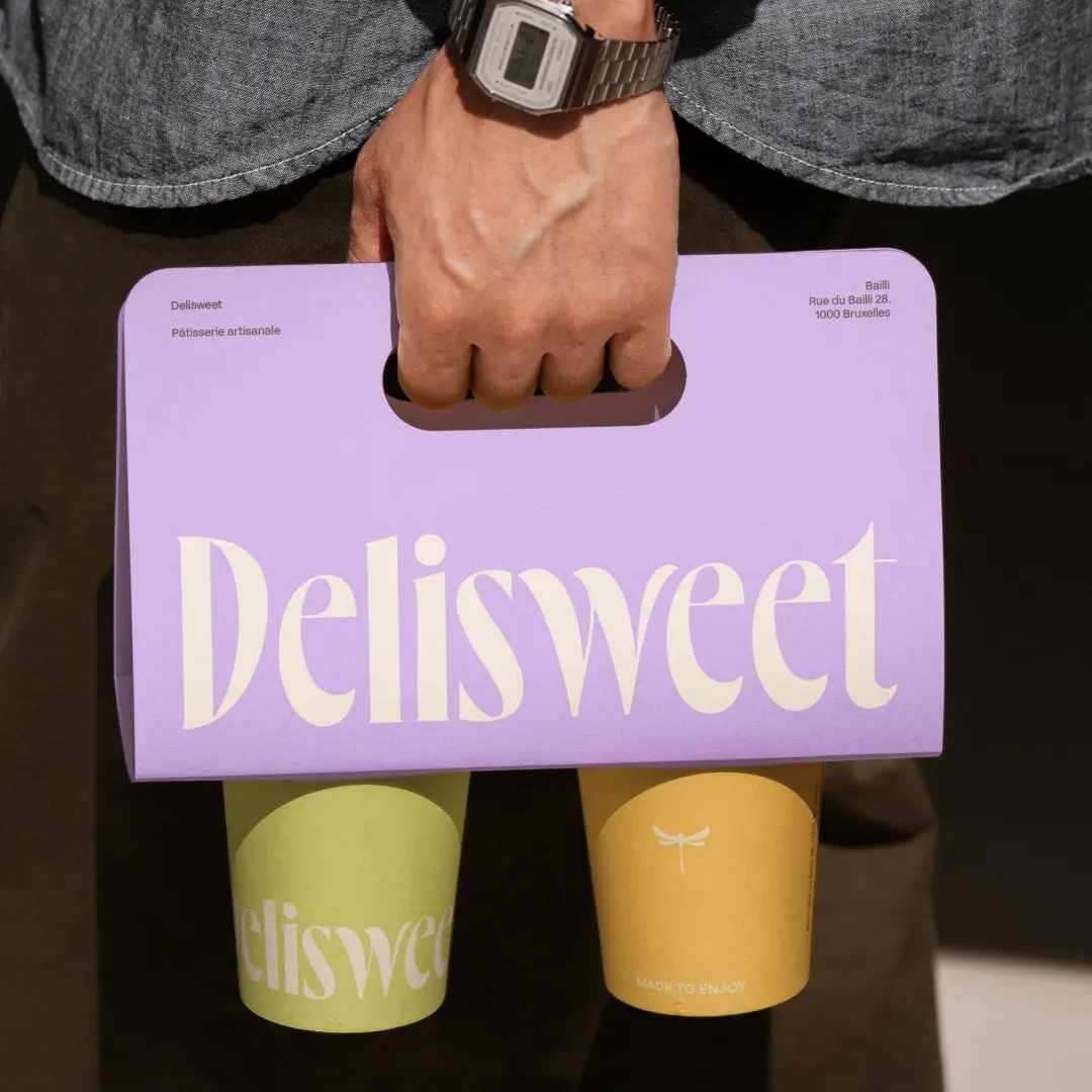
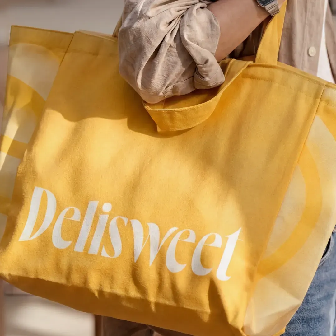
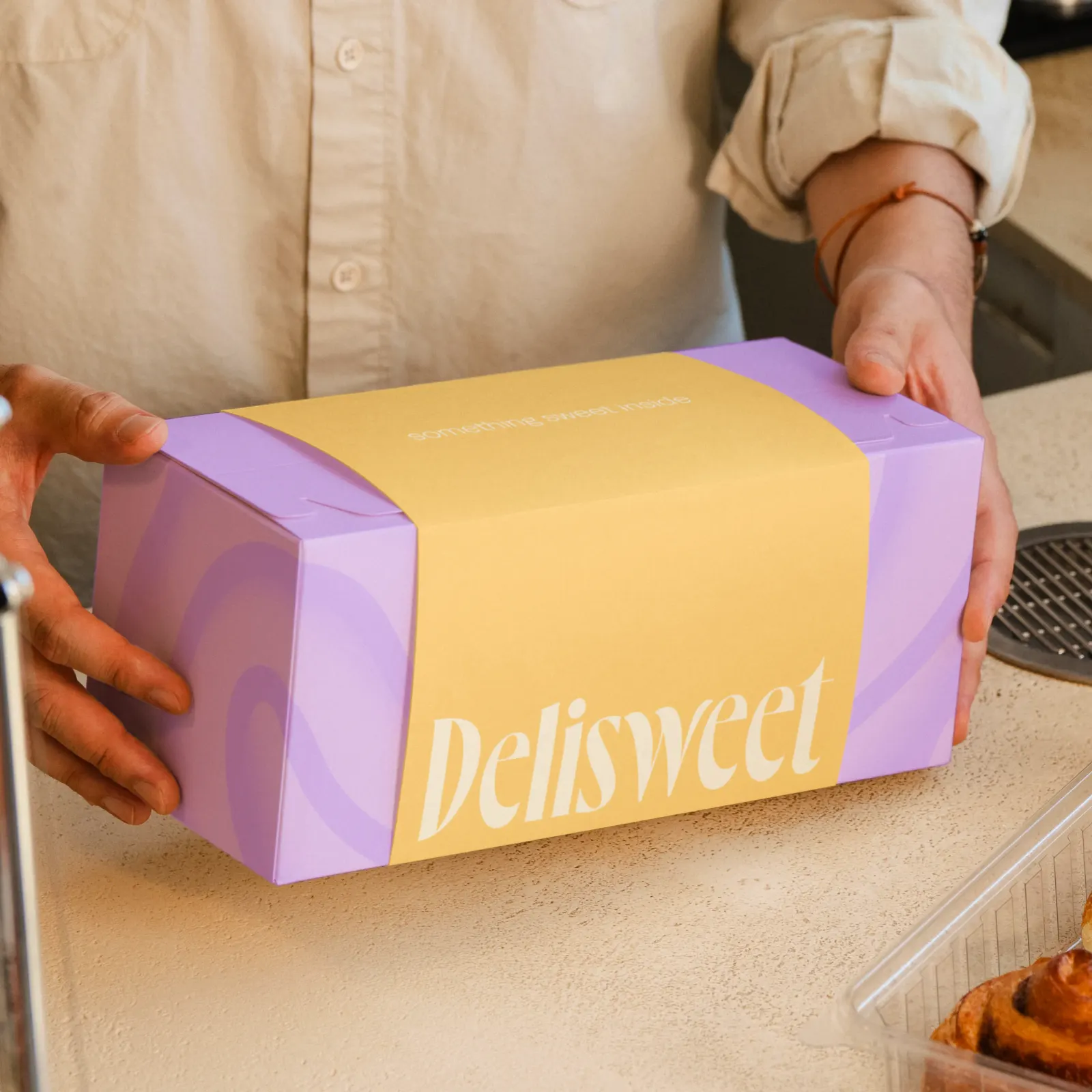
Images and video from nemesis.studio, by Nemesis.