The Brand Monograph
Flamengo brand identity by Ana Couto
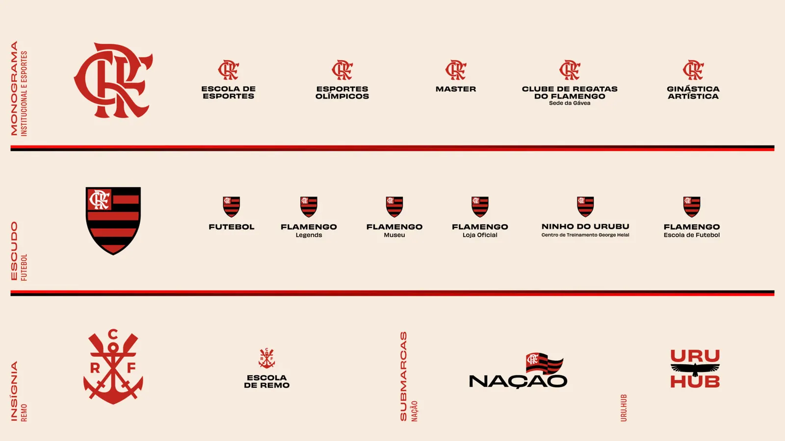
↗Ana Couto's Flamengo project is a club identity built to work well beyond the pitch. With more than 40 million fans but a presence tied to match day, Flamengo was running a crowded set of brands, channels, and fan programs that rarely connected. The studio, with strategists Louise Cruz and Tomás Backheuser, reorganized it into sport, entertainment, and legacy, giving the parent brand and its sub-brands clearer roles.
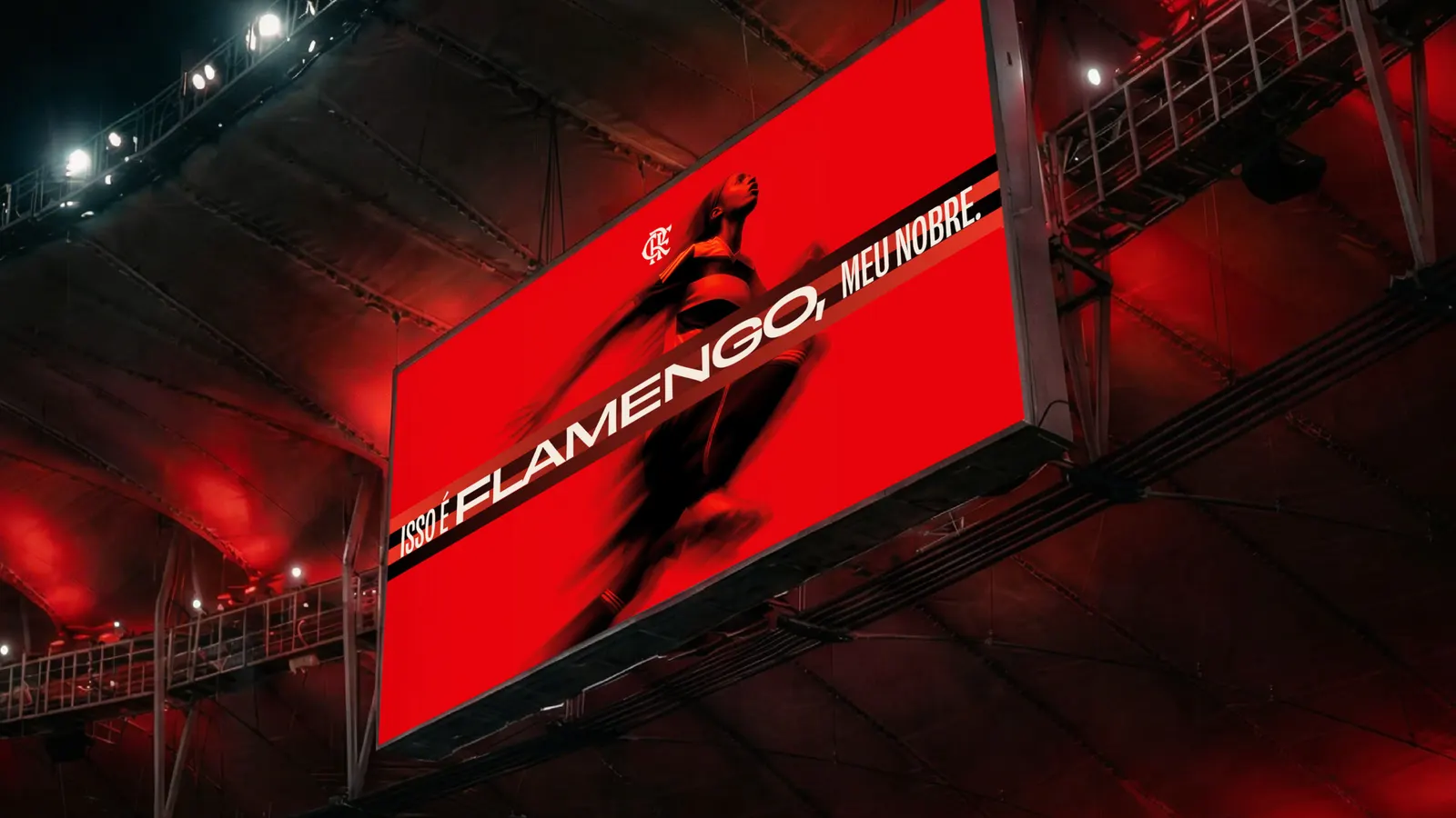
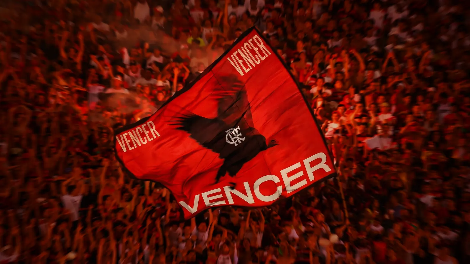
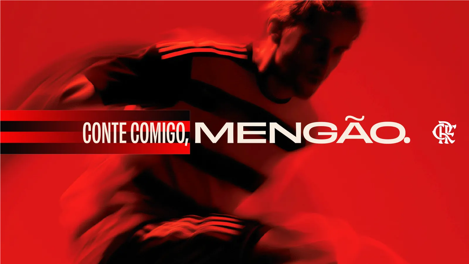
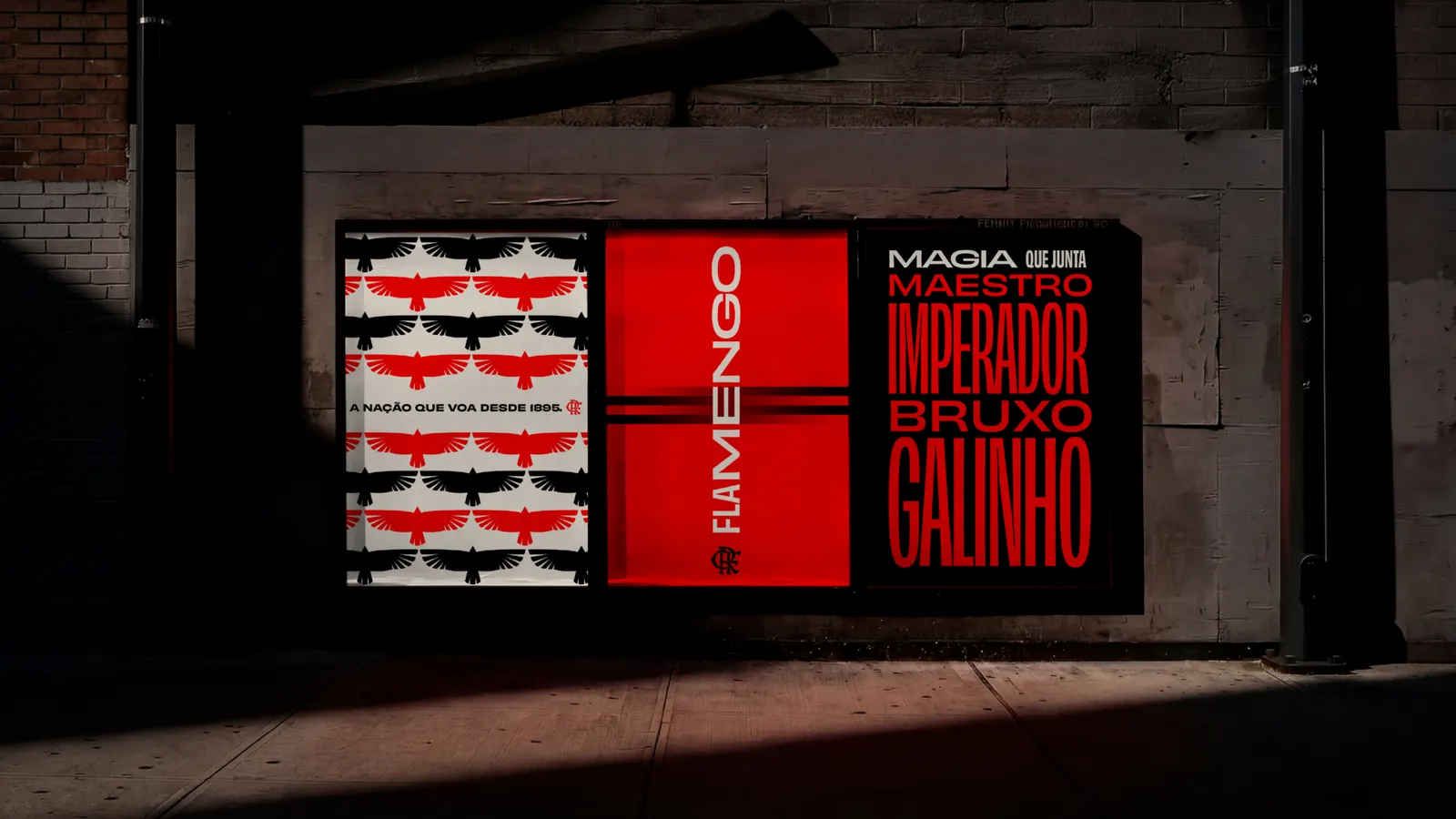
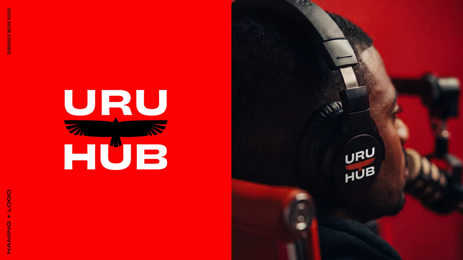
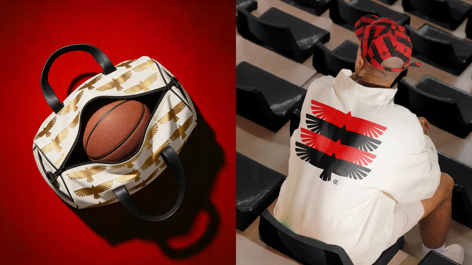
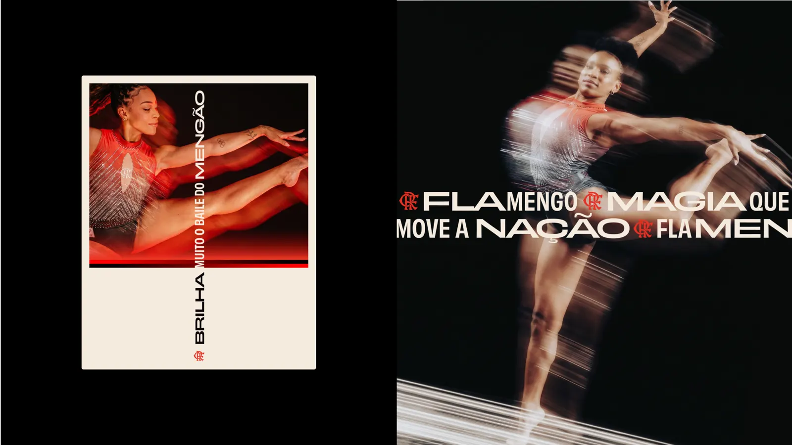
The visual system draws on the club's own inventory. The stripes become a red-to-black gradient, Acervo Flamengo photography is set in high contrast against red as a nod to Zico's bandeirão, and the typography turns more expressive. The shields and monogram stay, while the urubu is redrawn. Gustavo Faria, Luiza Vaz, and Rafael Torres led design, with Felipe Garcia, Gustavo Faria, and Vinicius Amorim on motion. The in-house media house became Uru.Hub, and ACACA's launch film, with sound by Mugshot, introduced "Flamengo Sem Intervalo."
Why it works
The restraint is what convinces. Keeping the shields and monogram preserves the equity fans already carry, while the gradient stripes and red-backed photography make the system feel more alive than the usual red-and-black football kit. Naming the media house after the urubu turns a fan nickname into a brand asset. Few clubs make their symbols do this much work across so many touchpoints without losing the feeling of a crowd.
Applications
Logo
Images and video from anacouto.com.br, by Ana Couto.