The Brand Monograph
HSBC SVNS brand identity by Further
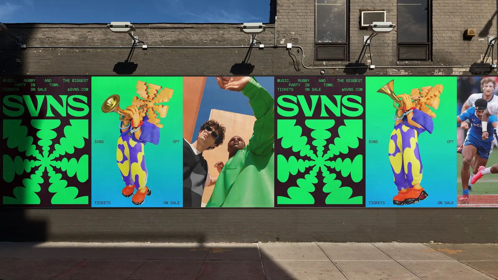
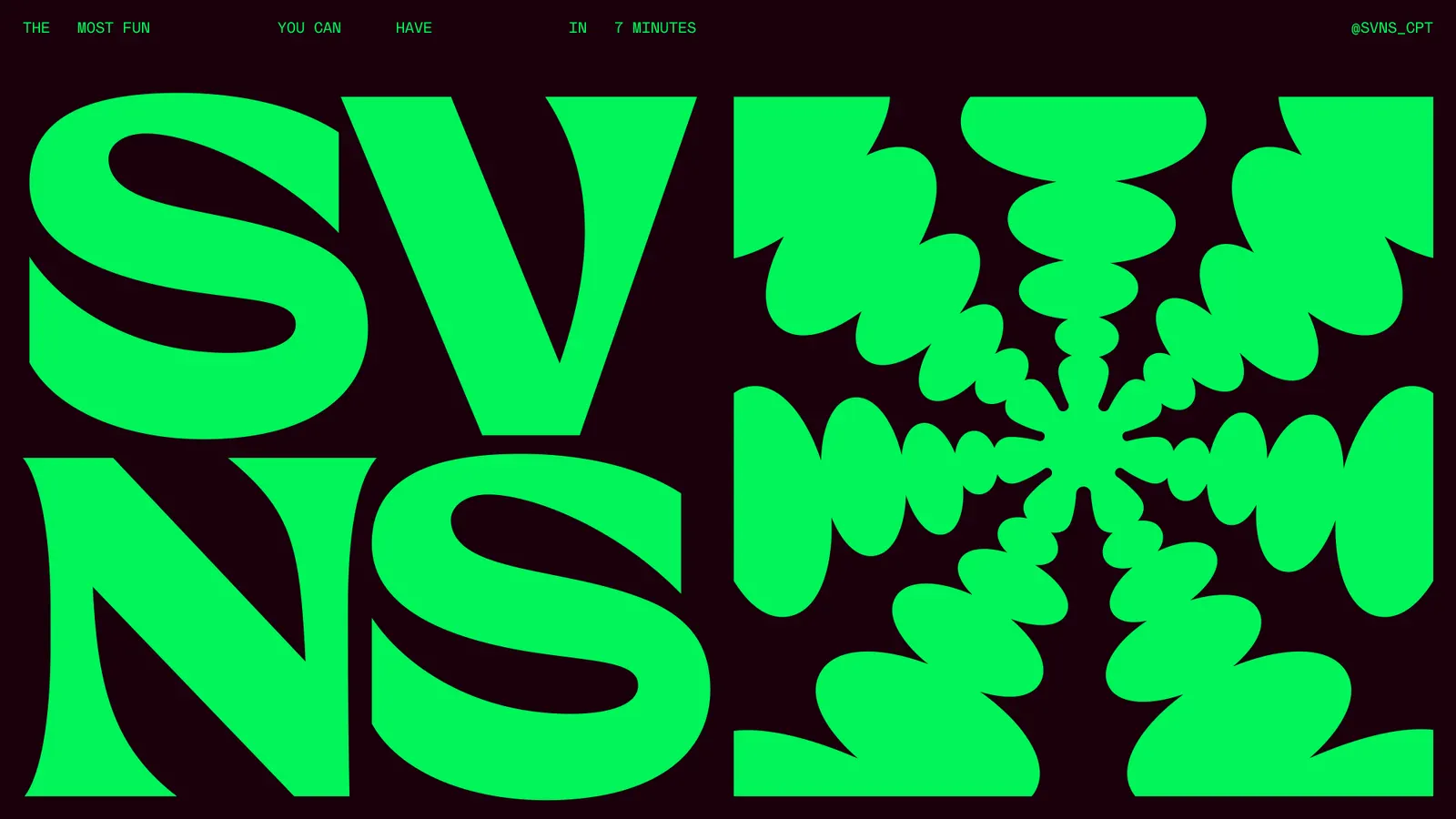
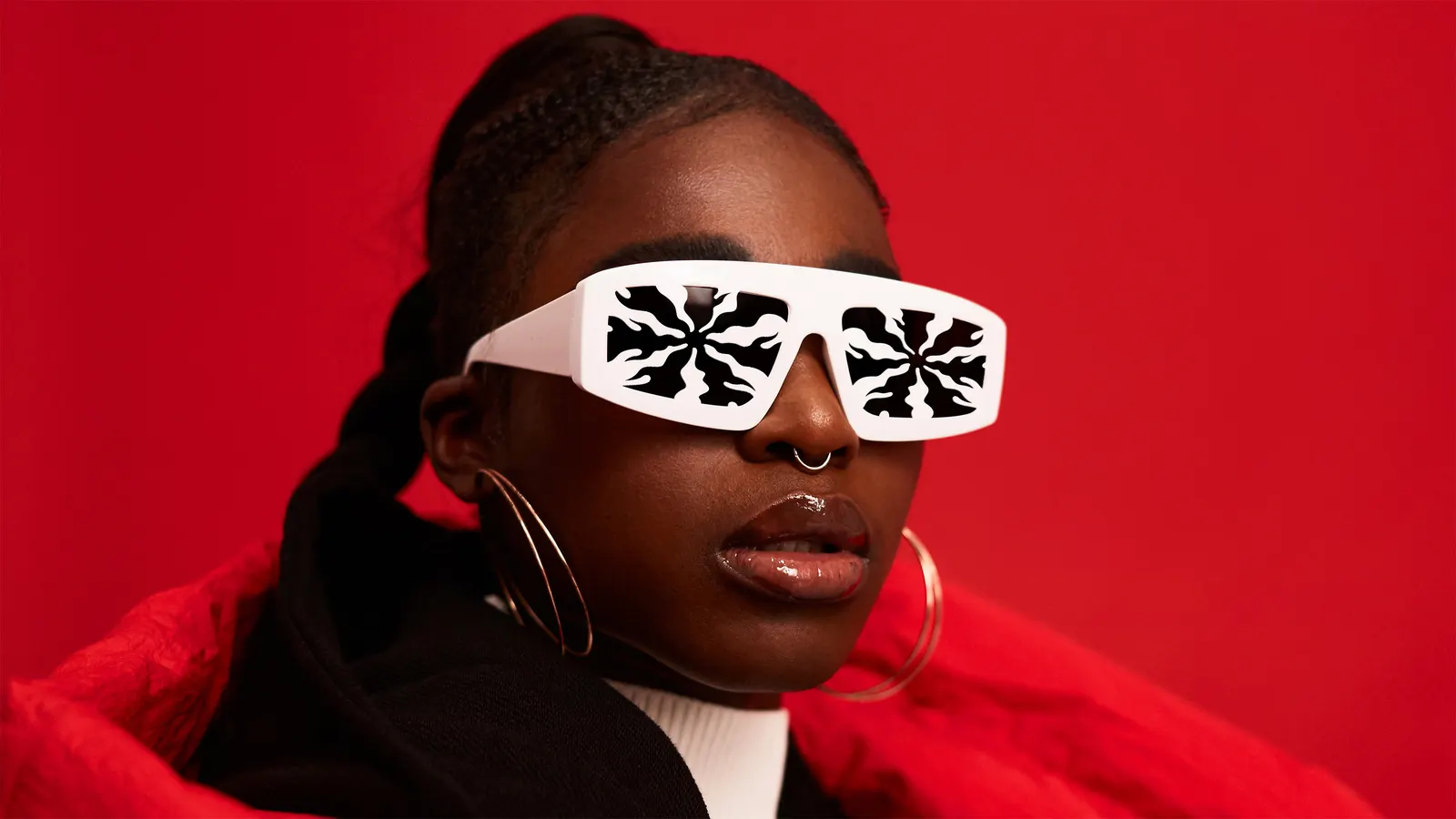
↗Further's SVNS identity gives a rugby tour a sun that behaves like a local. Its seven rays bend to suggest palm trees in LA, dunes in Dubai, or surf in Perth, so one symbol feels different in every host city while staying instantly recognizable.
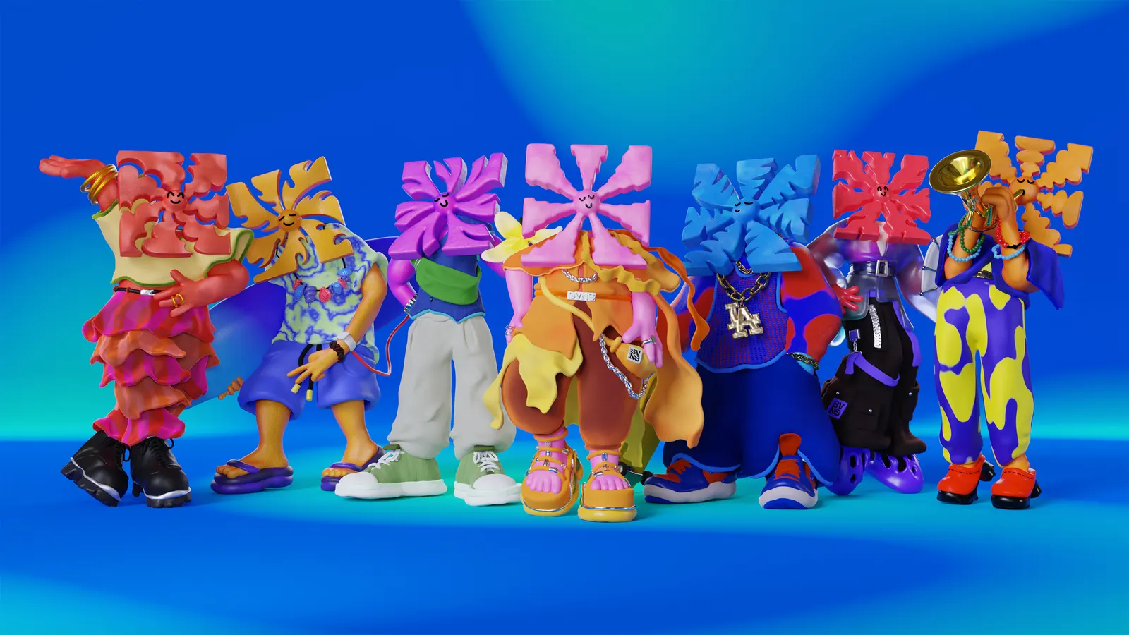
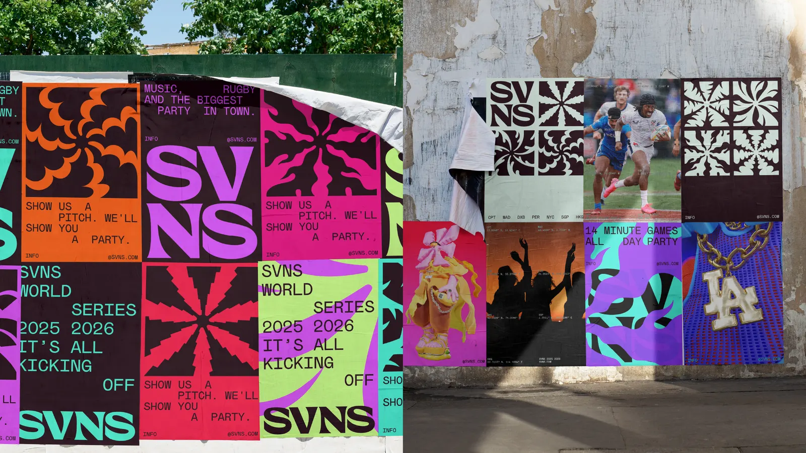
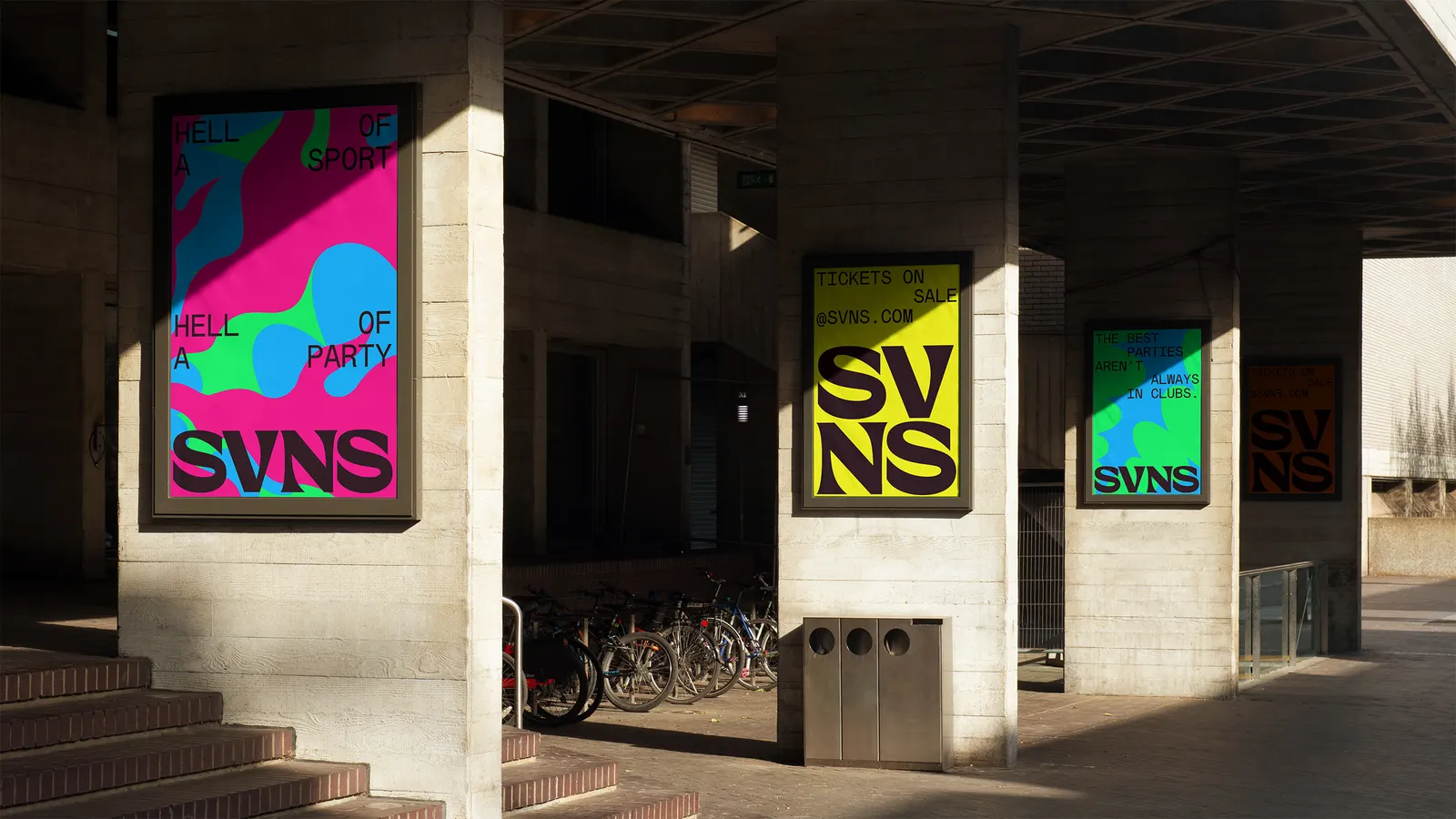
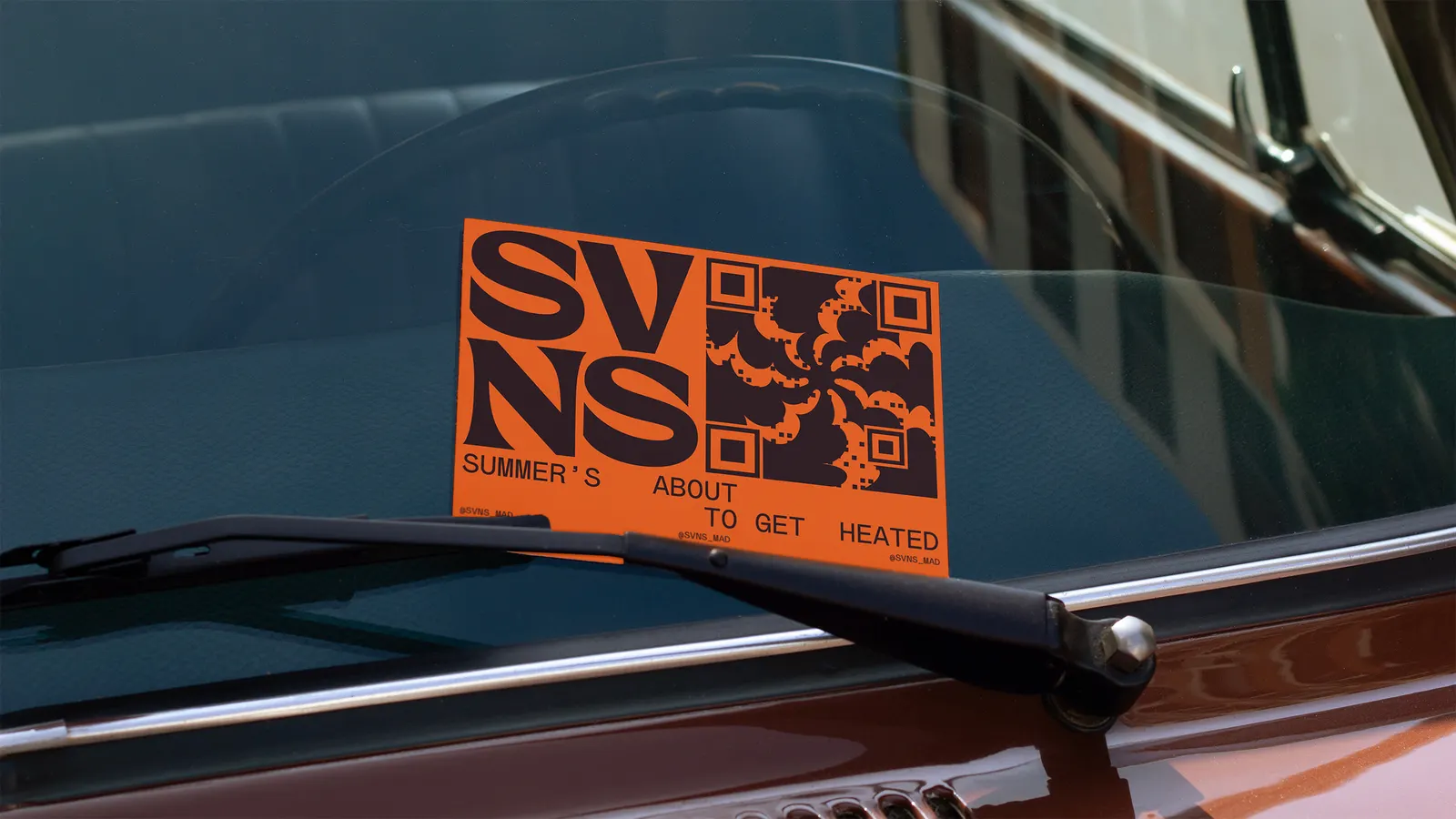
The brief asked Further to stretch the World Rugby HSBC Sevens Series beyond its core crowd and make it appealing to people who don't follow rugby. The studio found its idea in the format itself: seven players, seven-minute halves, and a calendar that follows summer around the globe. That logic shaped the shortened name, a modular wordmark, and a palette that sets black and white against bright, place-specific color. Mabry Mono from Colophon Foundry echoes the wordmark's geometry. Working with designer Vincenzo Marchese Ragona and with YONK on 3D and motion, Further then turned each city's sun into a mascot, with outfits and accessories carrying local culture.
Why it works
Sport branding often leans on heavy type and aggressive imagery, which mostly speaks to people already in the stands. A sun signals leisure as much as competition, so it welcomes newcomers without alienating fans. Fixing the ray count at seven gives the variation a rule, which makes each city's version read as a system rather than a one-off. The monospaced type adds a dry, playful note, and the black and white base lets each location's color do the talking. The mascots then give the sun a personality that can carry across social media and merchandise.
Applications
Logo
Images and video from further.group, by Further.