The Brand Monograph
CE Europa brand identity by Boc.Studio
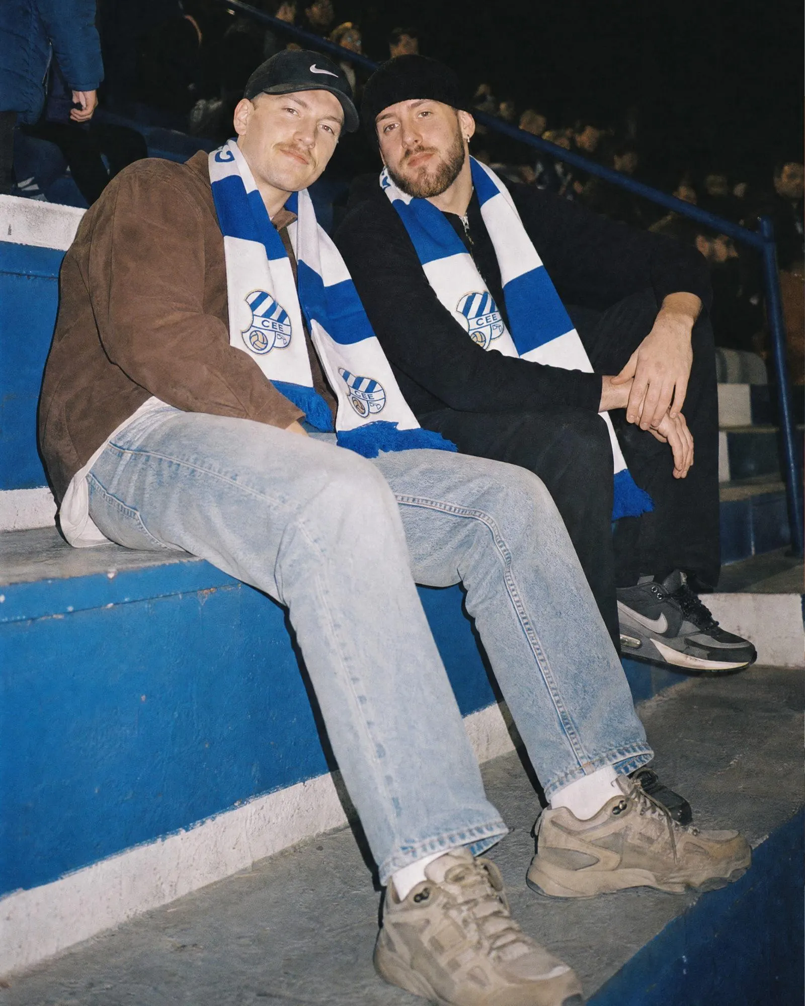
↗Few clubs can say they helped found La Liga and still call the same neighborhood home. Boc.Studio's identity for CE Europa builds on that rather than hiding it, and it avoids the glossy, global look most football branding settles into.
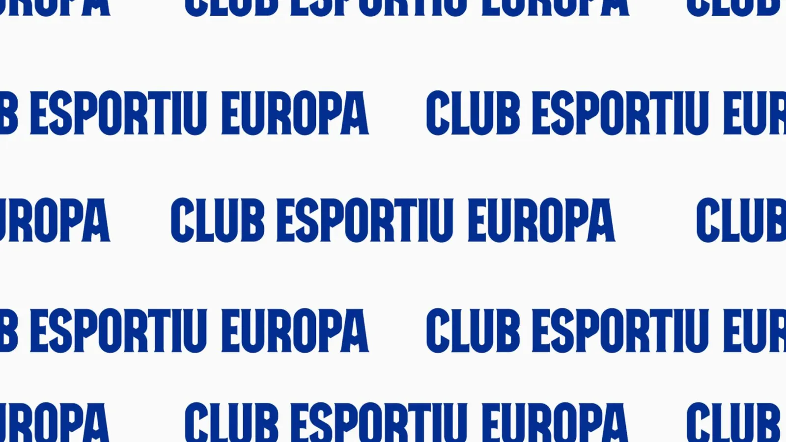
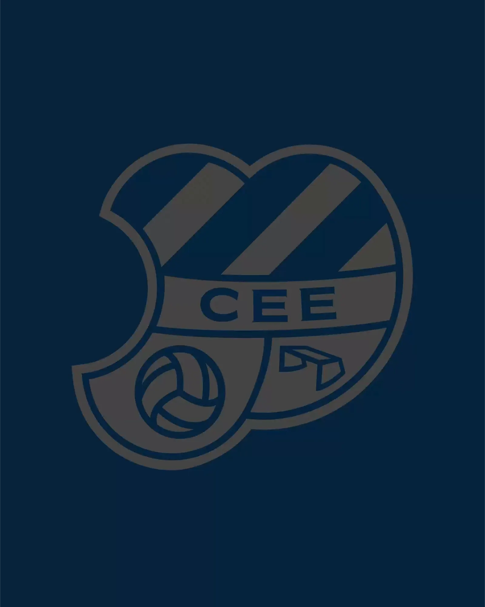
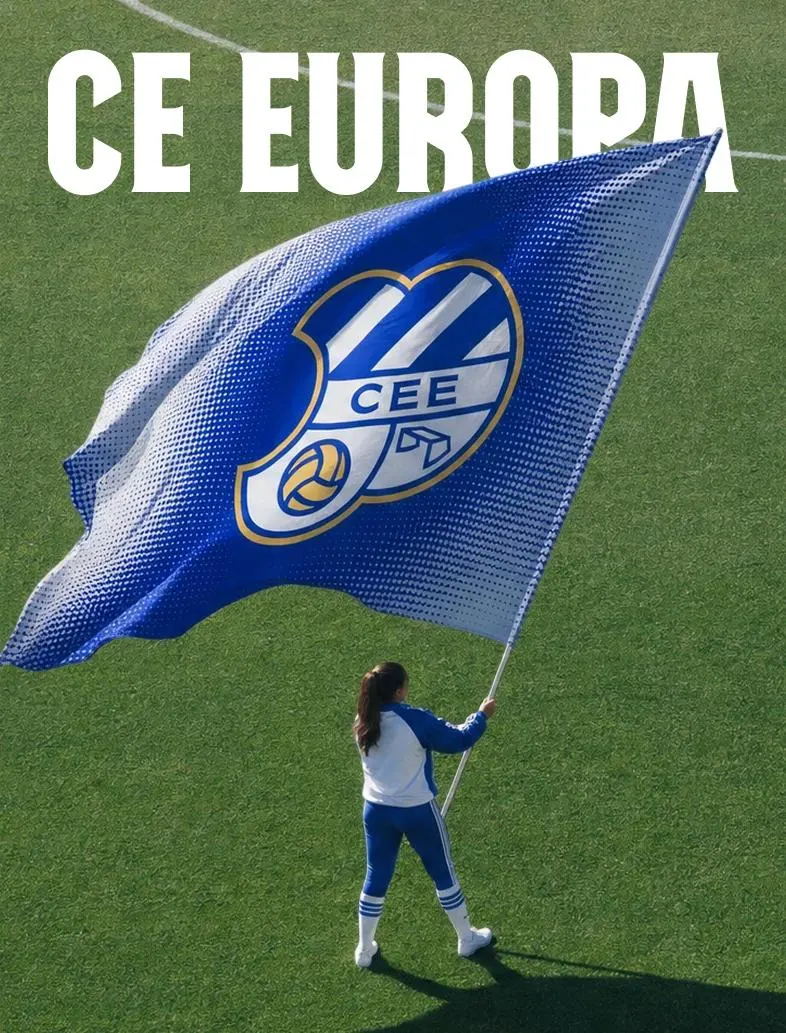
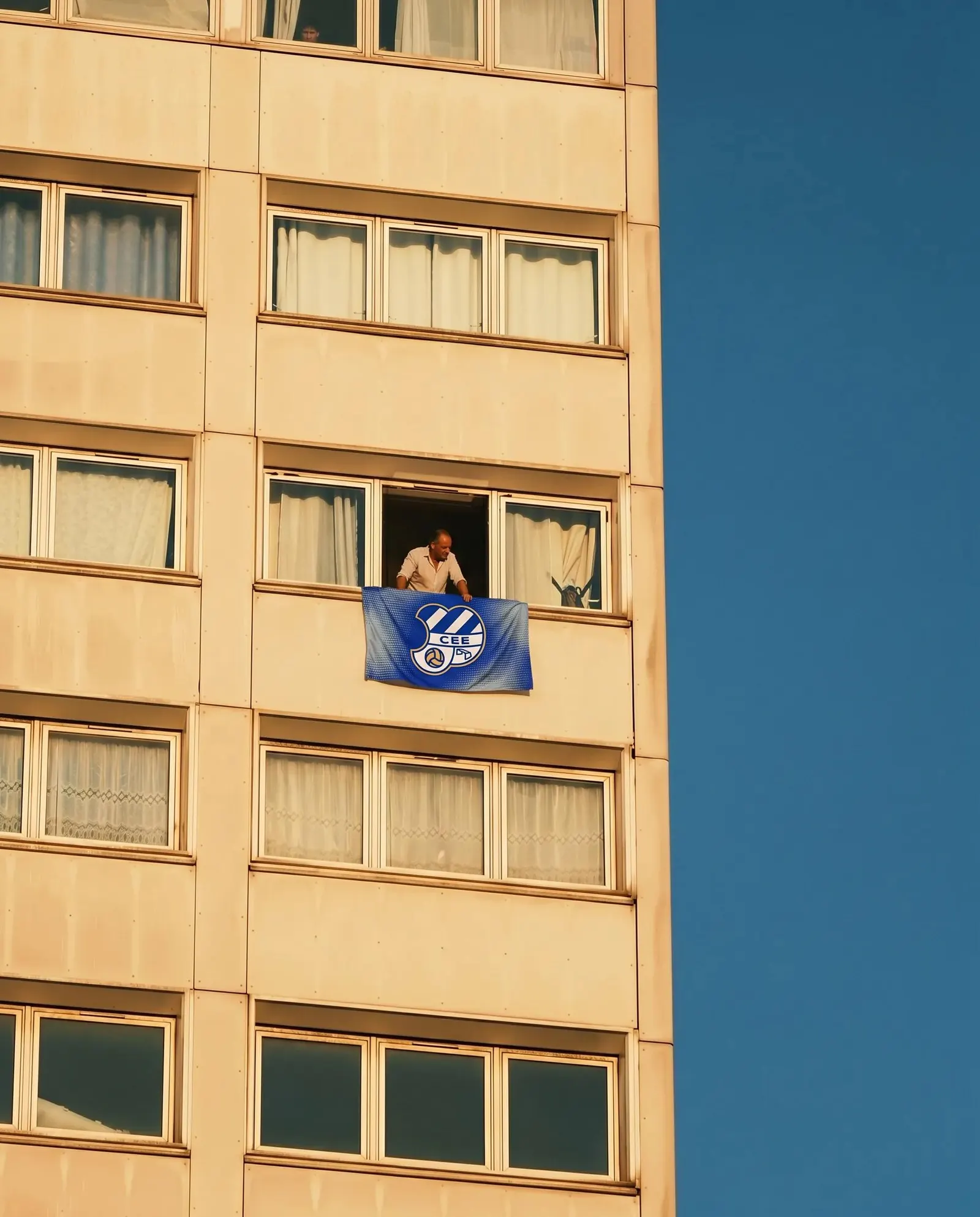
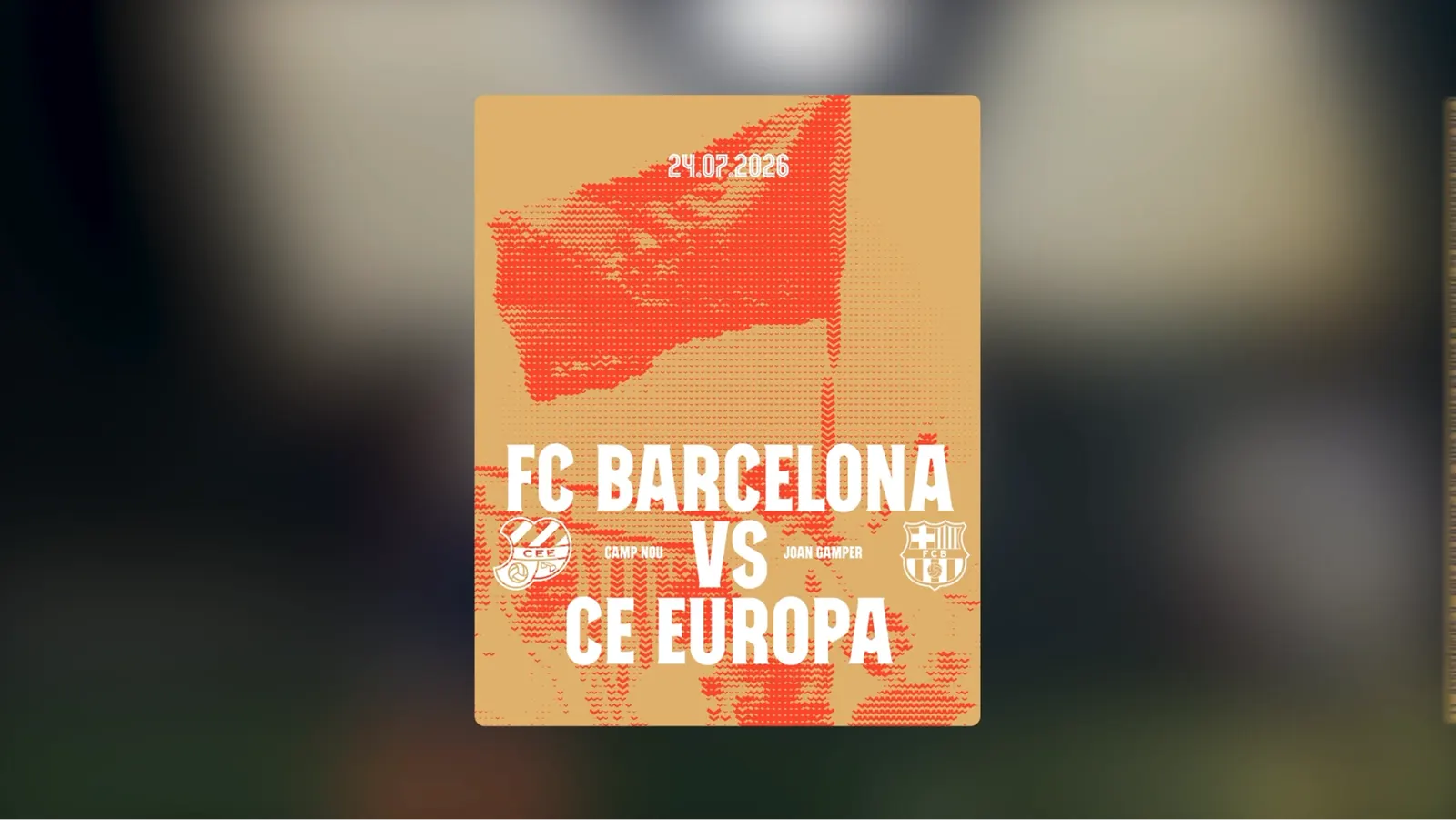
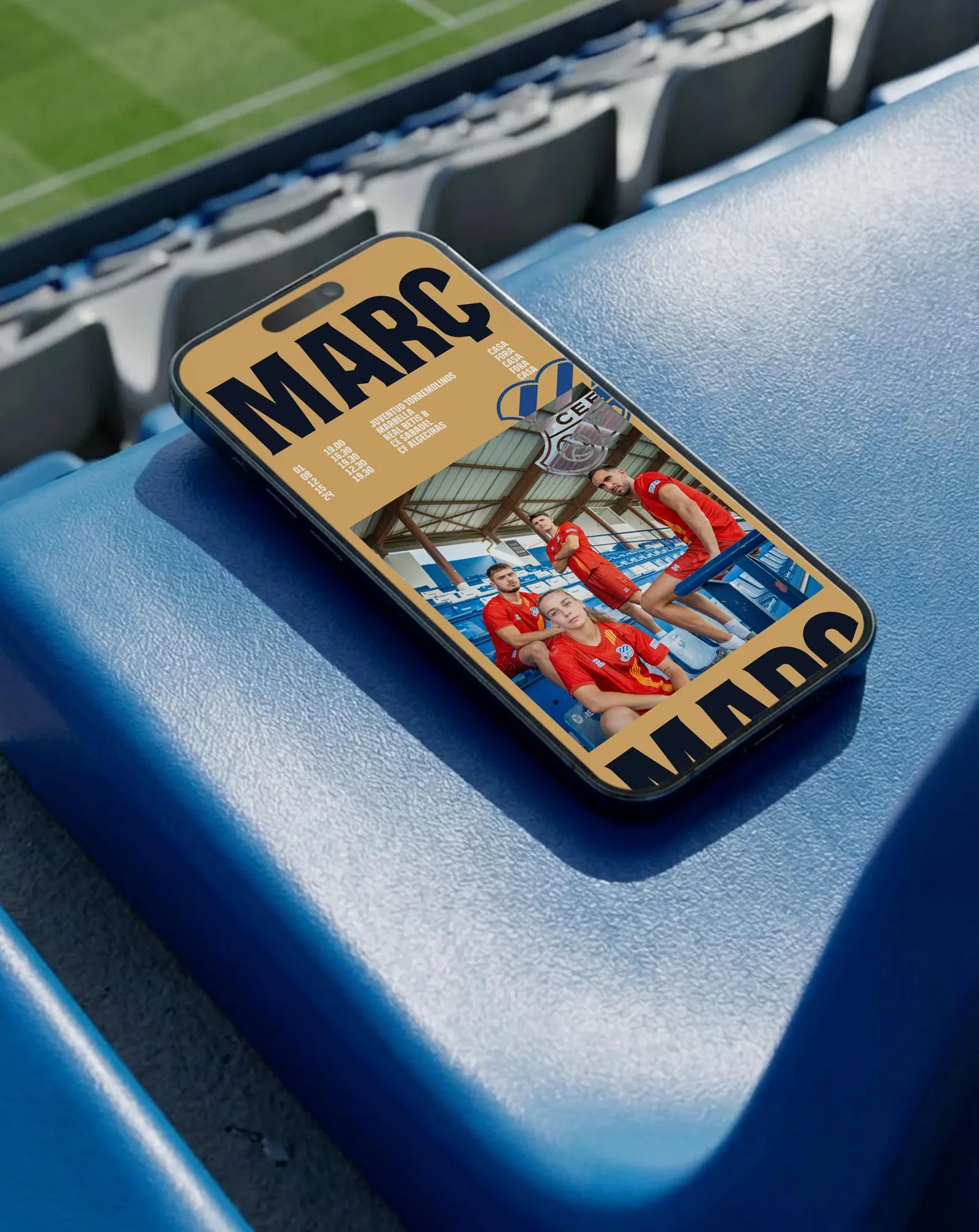
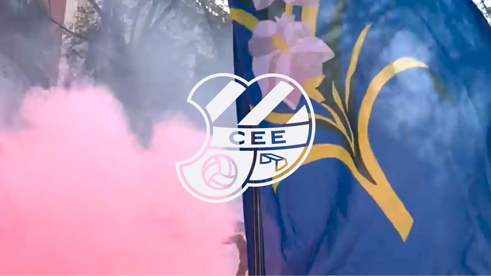
The presidency asked for restraint, so the studio redrew the crest with cleaner proportions suited to digital use instead of replacing it. The club's Escapulat stripes became the foundation of a custom generative tool that bends them into waves, giving every match, goal, and season its own pattern. Typography from Murri Studio sets the structure around it. The system runs from the shirt to the app to the stickers fans will put up around Gràcia.
Why it works
The stripes were already on the shirt, so the wave pattern feels like an extension of the club rather than decoration added on top. The fixed elements, a tightened crest and a confident typeface, anchor everything, which leaves the waves free to move. Because each pattern is tied to a specific match or goal, the identity records the club's season instead of simply repeating a look. That gives a small, loyal membership something to recognize as its own, and it sets CE Europa apart from clubs that all dress for the same screen.
Applications
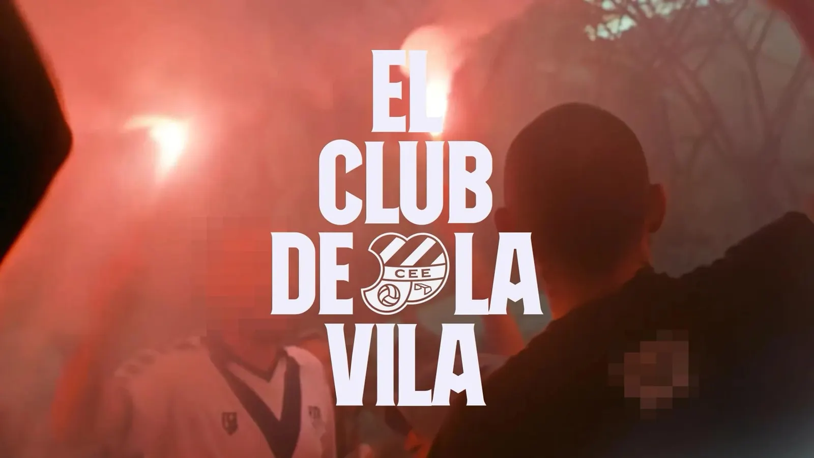
Logo

Images and video from boc.studio, by Boc.Studio.