The Brand Monograph
Abbe Museum brand identity by In-House International
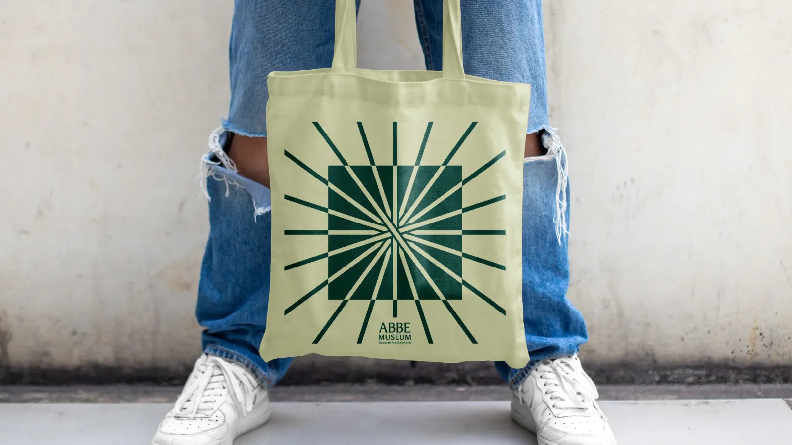
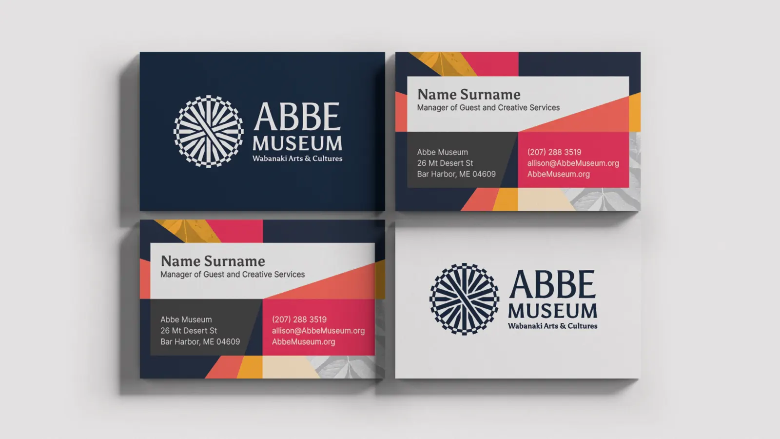
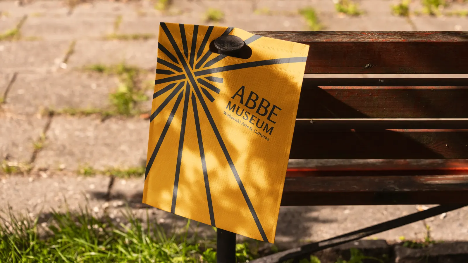
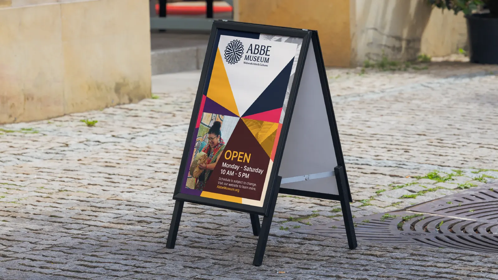
↗In-House International gave the Abbe Museum an identity that works harder than a sign on a busy street. Bar Harbor draws about 3 million visitors a year, most of them headed for Acadia National Park, and a Wabanaki-governed museum with two locations was easy to overlook. After a board workshop and onsite interviews led by Allelo Design, the studio built the mark from the basket spoke, the point where a Wabanaki basket begins, which also reads as a sun. It anchors the logotype alongside the subtitle "Wabanaki Arts and Cultures" and extends to marks for the Dawnland Festival of Arts & Ideas and the 2028 centennial.
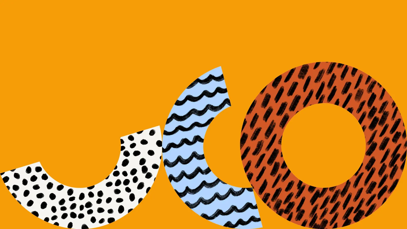
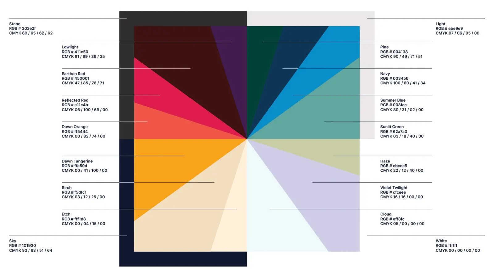
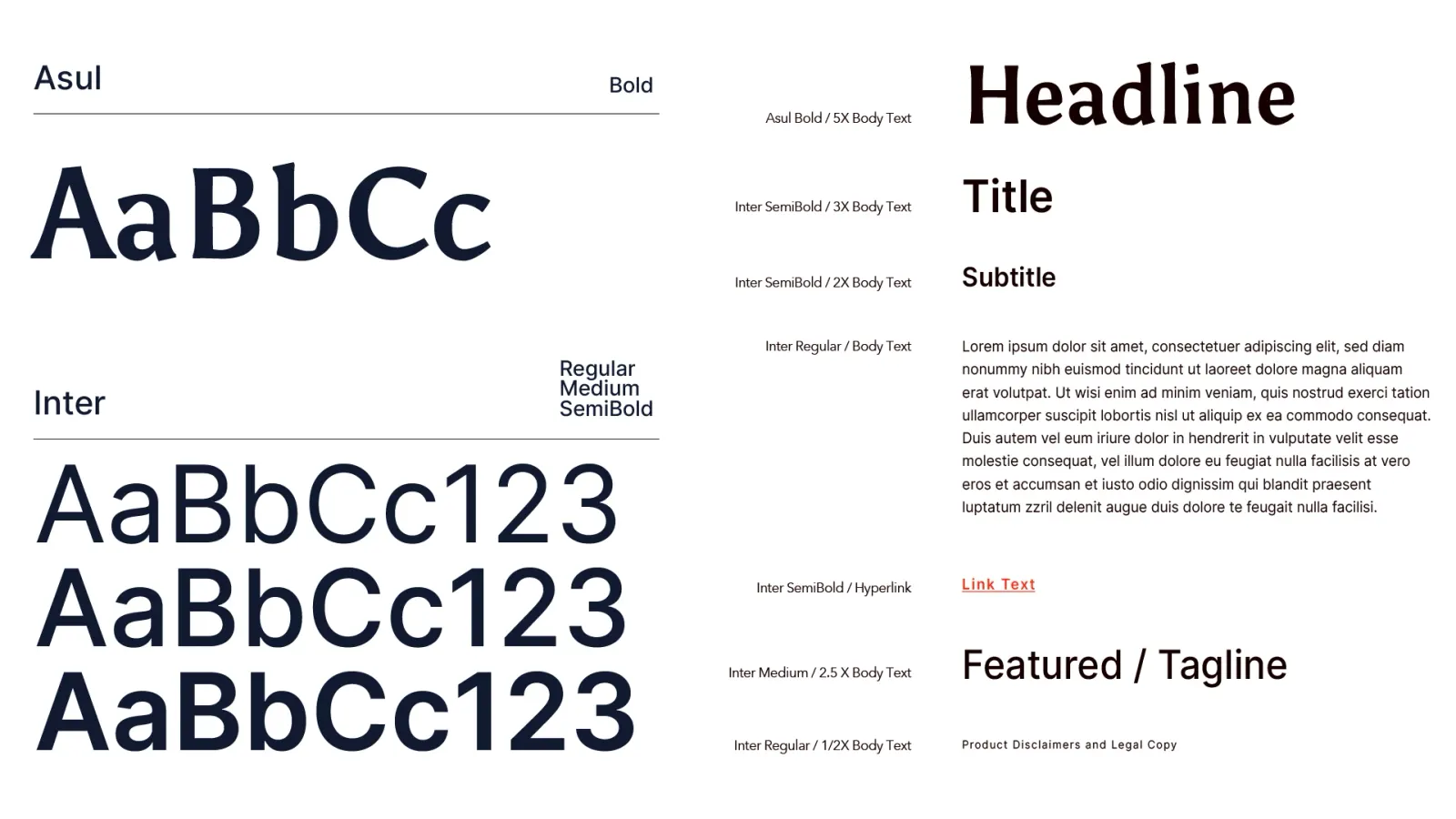
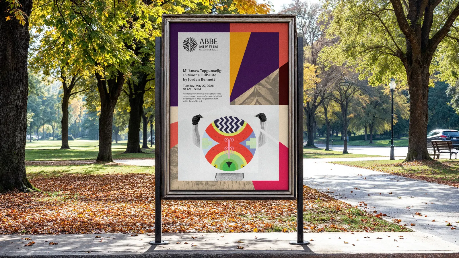
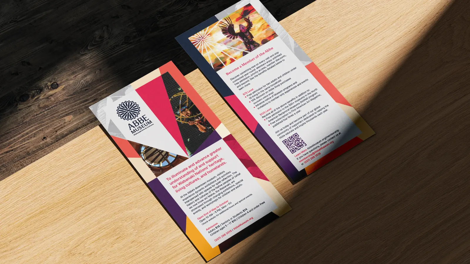
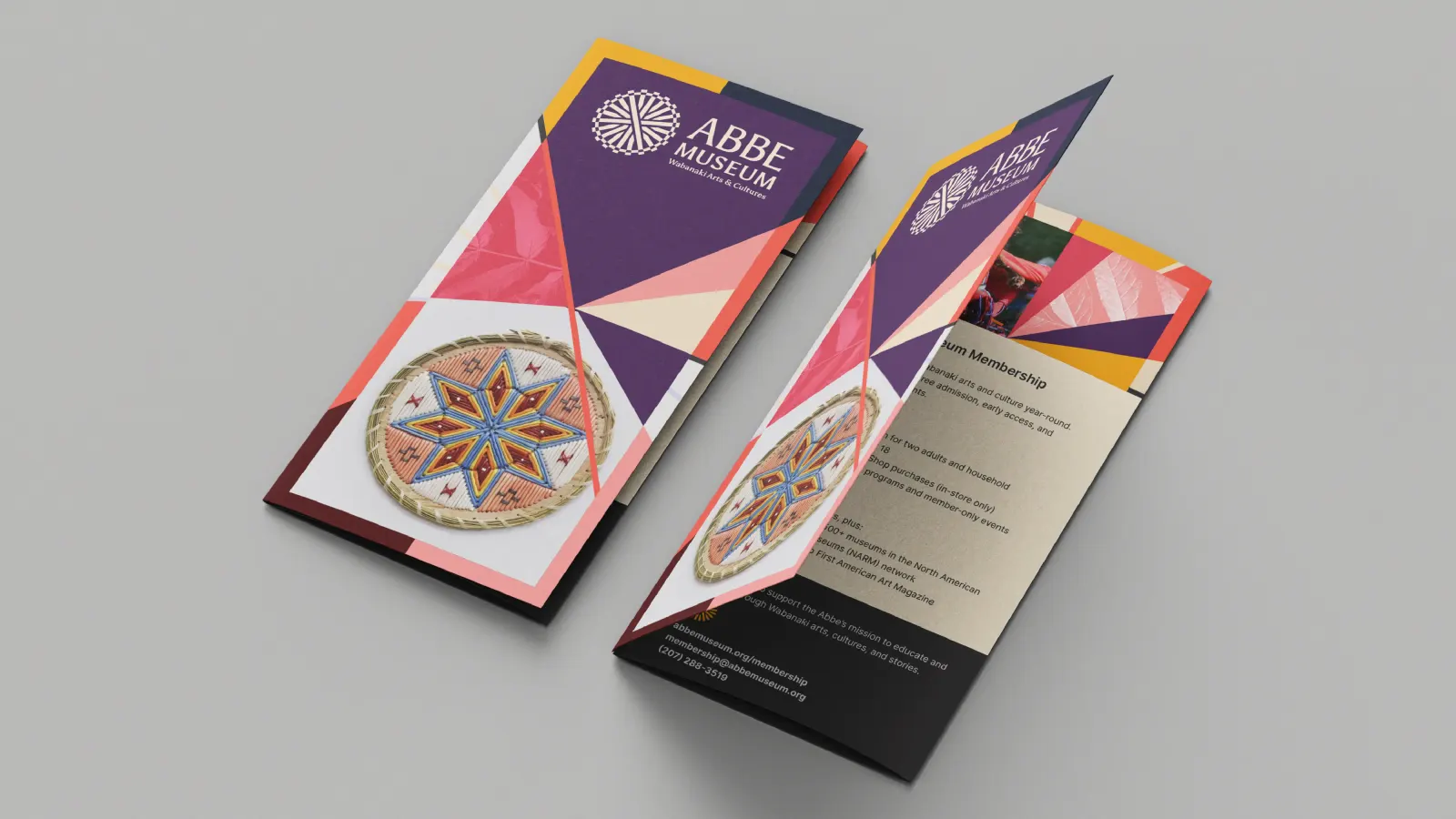
The supporting kit is deep but organized. Seventeen colors come from sunrise imagery, Asul is paired with Inter for text, and more than 20 patterns draw on craft details from the five Wabanaki Nations. Radial layouts echo the logo, and a Canva template library puts it all in the hands of a small staff.
Why it works
The mark carries two meanings in one shape, craft and sunrise, so it is specific to this place and hard to mistake for a generic museum emblem. Asul's semi-serifs add gravity with a hand-made warmth, while Inter keeps everyday communication plain and legible. Drawing the palette from the Dawnland sky lets color do some of the storytelling. The patterns give the team variety without asking them to design from scratch, so the identity can stay consistent across both sites.
Applications
Logo
Color
Typography
Images and video from weareinhouse.com, by In-House International.