The Brand Monograph
Circuit brand identity by The Collected Works
↗The Collected Works gave Circuit, which runs in more than 50 communities and has passed 10 million rides, an identity that reads more like a transit system than a startup. The brief had to satisfy two audiences: riders who use the service for everyday errands, and the city officials who decide whether it earns a place on their streets.
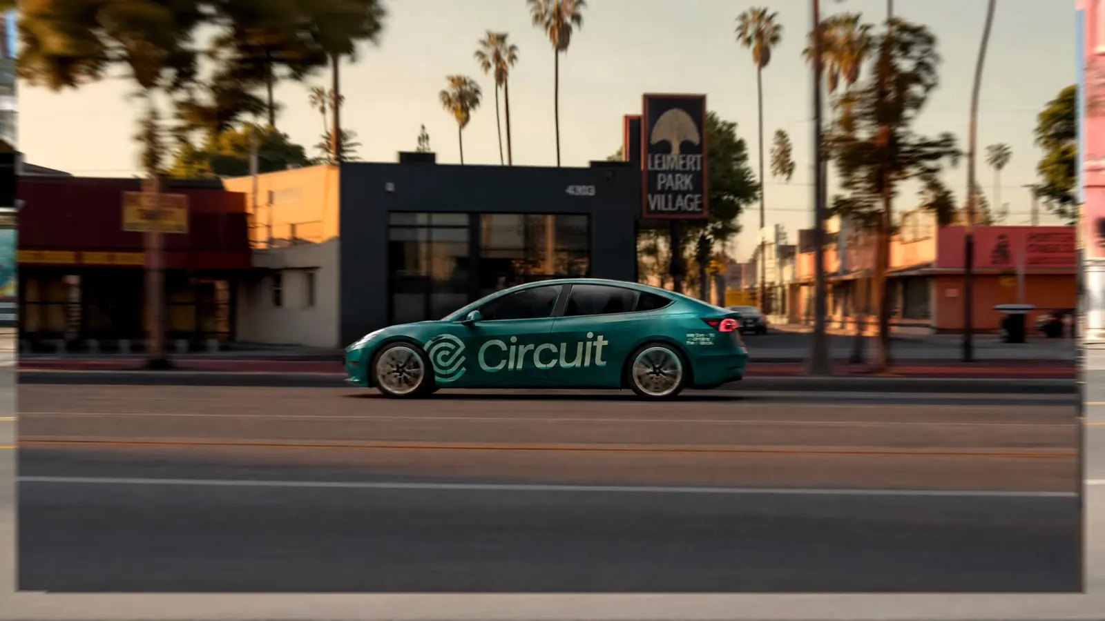
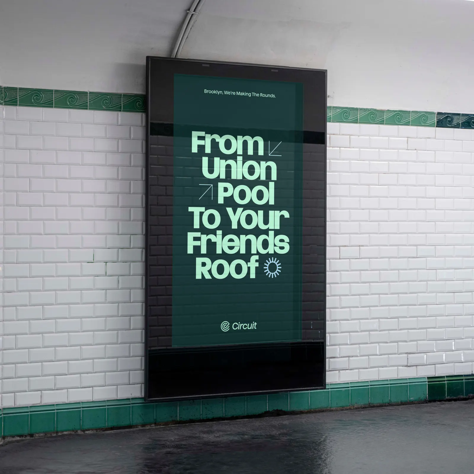
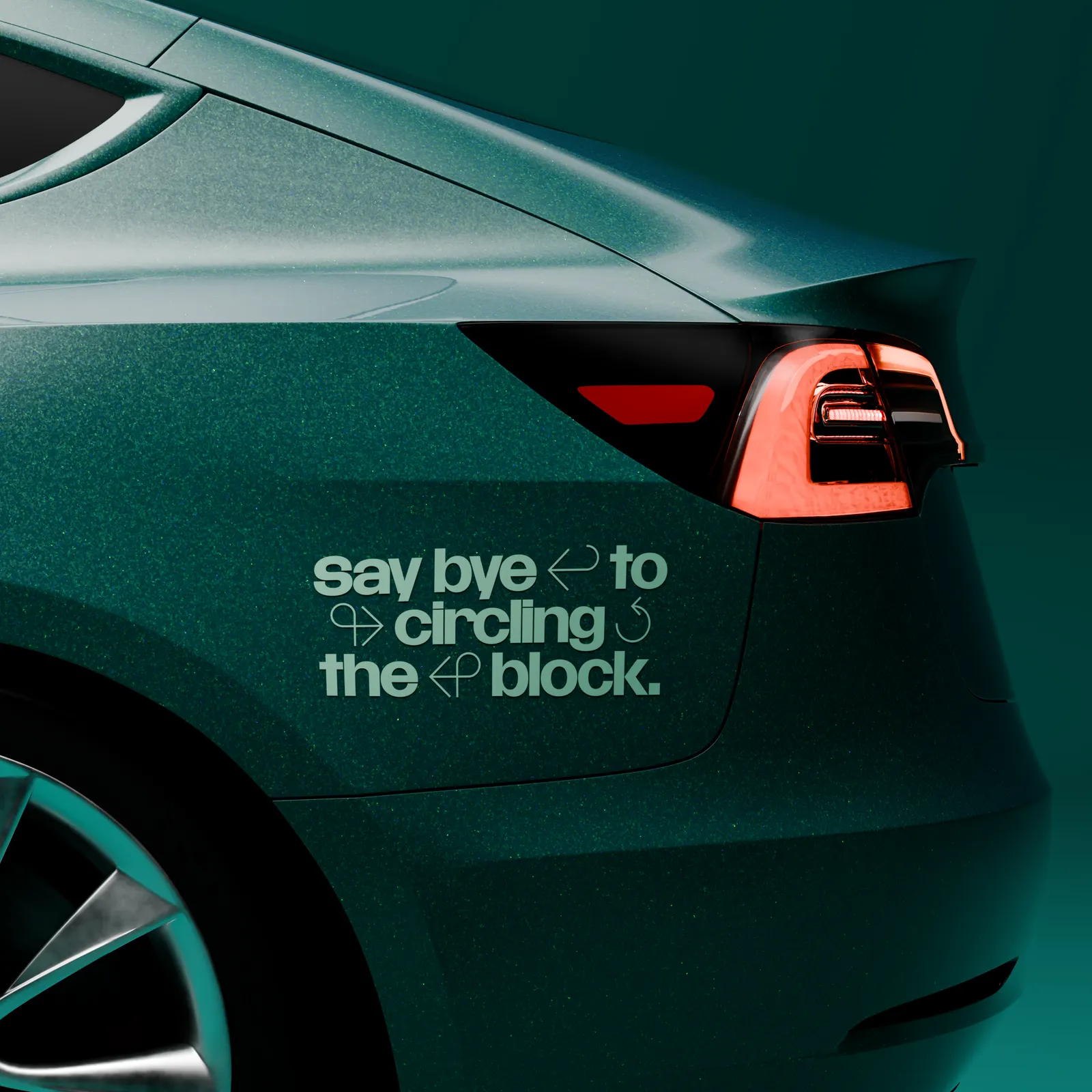
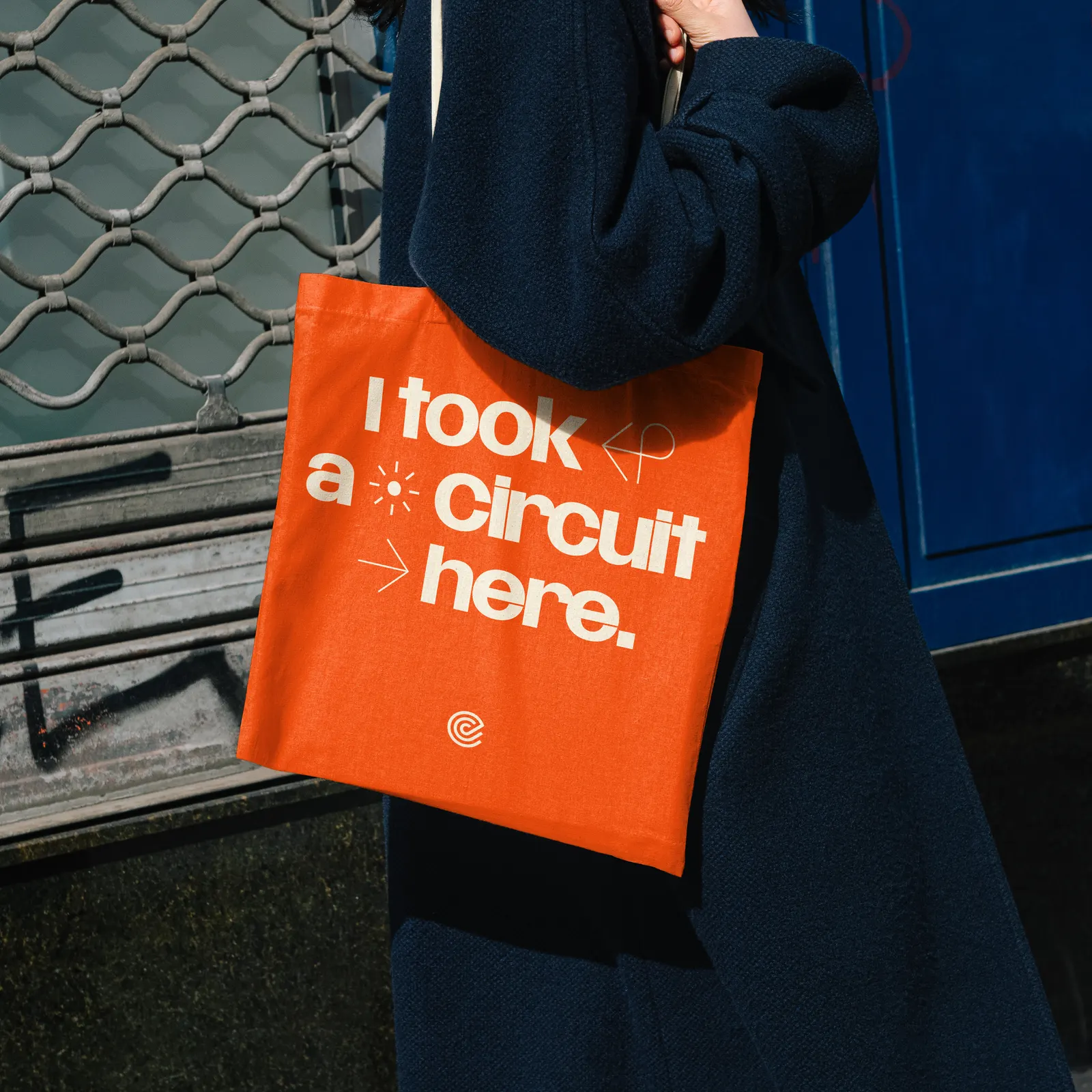
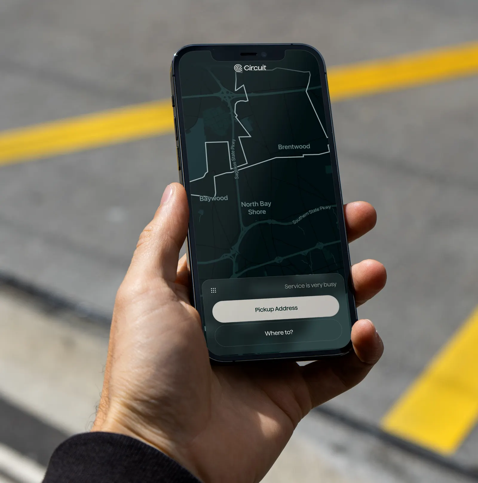
The studio drew its visual language from wayfinding, using the shapes of signage, maps, and directional markers to build a framing system for photography and messaging. On the cars, a restrained green sits behind an oversized wordmark, and the studio produced high-fidelity renders so Circuit could pitch with the new look before the fleet was rewrapped. Street names and landmarks give each market its own character. At the center is a continuous line, and a generative tool built with developer Nick DiMatteo lets Circuit's team produce new variations for digital, motion, and billboards on its own.
Why it works
The restraint is the smart part. Putting the scale into the wordmark instead of loud color makes a car recognizable at a glance while keeping it easy to live with on a residential street, which matters when the vehicle is the main piece of media. A line that turns and loops is also a literal picture of a route, so the mark explains the service without needing a metaphor. And because local references plug into fixed rules, a council in one town sees its own streets while the brand stays consistent everywhere.
Applications

Typography
Images and video from thecollectedworks.com, by The Collected Works.