The Brand Monograph
Sinfonia Varsovia brand identity by TOFU Studio
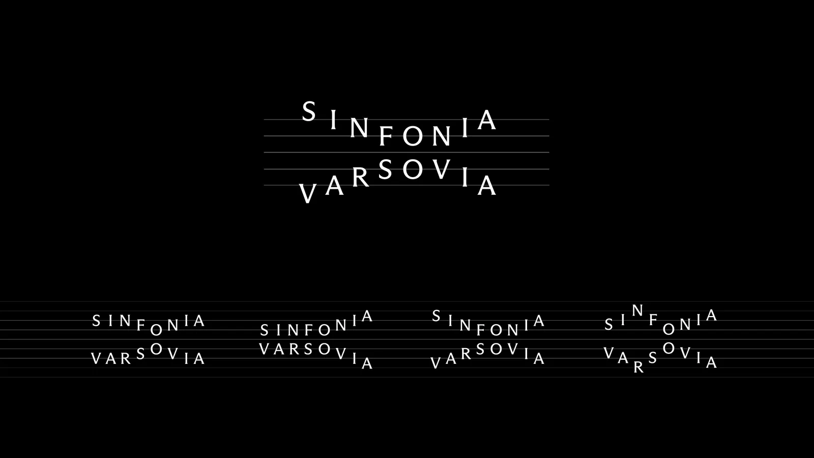
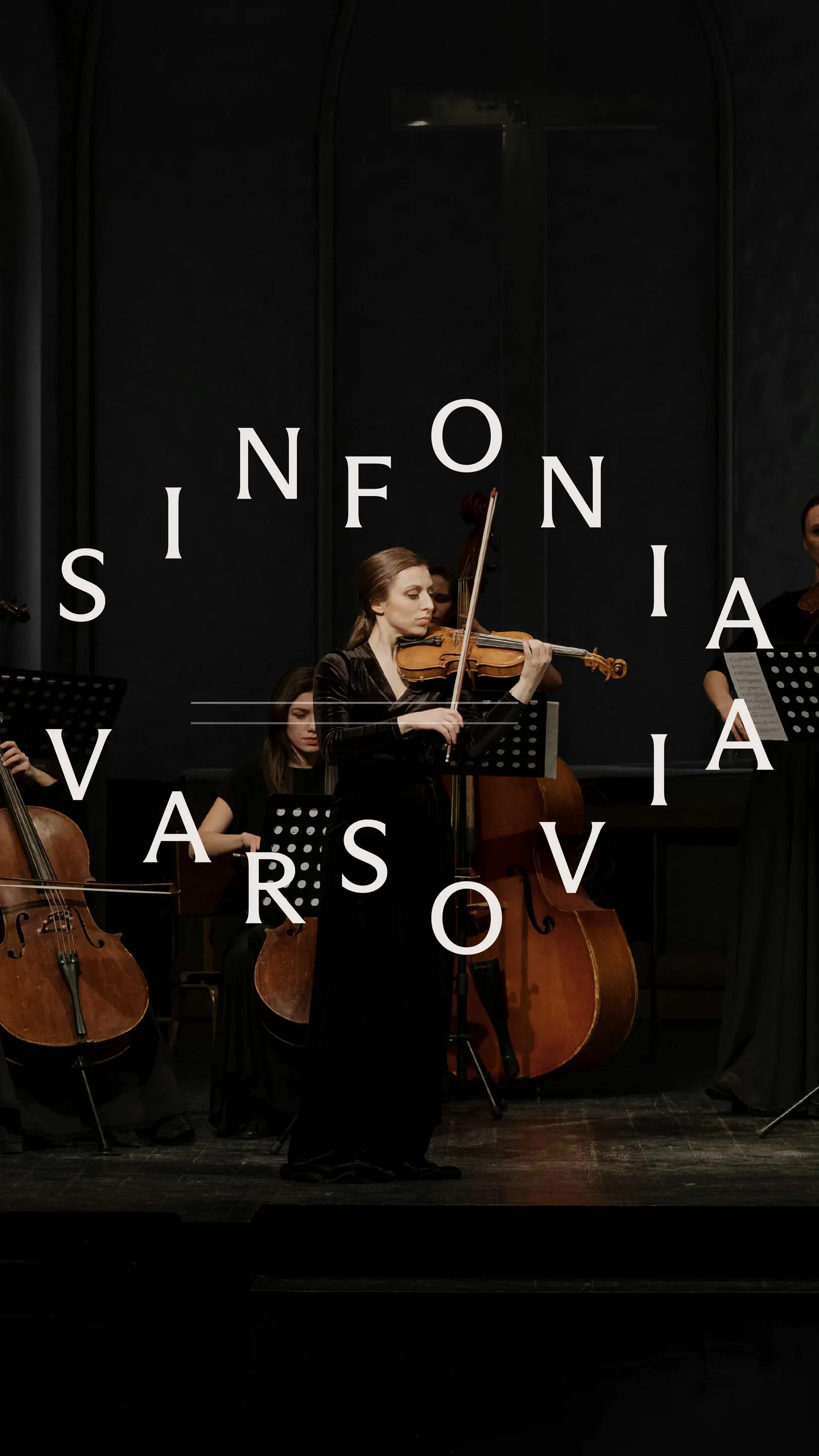
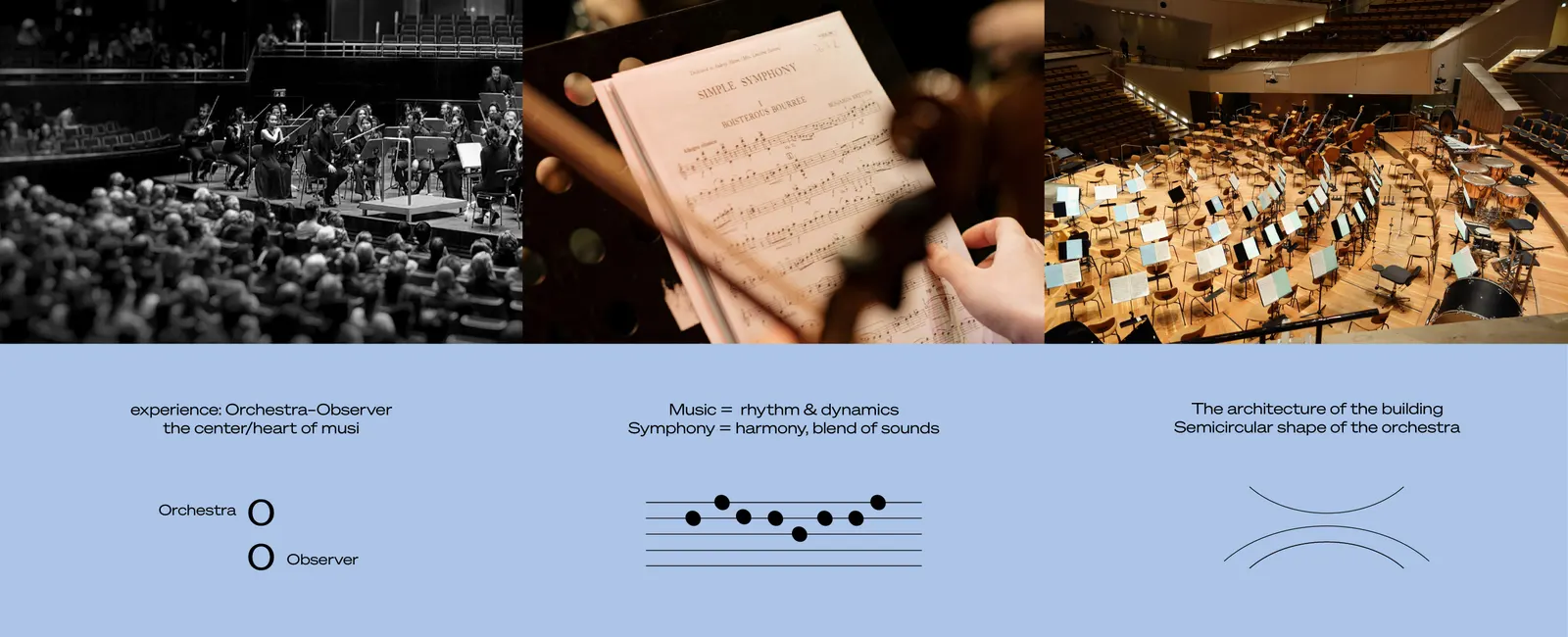
↗TOFU Studio's concept for Sinfonia Varsovia treats the logo as an instrument rather than a fixed stamp. The Warsaw orchestra is known for international collaborations, a broad repertoire, and education work, and it is getting a new music centre. The studio's identity was a competition entry. Its letters sit on a staff so they read as notes, and stacking them suggests several tones sounding at once. A semicircular line ties the mark to the orchestra's seating shape and to the building's interior.
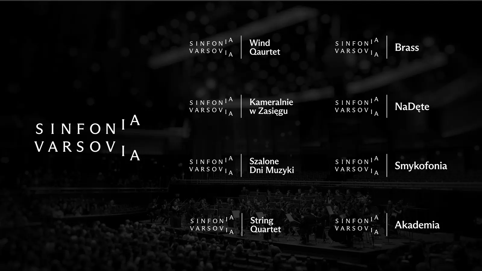
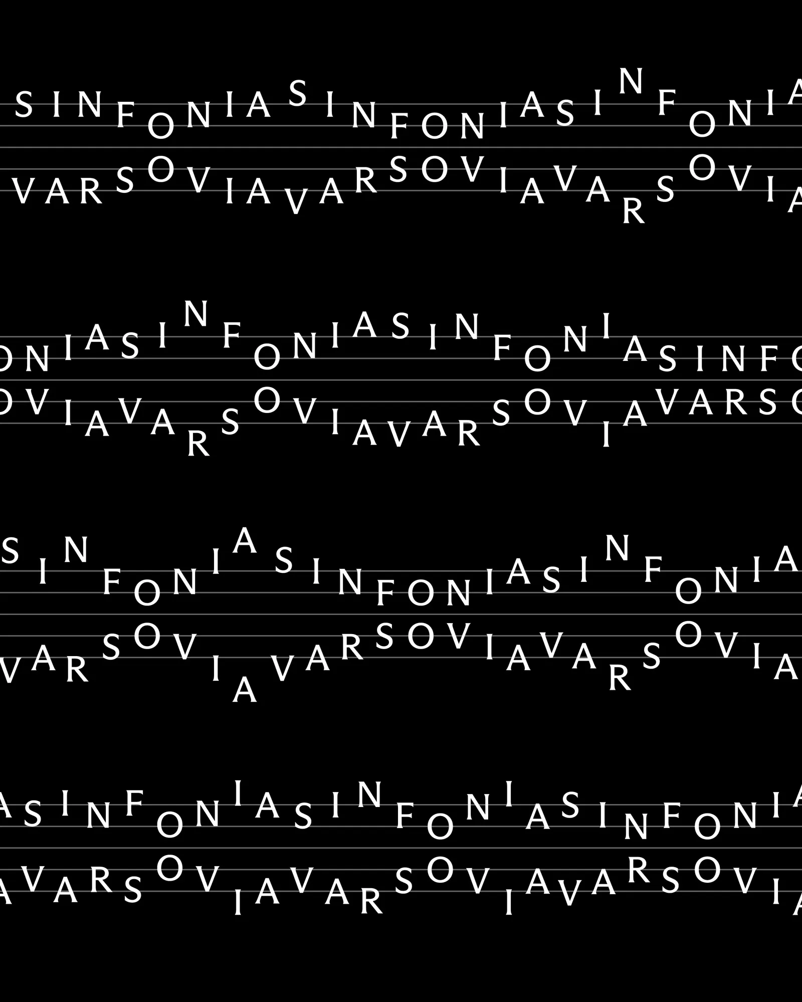
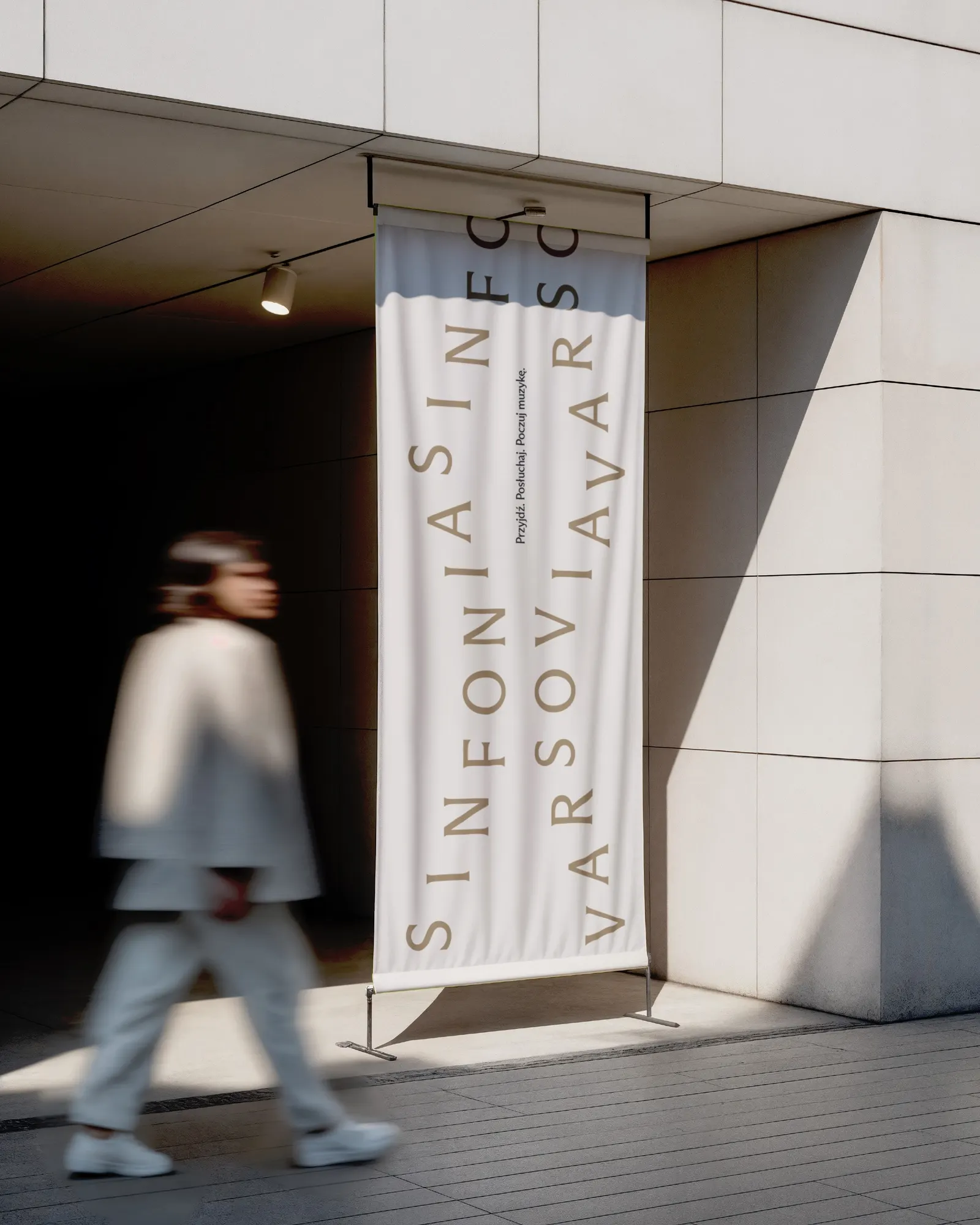
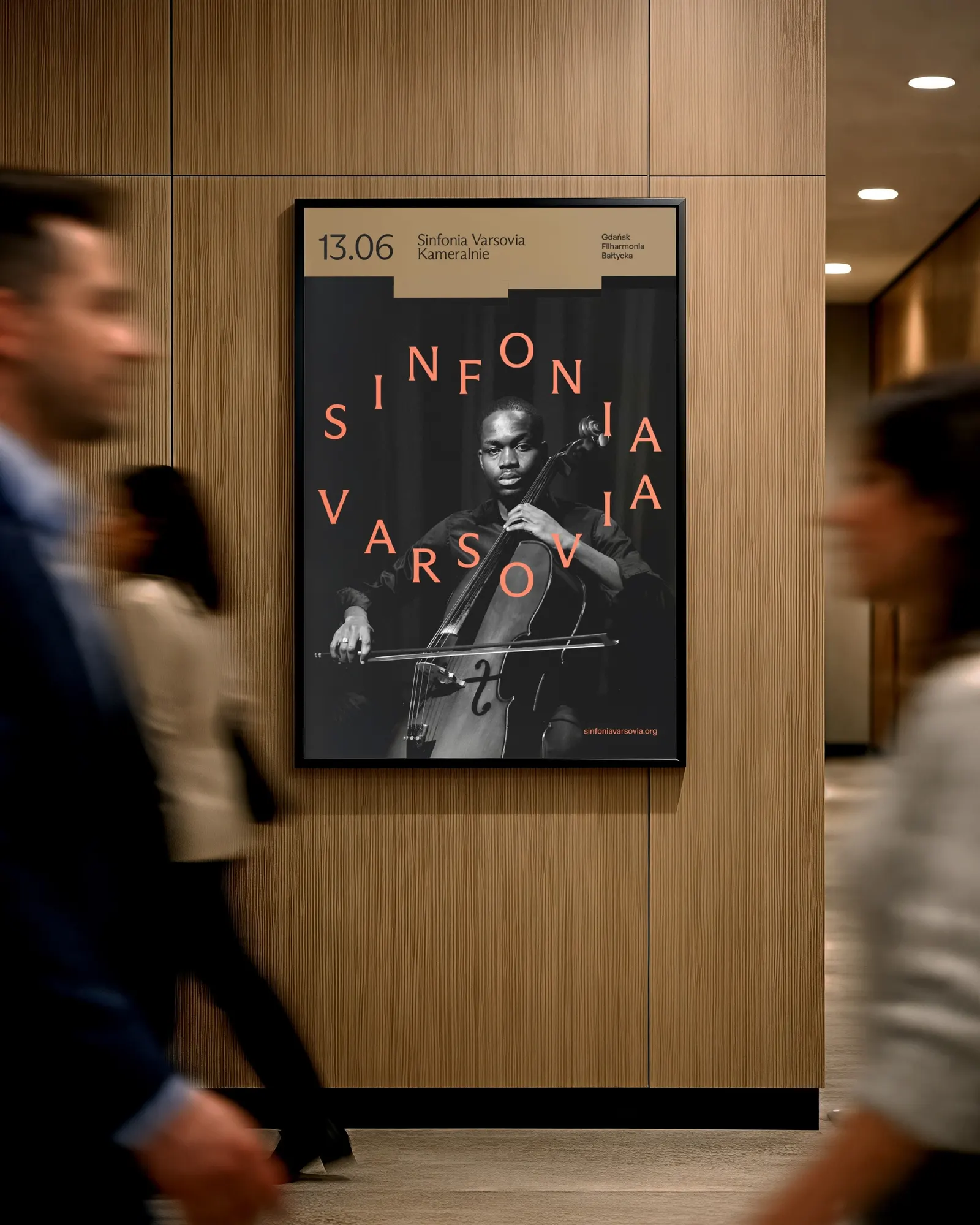
Simplified versions of the mark stretch to smaller ensembles, educational projects, and festivals. In the key visual, developed by Anna Holik and Weronika Cyganik with motion by Daniel Naborowski and Marcin Chyliński, the logo repeats into long strips, joined by a stretchy abstract shape that organizes information on the page. The project was never implemented, as the competition ended without a decision.
Why it works
Orchestra identities often borrow clefs, waveforms, or instrument illustrations. Here the name itself carries the musical idea, so nothing is imported from outside the brand. The staff makes the logo legible as a name and as notation, which suits both seasoned concertgoers and first-time visitors. Because the sub-brand versions are simplified from the same mark, a festival or school program feels related without being a copy. A fixed core with controlled variation also means the flexibility reads as intentional, never as drift.
Logo

Applications
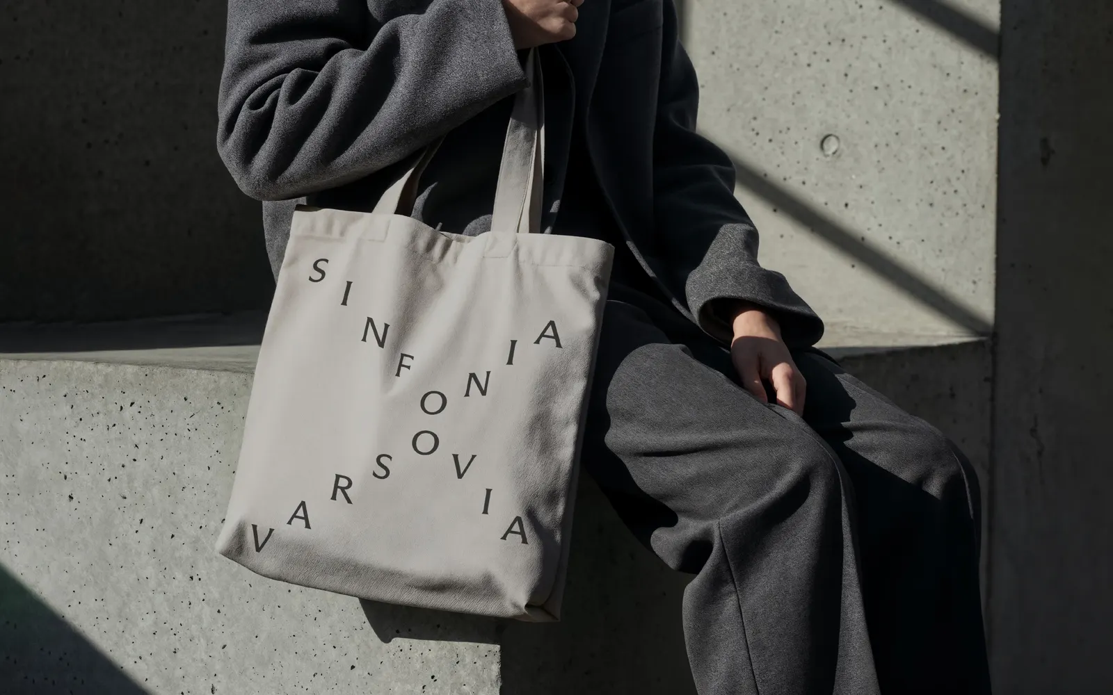
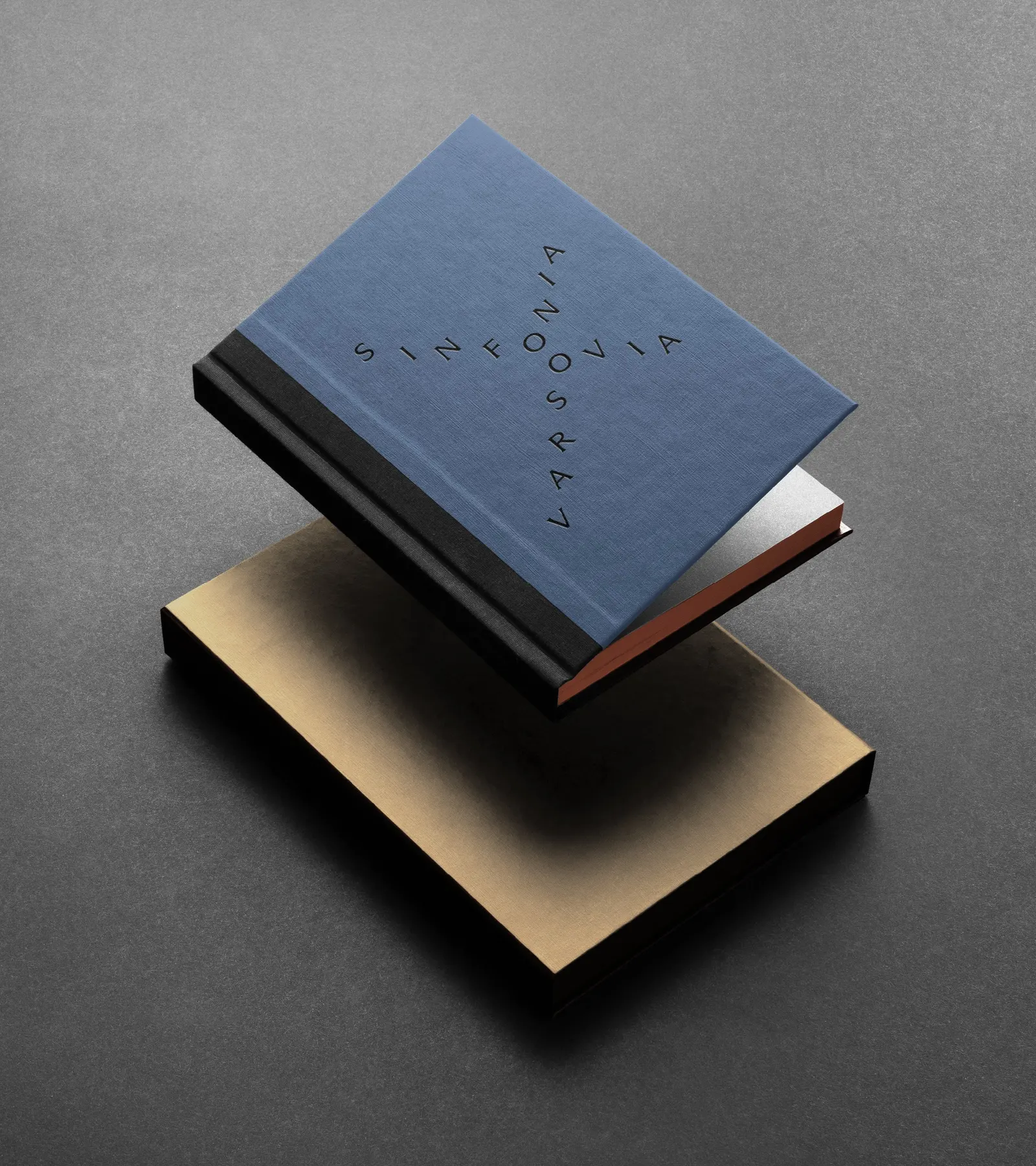
Images and video from tofu.pl, by TOFU Studio.