The Brand Monograph
MLB brand identity by Mother Design
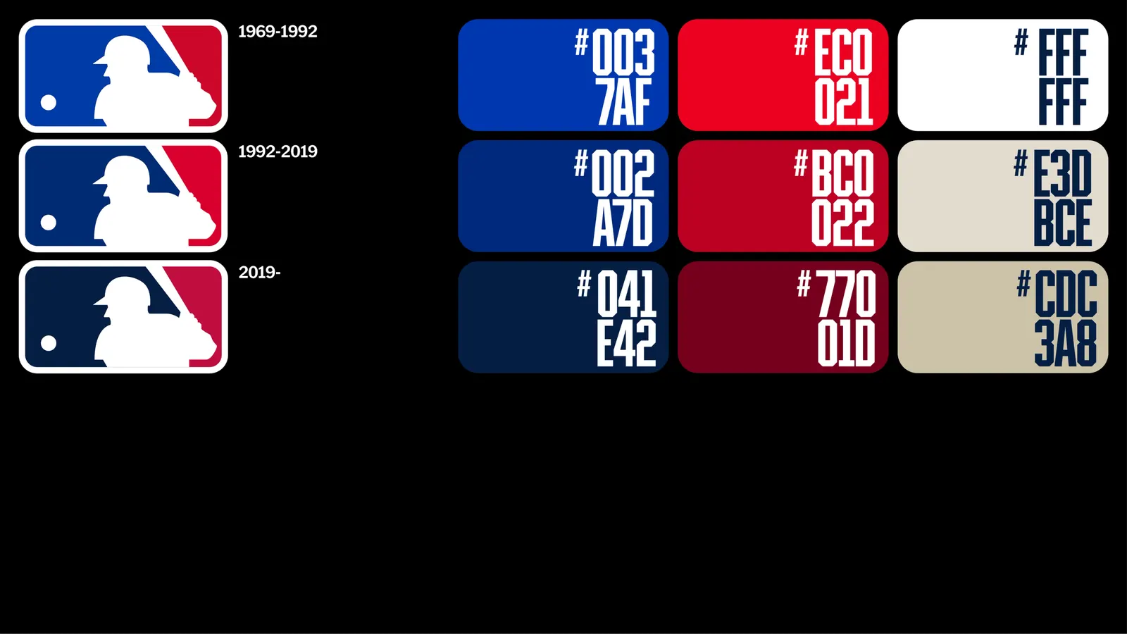
↗Mother Design left the one element nobody would dare touch, Jerry Dior's 1968 batter silhouette, exactly as it was, and rebuilt Major League Baseball's identity around it. The brief arrived as the league was changing its rules and courting a younger audience. Rather than replace baseball's visual history, the studio mined it, and it adjusted the wordmark so it sits comfortably within the new system.
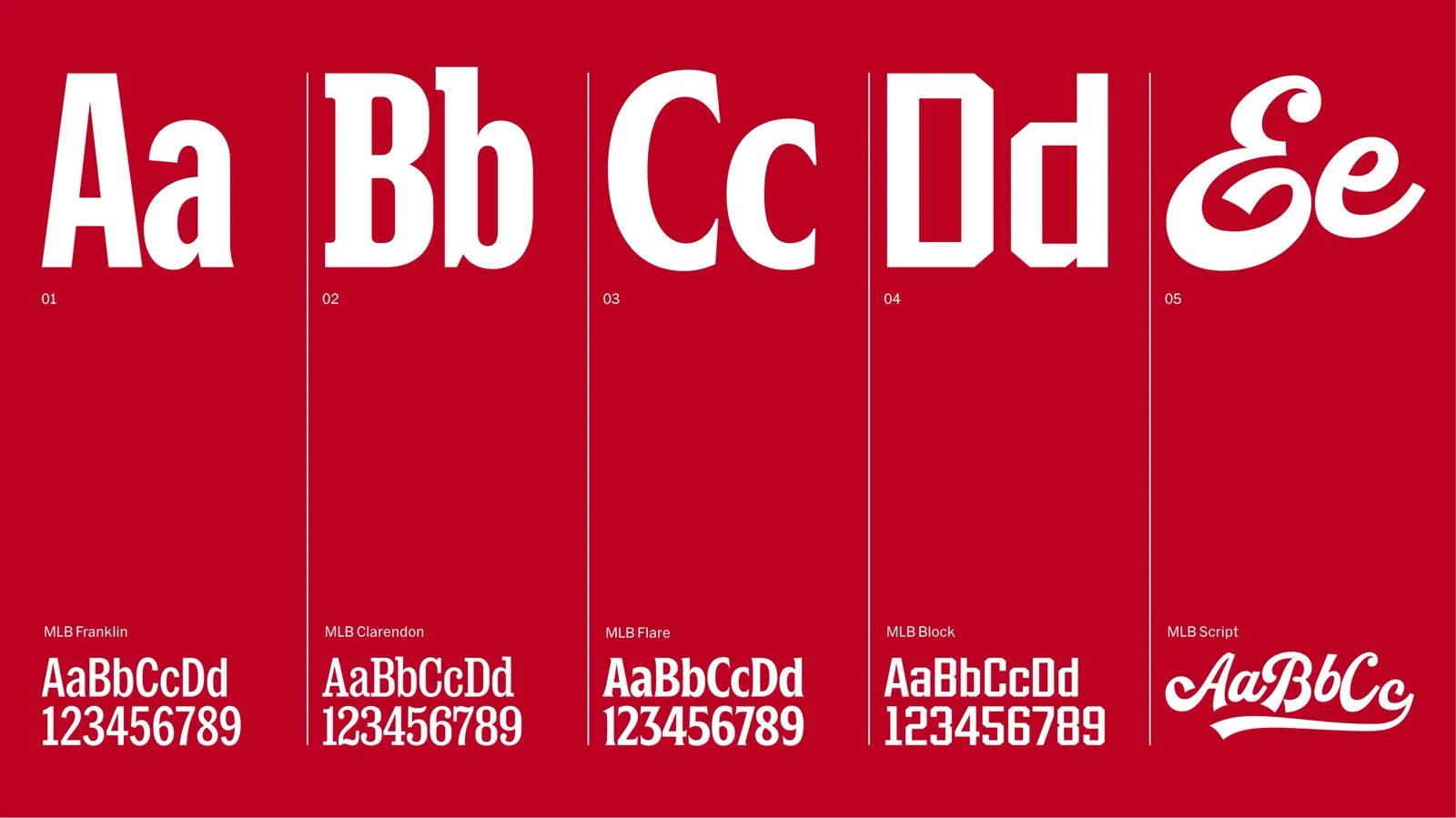
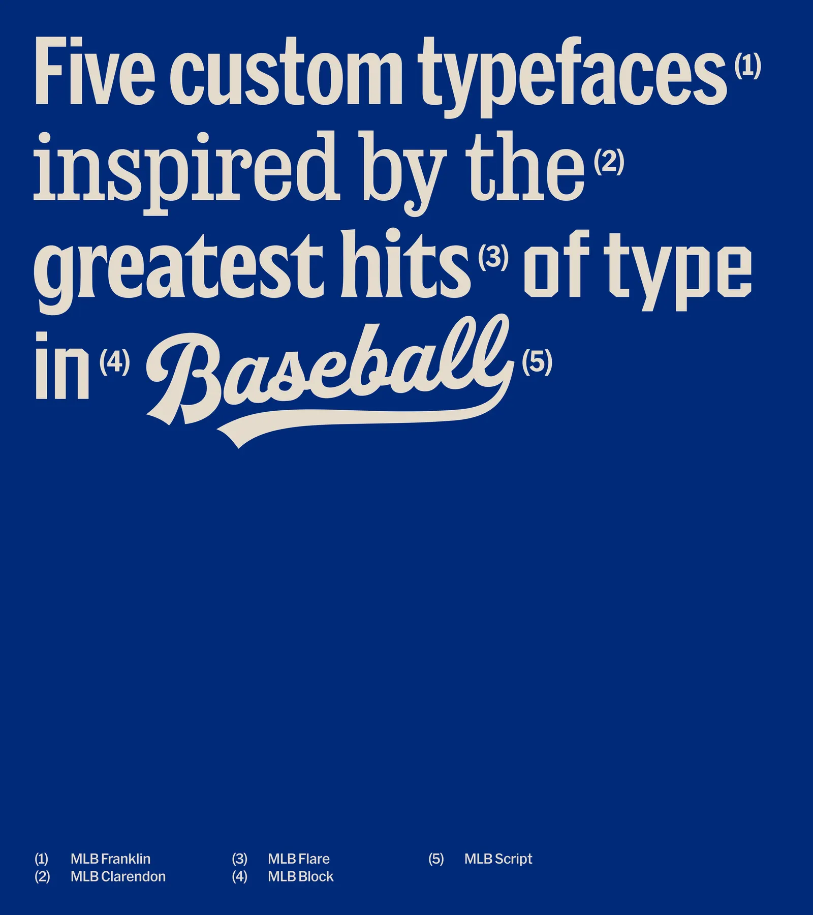
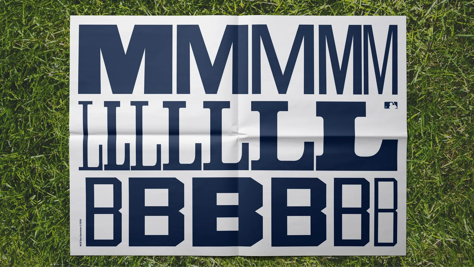
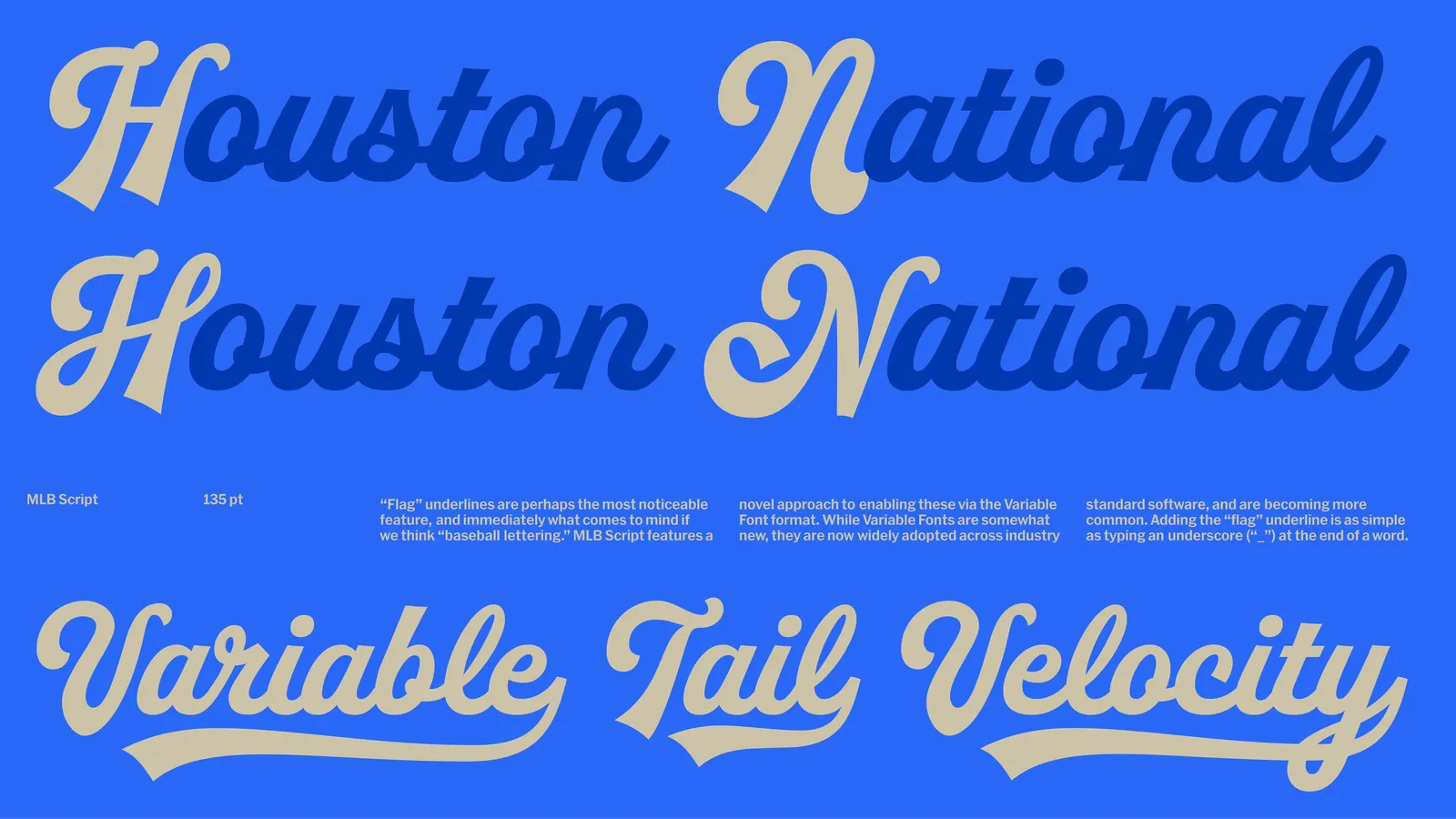
The craft is in the details. Five custom typefaces, each referencing lettering from the game's past, were developed with Nick Sherman, David Jonathan Ross, Bethany Heck, OH no Type Co., Skye Dillon, and Tipotype. Color runs in three tiers, from a restrained base to vivid hues distilled from club palettes. Graphic devices come from home plate, base lines, scoreboard rules, and the field seen from above. A brand matrix then sets how plain or expressive each sub-brand should look.
Why it works
Keeping the batter mark gives the league a fixed anchor, which frees everything else to move. The type suite does the heavy lifting: five voices drawn from real baseball lettering let MLB feel specific to its sport, not like another sports brand in generic italics, while still stretching from a ticketing app to a commemorative event. The matrix may be the most useful idea. It admits that utility and culture shouldn't be equally loud, and it gives internal teams a clear rule for deciding how far to push.
Logo

Typography
Applications
Images and video from motherdesign.com, by Mother Design.