 The Brand Monograph
DP World brand identity by Further
↗Ports and shipping rarely get a brand that feels like it's in motion, which is why Further's work for DP World deserves a look. The studio started with a company made up of many businesses and brands, and an ambition to make global trade simpler. Further merged them into one offer and anchored it in a purpose about DP World's effect on people, places, and society.
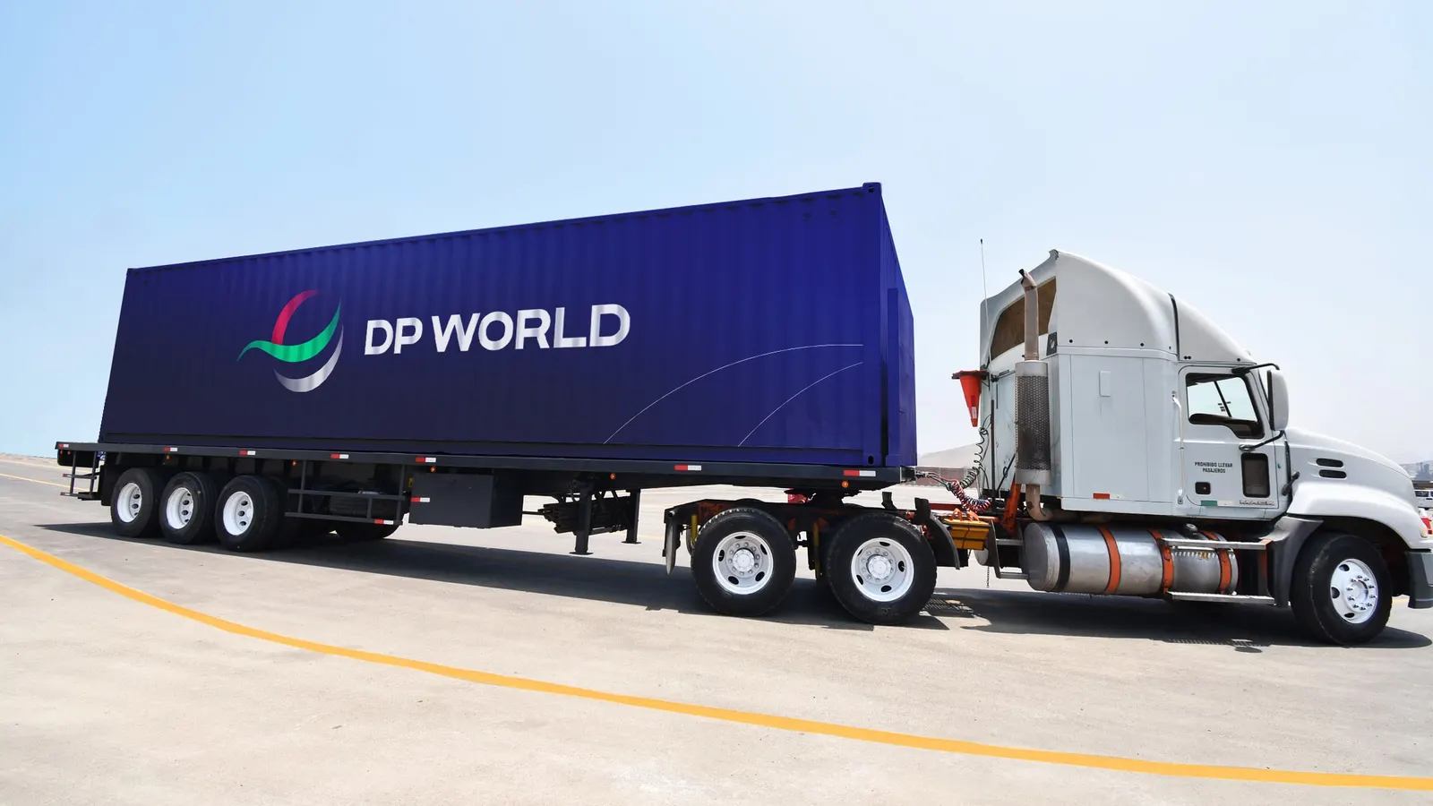
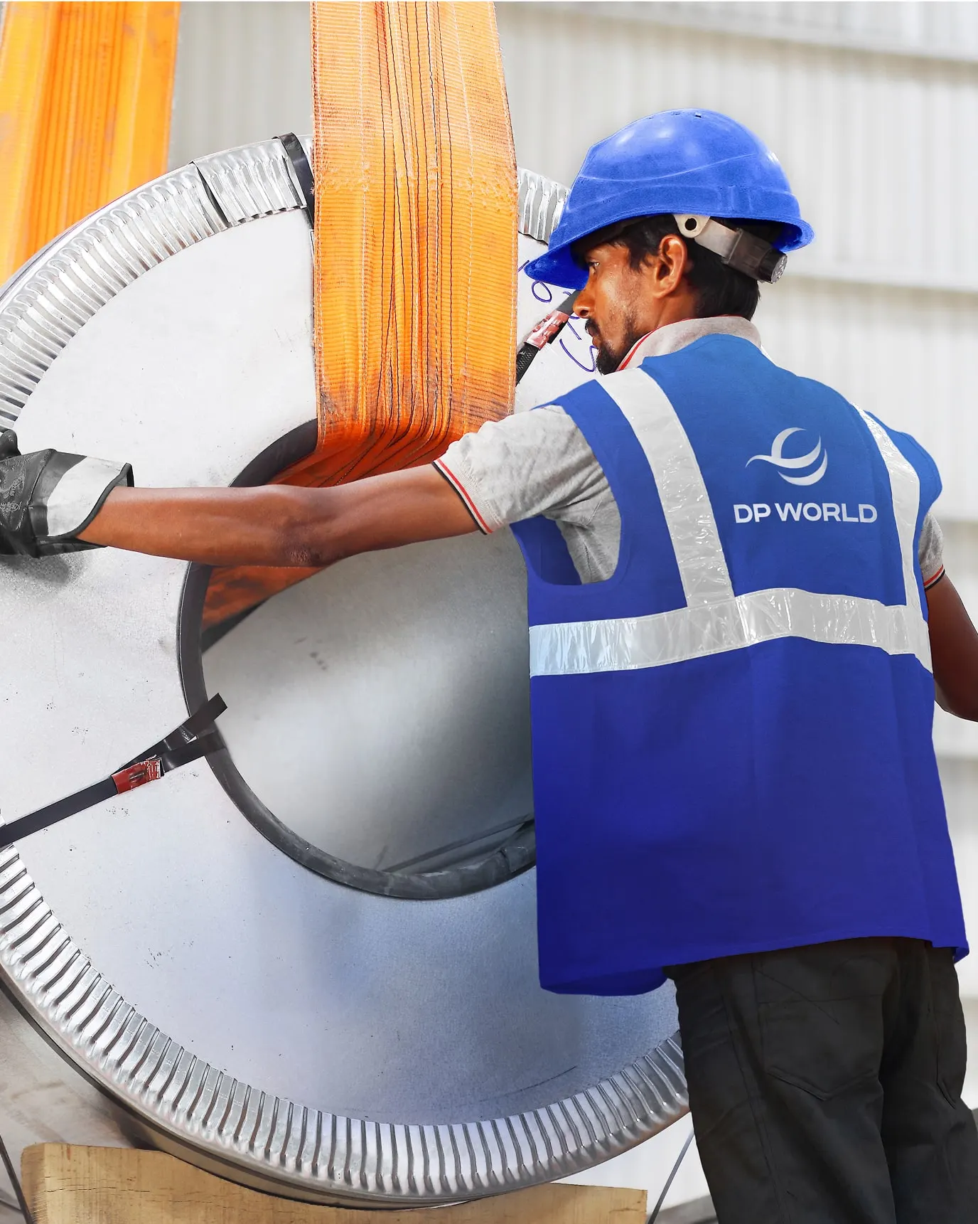
The identity is built on flow. A fluid symbol leads, backed by confident type developed with Nadine Chahine, gradient-rich color, and abstract 3D worlds that each take cues from a different service. Icons, illustration, art direction, tone of voice, and motion follow the same logic, with sound design by father. A digital system carries it into environments and livery across 6 continents, 40 countries, 80 ports, and hundreds of vessels, vehicles, and machines.
Why it works
Flow is an easy word to claim and a hard one to show, and this system earns it by making movement a rule rather than a decoration. Soft gradients and a fluid mark give a business built on heavy, fixed assets a lighter, more approachable feel, which sets it apart from category peers that default to industrial seriousness. The 3D worlds give each service a recognizable place in the brand, so a prospective partner can find their way in without decoding a corporate structure. And because everything shares one logic, it can sit on a ship, a crane, or a screen and still look like the same company.
Logo

Applications




Images and video from further.group, by Further.


