The Brand Monograph
TUI brand identity by Further
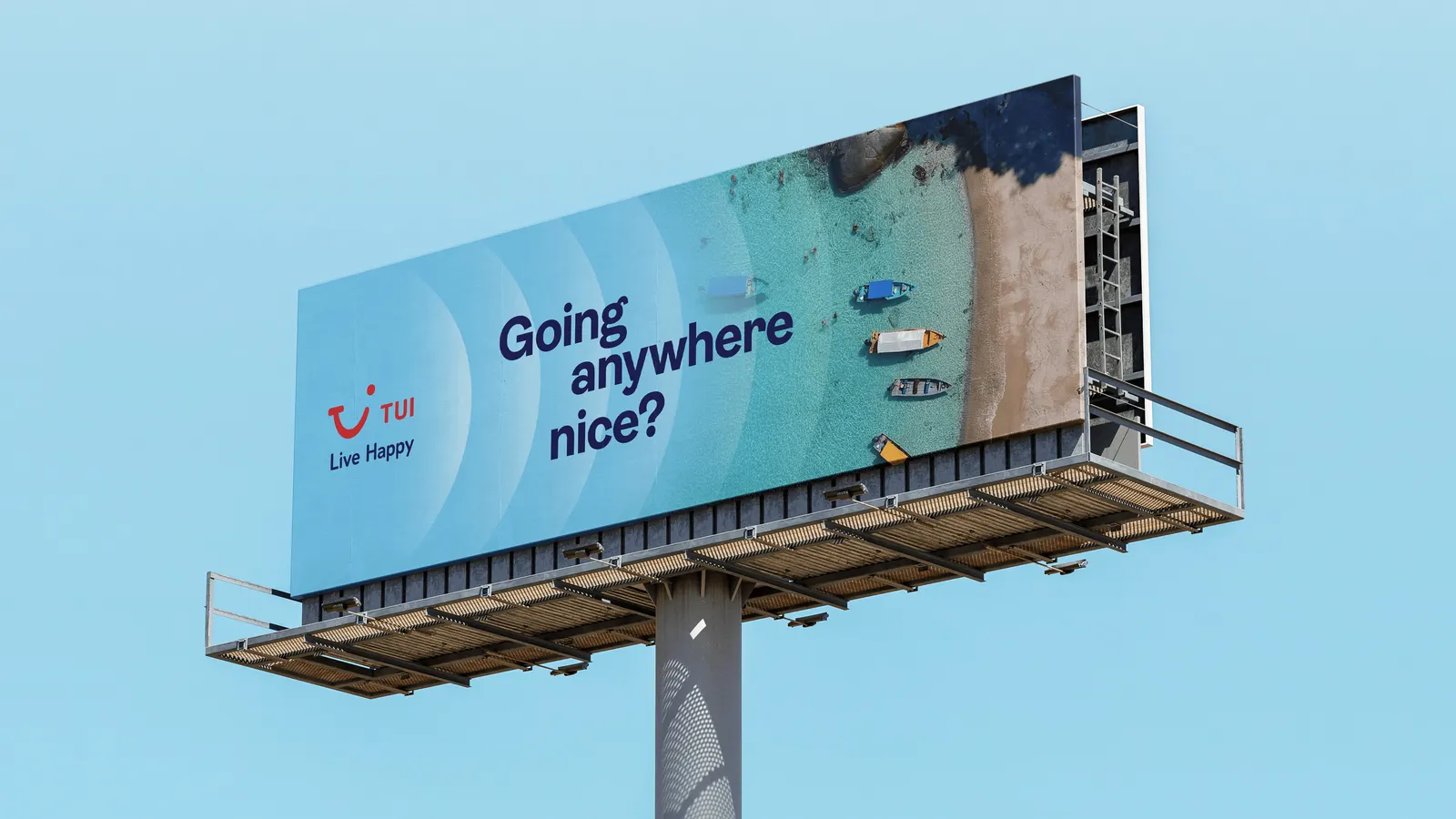
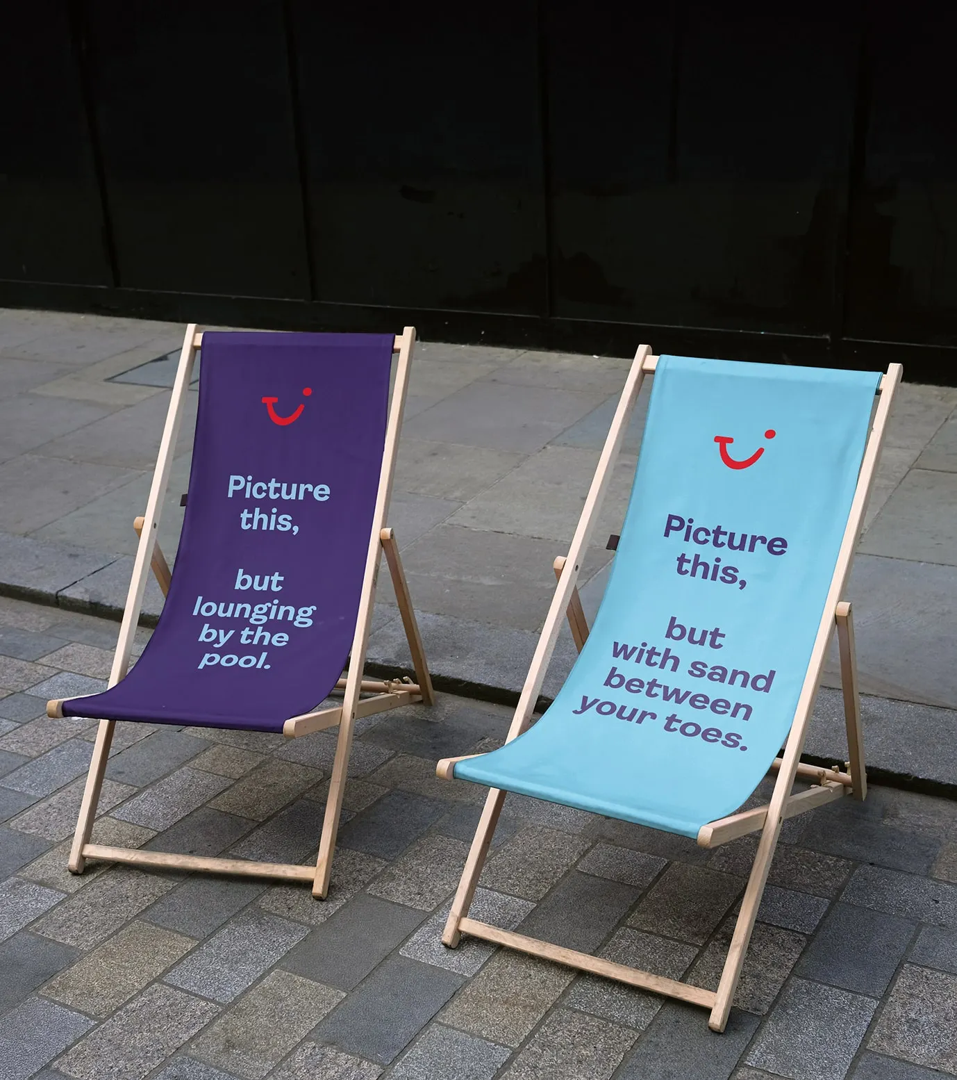
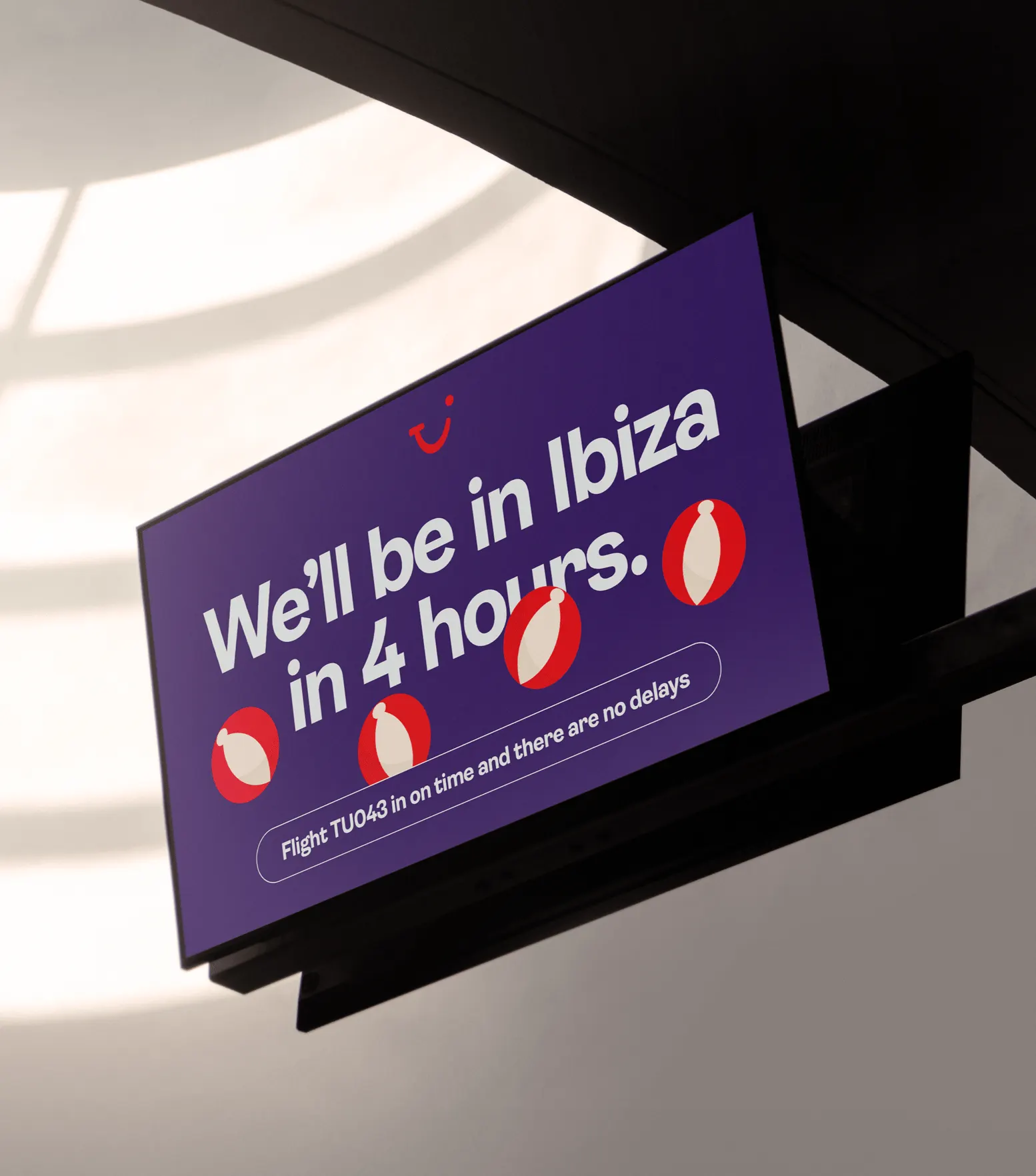
↗What stands out in Further's work for TUI is how far the smile travels beyond the logo. The brief arrived as travel rebounded after the pandemic: TUI wanted to be seen as a modern leisure brand rather than a traditional holiday provider, and to connect with a newer generation of travellers. Further responded with strategy, brand architecture, and an identity in which the smile's curves shape a ripple motif that moves through out-of-home, banners, and broadcast.
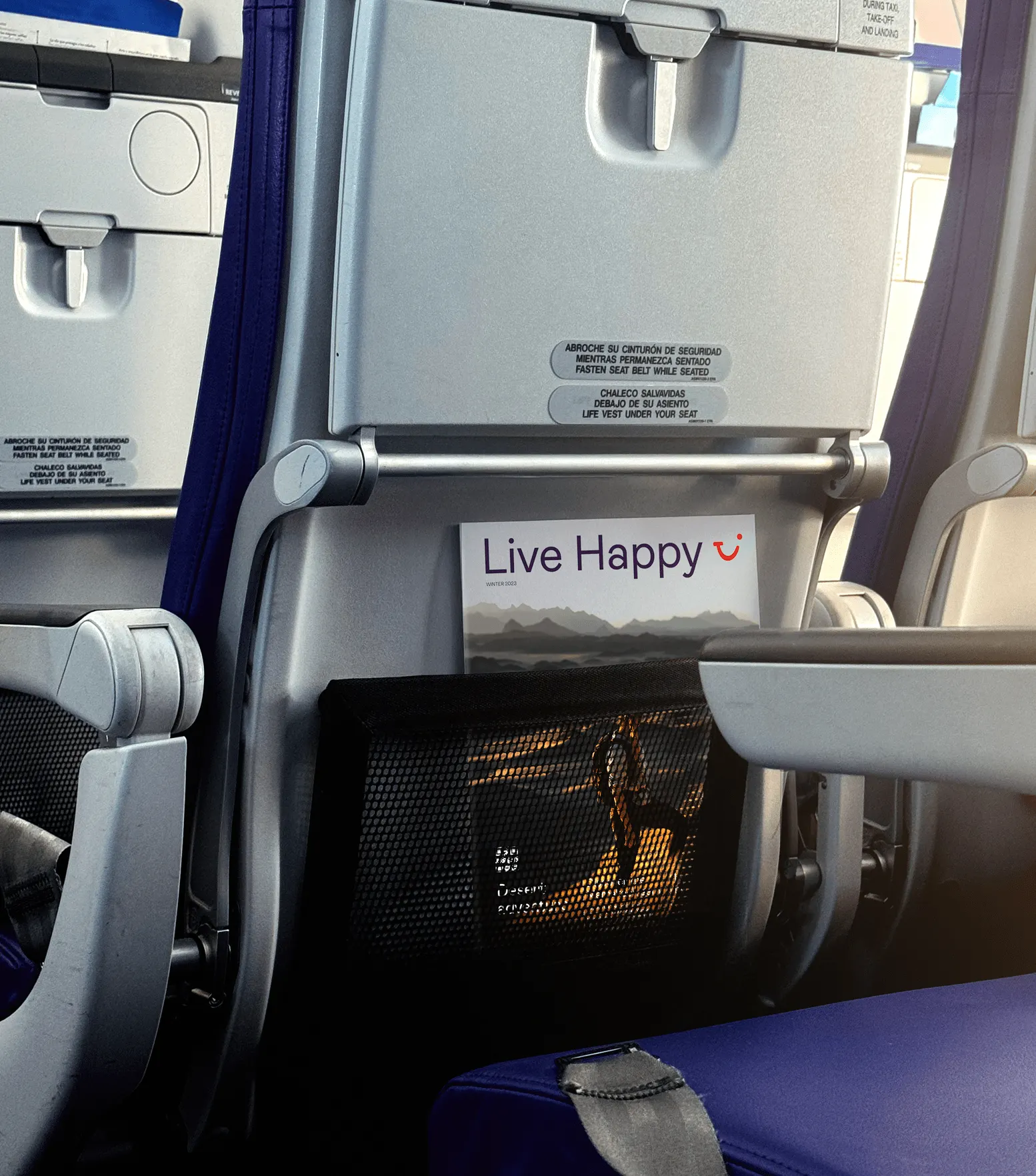
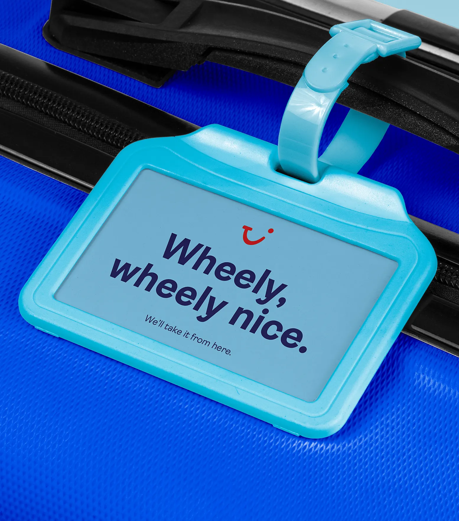
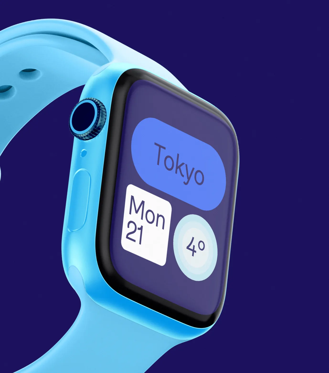
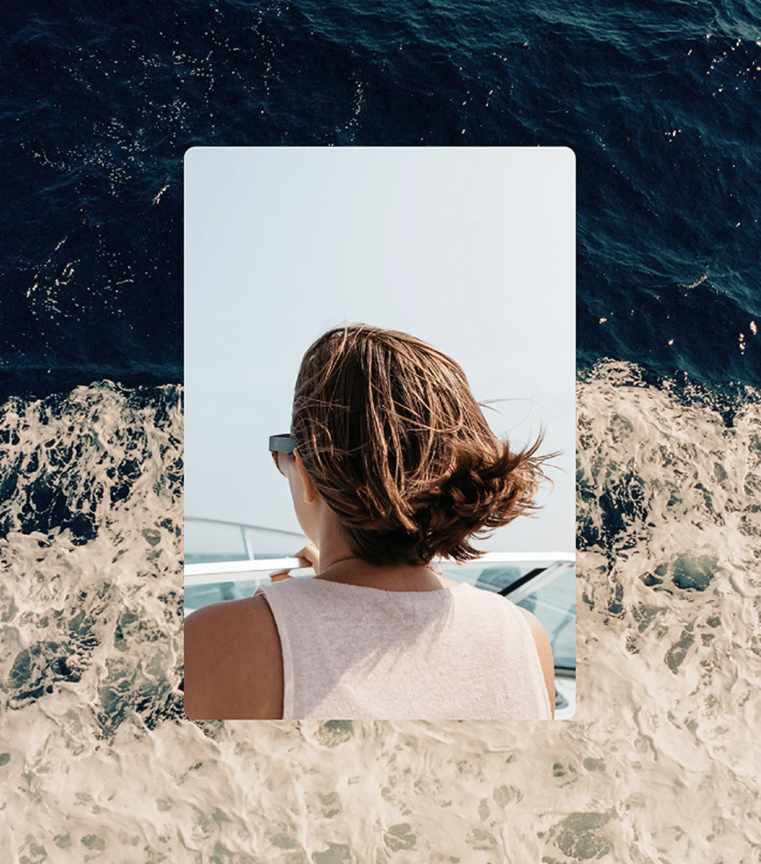
The toolkit has kept growing since. It now includes a simplified palette, a bold typeface chosen for warmth and clarity, art direction, motion, and an illustration style developed with Double Slice. A global digital design system carries the same curves into the interface, so every market feels related. Further continues to work with TUI, including on its first standalone luxury hotel proposition and refreshes of sub-brands such as TUI Blue.
Why it works
Travel branding tends to default to sun-soaked photography and interchangeable sans serifs. TUI's mark is already a gesture rather than a picture, and gestures scale. Turning that gesture into a repeating ripple gives the brand one simple, ownable move that holds up across a poster, a broadcast spot, and a booking screen. The restrained palette and confident type keep a huge, multi-market business clear and consistent, while the curved UI details stop the digital product from feeling like a generic booking engine.
Applications
Logo
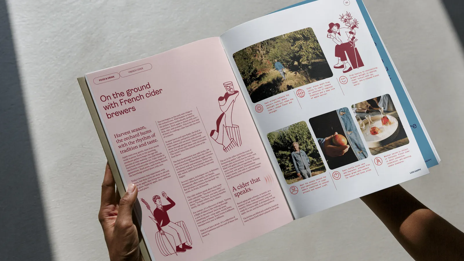
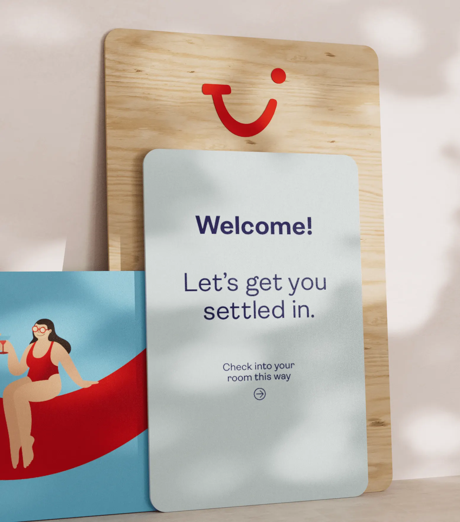
Images and video from further.group, by Further.