The Brand Monograph
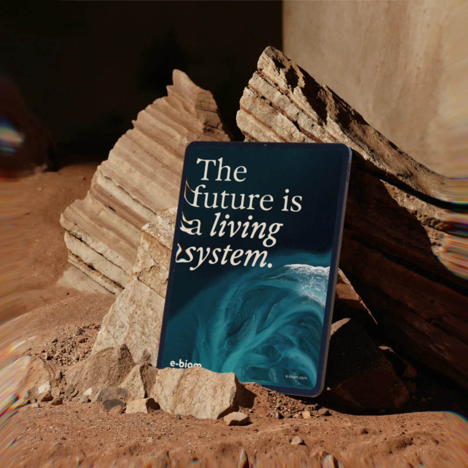
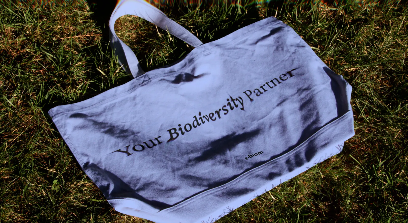
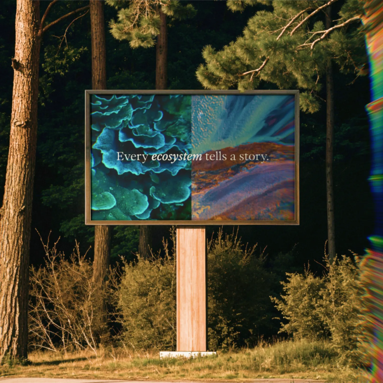
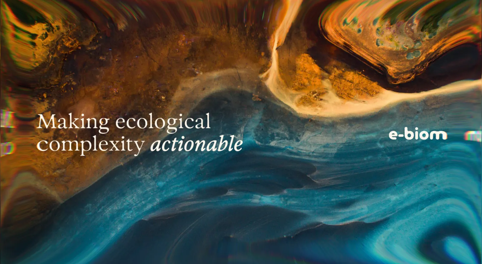
E-BIOM brand identity by Nemesis
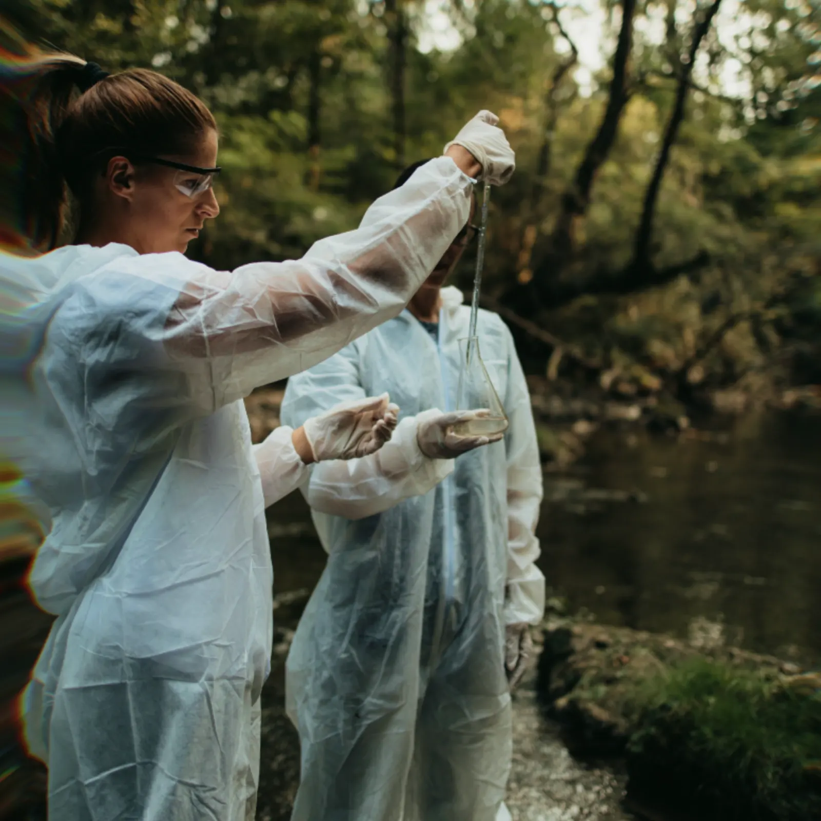
↗Few young science companies have to explain themselves to as many different audiences as E-BIOM. A spin-off from a university lab, it reads DNA in environmental samples to chart which species live where and what risks a site carries. Its work ranges from spotting endangered species to helping developers see permit restrictions coming, and it even helped the Belgian government track COVID-19 through wastewater in near real time.
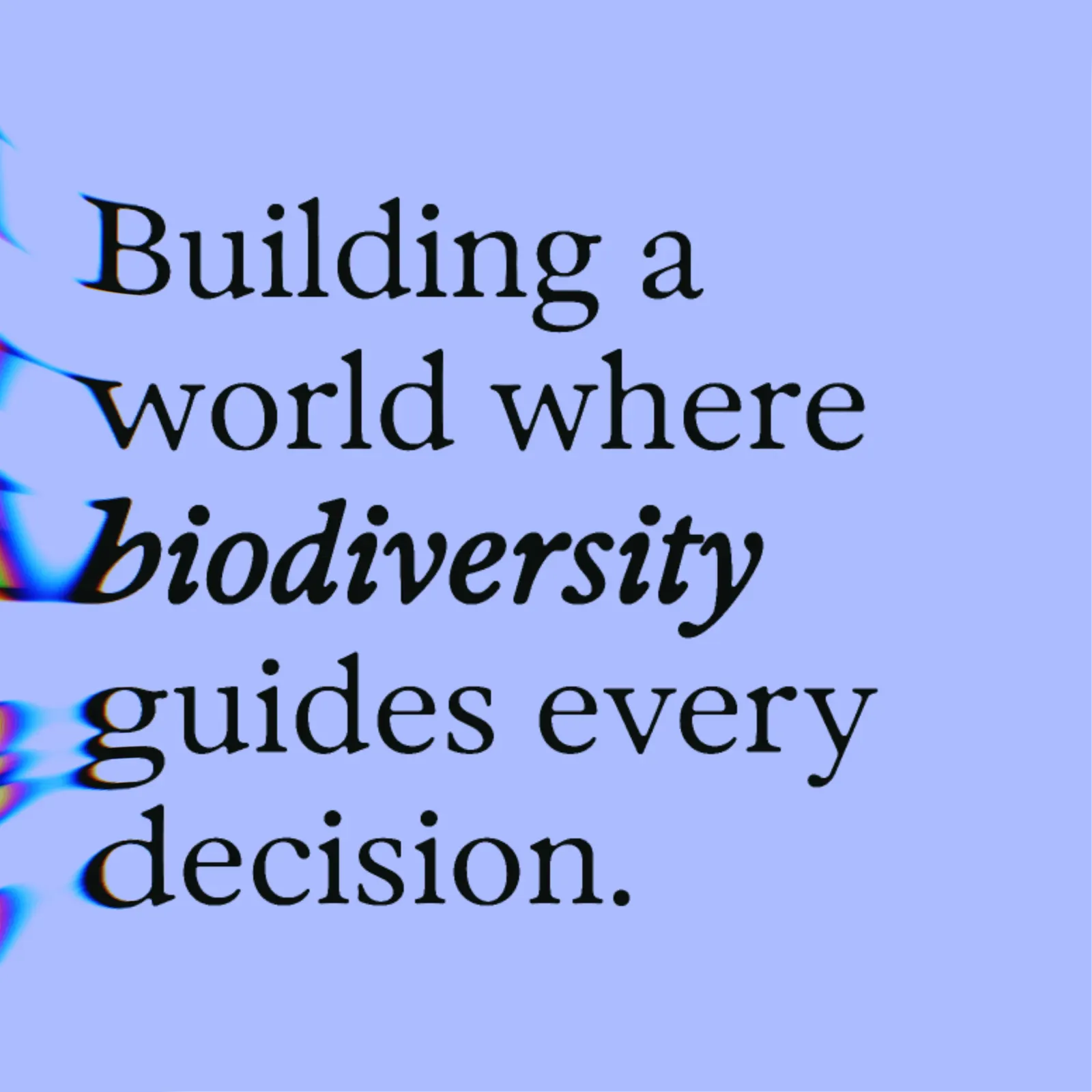
For the brand, Nemesis anchored everything in a single belief: organizations act more wisely when knowledge of the living world is part of how they plan. It's a position rather than a product list, so one identity can speak to a developer, a public authority, and a scientist without changing its story.
Why it works
Our read is that the strength lies in what the studio chose to make the brand about. Genetic sequencing is hard for outsiders to picture, and companies in this field often default to describing their method. Nemesis centered the outcome for the client instead, which gives non-scientists a reason to care and a role to play. That one idea stretches from a wastewater study to a permit application without feeling forced. It also moves E-BIOM past its academic origins toward a more commercial register, while the range of its work keeps the scientific credibility intact.
Applications
Logo
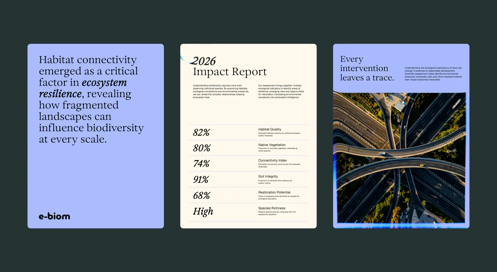
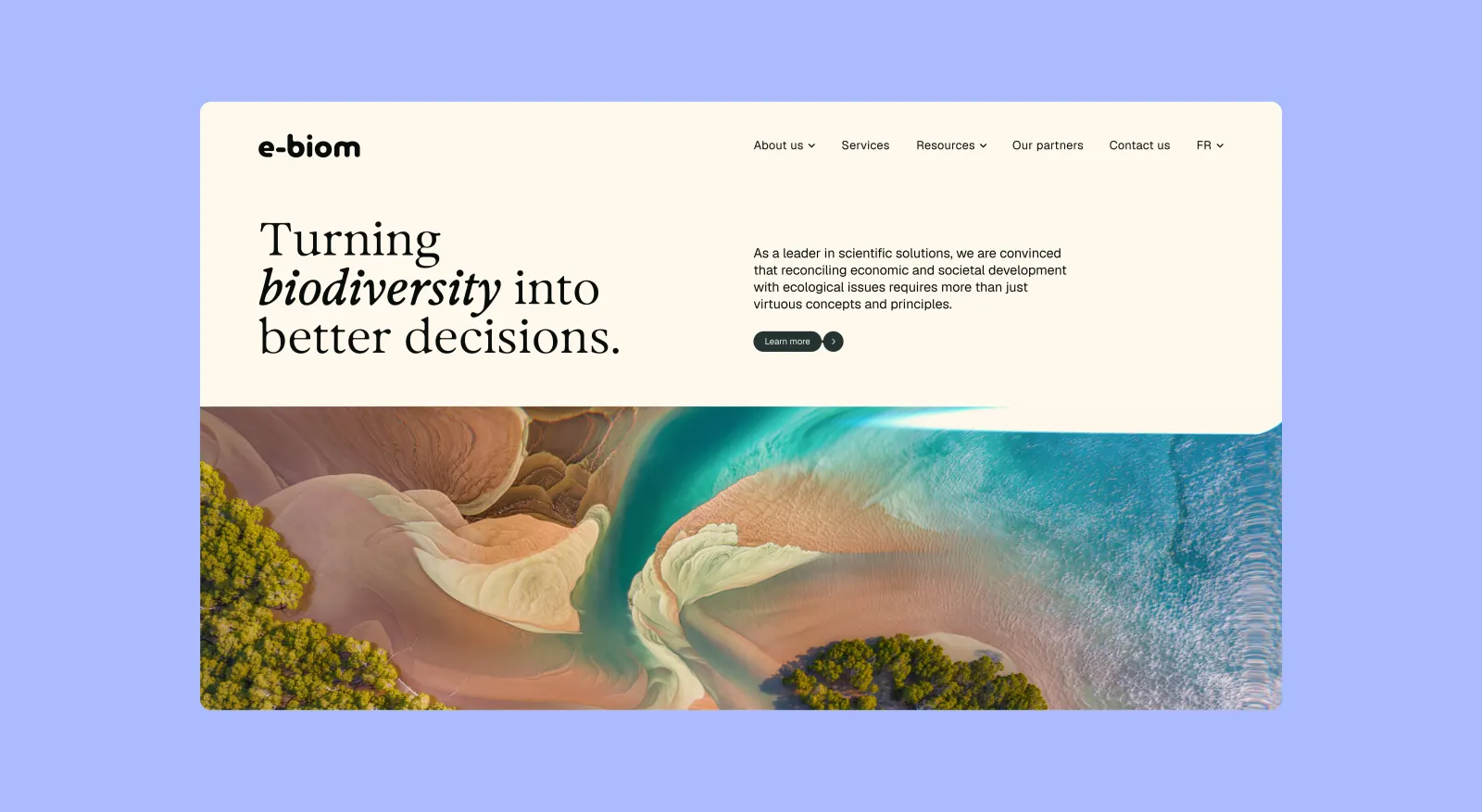
Typography
Images and video from nemesis.studio, by Nemesis.