The Brand Monograph
Faculty brand identity by Koto
↗Few AI companies look like they build things for a living. Koto's identity for Faculty, the UK team behind applied AI work that ranges from crisis response to clean energy capture, does. The studio's task was to show a company that pushes the technology forward and also puts it to work, and it treated those as one stance rather than two.
That stance lives in the threshold, a flexible graphic device at the center of the system. Around it, Koto built a restrained palette, custom typography, a generative tool for making new brand moments, and layouts borrowed from editorial design. The voice is practical but weighty. With Planes handling development, the website carries the editorial approach through bold, textured type, and the same language runs into internal templates and printed publications.
Why it works
AI branding often defaults to glossy abstraction, which makes everyone look alike. Faculty's identity avoids that by leaning on publishing conventions. Textured type adds a tactile, human quality, and editorial layouts suit an audience of decision-makers who want ideas explained, not just announced. The threshold is a single, ownable device that can flex without losing recognition, and the generative tool lets the system keep producing fresh work without drifting. Together, these choices make Faculty look like an authority.
Applications
Logo




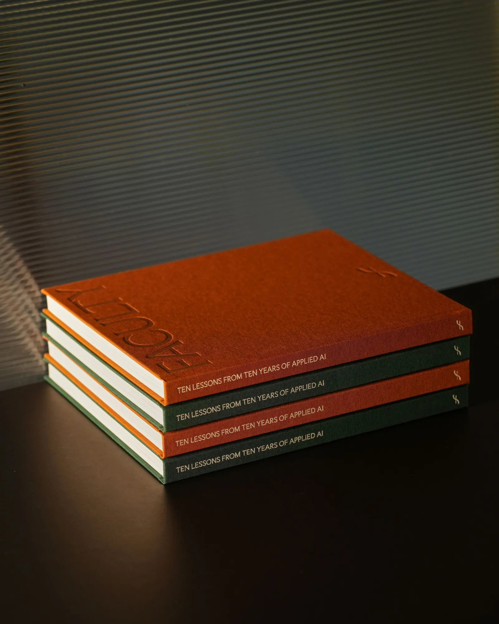
Images and video from koto.com, by Koto.