The Brand Monograph
Folger Shakespeare Library brand identity by Pentagram
↗Most cultural identities start with a logo. Pentagram's work for the Folger Shakespeare Library started with a line of stone lettering: the Art Deco inscription at the foot of Brenda Putnam's Puck statue. The timing was a renovation by KieranTimberlake that added the Adams Pavilion and put more of the collection, including all 82 First Folios, in public view.
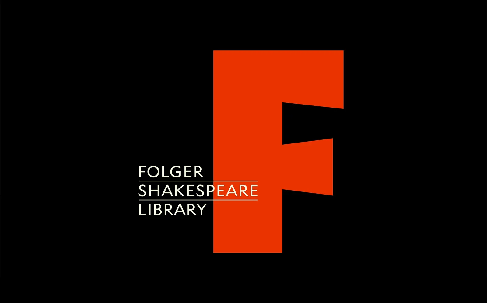
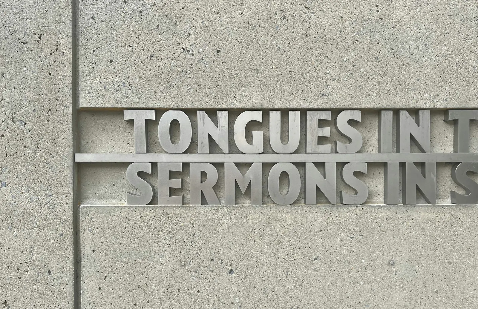
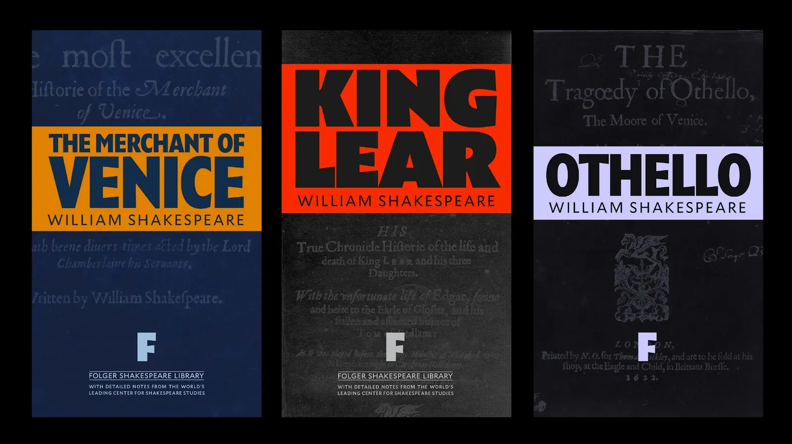
With Tobias Frere-Jones, the studio turned those letters into Puck Headline, a custom display face built from his Mallory, with the feel of old broadsides and playbills. It pairs with Optimo's serif Practice, and the "F" becomes the mark. The red, with a trace of orange, comes from the First Folios. Outdoors, faceted silver letters nod to Paul Cret's aluminum ornament, and a poem by Rita Dove is cut into curbing made from marble saved during excavation.
Why it works
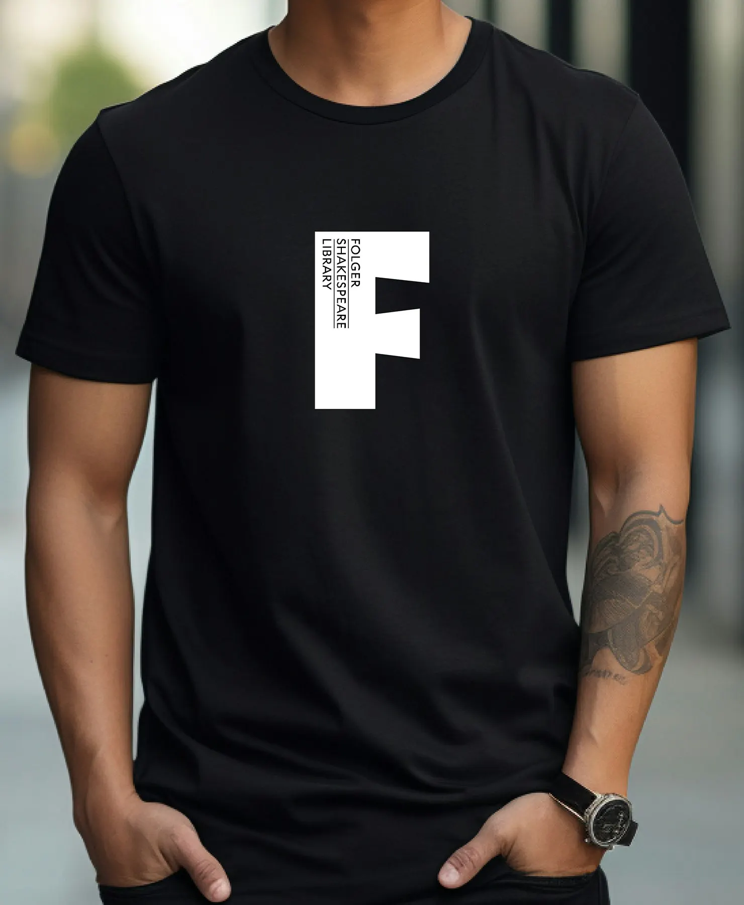
The starting point is a detail most visitors would walk past, which makes the identity feel specific to this building rather than to Shakespeare in general. The display type brings theatrical energy, while the serif and the paper-white and black palette keep it credible for scholars. A single-letter mark holds up on a playbill-style poster and on a wall of lettering. The warm red also sets the Folger apart from the muted tones many libraries default to.
Applications

Logo



Images and video from pentagram.com, by Pentagram.