The Brand Monograph
Museo Casa Kahlo brand identity by Pentagram
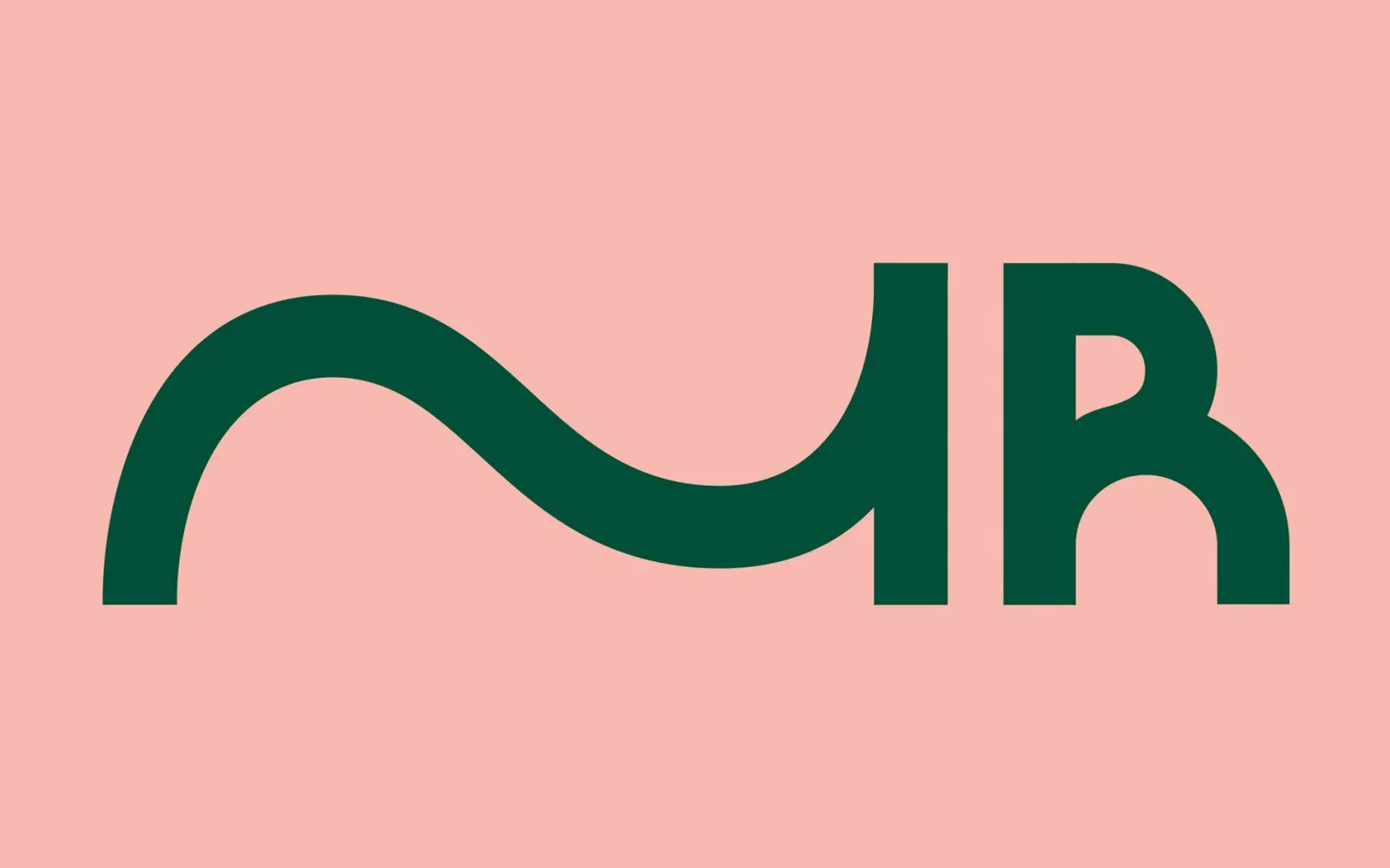
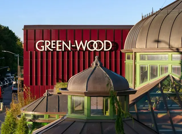
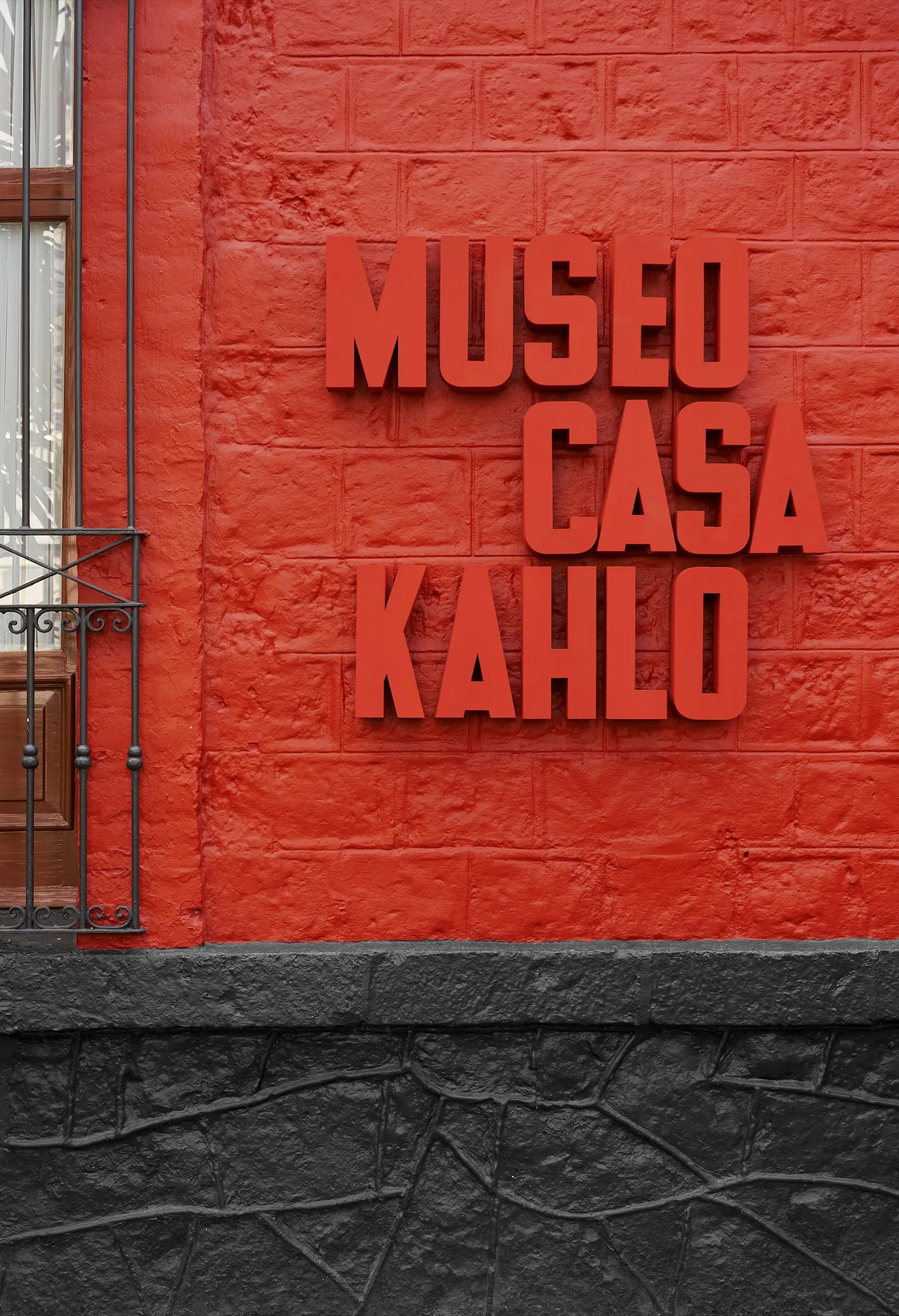
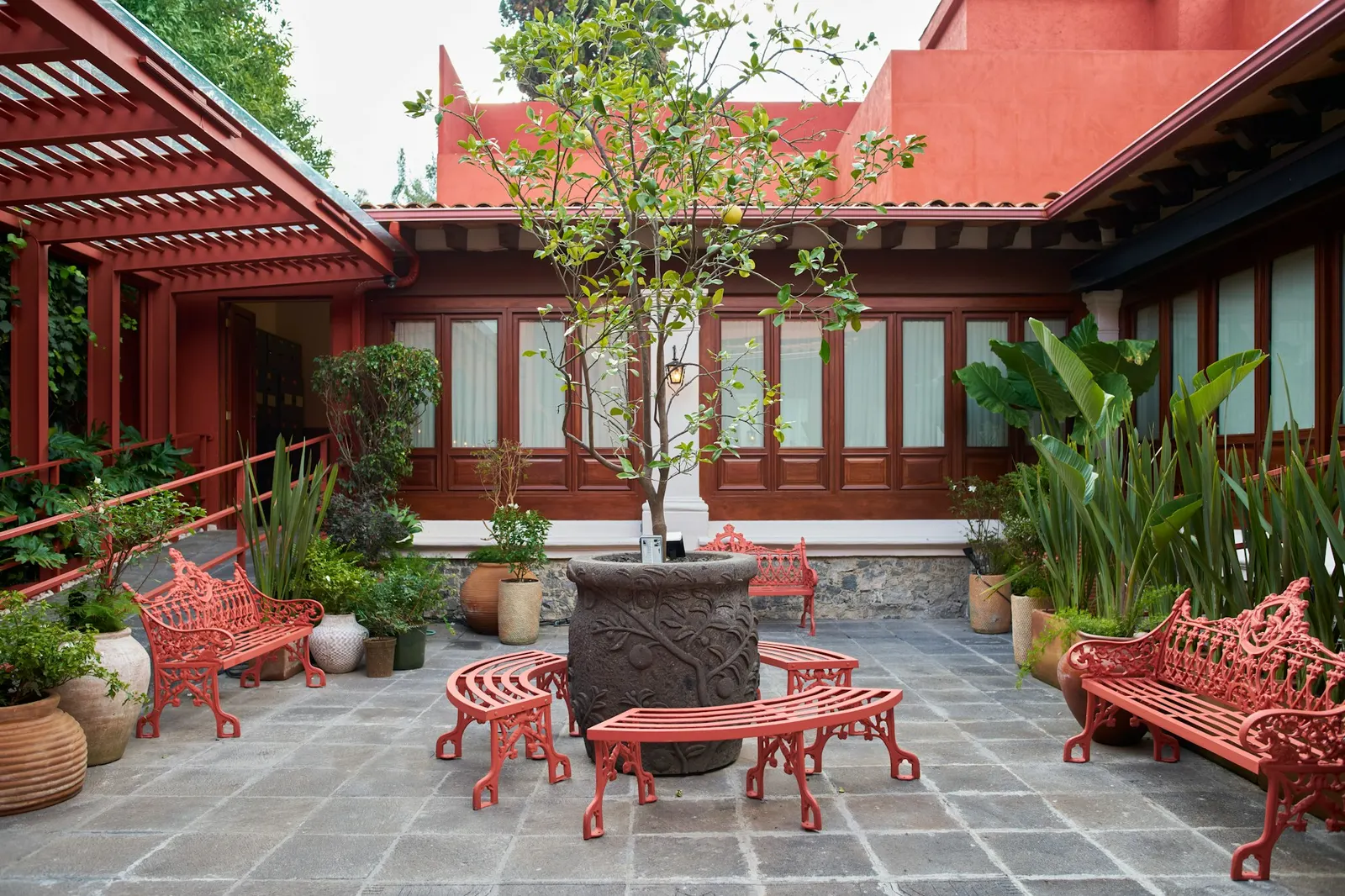
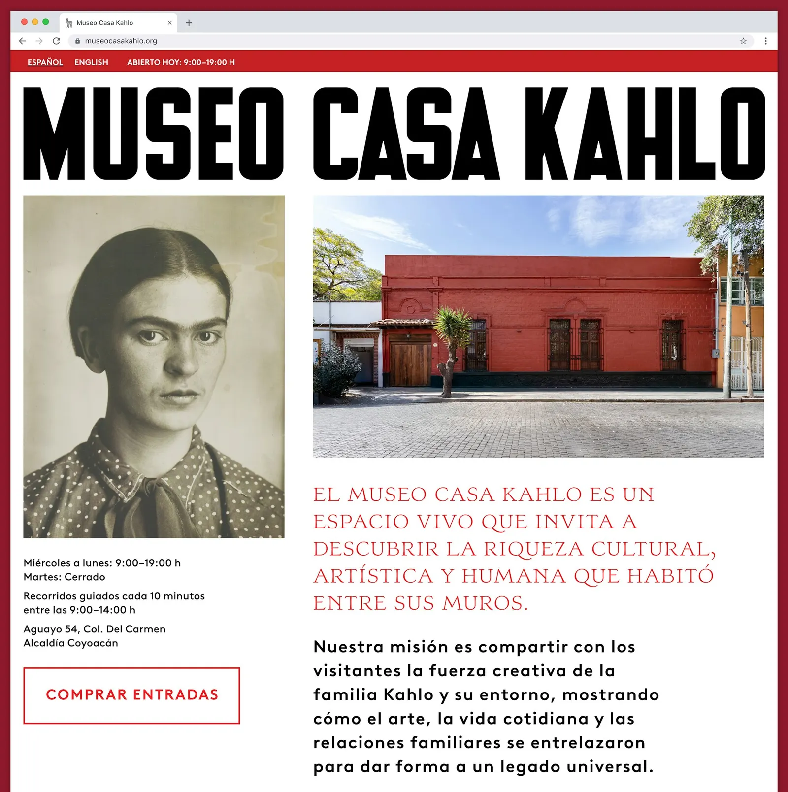
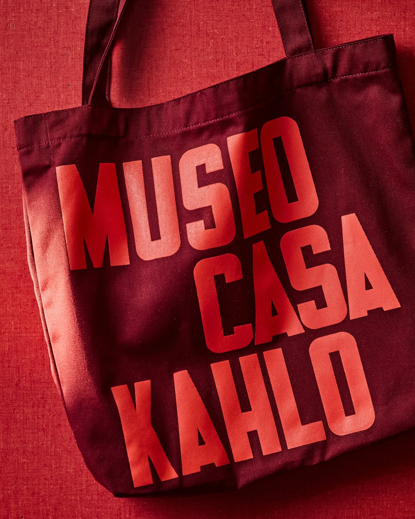
↗Most artist museums lead with the artist's famous work. Pentagram's identity for Museo Casa Kahlo leads with her handwriting. The museum occupies Casa Roja, the Coyoacán home of Frida's parents, a short walk from the better-known Casa Azul. Pentagram, with Abbott Miller among the designers, and type designer Connor Davenport turned Frida's own lettering into a typeface. They paired it with a hand-built wordmark that nods to Mexican modernist signage.
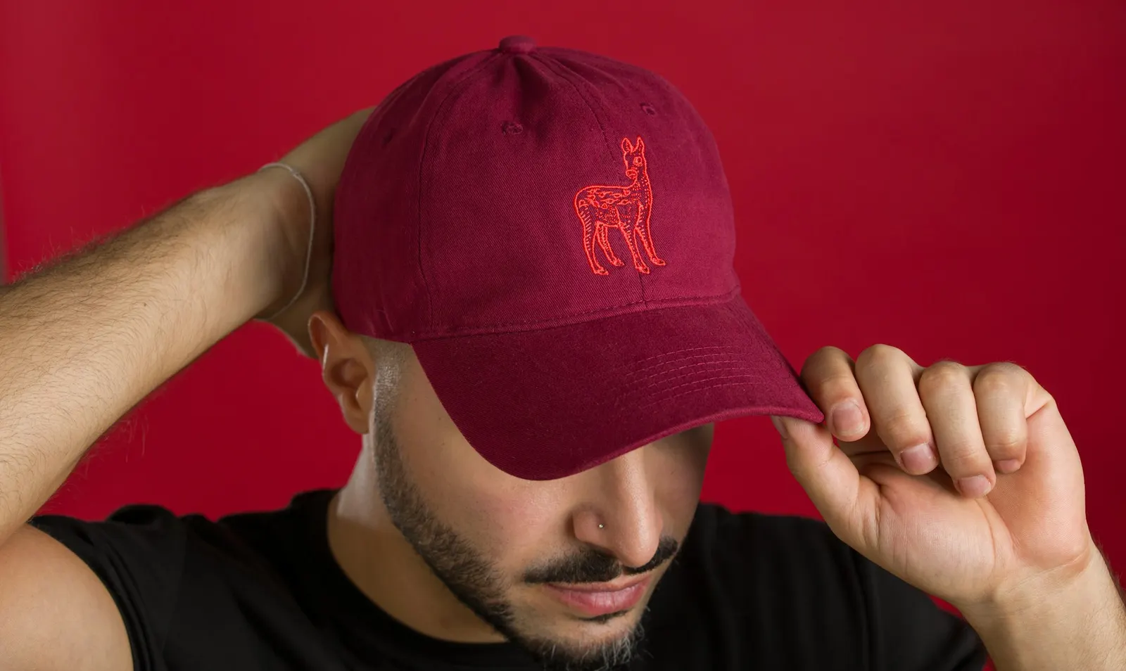
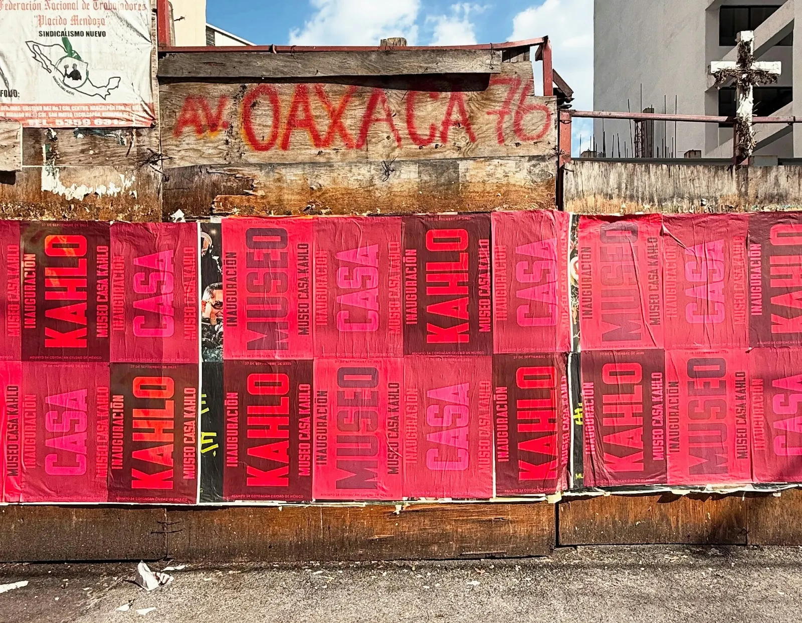
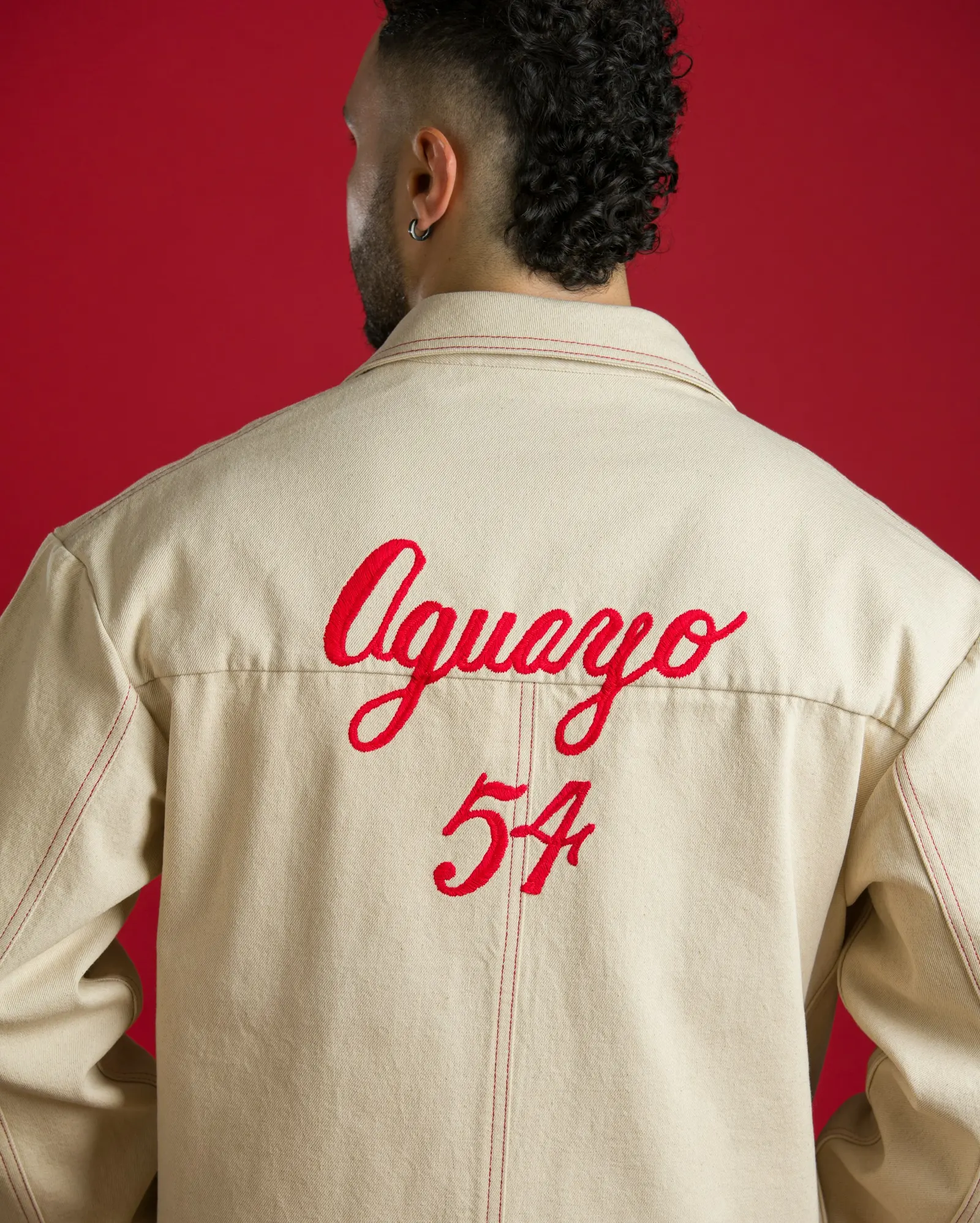
Red anchors the palette, and two small illustrated icons, a deer and a Xoloitzcuintli, stand in for Frida's pets. Inside, the graphics are woven into the rooms. Quotes are embroidered on curtains, and a projection in the bathtub echoes one of her paintings. Promotional pieces set family portraits against the typography, and merchandise carries the icons and the street address, Aguayo 54. Pentagram developed the work with the Kahlo family, Fundación Kahlo, and curator Adriana Miranda.
Why it works
The identity gives the museum a different job from its famous neighbor. Where the blue house is a pilgrimage site about Frida the icon, red and a family-centered voice make this one feel like a household. Using her lettering for type makes every sign read like a note from someone who lived there, not a brand speaking over the house. Embroidery and projection borrow domestic materials, which keeps the graphics from overpowering the rooms. The pets and the address give merchandise something personal to carry besides her face.
Applications
Images and video from pentagram.com, by Pentagram.