The Brand Monograph
Mosaic Rooms brand identity by Pentagram
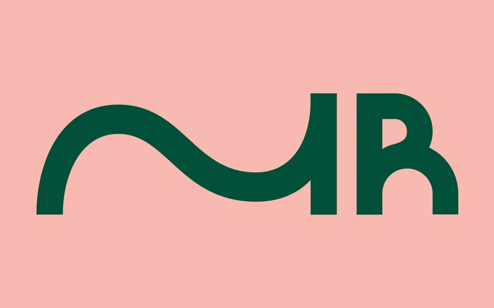
↗Most monograms try to look fixed. The one Pentagram partner Samar Maakaroun designed for Mosaic Rooms is restless on purpose: an M stretched past its usual proportions, with one straight edge and one curved, so it reads as a letter and a gesture at once.
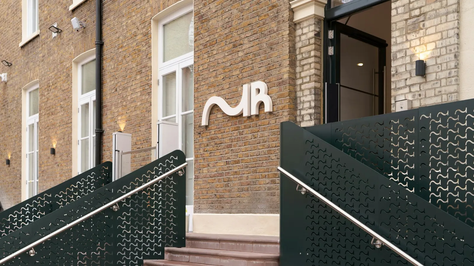
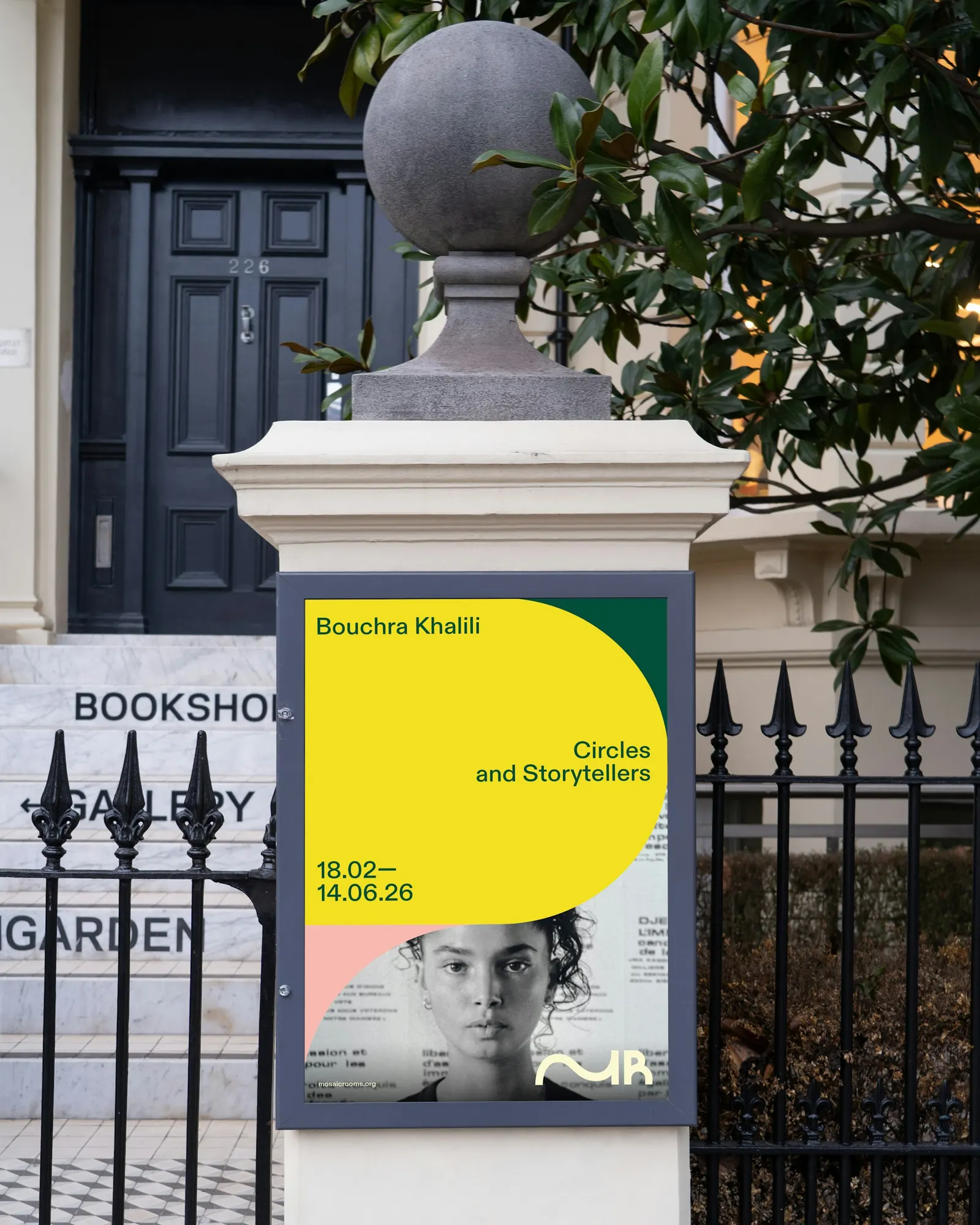
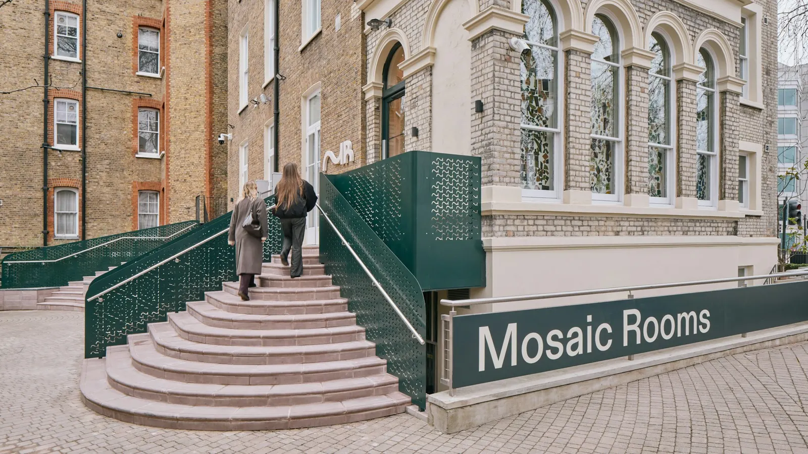
The brief arrived with the London arts space's reopening in Kensington, after a refurbishment by A Small Studio, and its change from a privately funded project to a public institution. Pentagram delivered strategy, identity, and tone of voice together. Circles stretch into ovals and interlock around the monogram, while yellow, deep green, muted yellow, and pastel pink draw on citrus, olive, and light. Sayeed Islam handled motion, Andy Stagg photography, and David Ormondroyd copy, so the movement carries into image and language. The system runs from website to signage.
Why it works
The restraint is what makes it work. Keeping the M simple and the surrounding forms fluid gives the institution one steady anchor and plenty of room to vary, so the mark stays recognizable however the system moves. The asymmetry also makes it distinctive at small sizes. The warm palette feels welcoming and stands apart from the black, white, and gray that dominate gallery branding. The pink gives it a point of view, and it suits an audience used to being flattened into stereotypes.
Logo
Typography
Applications
Images and video from pentagram.com, by Pentagram.