The Brand Monograph
Alpha Bank brand identity by Pentagram
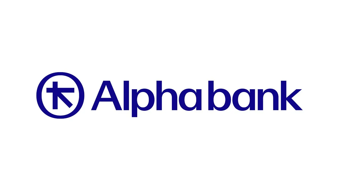
↗Pentagram's identity for Alpha Bank goes back to the source of the bank's previous big redesign: an ancient silver stater of Aegina from its own collection, which also inspired the 1972 logo. The studio redrew the coin's quiet central axis and wrapped it in a roundel that keeps the irregularities of the original.
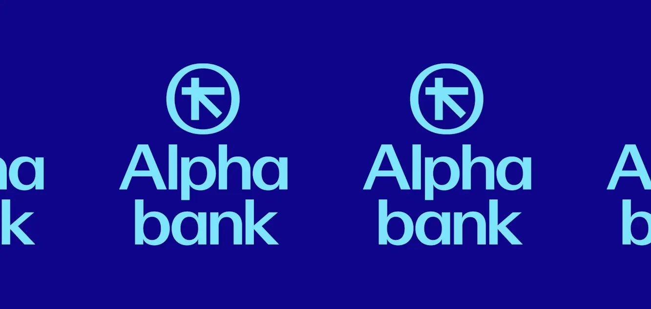
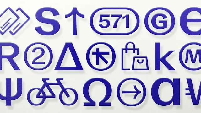
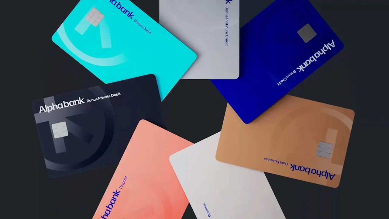
The brief was to modernize a bank founded in 1879 without losing its standing, for audiences from young professionals to private clients. Working with Simple Revolution on strategy, Pentagram, with a team including Domenic Lippa, extended the symbol into the wordmark, icons, signage, floor numbers, and patterns. Tom Baber collaborated on Alpha Sans, a five-weight Greek and Latin family, with Alpha Text as a secondary face. The palette builds on the existing Alpha Blue, adding turquoise, pink, and gold, and Dalziel & Pow carried it into the Kolonaki branch.
Why it works
A coin is a smart origin for a bank's mark. It signals value and permanence without resorting to pillars or shields, and the preserved asymmetries keep the symbol from looking like generic geometry. That imperfection reads as human, which matters for a bank that sells personal relationships. Designing Greek and Latin letterforms together treats the home language as a first-class citizen. Keeping Alpha Blue protects recognition, while pink and turquoise warm up a category that tends to default to cold blue.





Images and video from pentagram.com, by Pentagram.