The Brand Monograph
Green-Wood Cemetery brand identity by Pentagram
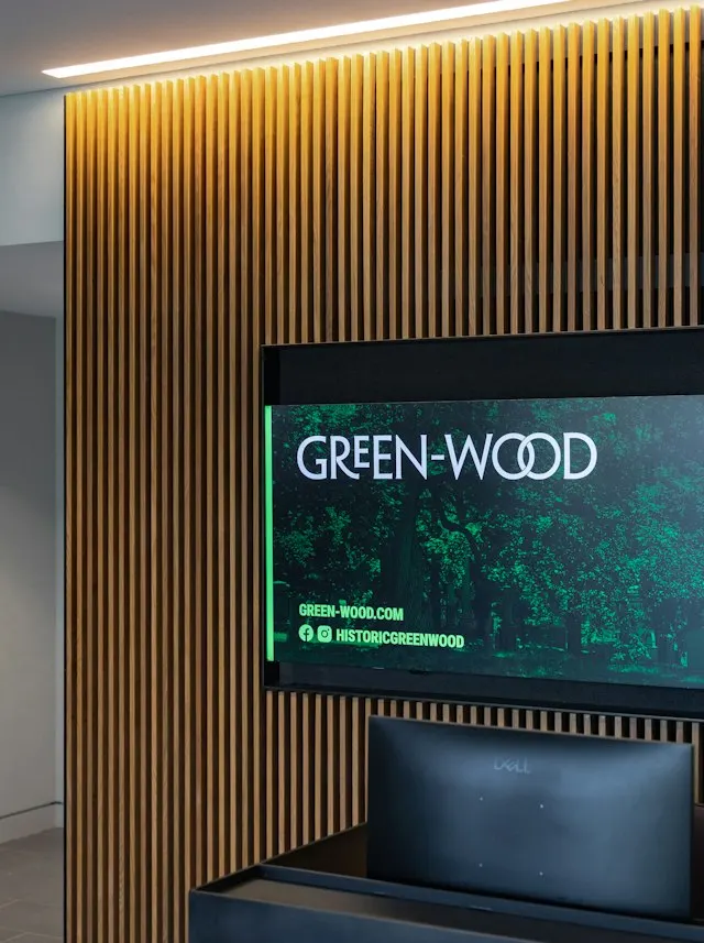
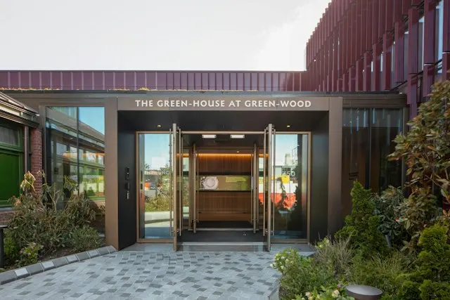
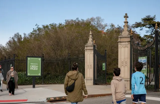
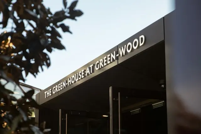
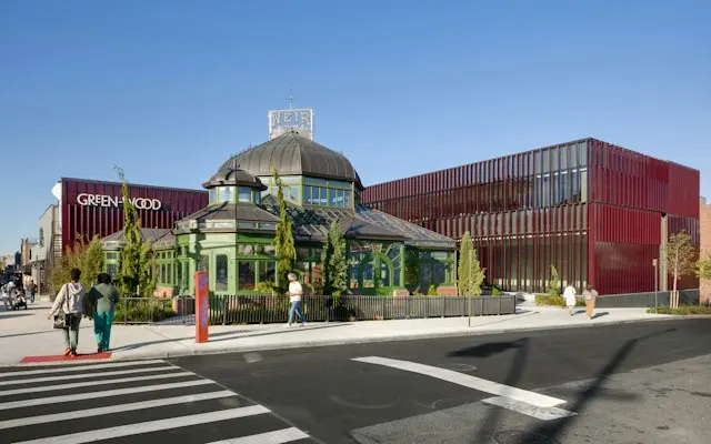
↗Few briefs ask a designer to make a cemetery feel inviting without making it any less serious. Pentagram took on that challenge for Green-Wood, the Brooklyn cemetery founded in 1838, as it opened the Green-House, a visitor center built around a restored 1895 greenhouse. The commission covered a visual identity and a signage system for both the grounds and the new building.
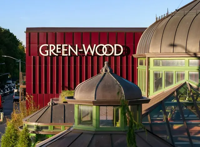
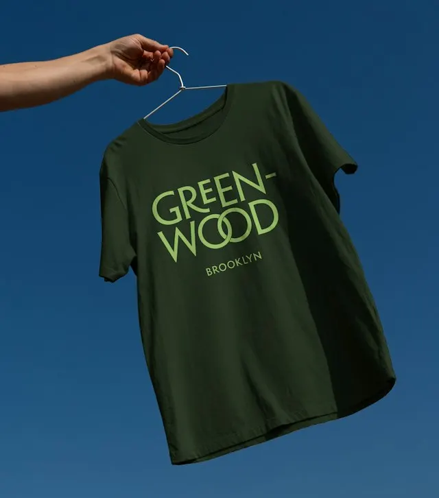
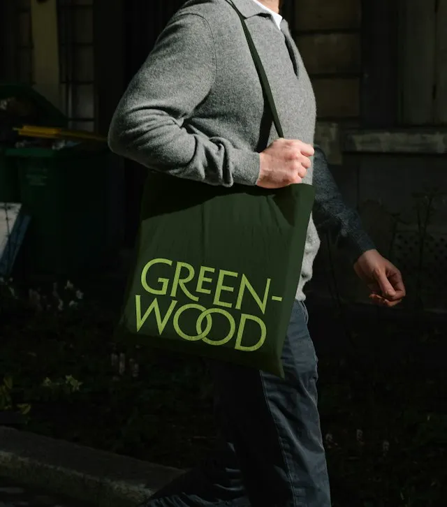
The wordmark is built from letterforms rooted in historical typefaces and in the carved lettering on Green-Wood's own headstones and plaques. The two O's are fused into one ligature, a nod to the wreaths found around the cemetery. The team of Abbott Miller, Kirsty Gundry, Michelle Brown, and Paul Lenaers carried a single typeface family through the signage, so visitors hear the same voice at the entrance and out on the paths.
Why it works
The identity borrows its voice from the place itself. Because the lettering comes from inscriptions already on site, it feels earned rather than applied, and it avoids both the stiff solemnity and the sentimentality common to the category. The ligature is the only flourish, which keeps the mark restrained and easy to recognize at signage scale. A single type family then makes wayfinding feel like part of the brand. For visitors who come to stroll rather than to mourn, that quiet consistency reads as welcome without losing respect.
Applications
Images and video from pentagram.com, by Pentagram.