The Brand Monograph
Imperial brand identity by Pentagram
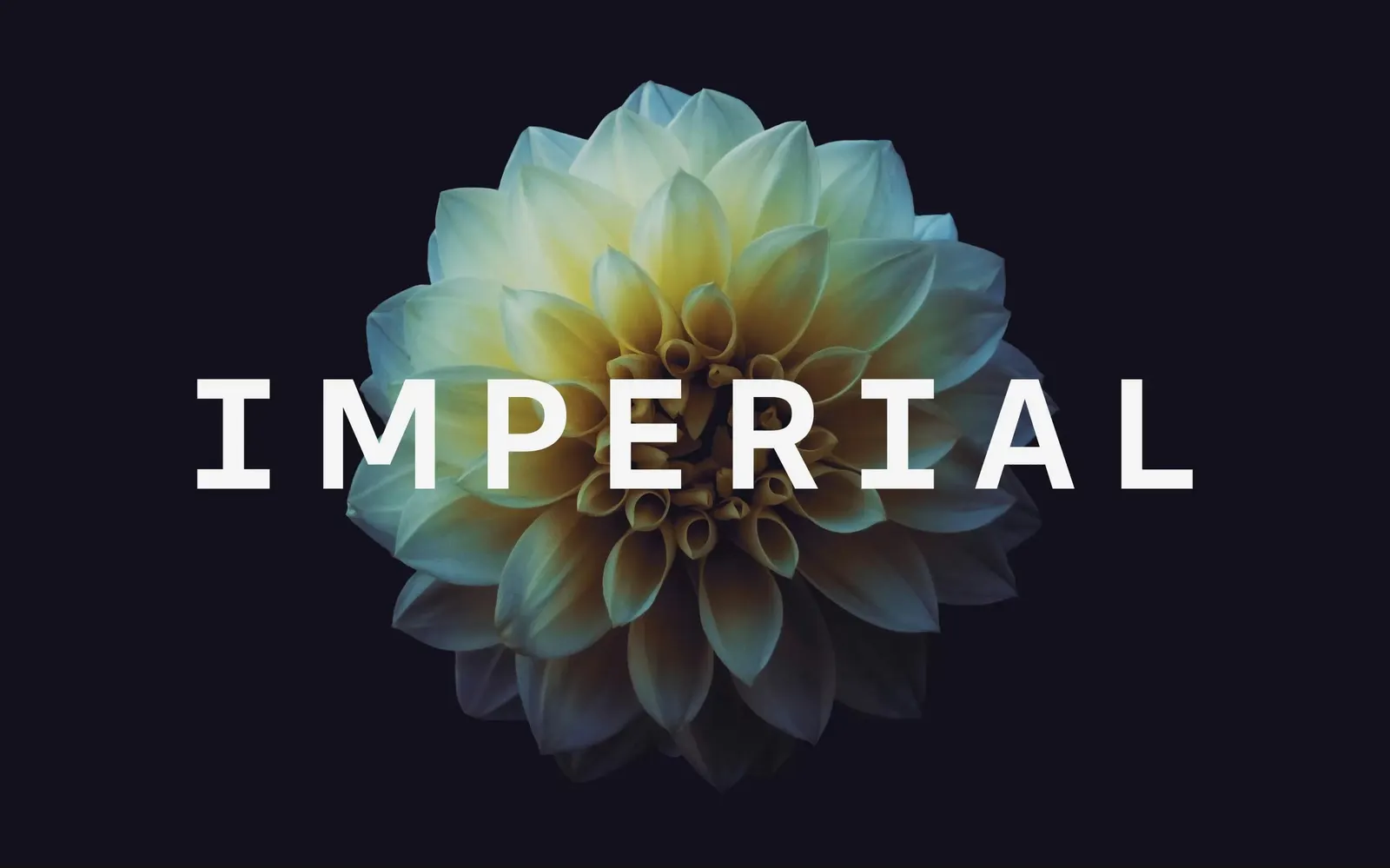
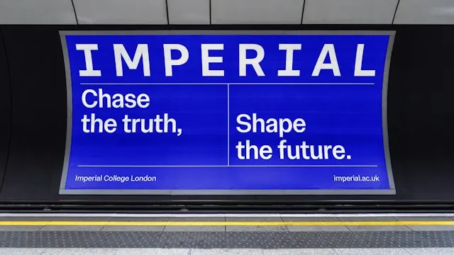
↗Pentagram's identity for Imperial College London hangs an entire university on a single serifed capital "I." The brief was to replace a 1990s look that never had a clear proposition behind it, and to give a top-ten institution a more confident way to present itself. The studio put "Imperial" alone on the logo, as Oxford, Cambridge, Harvard, and Stanford do with their names, while the full title stays in place. The university chose to address the word's imperial baggage openly rather than sidestep it.
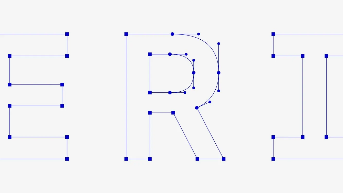
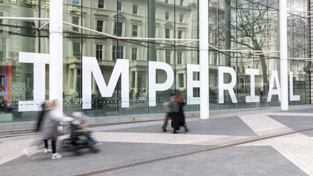
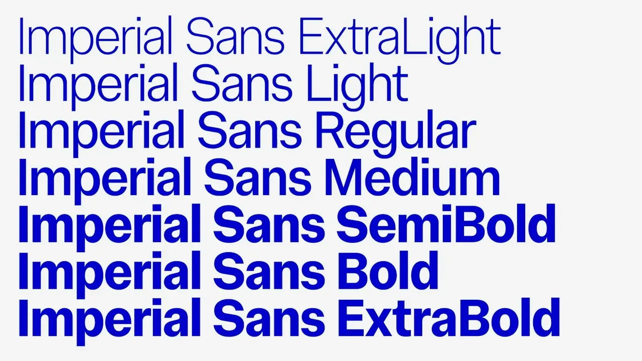
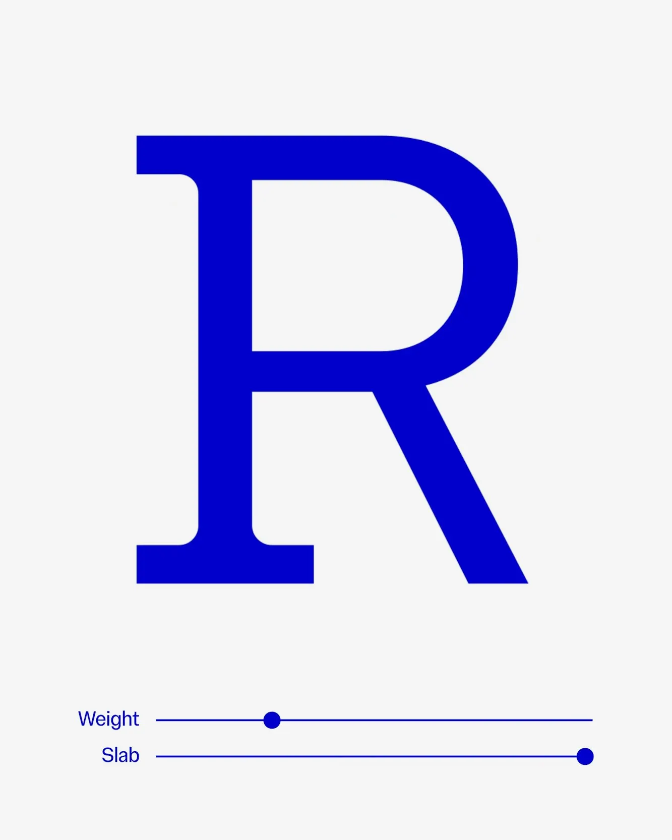
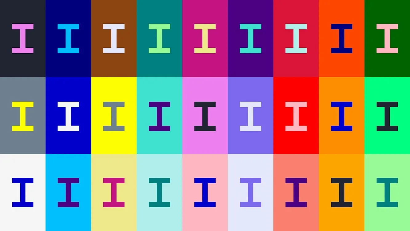
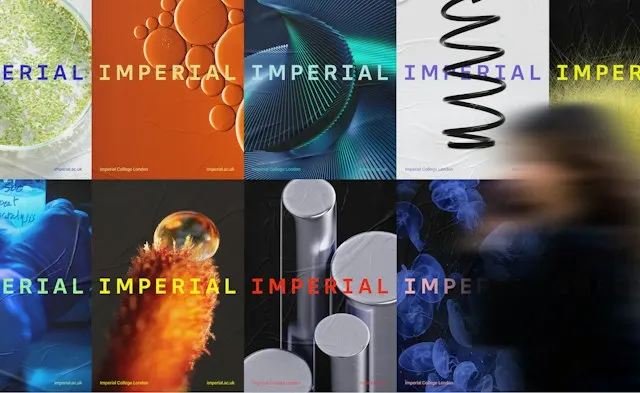
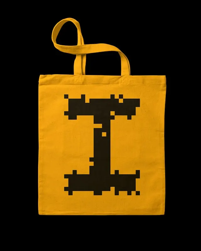
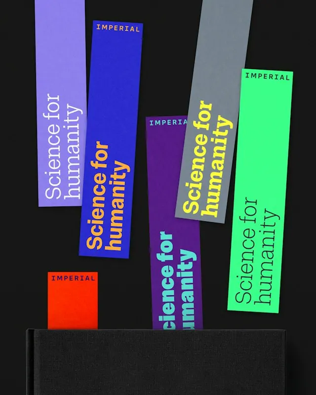
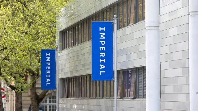
The bespoke wordmark is set in a new Imperial Blue, paired with black and white. Simple Revolution led the brand strategy, and Pentagram's team added narrative, tone of voice, icons, guidelines, signage, and merchandise. NaN and Luke Prowse handled typography: a variable family with Imperial Sans, plus Display and Slab cuts for headlines. Illustrated letter "I"s and repeat patterns add a looser, more playful layer.
Why it works
The serifed "I" is a smart anchor for an institution this sprawling. One letter is easy to repeat, illustrate, and pattern across faculties, merchandise, and signage, and the serif gives it academic weight without stiffness. Restricting the core palette to blue, black, and white leaves room for the science itself to bring the color. The playful "I"s and patterns keep the system from feeling austere. Choosing the single name also gives the university a short, ownable handle that works at any scale.






Images and video from pentagram.com, by Pentagram.