The Brand Monograph
KFC brand identity by JKR
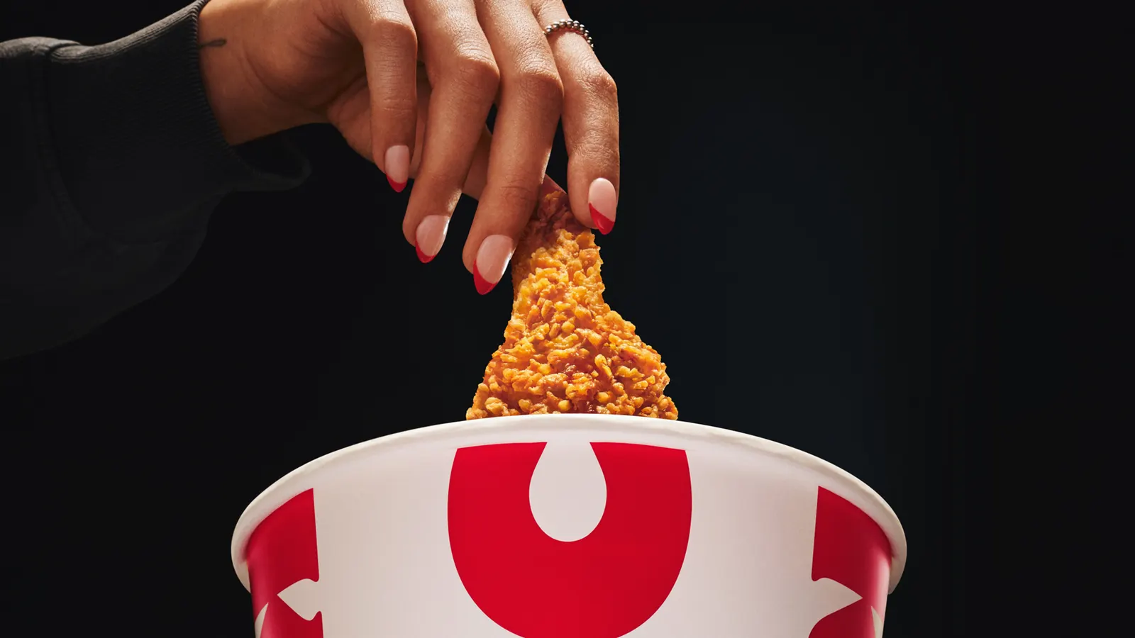
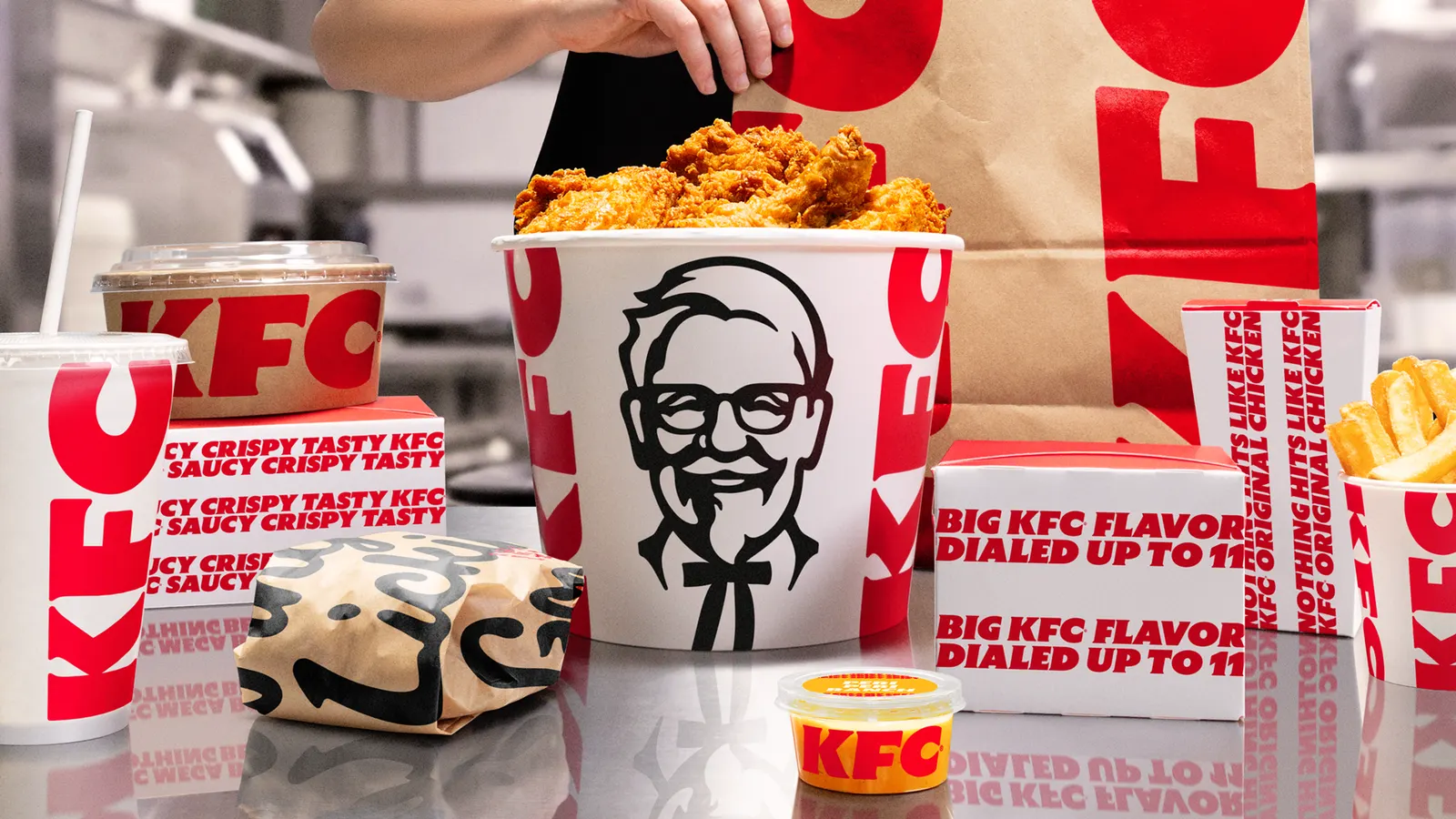
↗Most heritage brands treat their icons as something to protect. JKR treated KFC's bucket as something to build around. The Bucketverse takes a famous object out of the packaging role and puts it at the center of an identity and brand experience that aims to be expressive, not just recognizable.
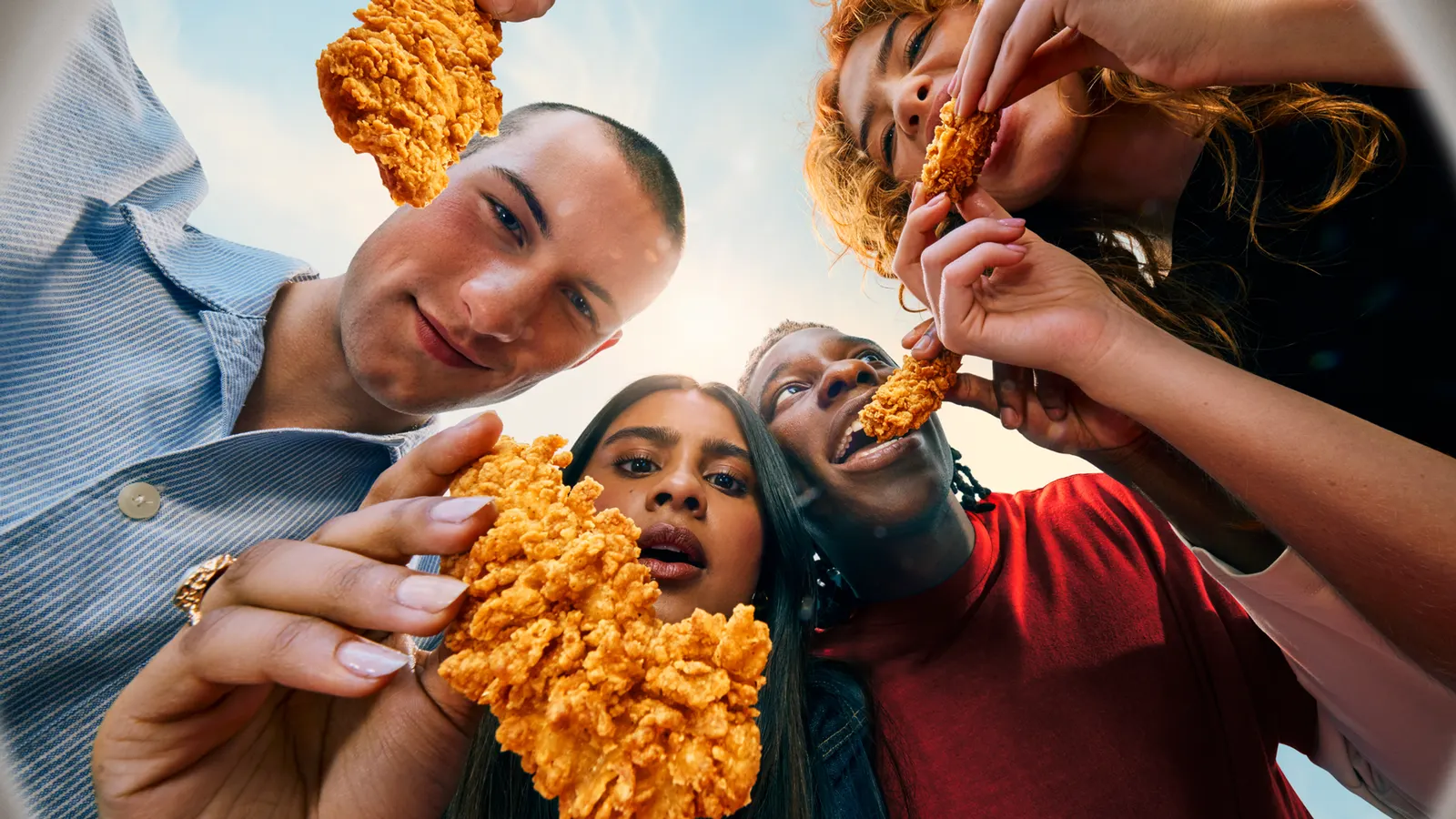
The challenge was turning near-universal recognition into momentum. JKR's answer is a system where sound, illustration, lettering, and photography all orbit the same idea. Antfood handled sound, Boomranng and Eva Cremers contributed illustration, StudioDRAMA and Tobias Hall worked on typography, and Frankie Turner and Reece James Morrison shot the photography. Bringing that many voices under one concept is what makes this feel like a world rather than a campaign look.
Why it works
Choosing an object over a logo or mascot as the organizing idea is a smart move in a category crowded with both. A bucket is ownable, tactile, and instantly KFC, so it can anchor a system without boxing it in. That leaves room for illustrators, type designers, and sound artists to bring distinct personalities while the center stays fixed. It's a sensible way for an old brand to feel current to younger audiences without giving up what people already love about it.
Applications
Logo
Images and video from jkrglobal.com, by JKR.