 The Brand Monograph
Schwartzapfel Holbrook brand identity by Order
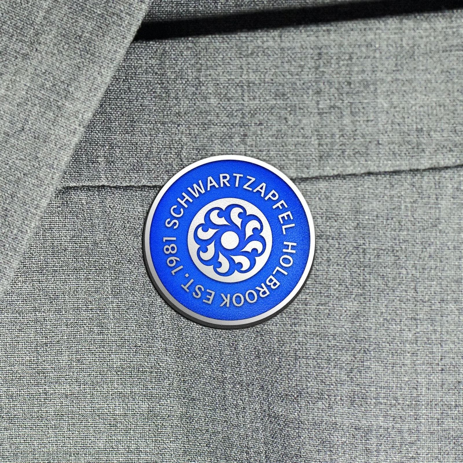
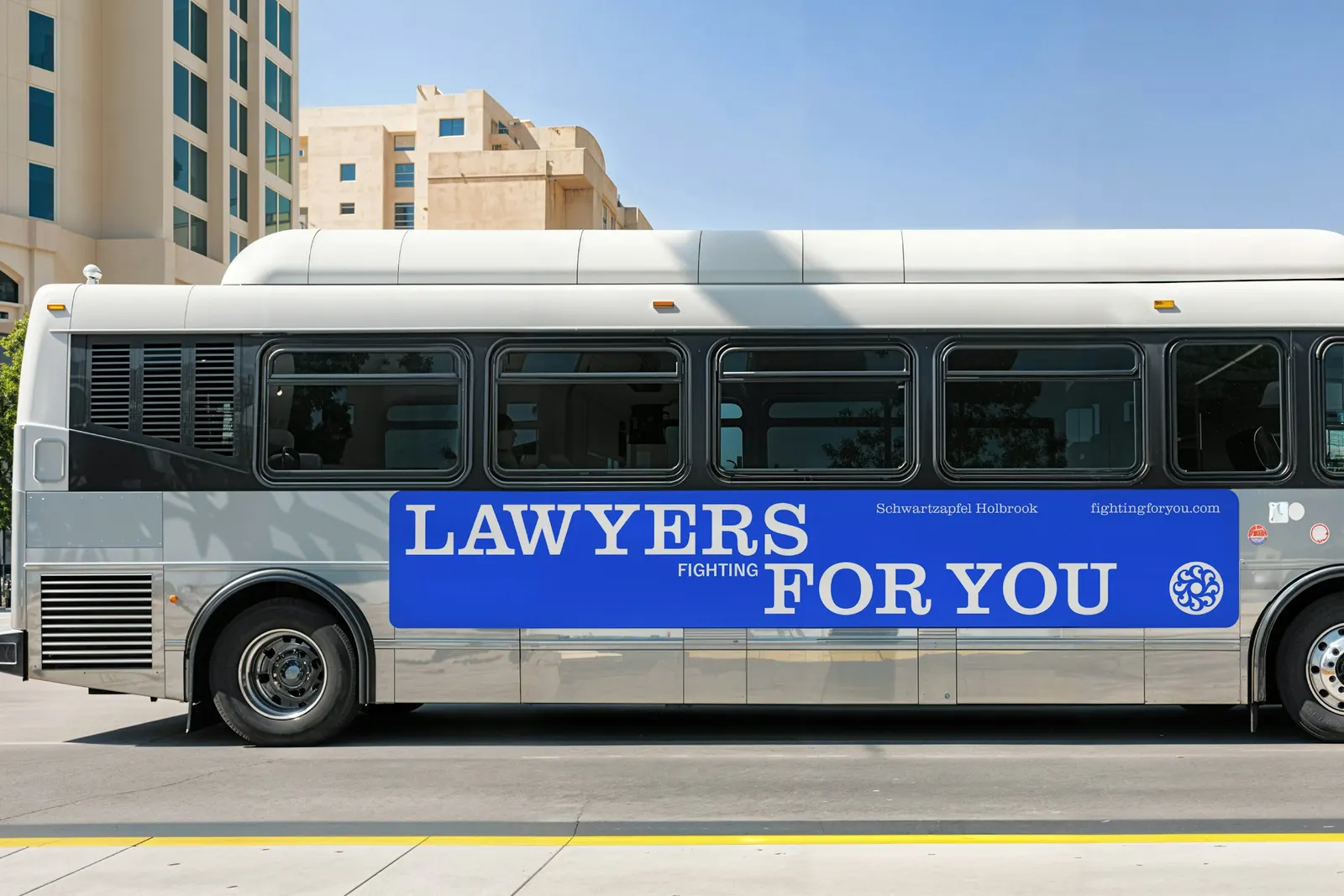
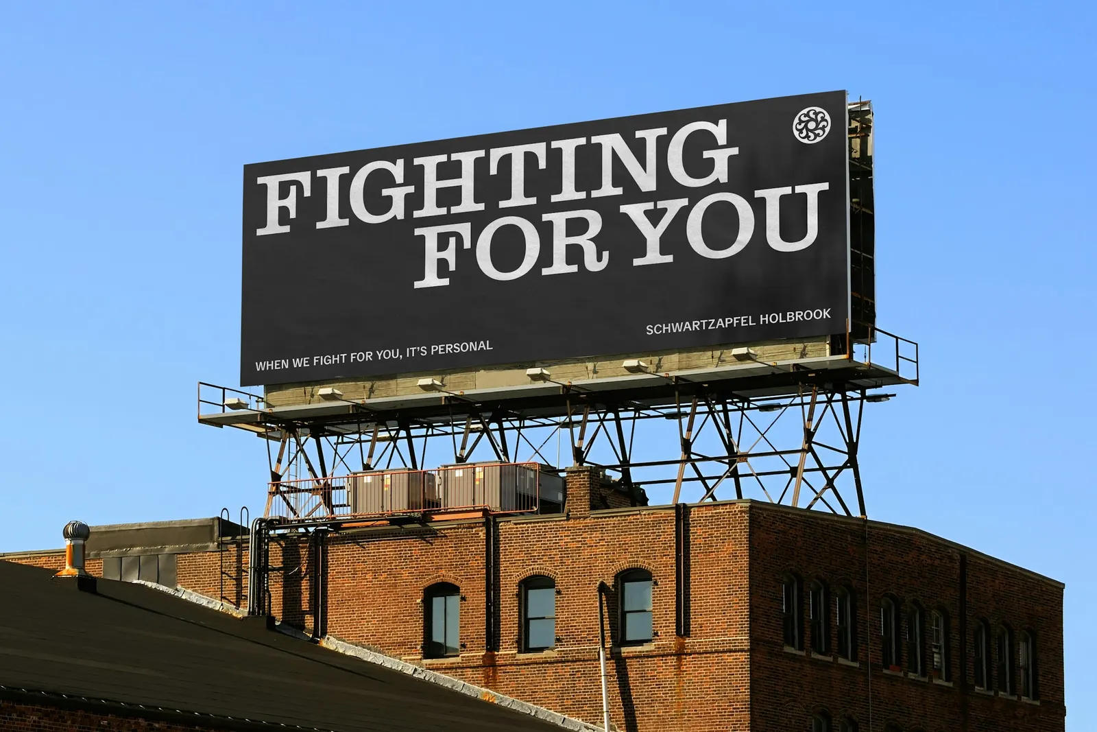
↗Personal injury advertising tends to shout, so Order's work for Schwartzapfel Holbrook stands out by speaking plainly. The New York firm, founded in 1981, handles workplace injuries, car accidents, and workers' compensation, and much of its client base comes from construction. The studio looked to union seals and labor movement printed matter, where circular, centered forms signal solidarity.
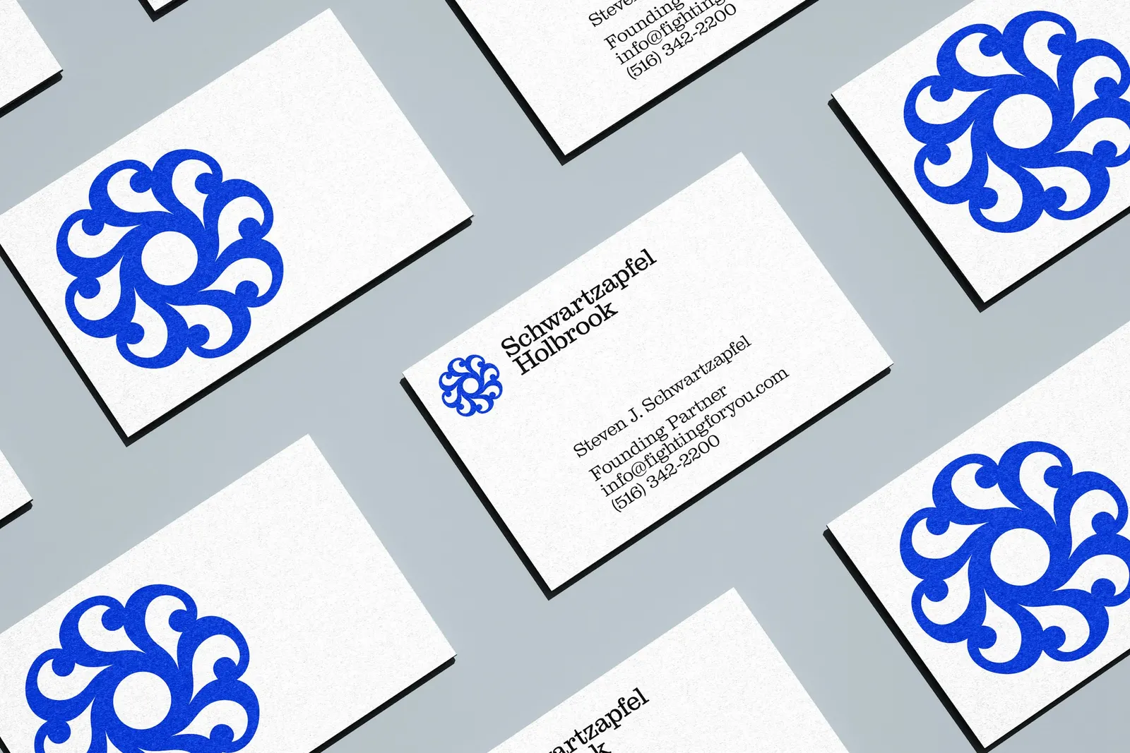
The emblem merges an S with a section sign and works like a rubber stamp, either set on photography or cropped large behind headlines. Type pairs Clarendon Graphic from Optimo with Delegate from Commercial Type for captions, arranged in stacked lines that mix styles and scale up key words. The blue was refreshed, with pared-back colorways for internal use. Emily Klaebe and Jesse Reed led design, alongside photography by Pojo Studio of job sites and finished buildings. The website puts phone numbers up front.
Why it works
The section sign nods to the law without resorting to scales or gavels, and fusing it with the S makes the mark ownable. The seal form borrows the credibility of institutions the firm's clients already trust, so the firm reads as standing beside them rather than selling at them. Clarendon supplies legal familiarity, while the stacked, oversized type adds muscle. Photographing buildings instead of injuries lets the work imply the stakes without exploiting them, a real point of difference in this category.
Logo



Applications

Images and video from order.design, by Order.


