The Brand Monograph
Masses Bagels brand identity by Studio of Design and Art (SODAA)
↗Masses Bagels' refresh from Studio of Design and Art (SODAA) is a good example of knowing what to keep. The bagel shop began at the market and now has a permanent home in Fitzroy, and its following grew on the strength of the product. Instead of starting over, the studio kept the mark people already recognized and gave it a much bigger job.
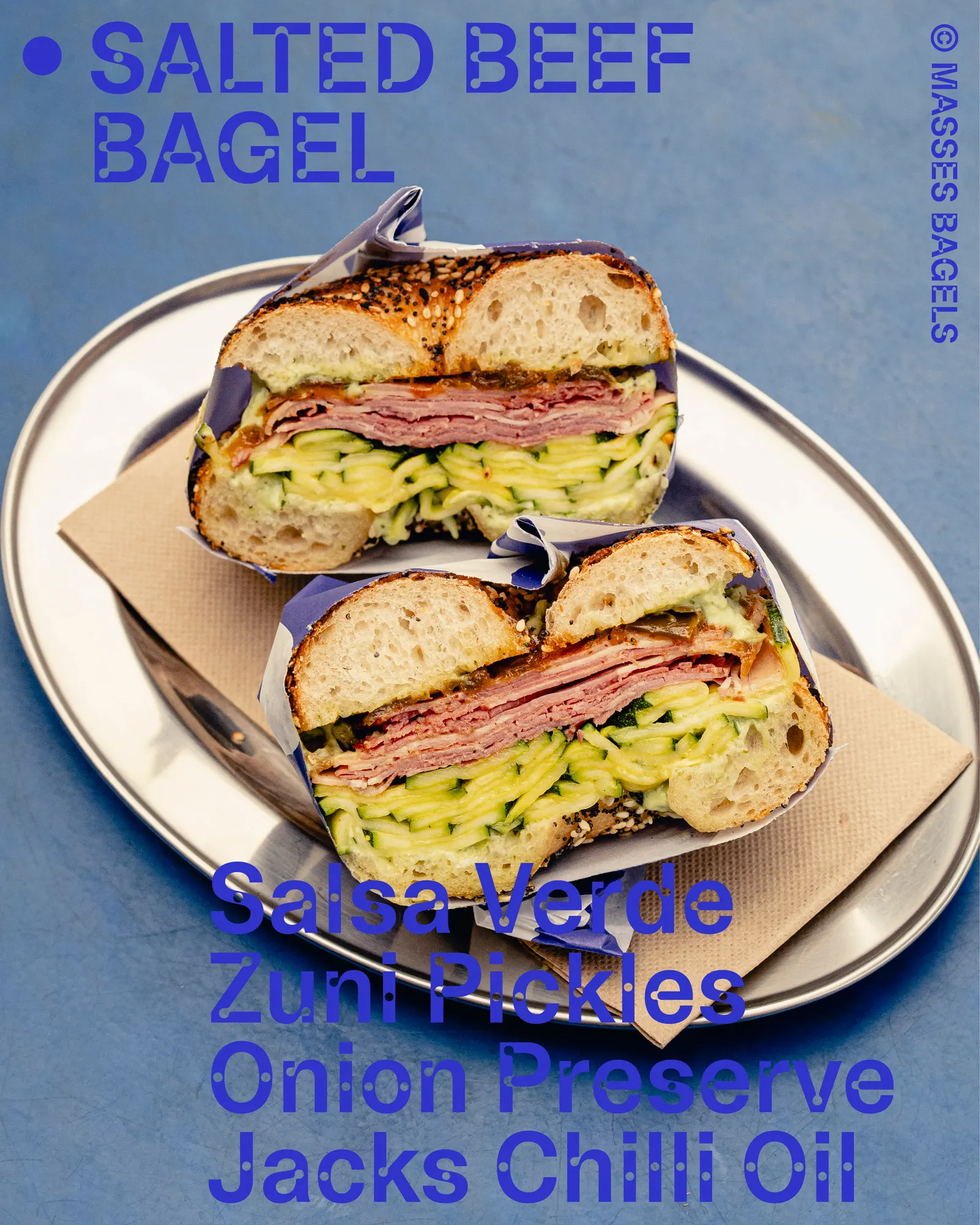
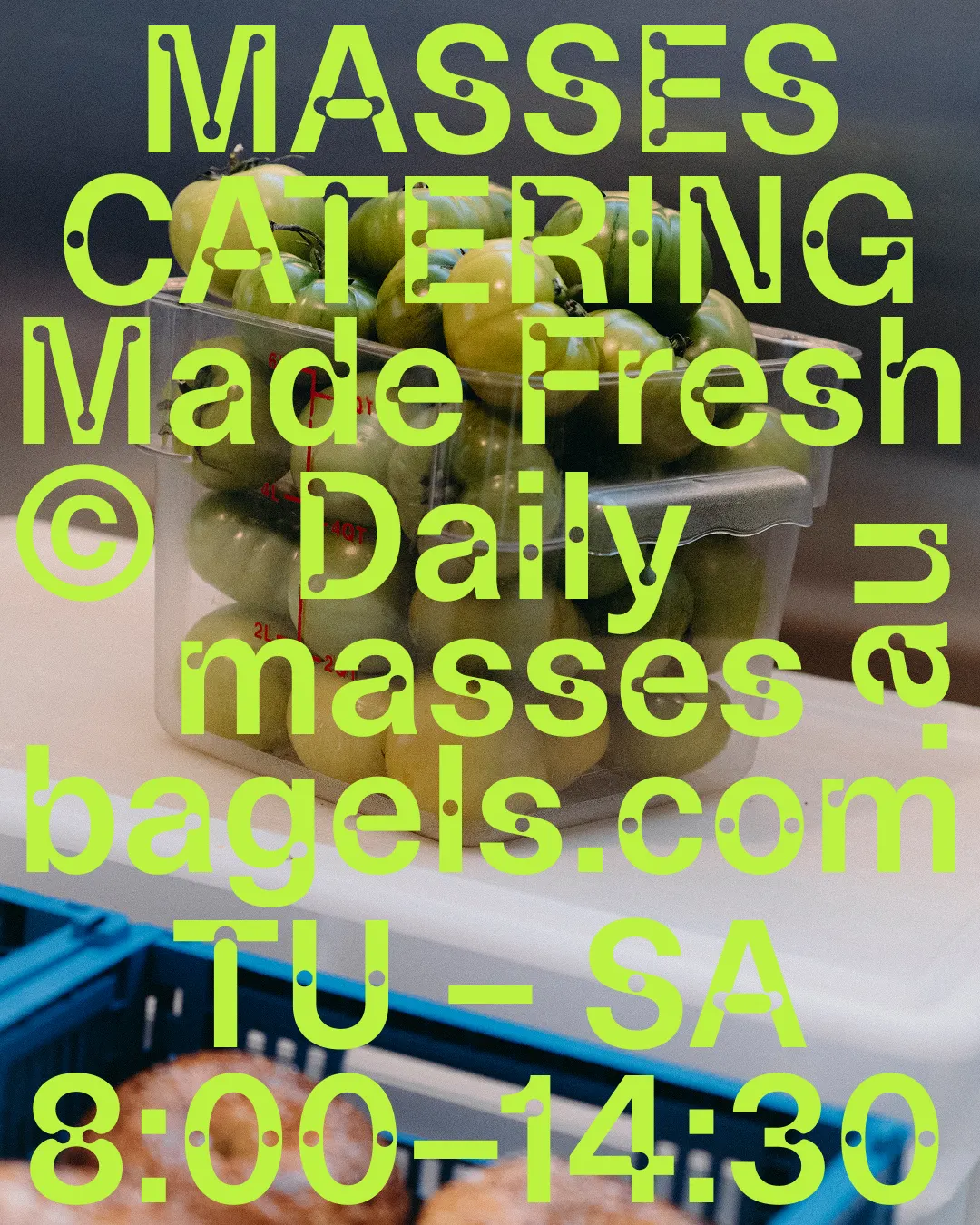
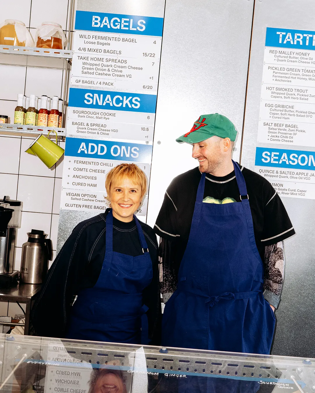
The brief was to bring order to an identity that had grown alongside the business. The studio's idea comes from the bakery's own method: the dough ferments slowly and is never quite the same from one moment to the next. Camera Plain from ABC Dinamo sets the tone for menus, packaging, and communications, and the mark is repeated, multiplied, and offset to form patterns that can shift from one application to the next. Zac Tan's photography documents the result.
Why it works
A bagel is a ring of dough, so a round mark and a typeface with circular letterforms feel closely related, and the type and the symbol read as one family without extra decoration. Because the patterns are built from the existing mark, the system can flex across applications without drifting from the brand. Regulars still recognize it, while newcomers get a look that feels more considered than the usual rustic bakery cues. The variation also gives a fermented, handmade product a visual identity that feels alive.
Applications
Logo
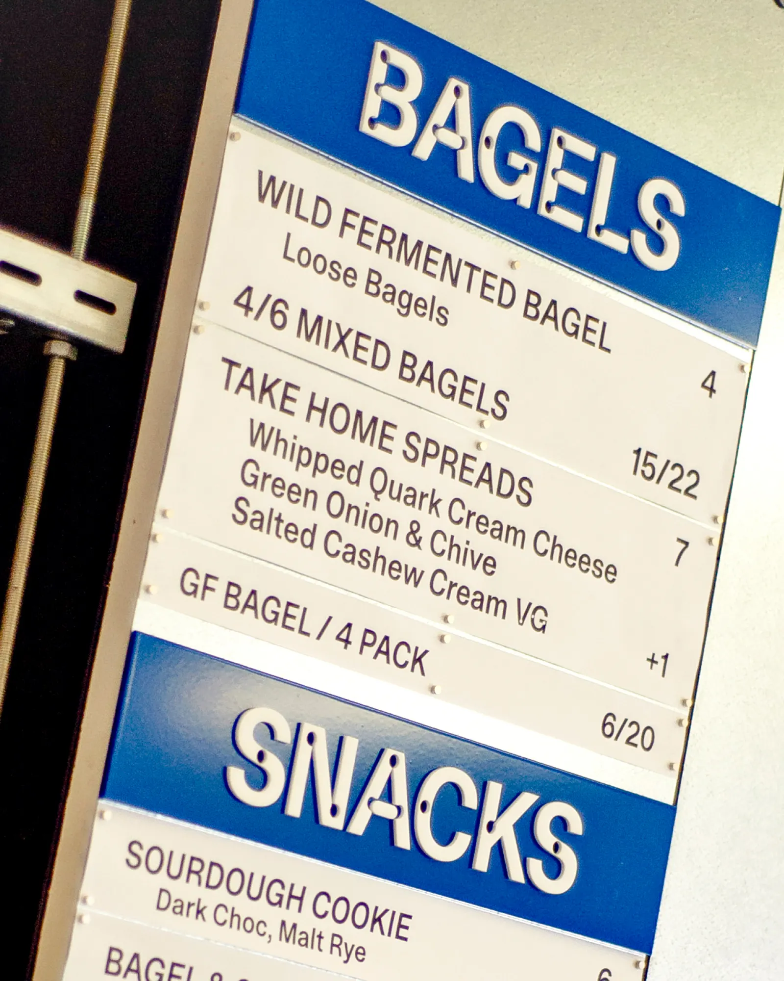
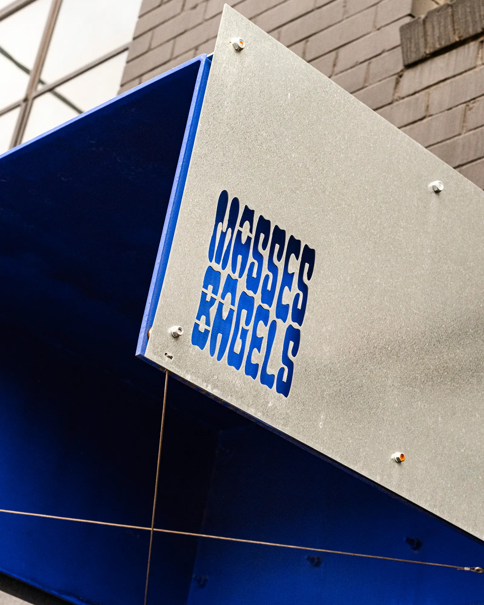
Images and video from sodaa.co, by Studio of Design and Art (SODAA).