The Brand Monograph
Maxio brand identity by Order
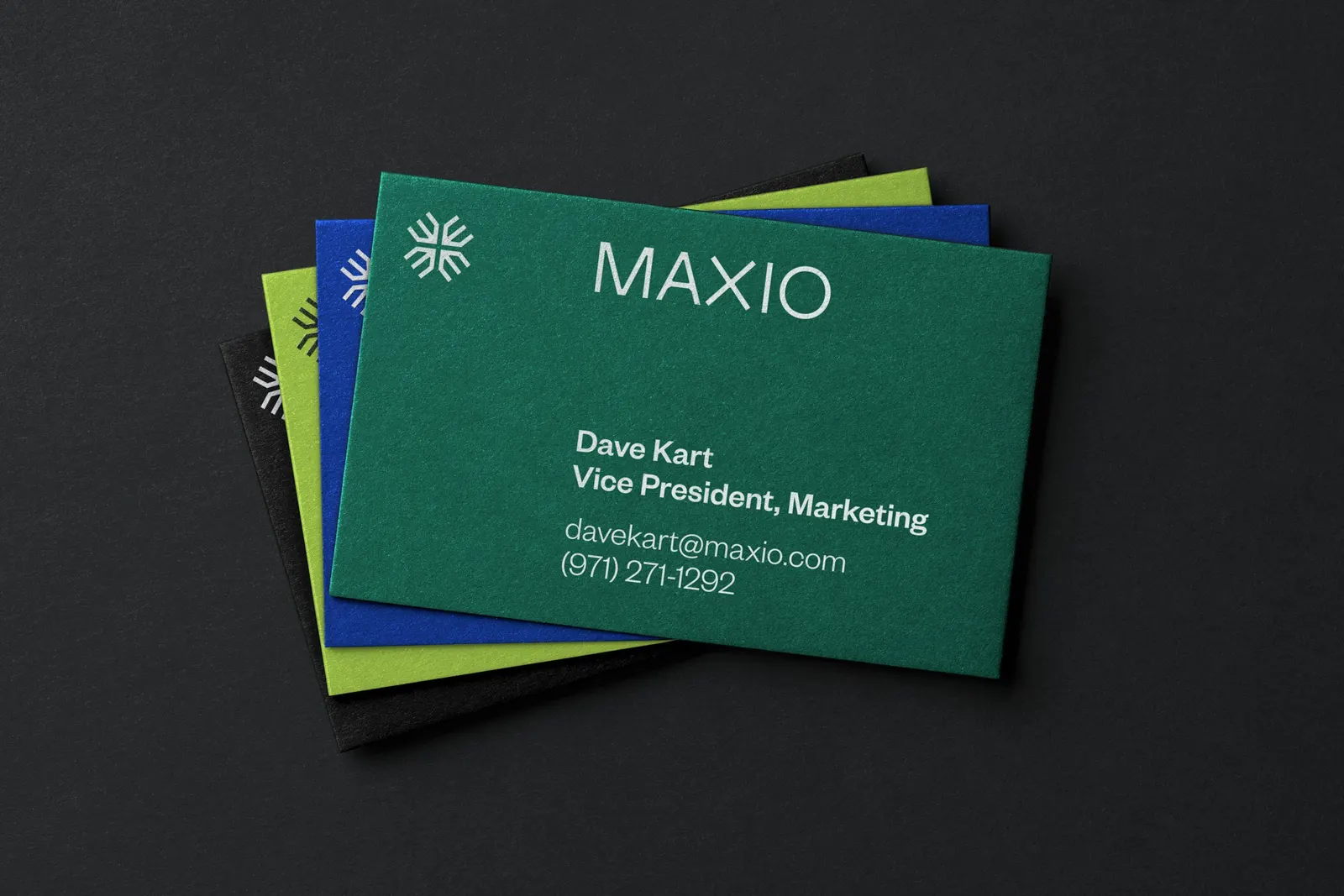
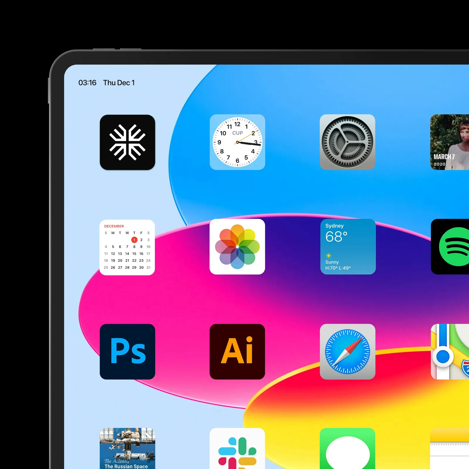
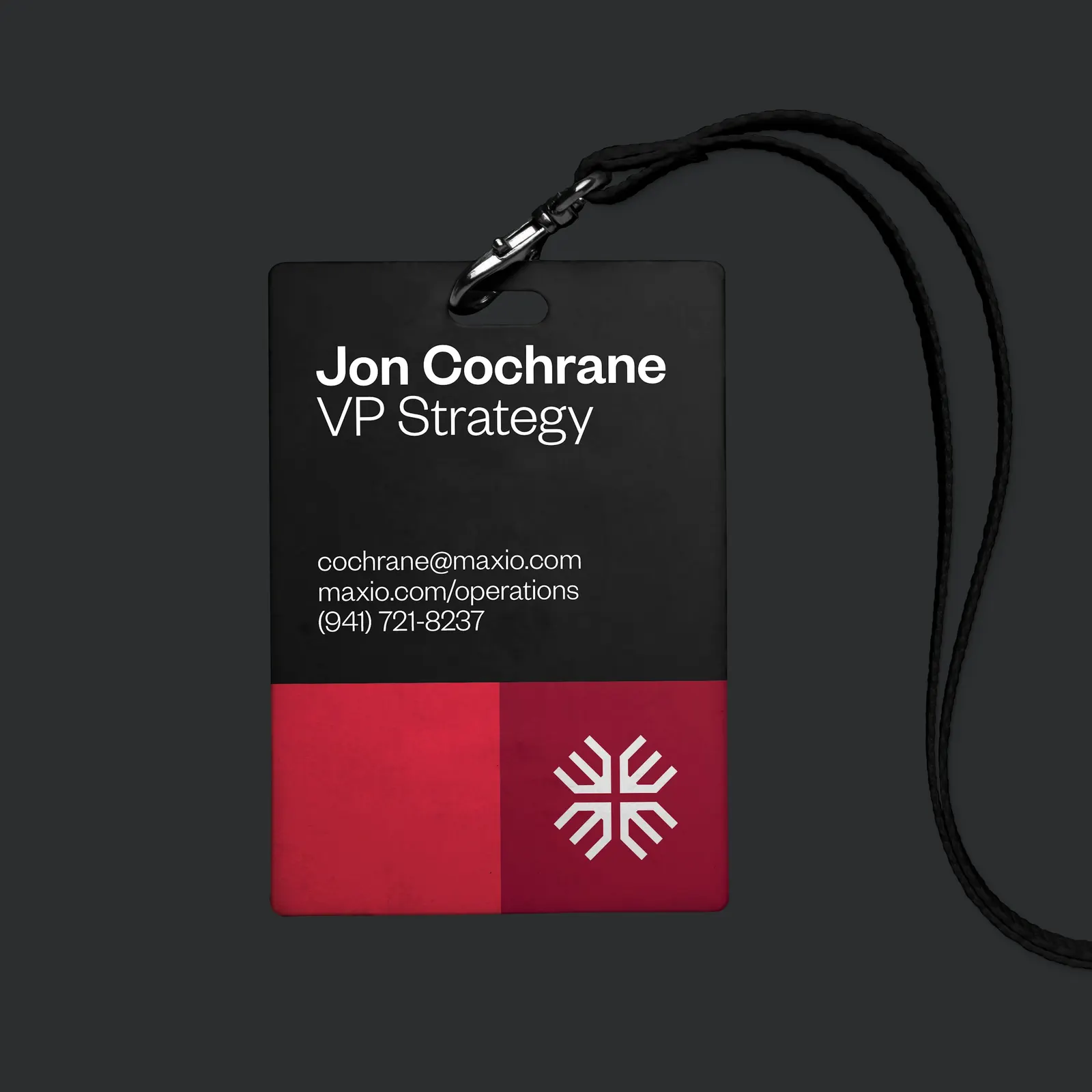
↗Billing software rarely inspires affection, which is what makes Order's work for Maxio stand out. After Chargify and SaaSOptics merged, the studio had to give one combined team a single identity, and it found it in the pull between spreadsheet rigor and the people behind the numbers. The symbol folds a pencil, an abstract M, and a plus sign into one mark. The custom logotype follows the same construction, with an X that quietly winks at data.
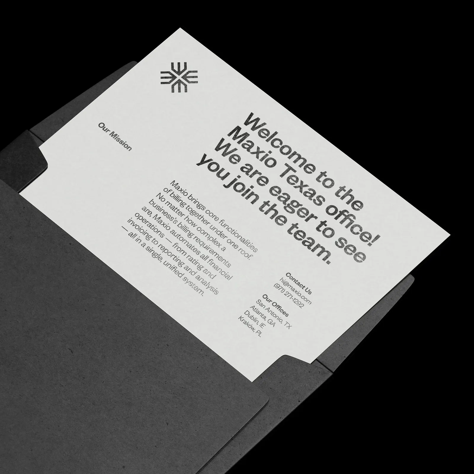
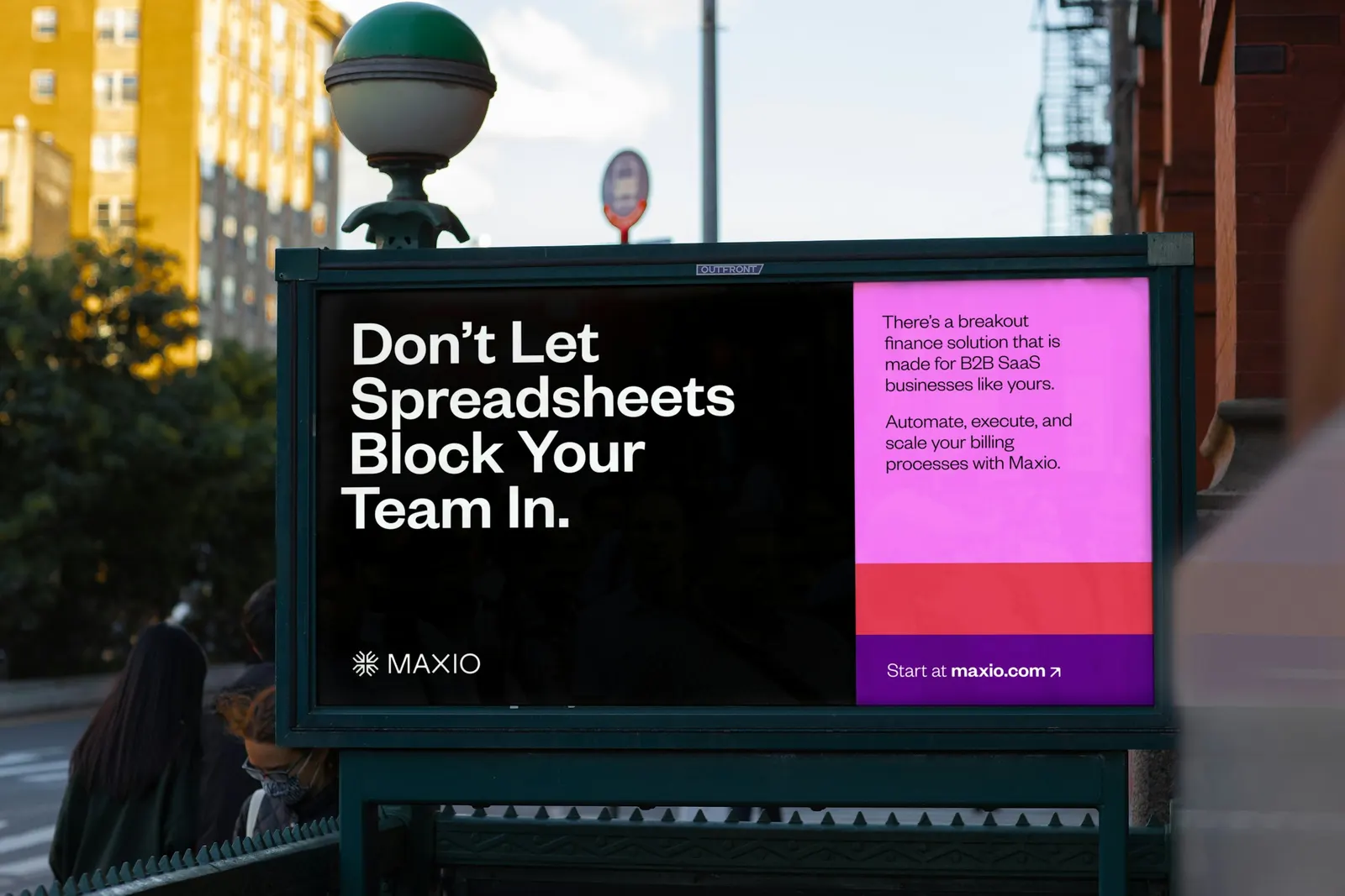
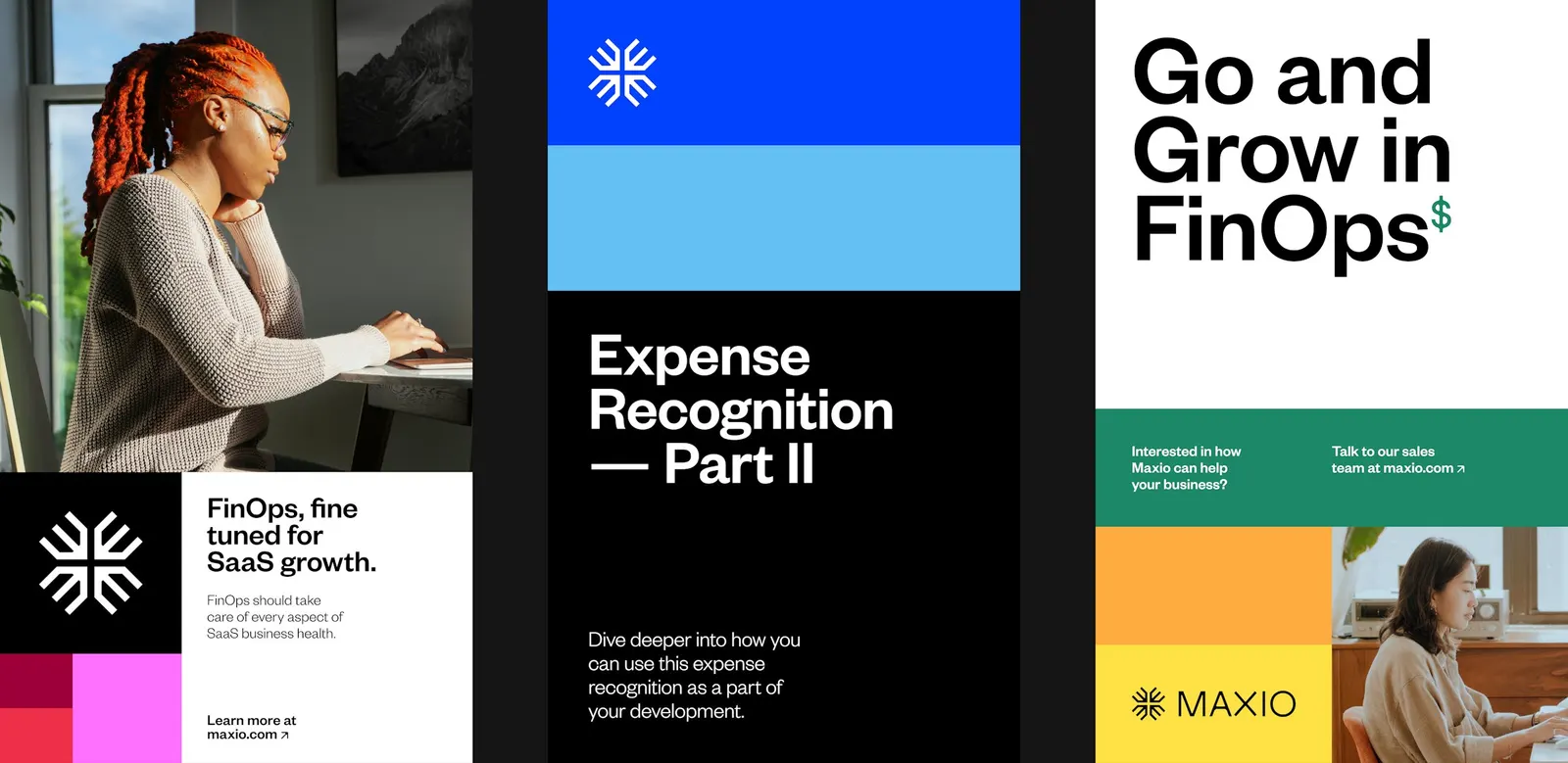
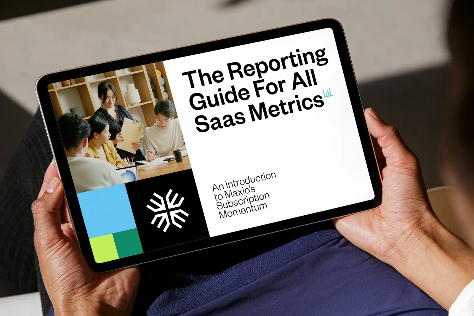
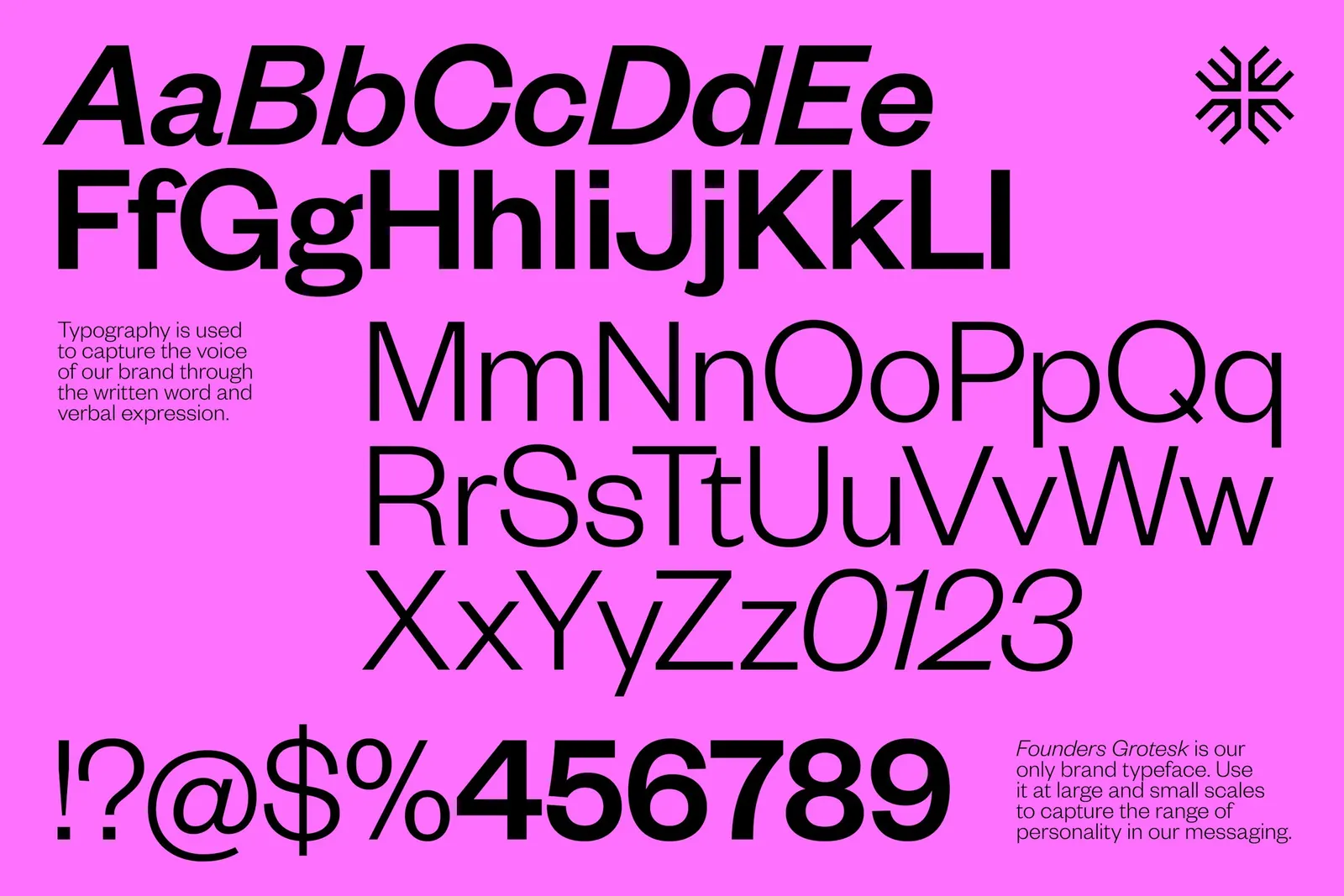
Klim Type Foundry's Founders Grotesk is the only typeface, and color is capped at three hues per layout. A Fibonacci-based grid governs composition, while data graphics borrow shapes from the logo and an icon set inherits its details. Order, with Emily Klaebe on design, also built the launch website and wrote guidelines so Maxio's team can extend the system on its own.
Why it works
Maxio sells to growing B2B SaaS teams, an audience that trusts numbers and is used to cold, interchangeable software. Order puts the logic where people can feel it instead of announcing it. A pencil inside a mark about growth suggests someone is actually working the figures. One typeface and a three-color ceiling keep the brand calm, which reads as reliability. Because the grid and graphics share the logo's geometry, the whole identity feels engineered, a clear step away from the stock look of much fintech.
Applications
Logo
Typography
Color
Images and video from order.design, by Order.