The Brand Monograph
Munson brand identity by Order
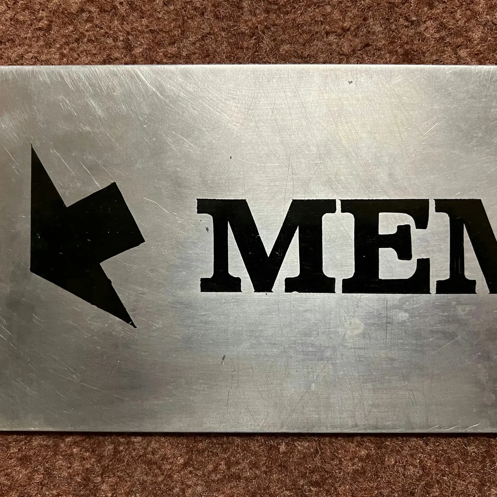
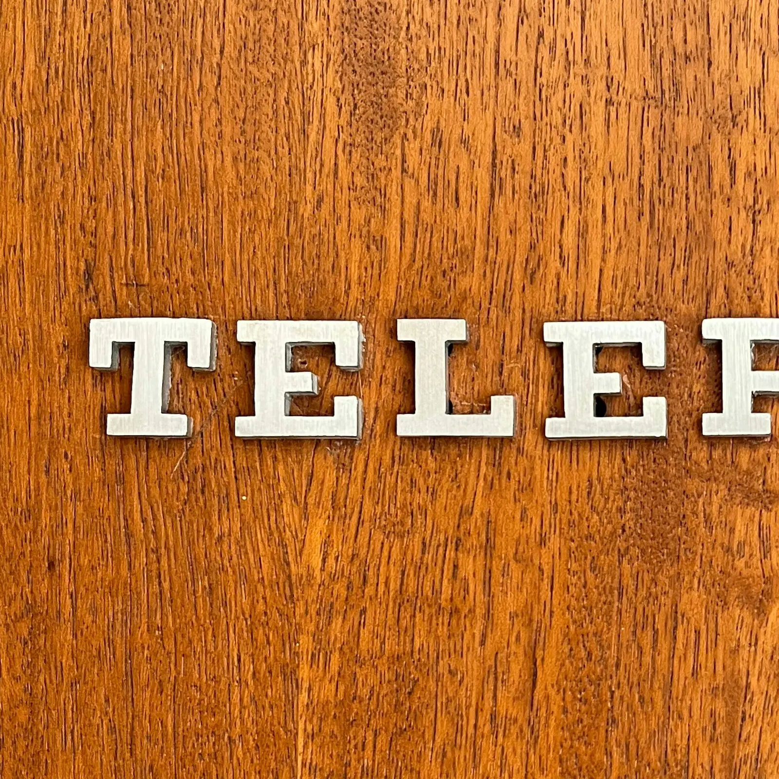
↗Order found Munson's new identity already in the building. While researching the Utica arts institution, the studio noticed hand-painted lettering across the museum's signage and printed materials, and traced it to designer Elaine Lustig Cohen. That discovery became the starting point for rebranding the institution formerly known as Munson-Williams-Proctor Arts Institute.
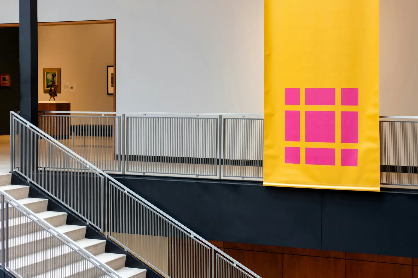
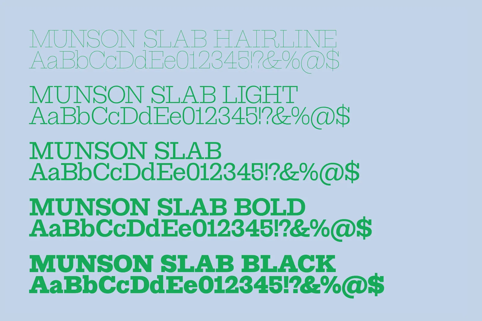
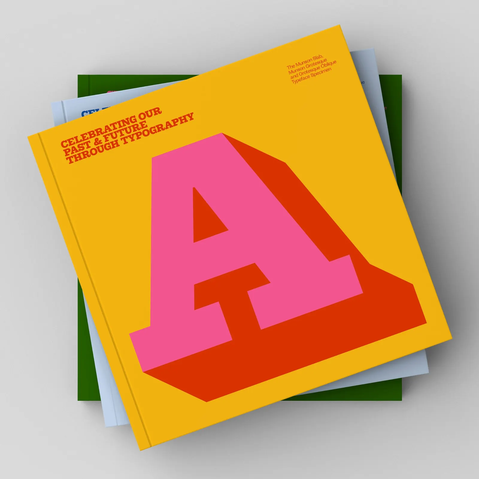
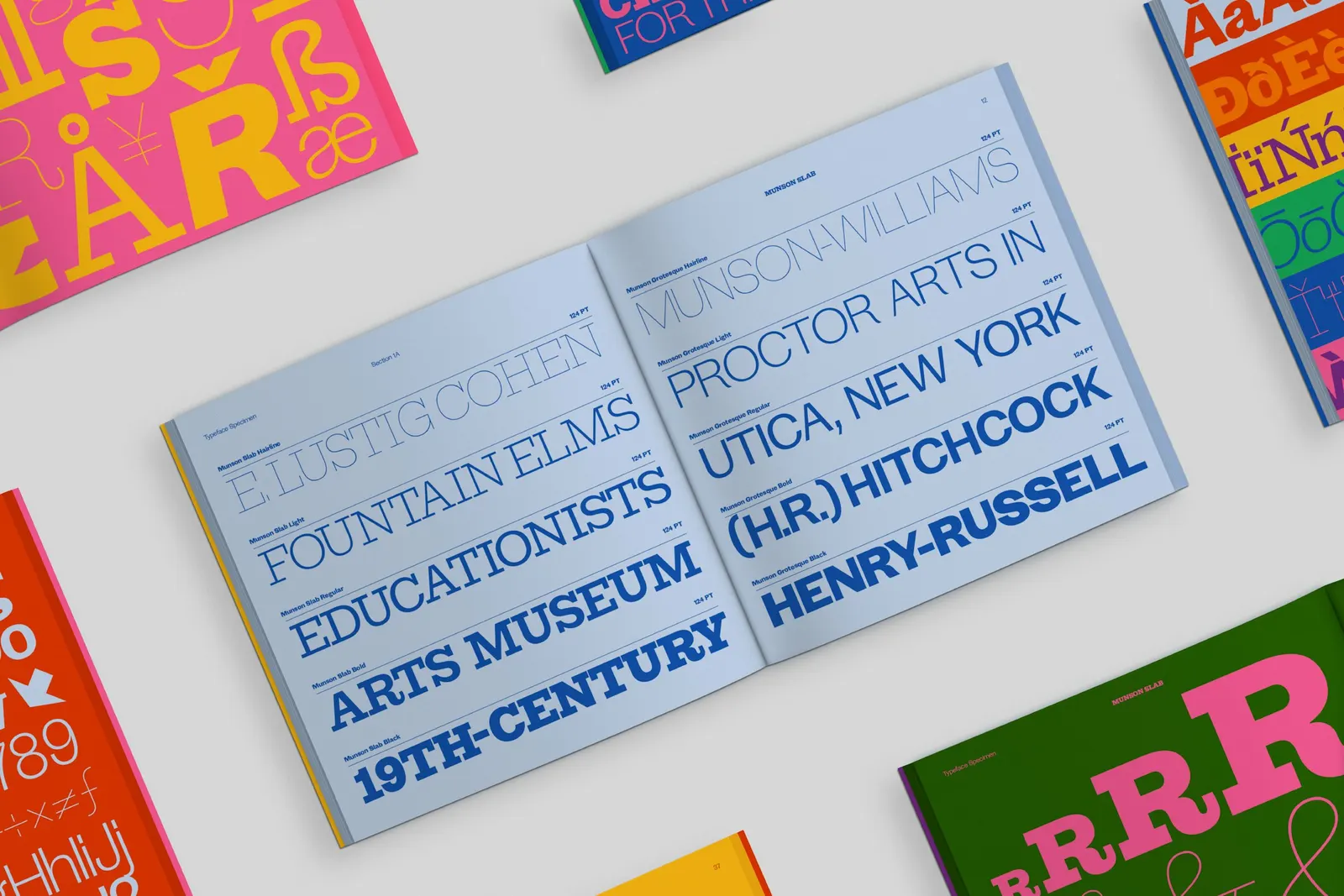
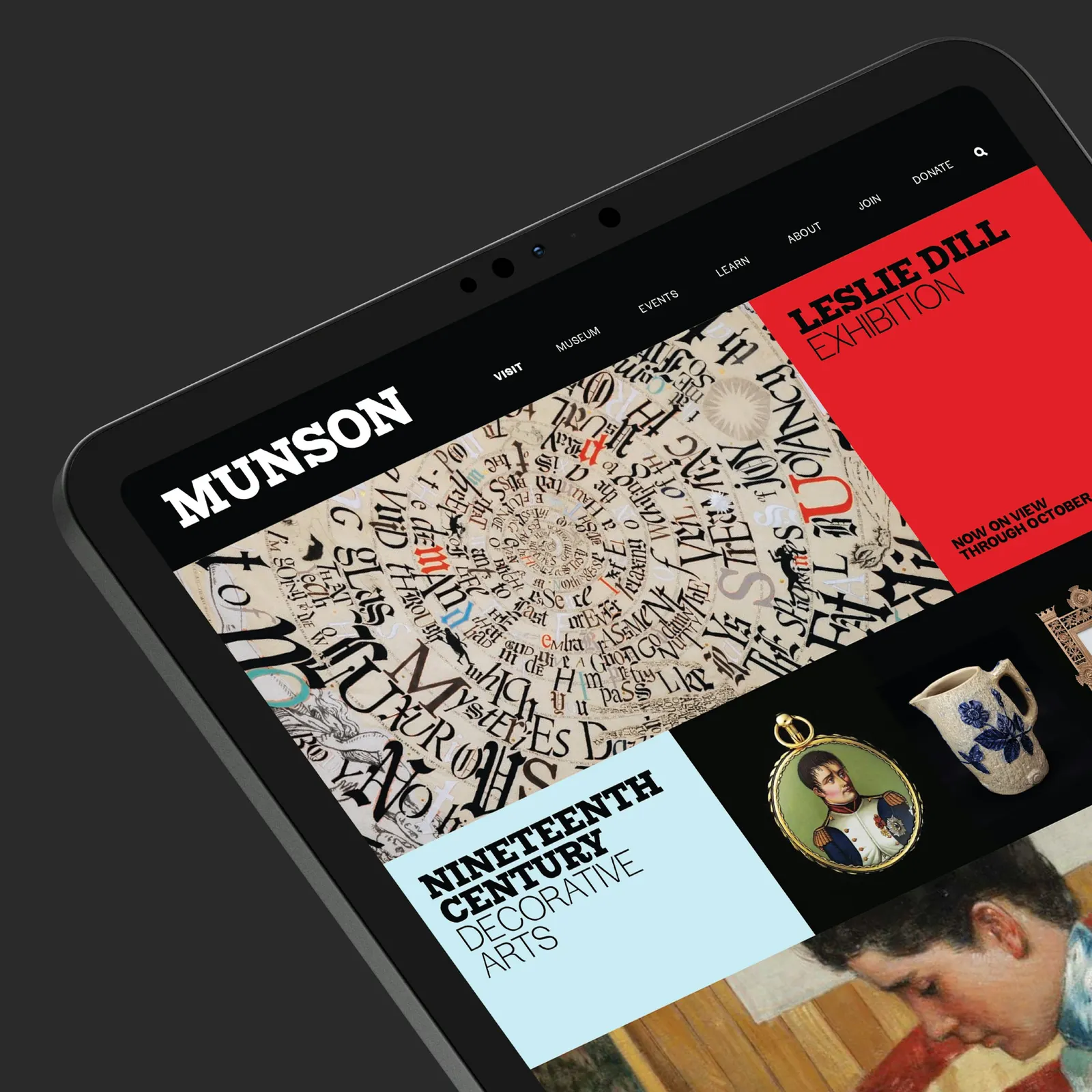
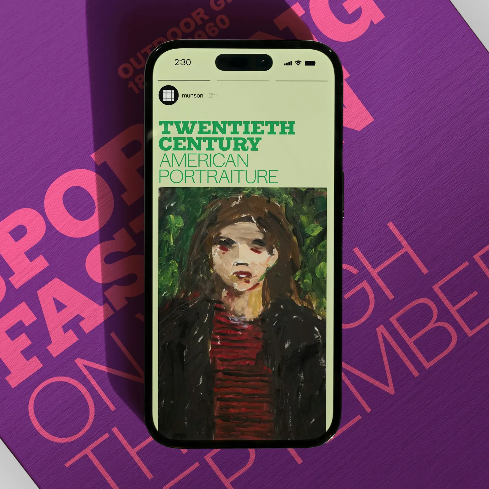
From there, Order built a type-led system with Elastic Strategy and Jesse Reed on strategy. Emily Atwood drew Munson Slab, Munson Grotesque, and an Oblique, and Tiny Type Co. mastered the fonts. The symbol and layout grid borrow from the modular architecture of Philip Johnson's gallery building, while the palette revisits the bold color pairings of the museum's Bulletin. A Pratt Munson College lockup uses yellow as its marker. The launch paired merchandise in the Museum Shop with an exhibit of Cohen's lettering.
Why it works
Most museum identities borrow authority from outside. This one earns it from the institution's own history, so the typography feels inherited rather than chosen. Pairing a slab with a grotesque gives Munson two registers, one with archival weight and one that reads as current, which suits a place that is both a landmark and a community hub. Tying the symbol to the building makes it specific to Utica instead of generic gallery branding. The plain grid and saturated color pairings stay lively without competing with the collection.
Applications
Logo
Typography
Images and video from order.design, by Order.