The Brand Monograph
Watts brand identity by View Source
↗View Source's work for Watts is a rare case of one studio taking a pet brand from naming all the way to a live Shopify store in eight months, and still leaving room for a joke on the 404 page. The brief came from three former pet food executives frustrated that dog supplements either work and get refused, or get devoured and do nothing.
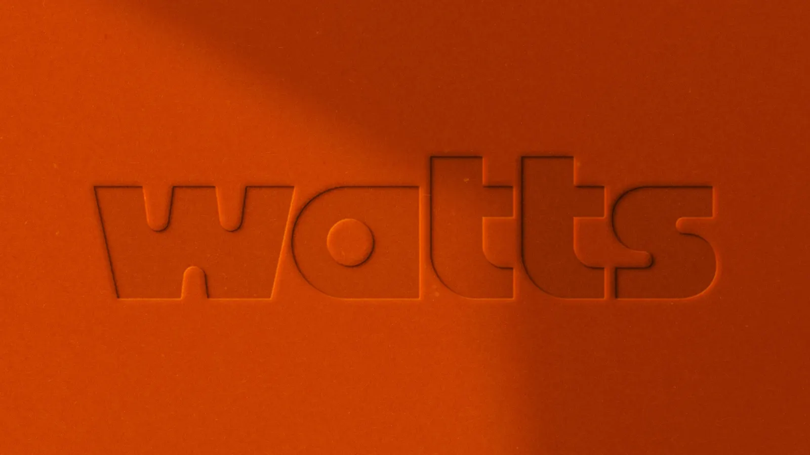
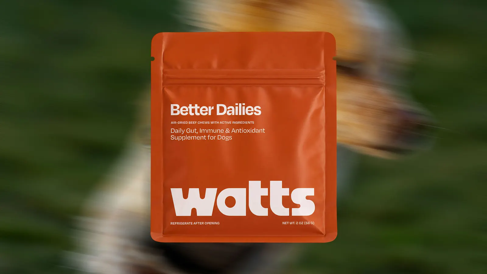
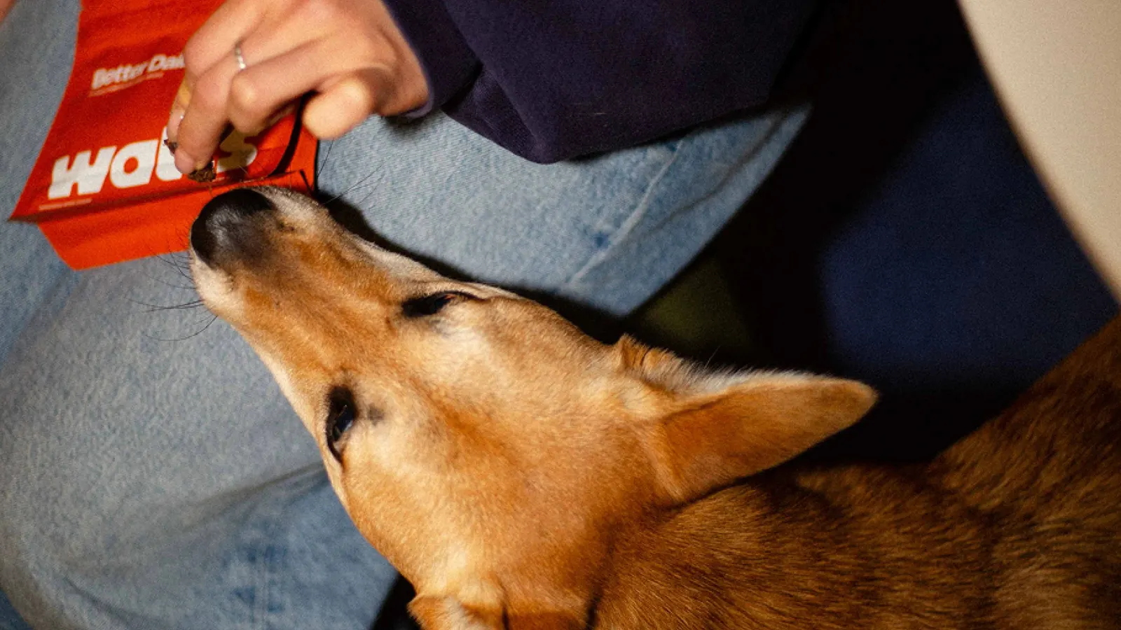
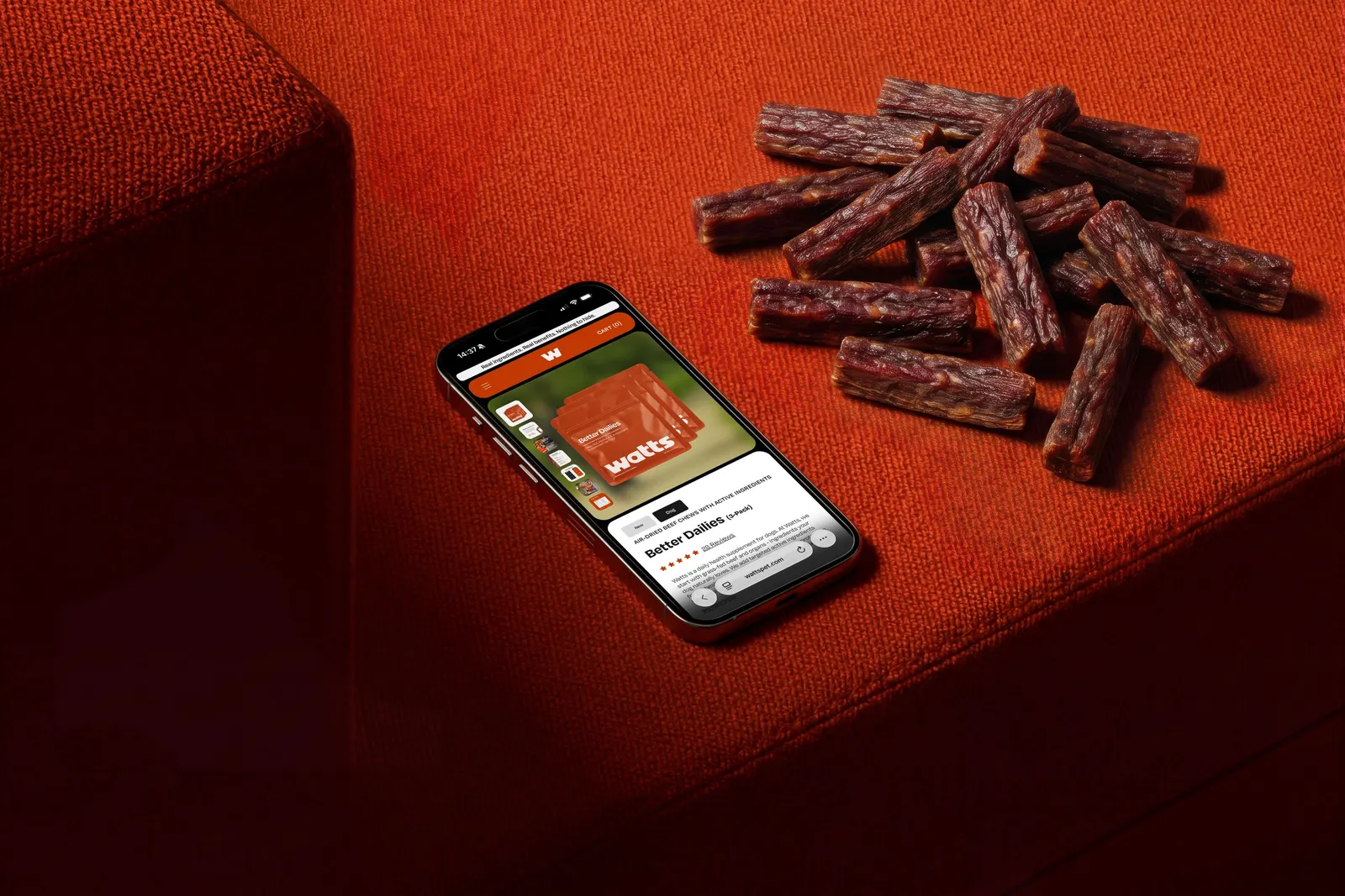
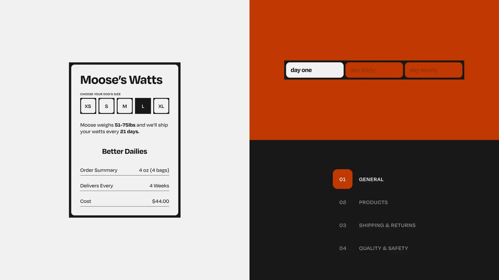
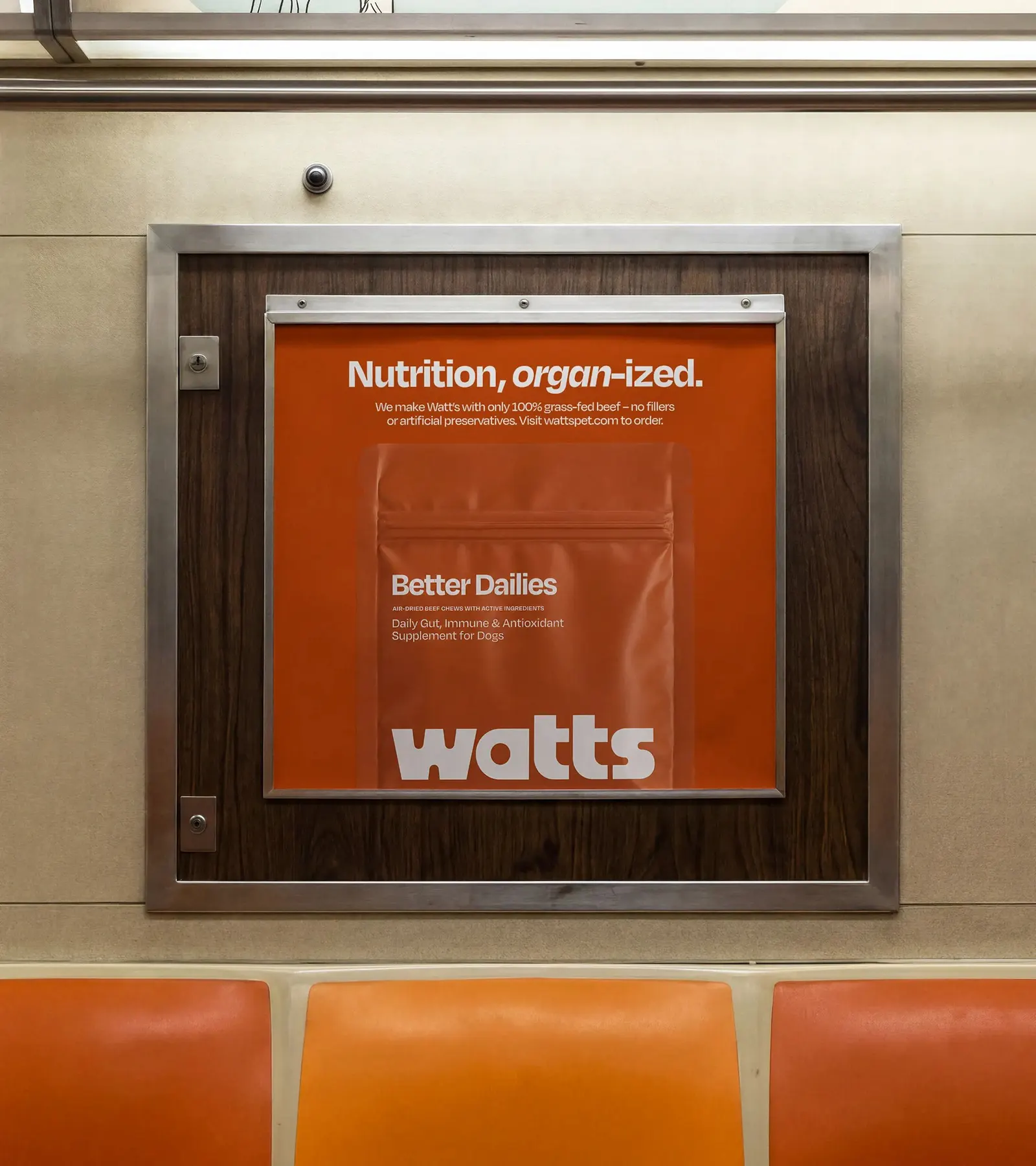
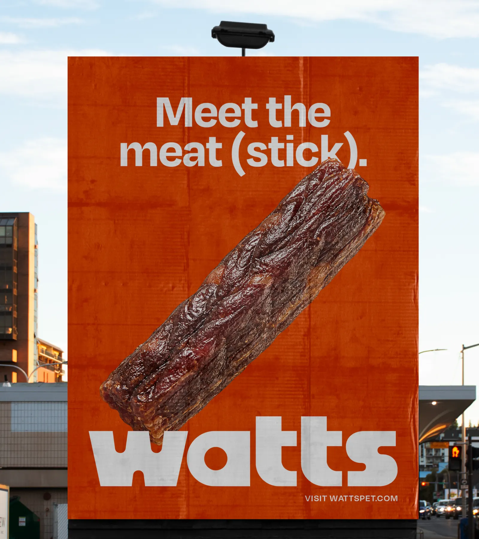
The studio set the brand between clinical and cartoonish, then built everything from that position. The name is short and charged. The wordmark is a single geometric mark set in Degular from OH no Type Co. The palette is a deep brown called Beef, with Bone white and black. The compact pouch has a resealable zip for the air-dried formula. Photography, 3D renders, motion, and a custom icon set share the wordmark's geometry, and the 404 page is a mini-game that pays out a discount code.
Why it works
Brown is the smartest choice here. Next to the bright packaging around it, Beef reads as real food rather than medicine or toy, which suits owners who read ingredient lists. Degular's slight irregularities keep the geometric wordmark from feeling sterile, so it can be precise and friendly at once. A short name set in one distinctive mark holds up from pouch to browser tab. The icons, drawn in the same geometry, make the system feel built rather than assembled.
Applications

Logo
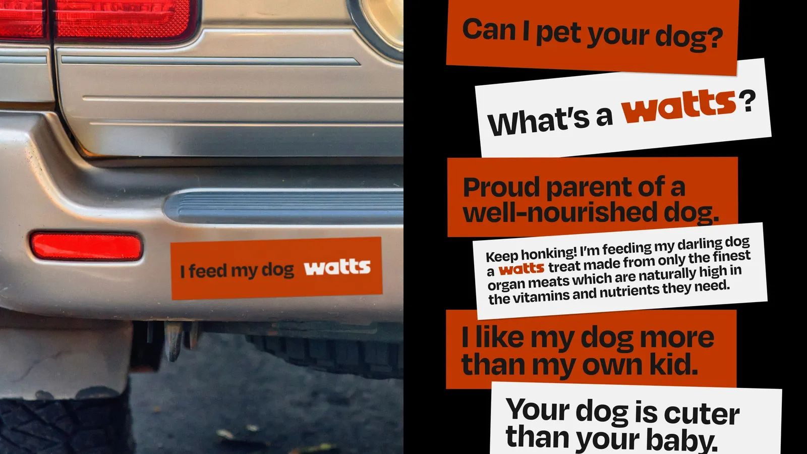
Images and video from view-source.com, by View Source.