The Brand Monograph
PopUp brand identity by Red Antler
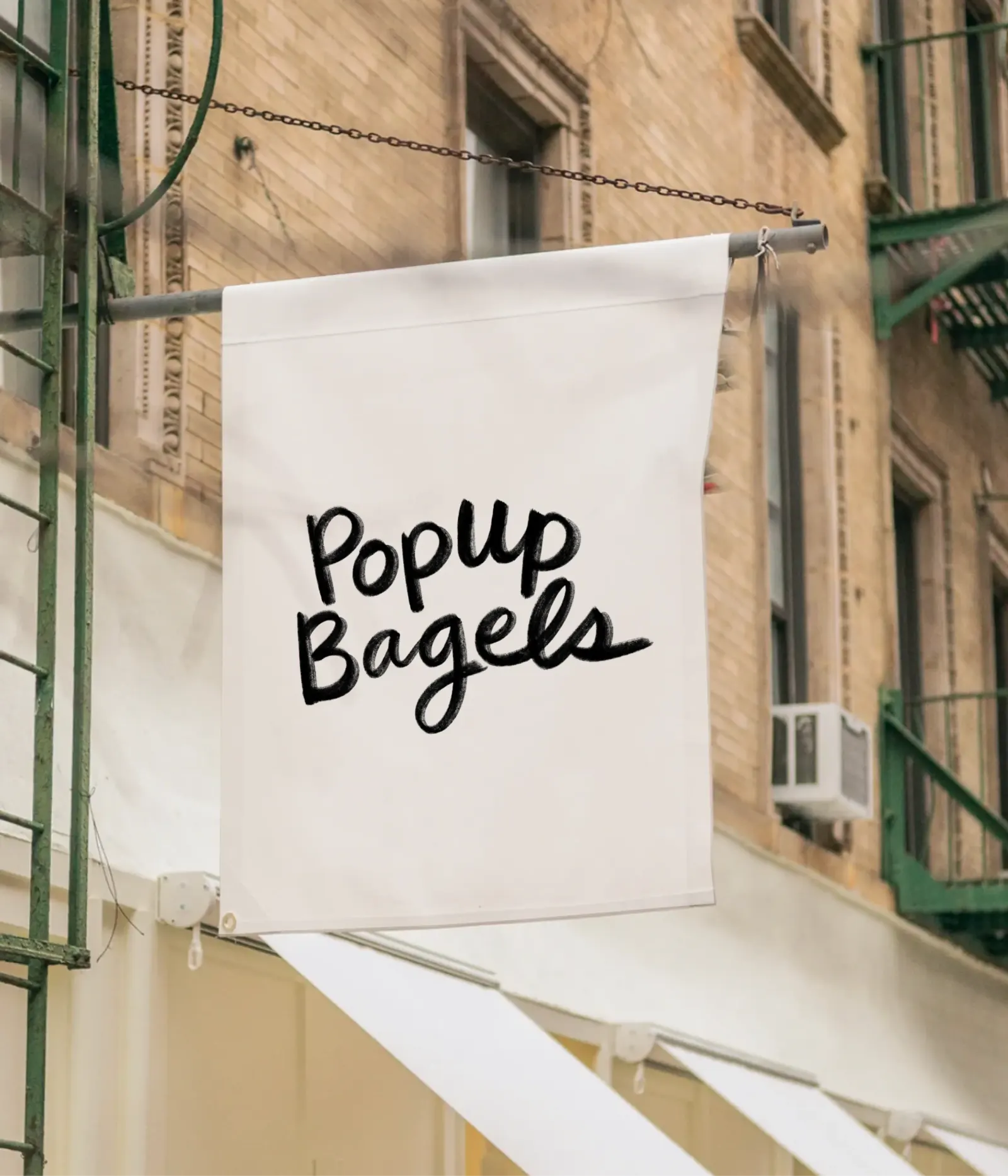
↗Red Antler's work for Popup Bagels shows how restraint can carry a brand well beyond its origin story. The Connecticut bagel maker had built a devoted following almost overnight, and its first New York shop was the moment to prove that appeal could travel.
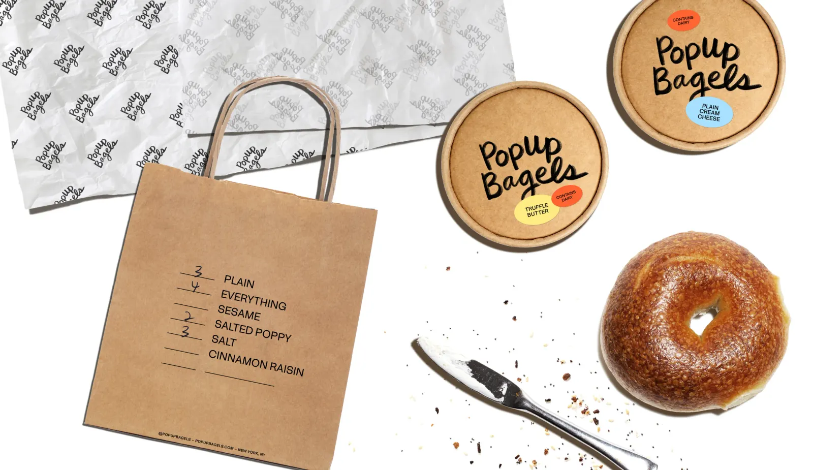
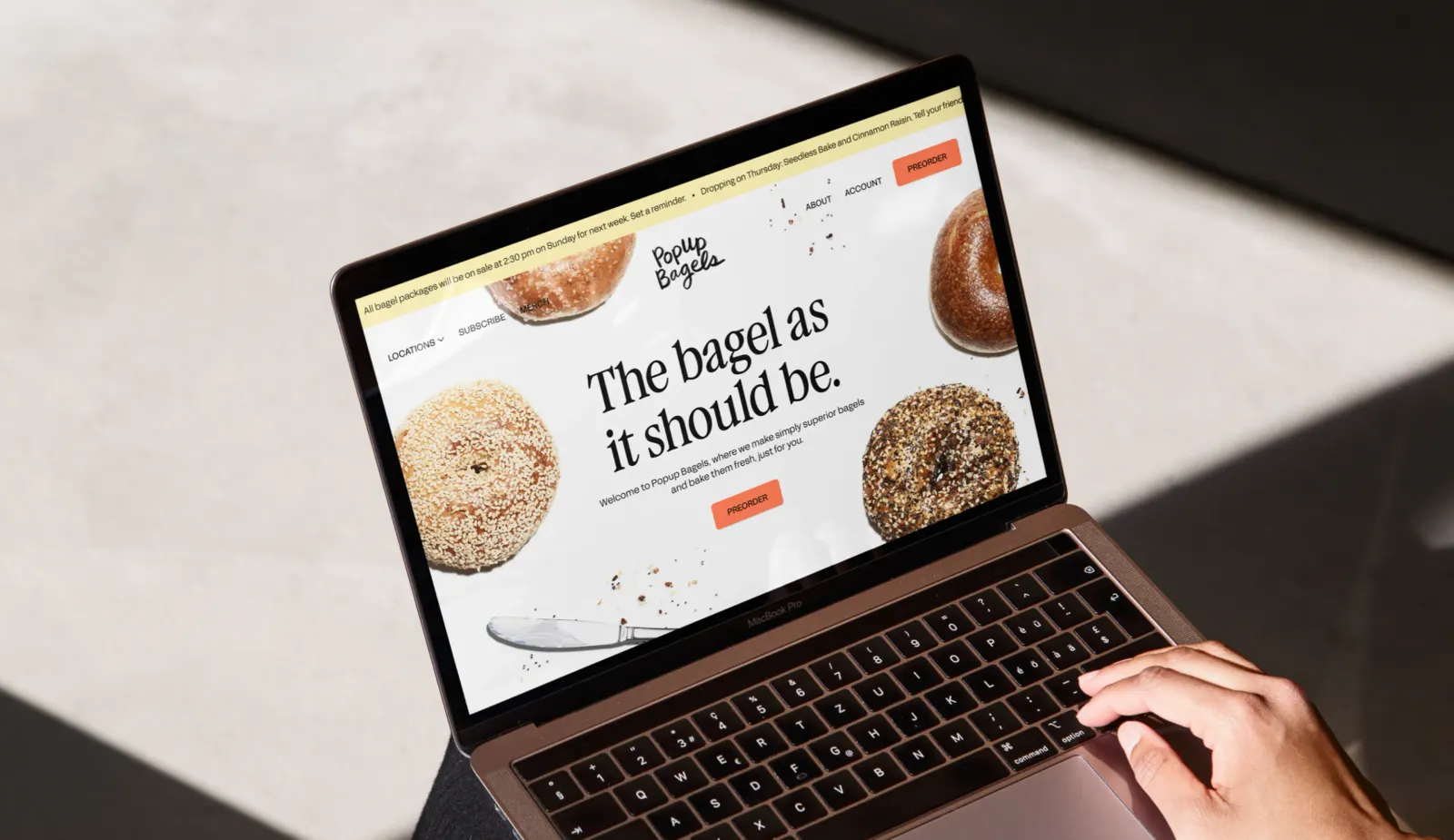
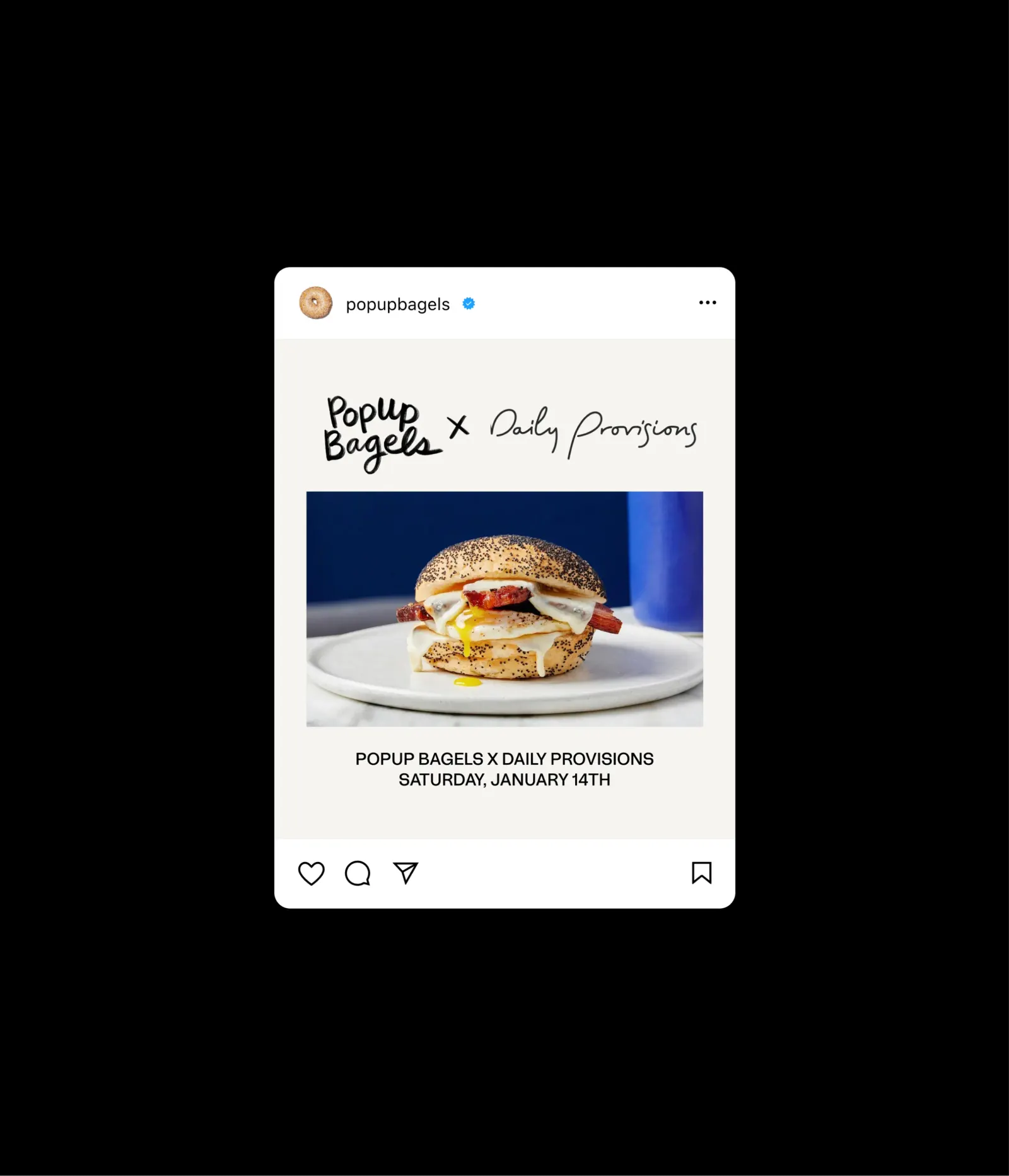
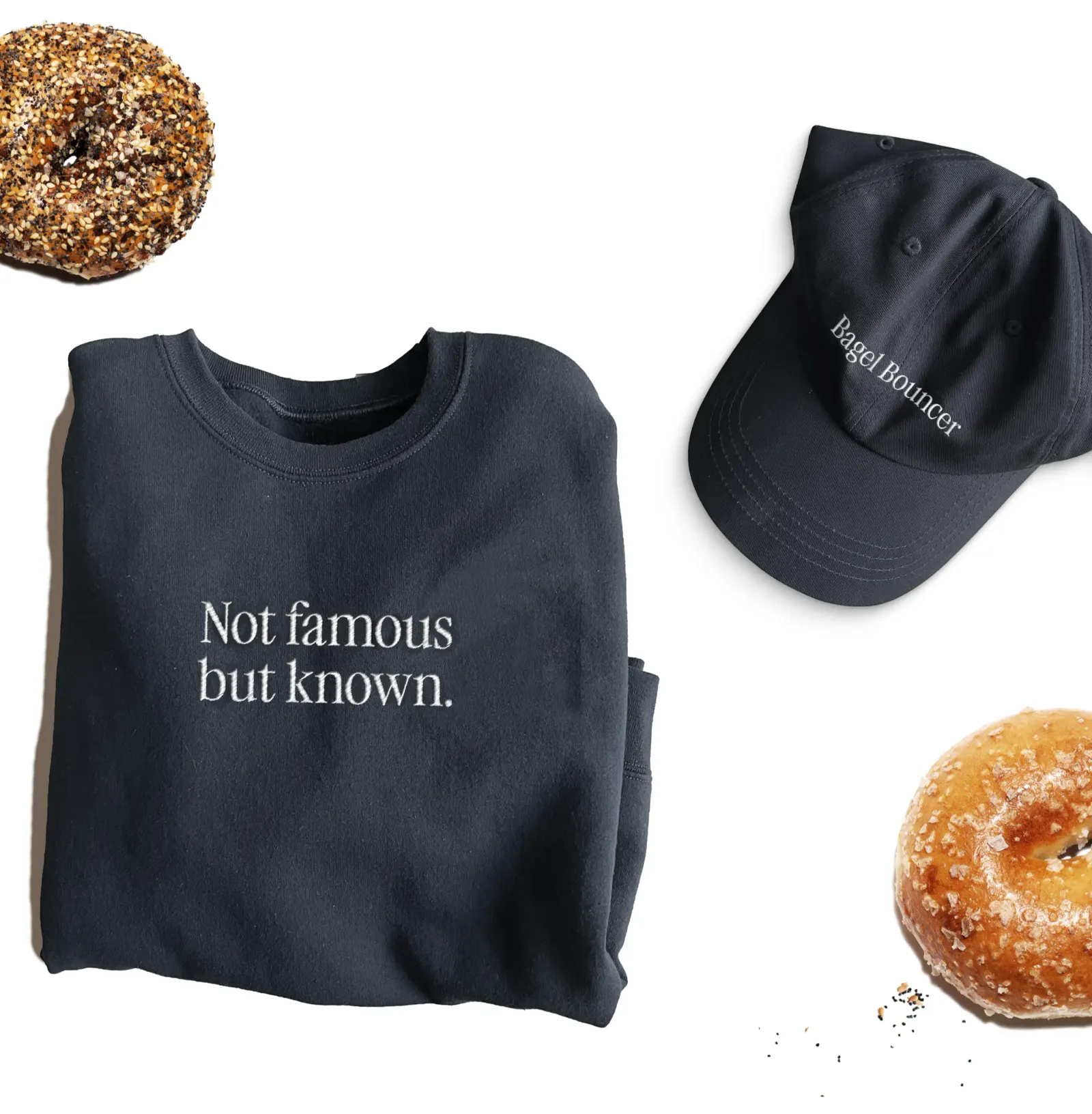
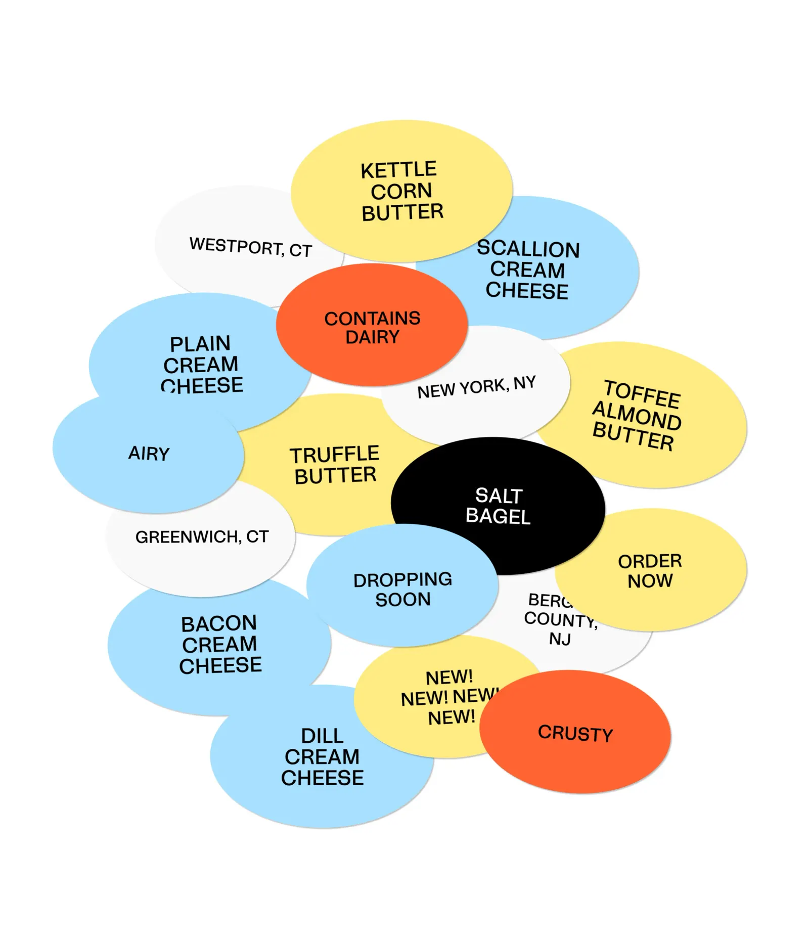
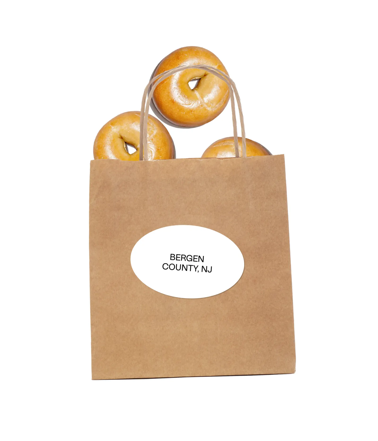
The brief was to grow nationally without turning generic. Red Antler placed the brand between old-school neighborhood bagel shops and the novelty, color-heavy bagels that circulate on social feeds, then made the bagel itself the brand's point of view. That plain-spoken logic runs through the packaging, including a brown paper to-go bag, and through merchandise made to be worn and carried. The studio also built a website with a pre-order system, shaped around the demand the shop was already seeing.
Why it works
The smartest move here is what the identity leaves out. By skipping the gimmicks of the trendy end of the category, and the nostalgia of the traditional end, Red Antler gave Popup Bagels a position that is easy to defend as it grows. The brown paper bag is a familiar bagel-shop object, so it feels trustworthy, while the merch lets fans carry the brand into the world. The pre-order system treats demand as a design problem, which makes the brand feel as considered online as it does at the counter.
Applications
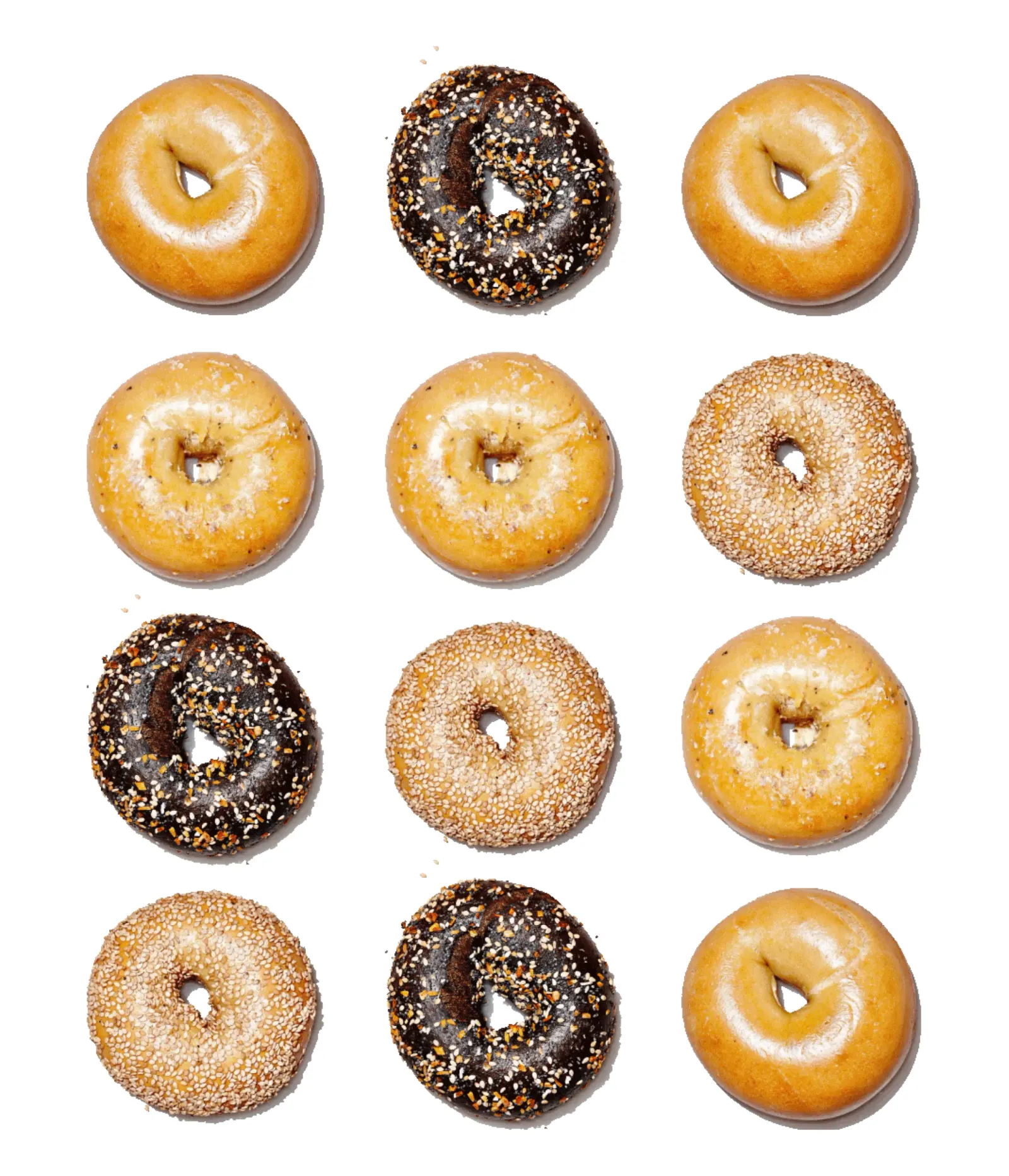
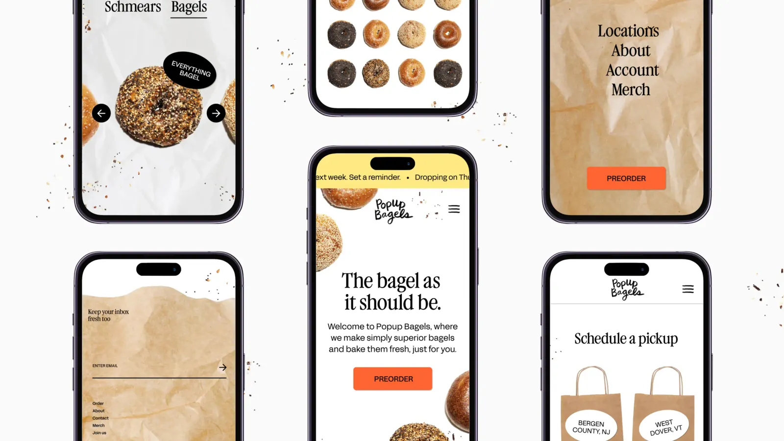
Images and video from redantler.com, by Red Antler.