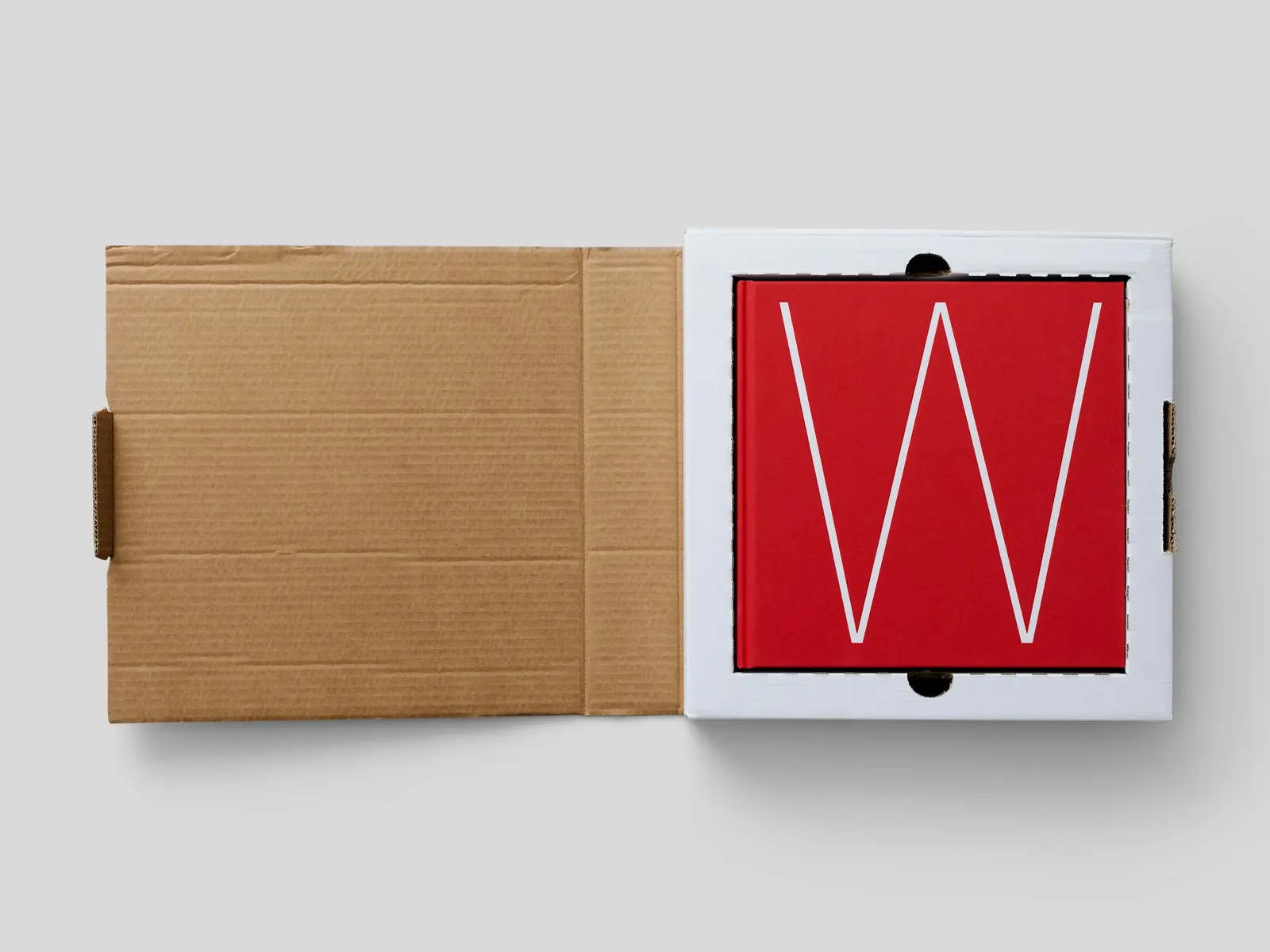
The Brand Monograph
Groove brand identity by Order
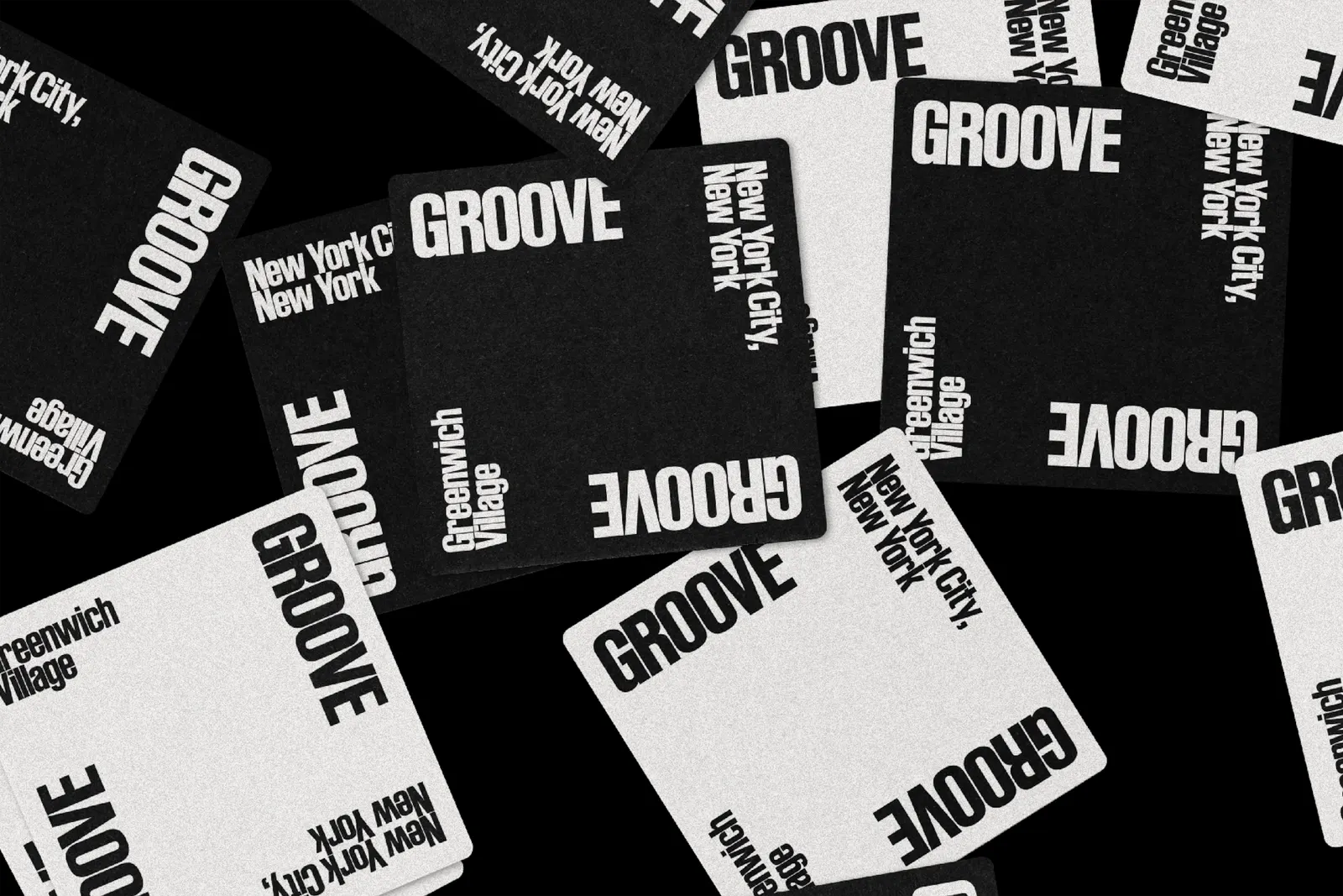
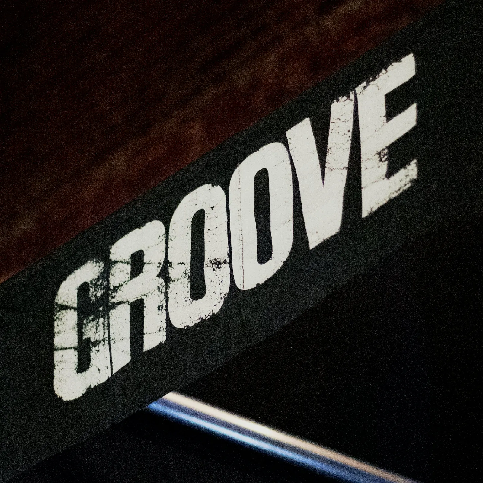
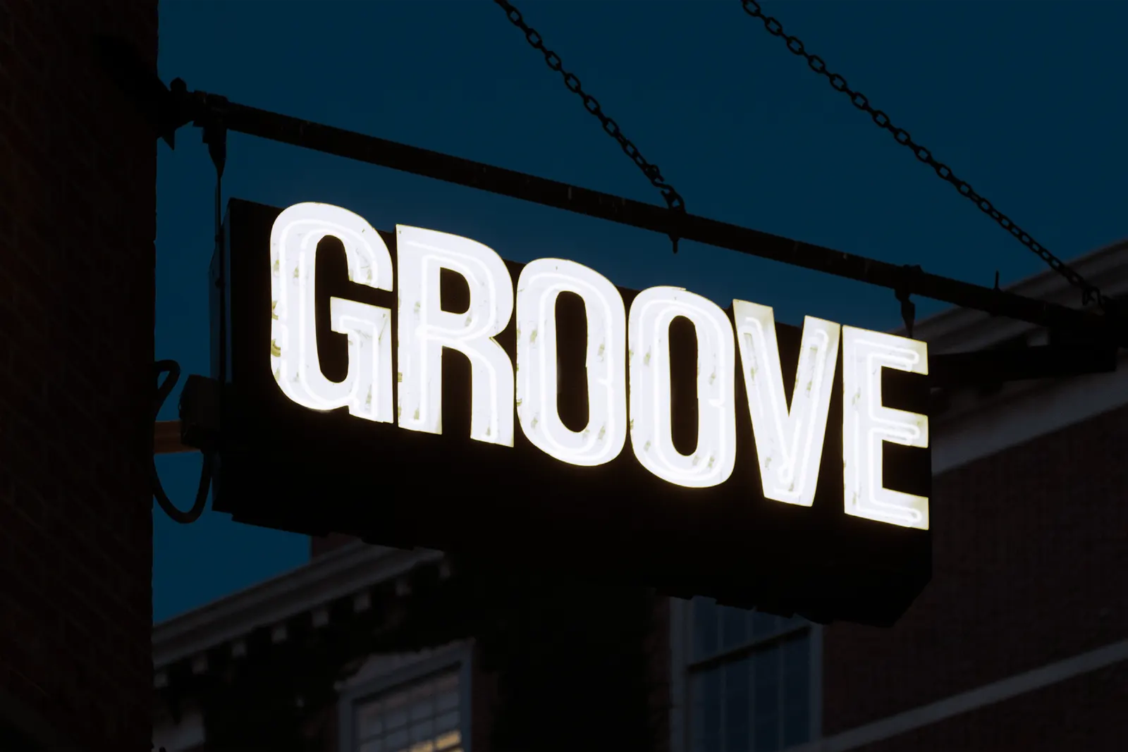
↗Order's identity for Groove treats the name on the bill as the main event. Instead of locking the venue into one fixed logo, the studio built a system where lettering stretches, stacks, and squeezes to suit whoever is playing, in the spirit of the gig posters that came before it.
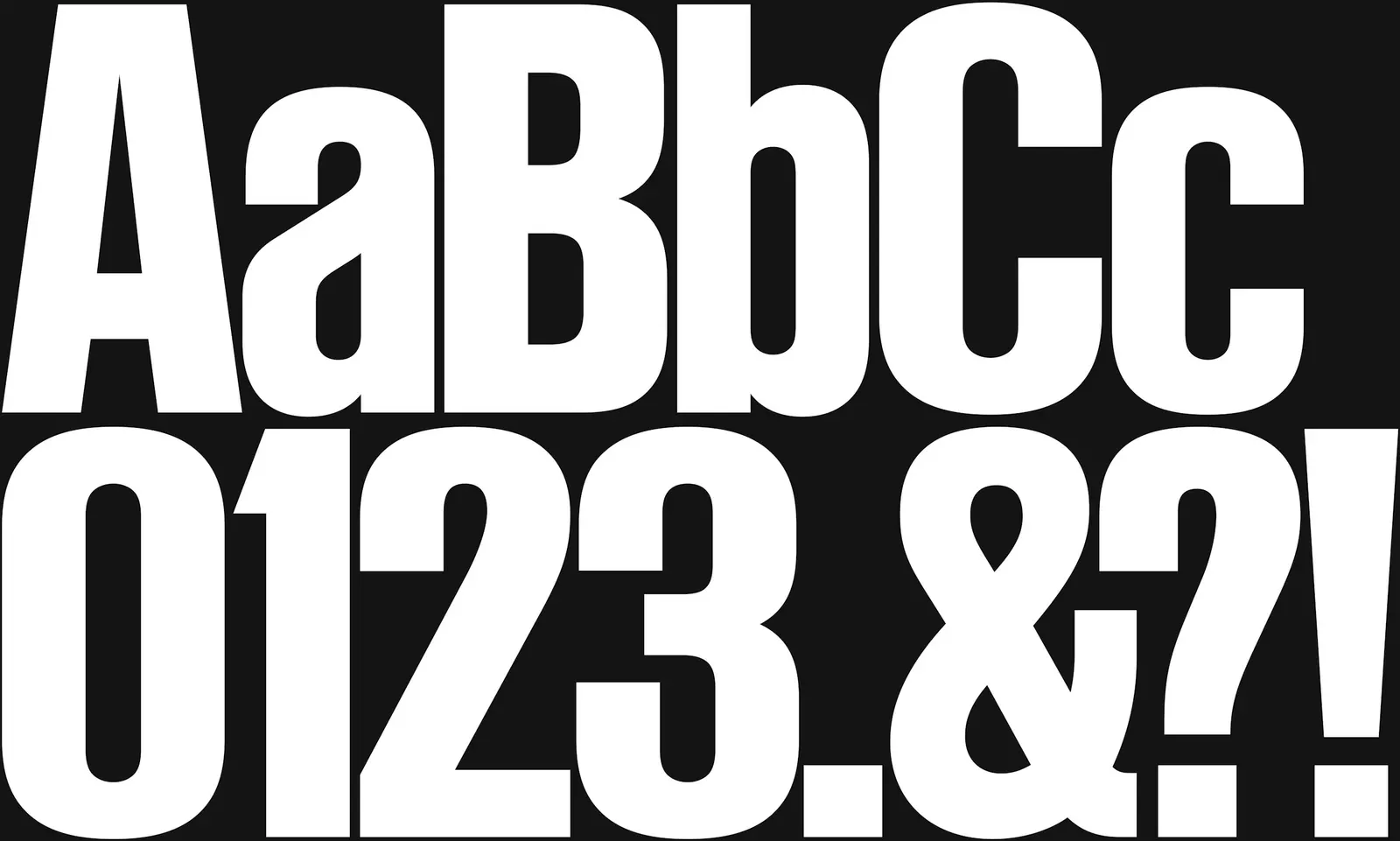
Groove has been a Greenwich Village fixture since 1998, and its calendar spans a wide range of genres. Designers Garrett Corcoran and Juju Stojanovic set Lineto's Ruder Plakat as the lead voice, with Lineto's Medium handling quieter jobs like food and drink menus. In condensed formats, the G steps in as a symbol. Color plays a supporting role, appearing as a field behind photography and across signage at the venue.
Why it works
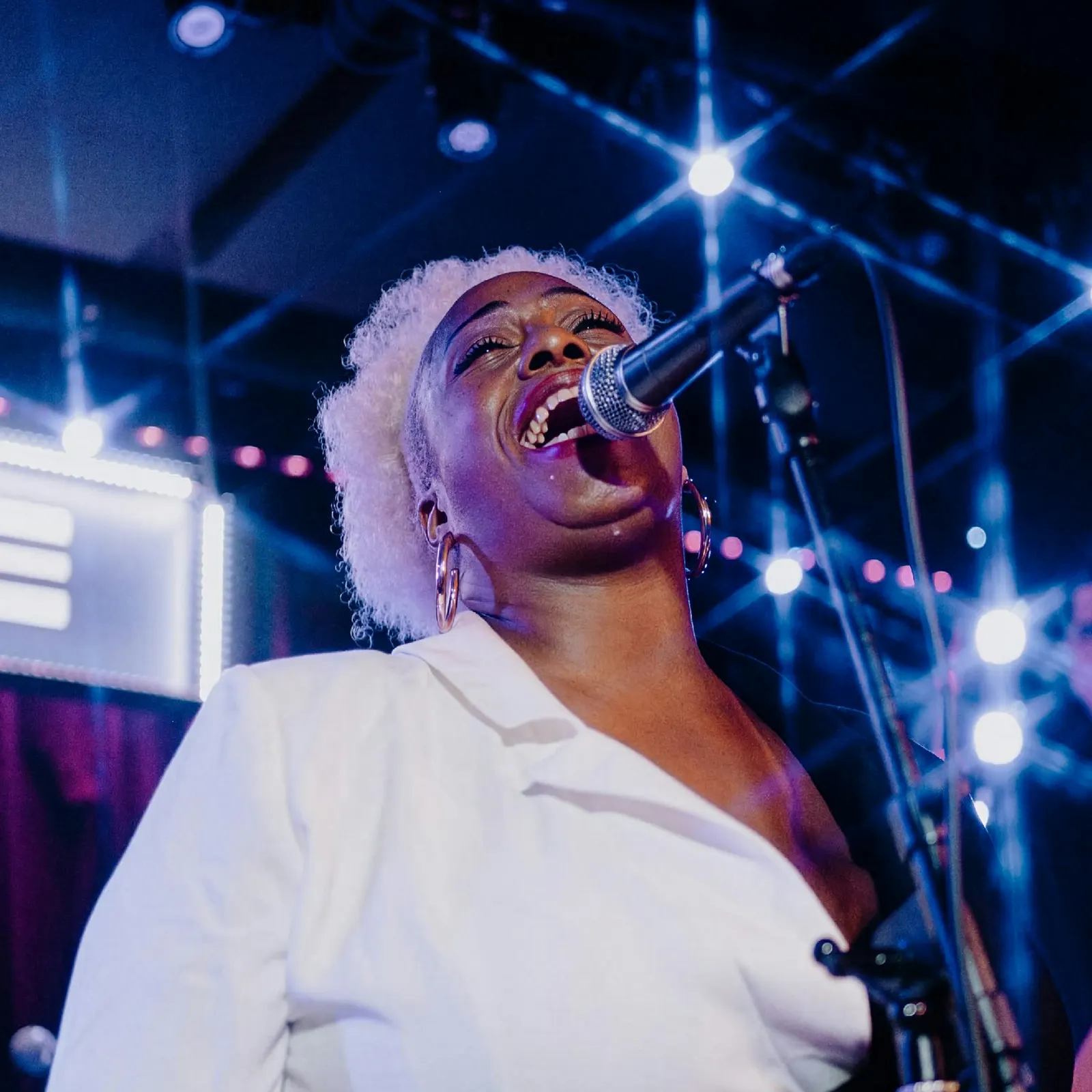
Music venues often fall back on a single look, whether neon, vintage, or gritty, that suits some nights and not others. Here, the type itself does the adapting, so a jazz quartet and a loud rock band can each look right without the brand losing its footing. The condensed G gives the system a compact signature when a full wordmark won't fit. Restrained color keeps the focus on photography of the musicians, and the plain Medium setting keeps practical information easy to read.
Logo
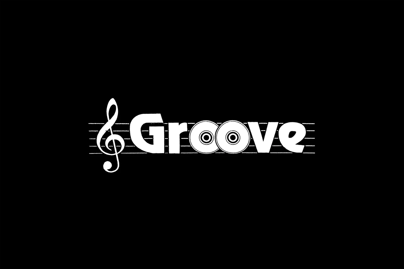
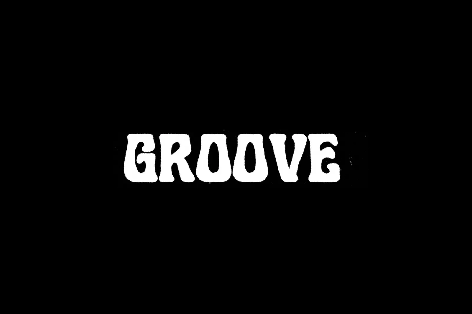
Typography
Applications
Images and video from order.design, by Order.