The Brand Monograph
Work & Co brand identity by Order
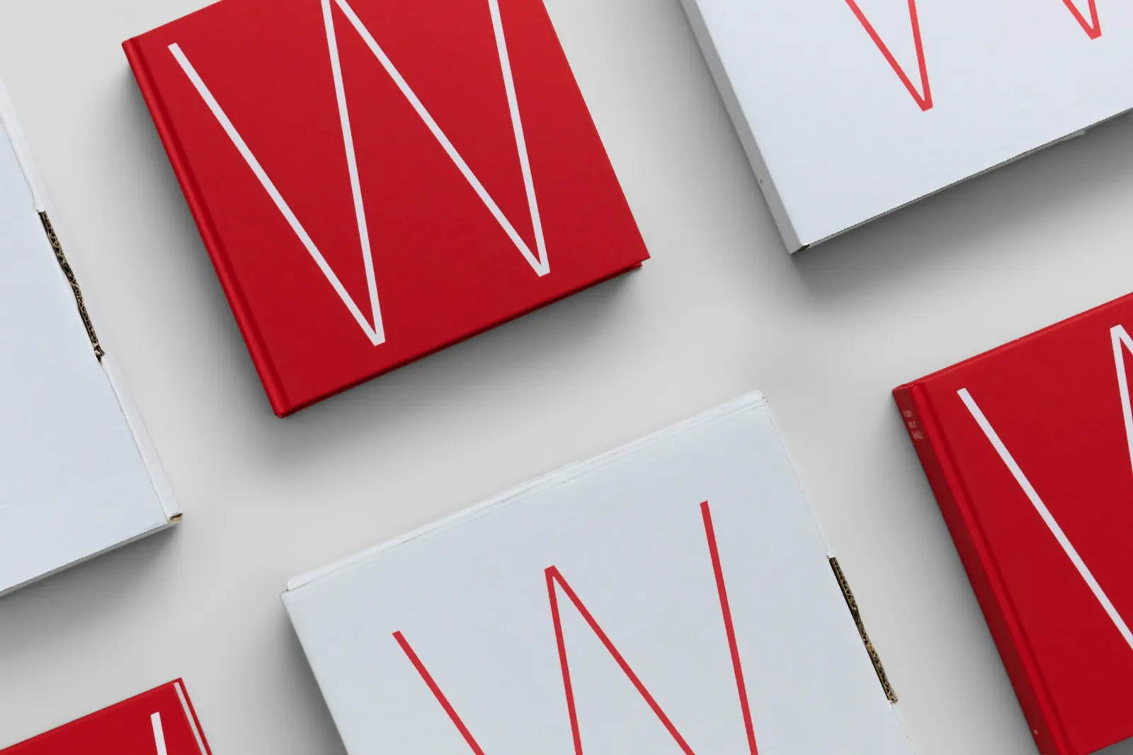
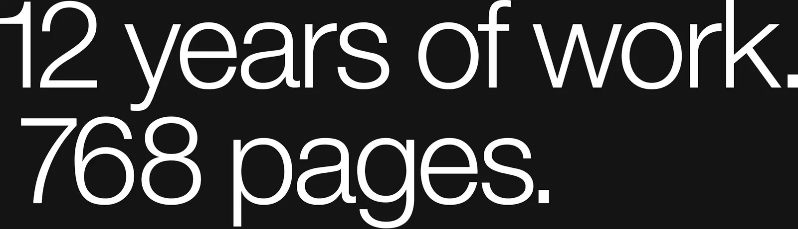
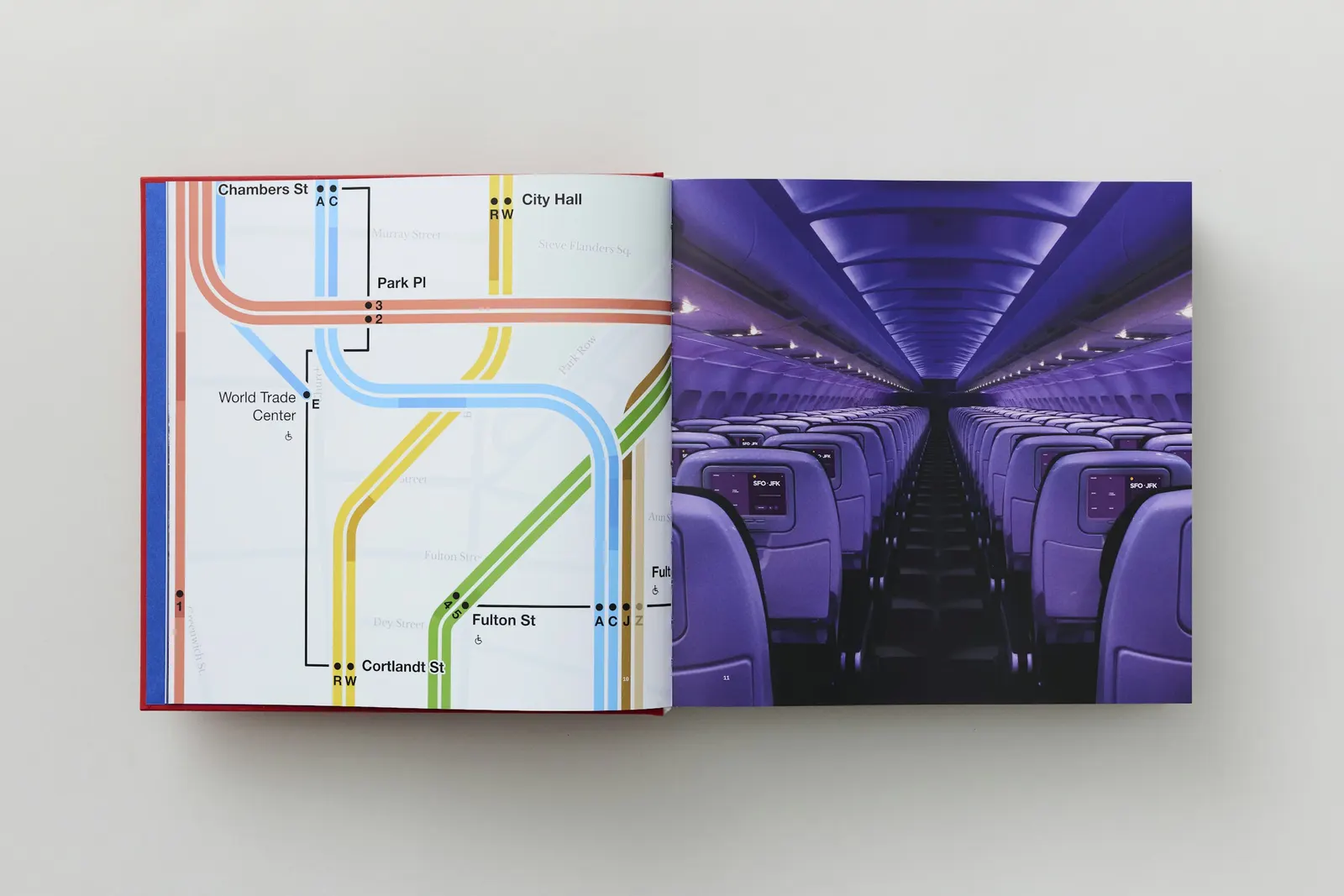
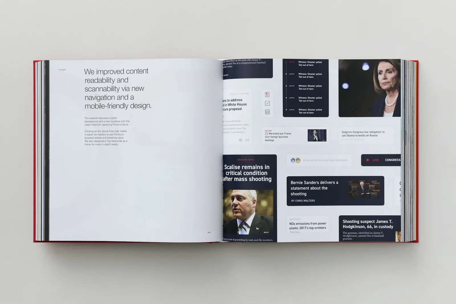
↗Order's book for Work & Co's 12th anniversary is a near-800-page object that skips the greatest-hits tone of a typical agency retrospective. Working with designers Emily Klaebe and Jesse Reed, and with photography by Casey Steffens, the studio used the agency's habit of running design and technology in parallel as the logic of the layout itself.
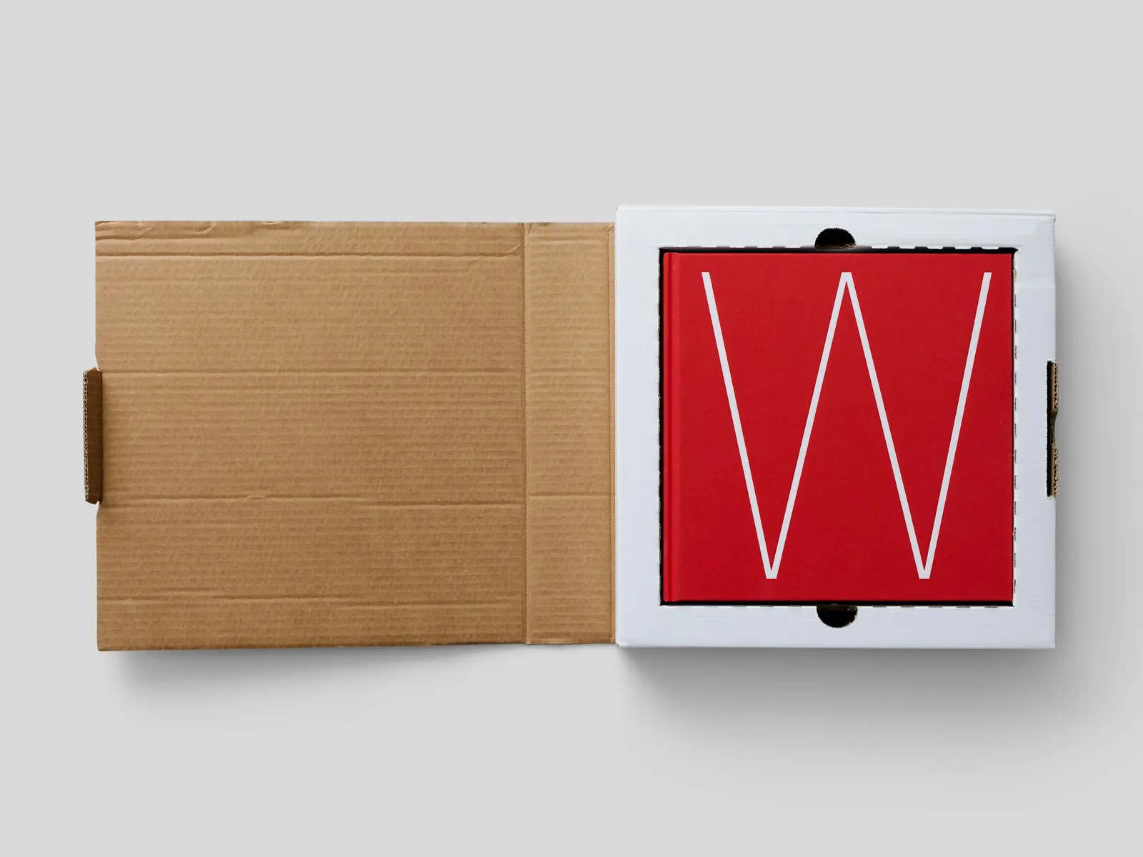
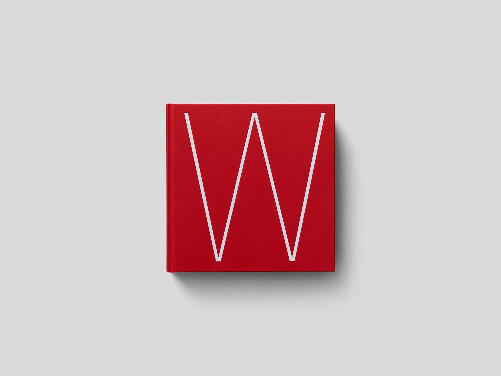
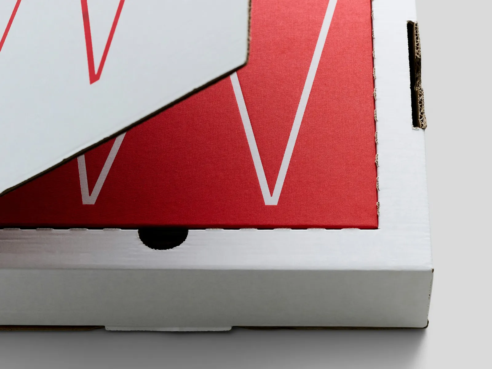
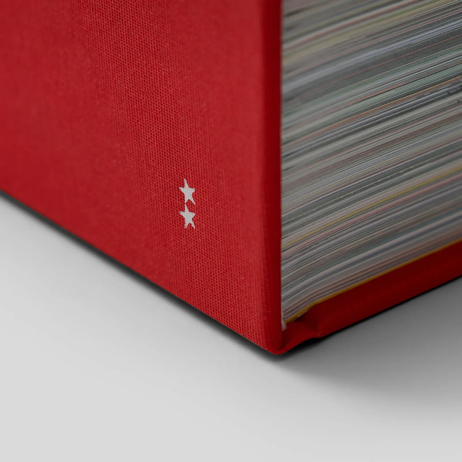
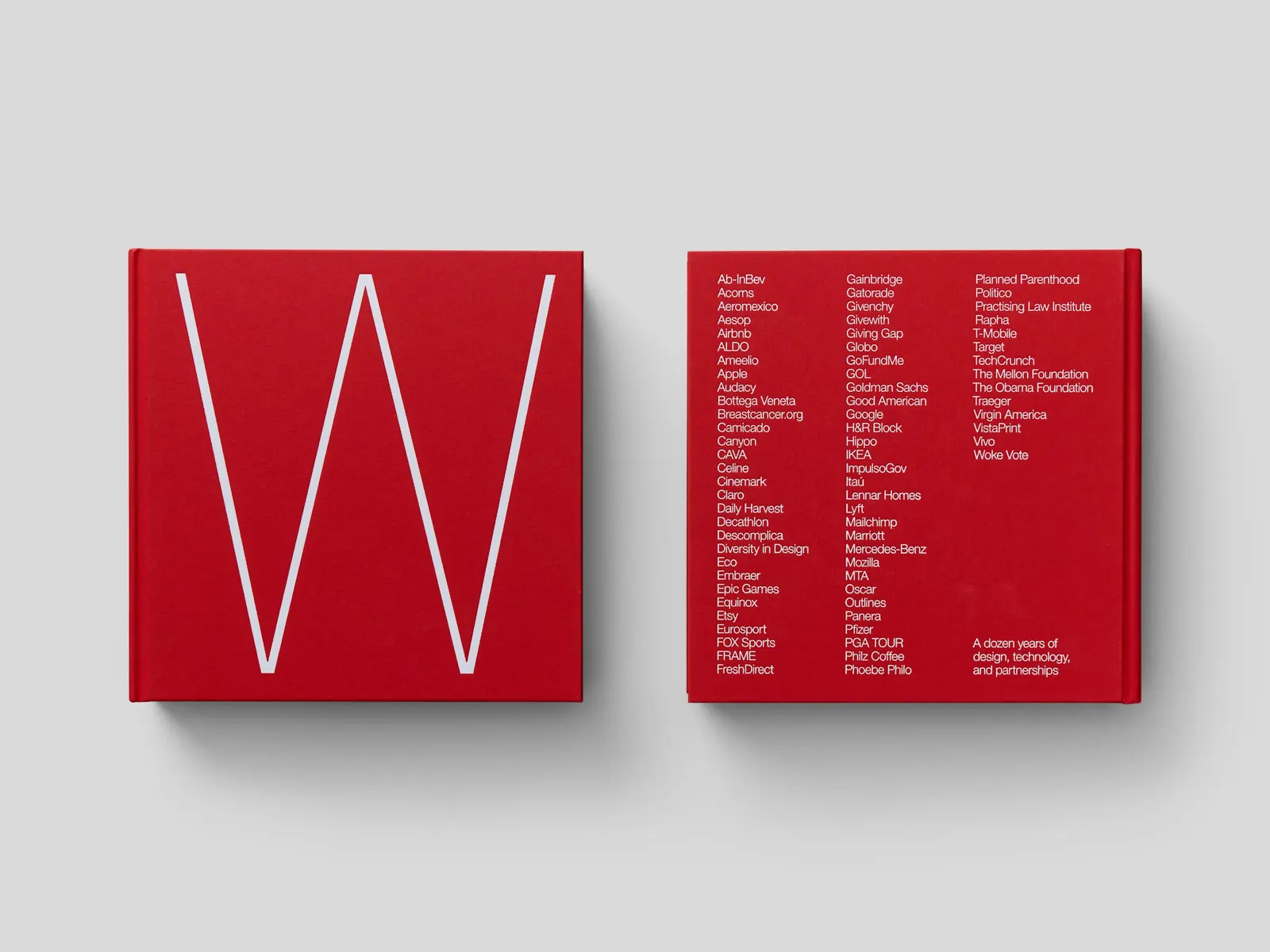
The cover is a single red W, and the mailer box repeats it, so the shipping carton doubles as a preview. Inside, large Helvetica Neue headlines sit against IBM Plex Mono captions and credits, across four sections: Foreword, Work, Spaces, and Company. Project openers use tightly cropped client logos before the finished work appears, and a few page footers hide URLs to archived live sites.
Why it works
The restraint is the point. Reducing the name to one red letter gives the agency a confident, ownable signal without any decoration, and the neutral Helvetica keeps attention on the client projects instead of on the book. The monospaced captions add a quiet technical note that suits a digital product studio. The hidden URLs are the smartest detail, since they acknowledge what print can't do and reward the readers curious enough to look.
Applications
Typography
Logo

Images and video from order.design, by Order.