The Brand Monograph
Sonny's Corner brand identity by Order
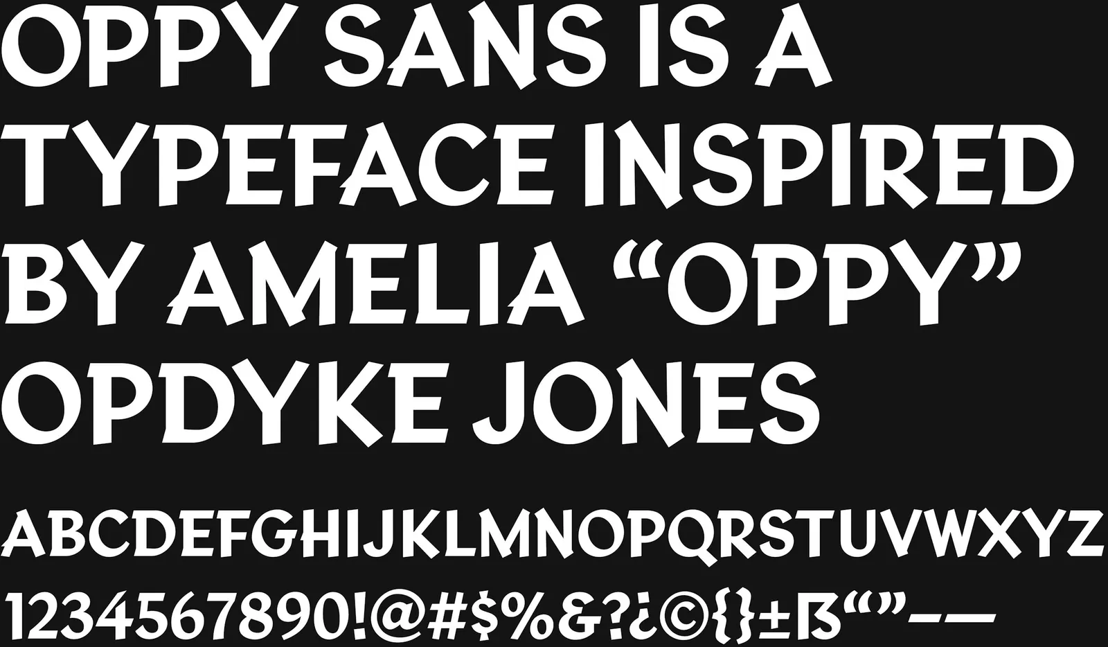
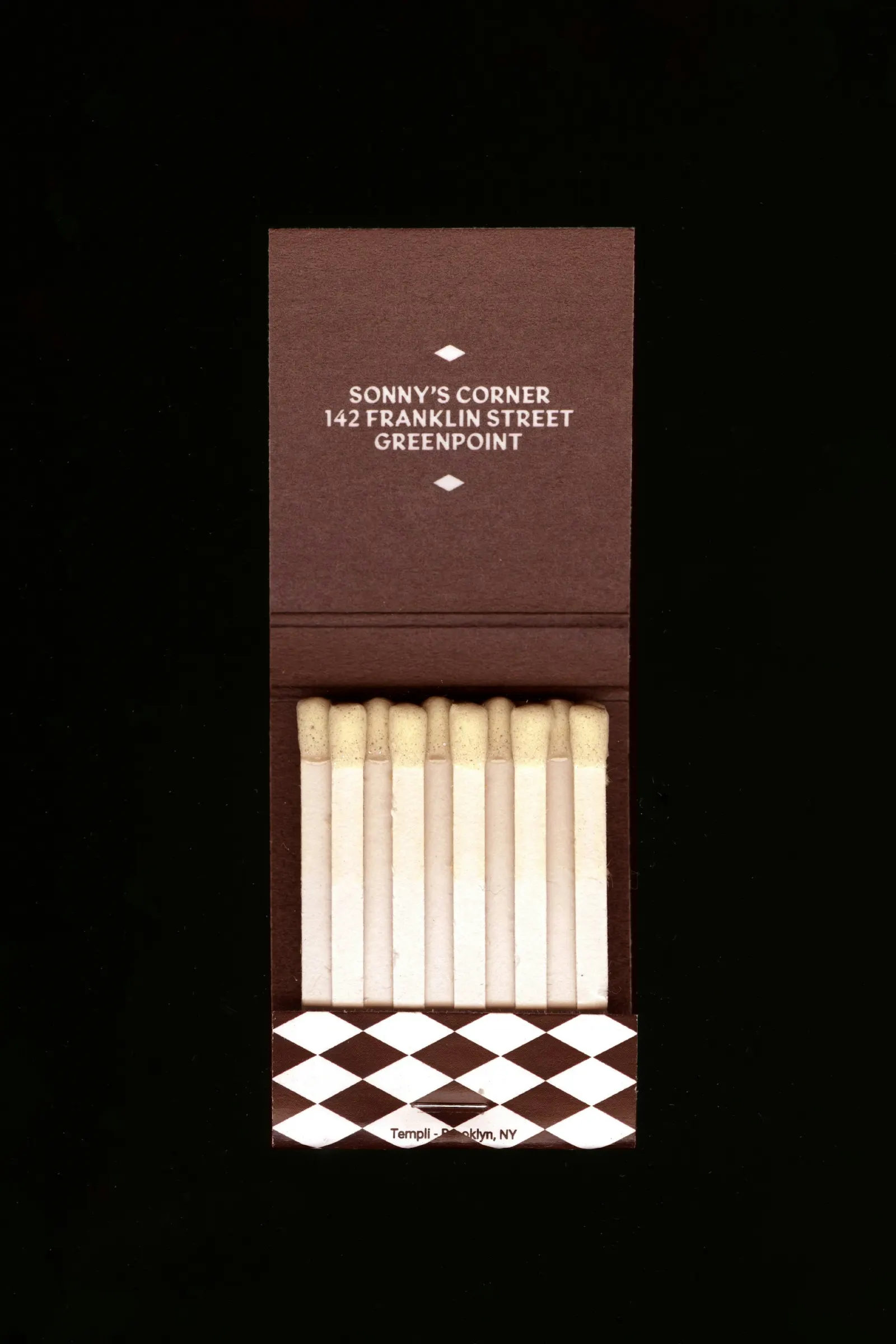
↗Order's identity for Sonny's Corner starts from an unusual source: the hand-lettering of Amelia Opdyke Jones, who drew the Subway Sun, a humorous etiquette notice that ran on New York trains from 1918 until around 1965. The bar sits at Franklin Street and Greenpoint Avenue, in a landmarked 1930 building and the space the Pencil Factory left behind. The studio's Brooklyn office is only a few blocks away.
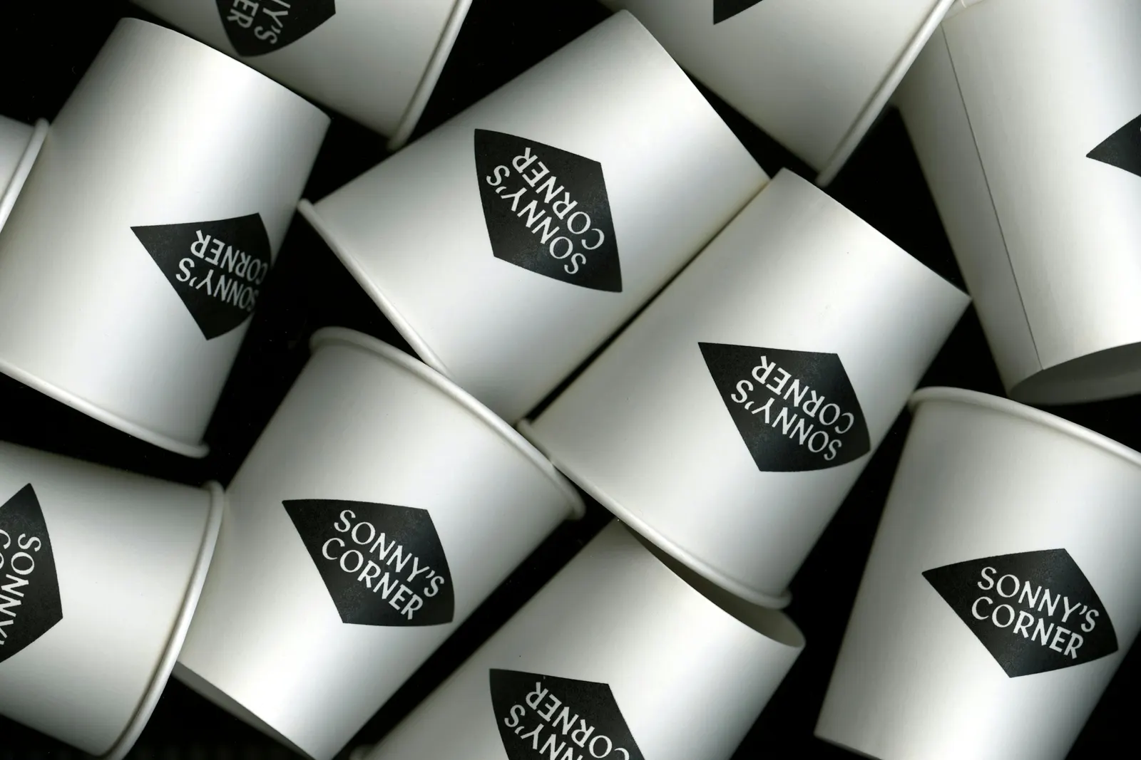
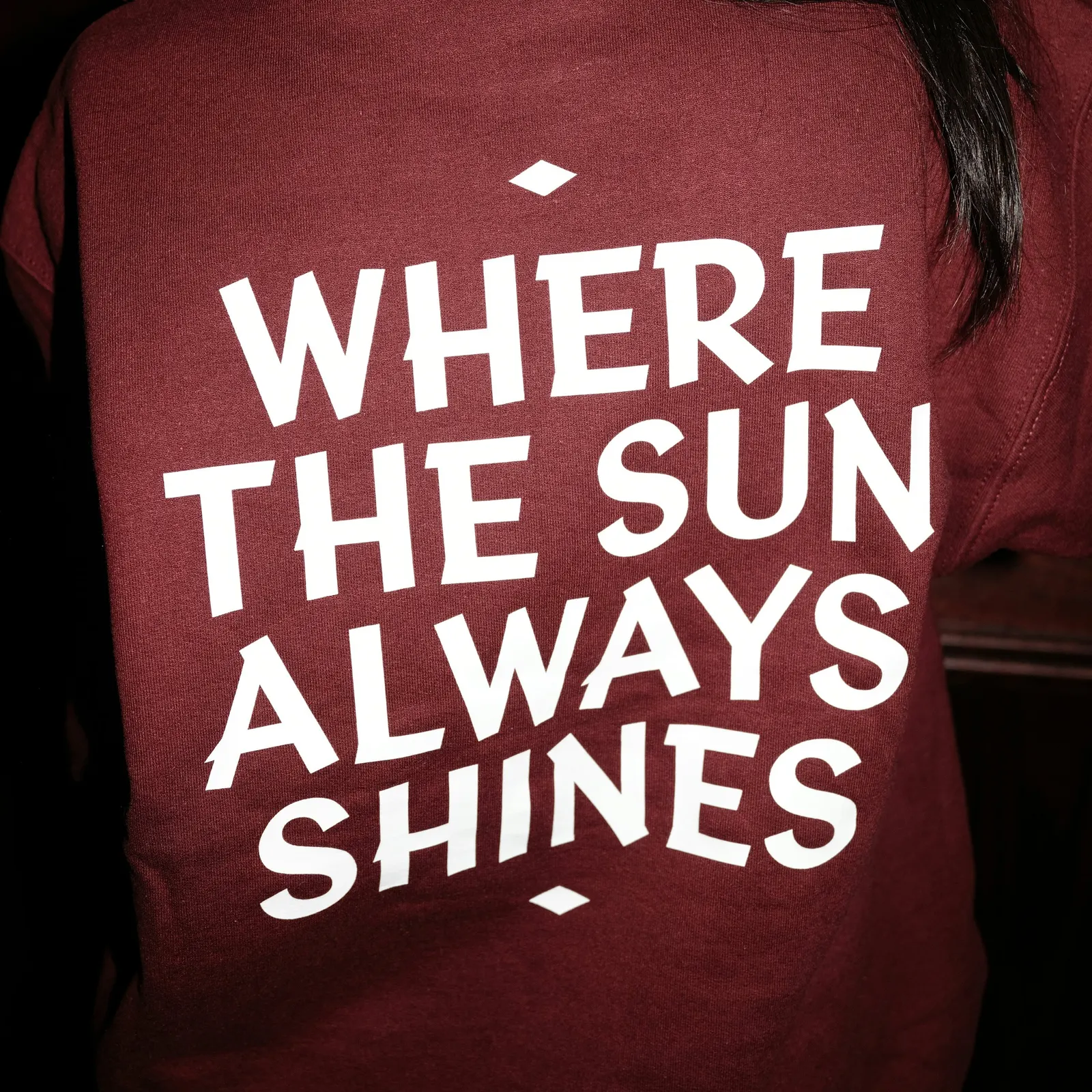
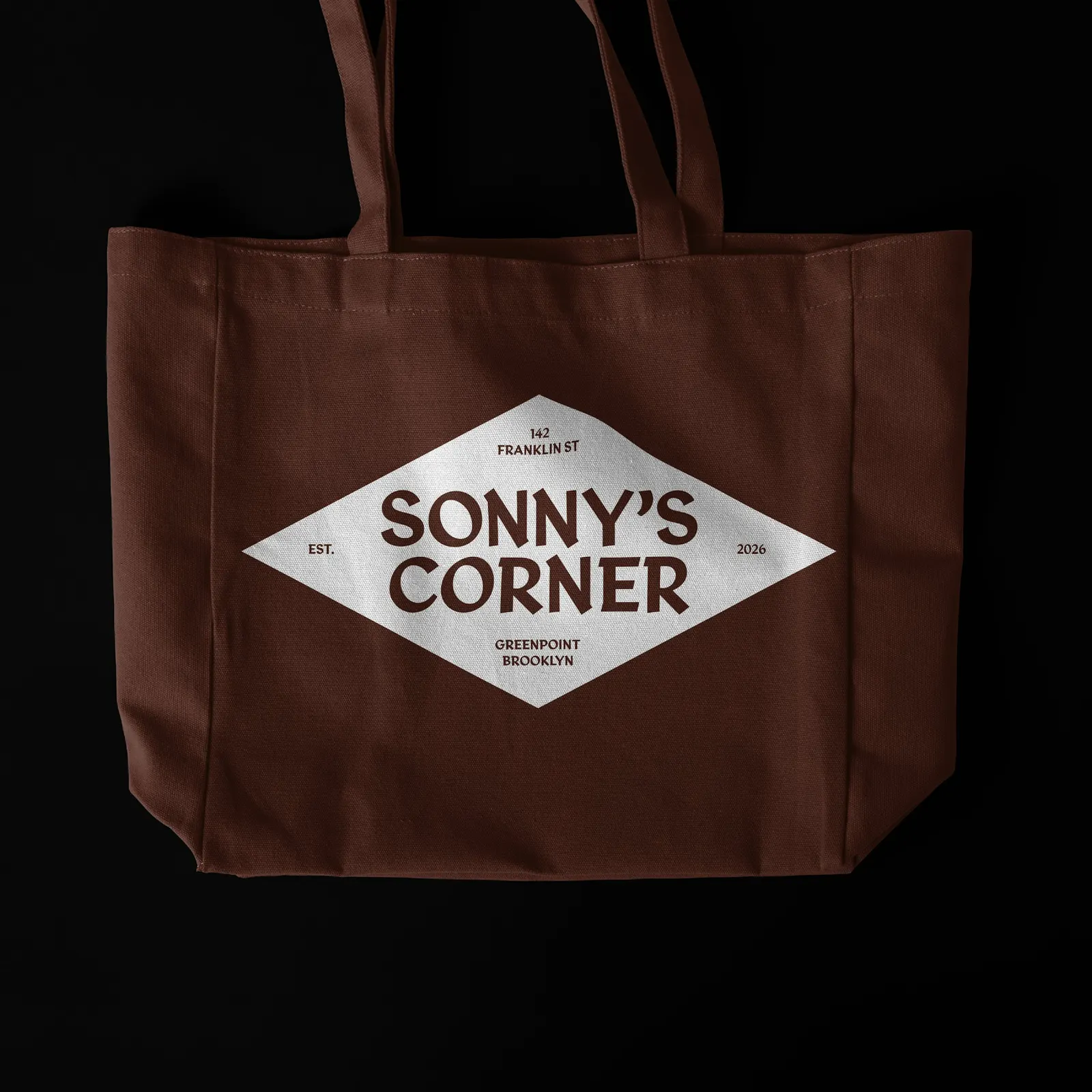
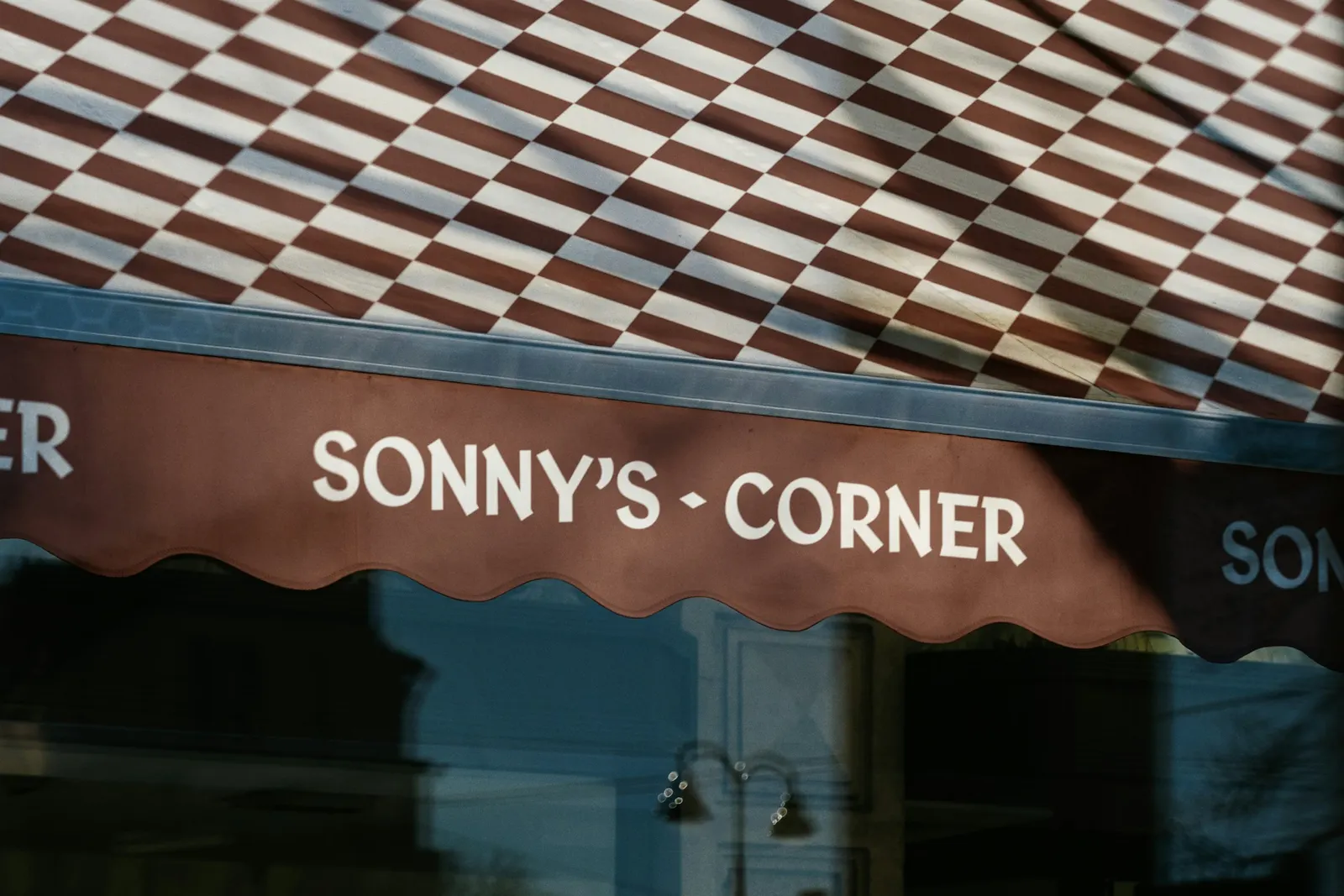
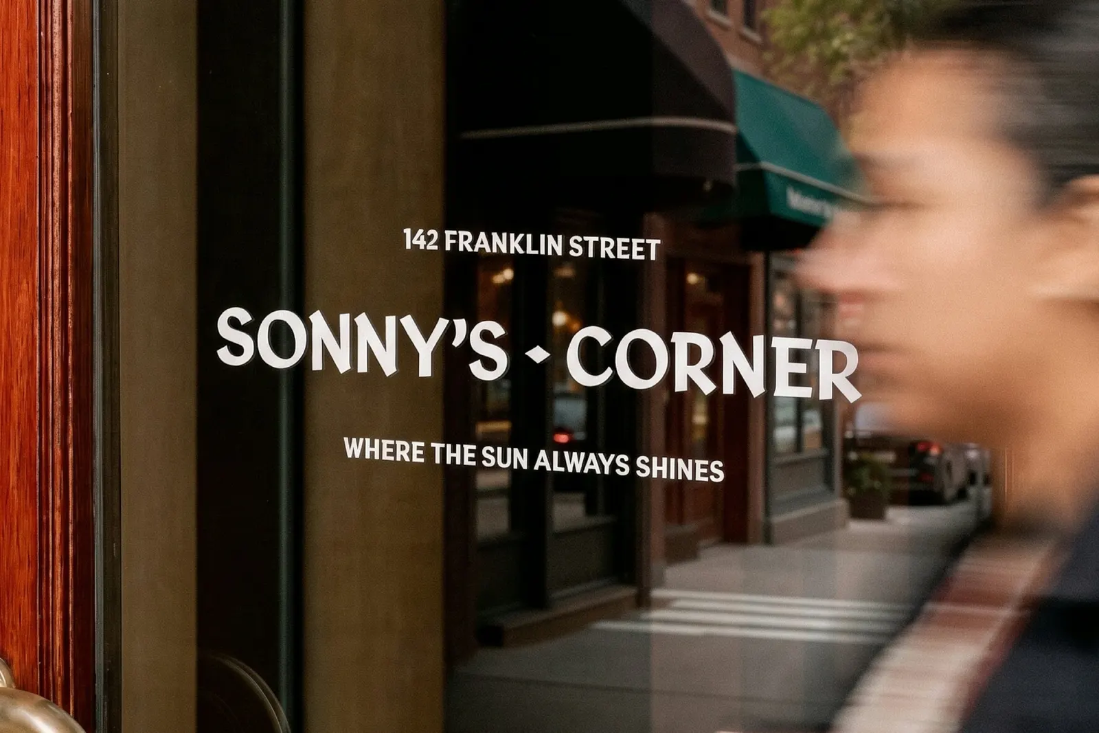
Working with Benjamin Tuttle, who was already developing a typeface from Jones's lettering, and designer Jesse Reed, Order turned it into Oppy Sans. It is the brand's only typographic style, used from signage to packaging. A deep red picks up the room's wood and seating, with neutrals and materials filling in around it. The motto stacks references to the typeface, the owner's newborn child, and the corner's afternoon light, tied to Manhattanhenge.
Why it works
A neighborhood bar succeeds when it feels like it has always been there, and this identity borrows a past that belongs to the city. Oppy Sans has the warmth of hand-drawn letters, which suits a place meant for unwinding after a commute, and it connects to the subway so many locals ride. The restraint matters too. One typographic style and one red keep the system consistent and stop it from feeling themed, a common trap for bars that lean on nostalgia. The layered motto gives regulars something to discover.
Logo

Typography
Applications
Images and video from order.design, by Order.