The Brand Monograph
Salt Lick on Salt Creek brand identity by Order
↗Order turned a century-old type specimen book into the backbone of a lavender farm's identity, and the result looks like nothing else on the shelf of botanical and personal care brands. Salt Lick on Salt Creek is one of the highest-elevation lavender farms in the world, and the studio needed a look for the family property in Colorado and for the products grown there.
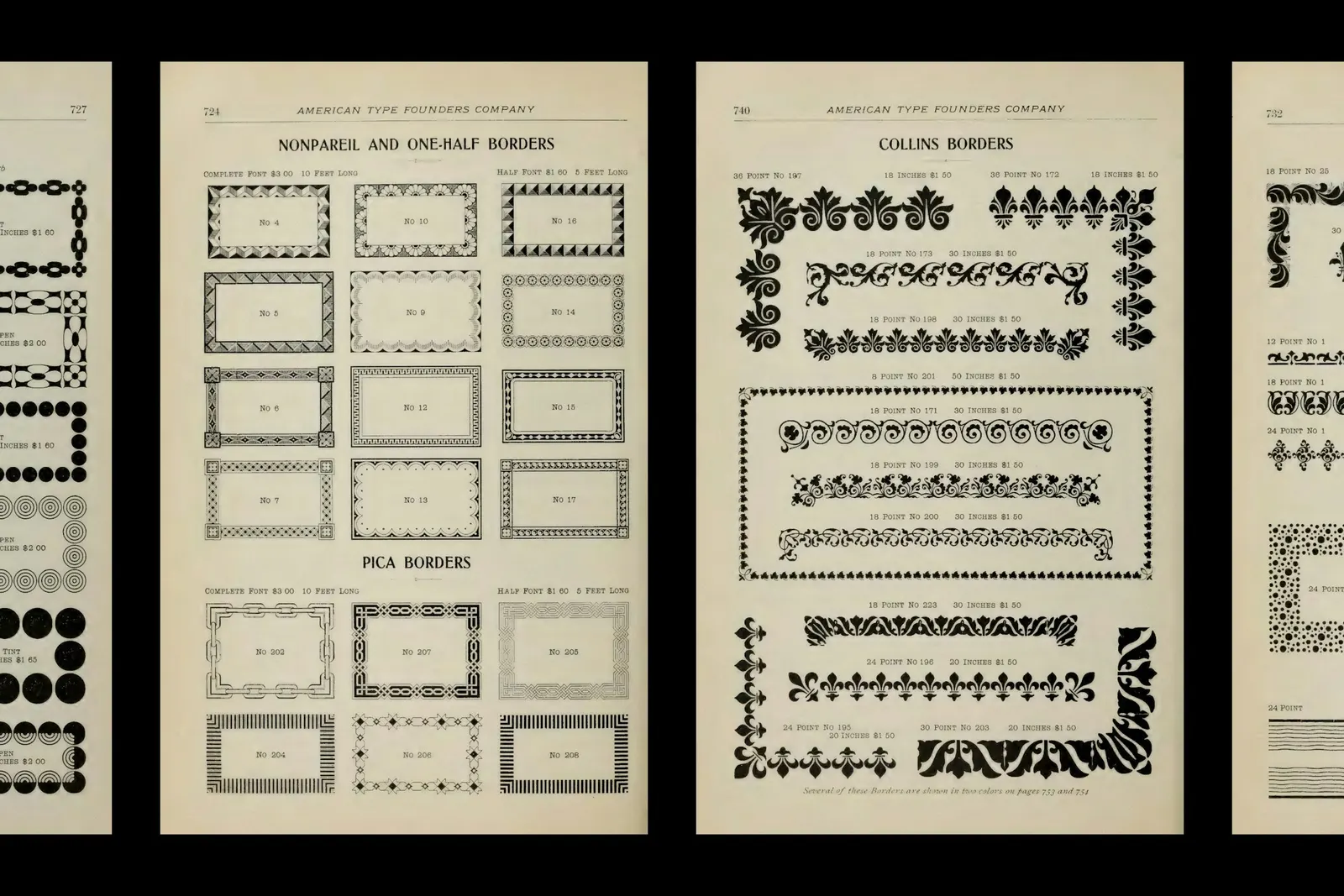
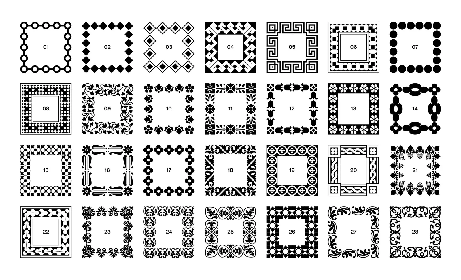
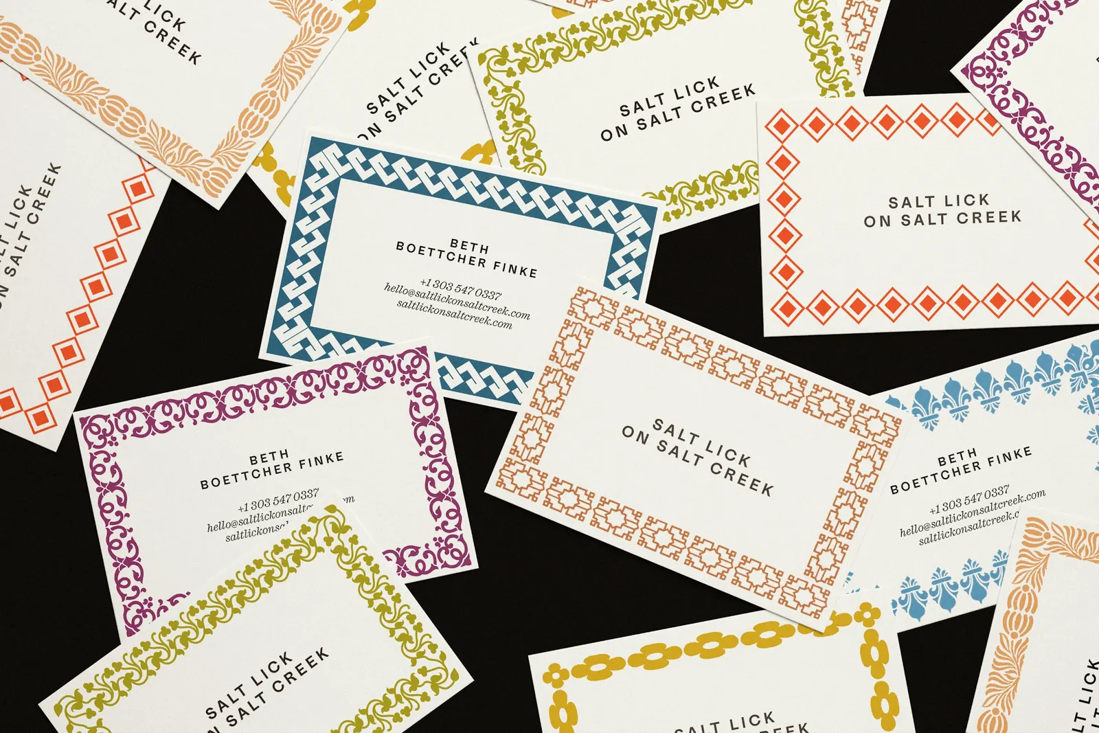
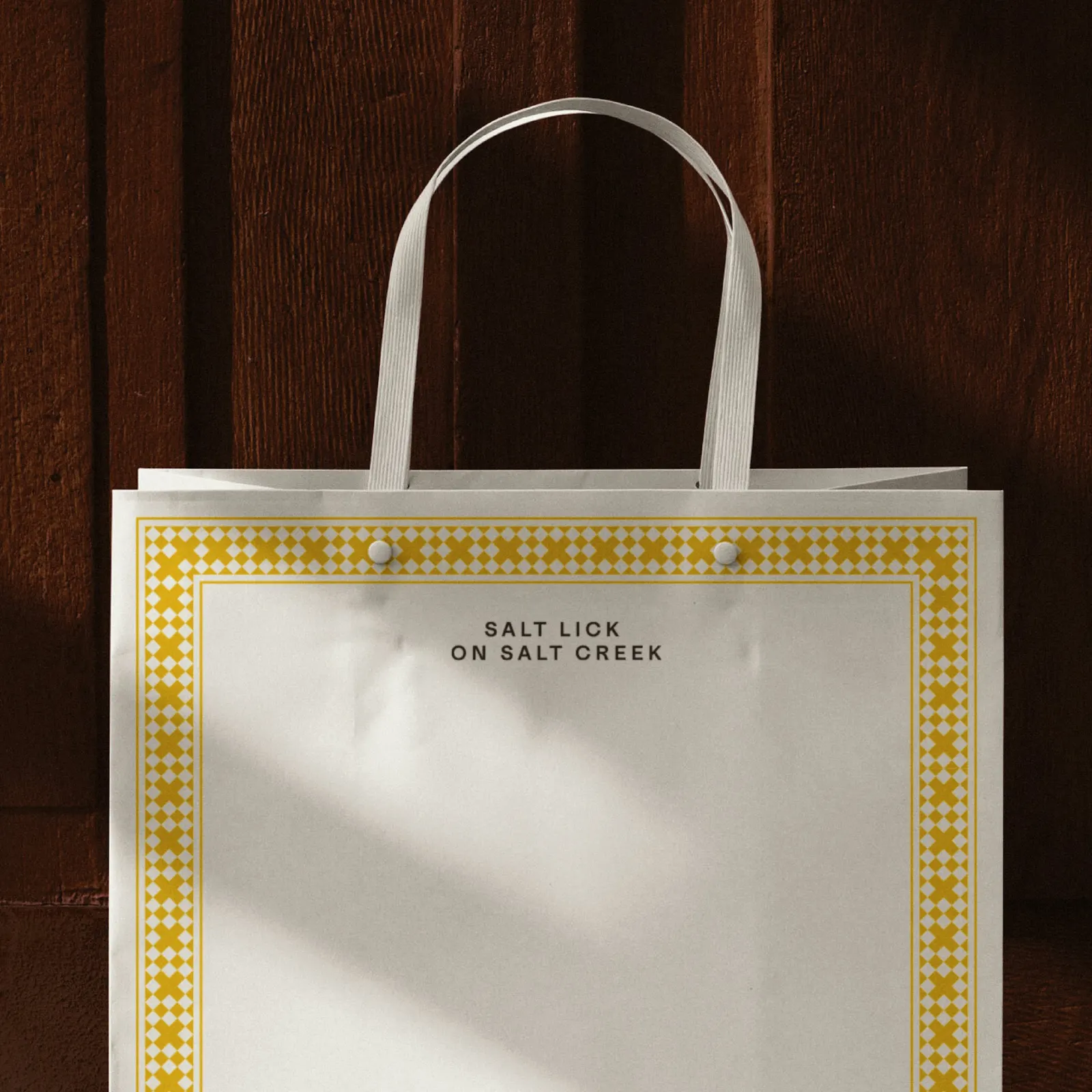
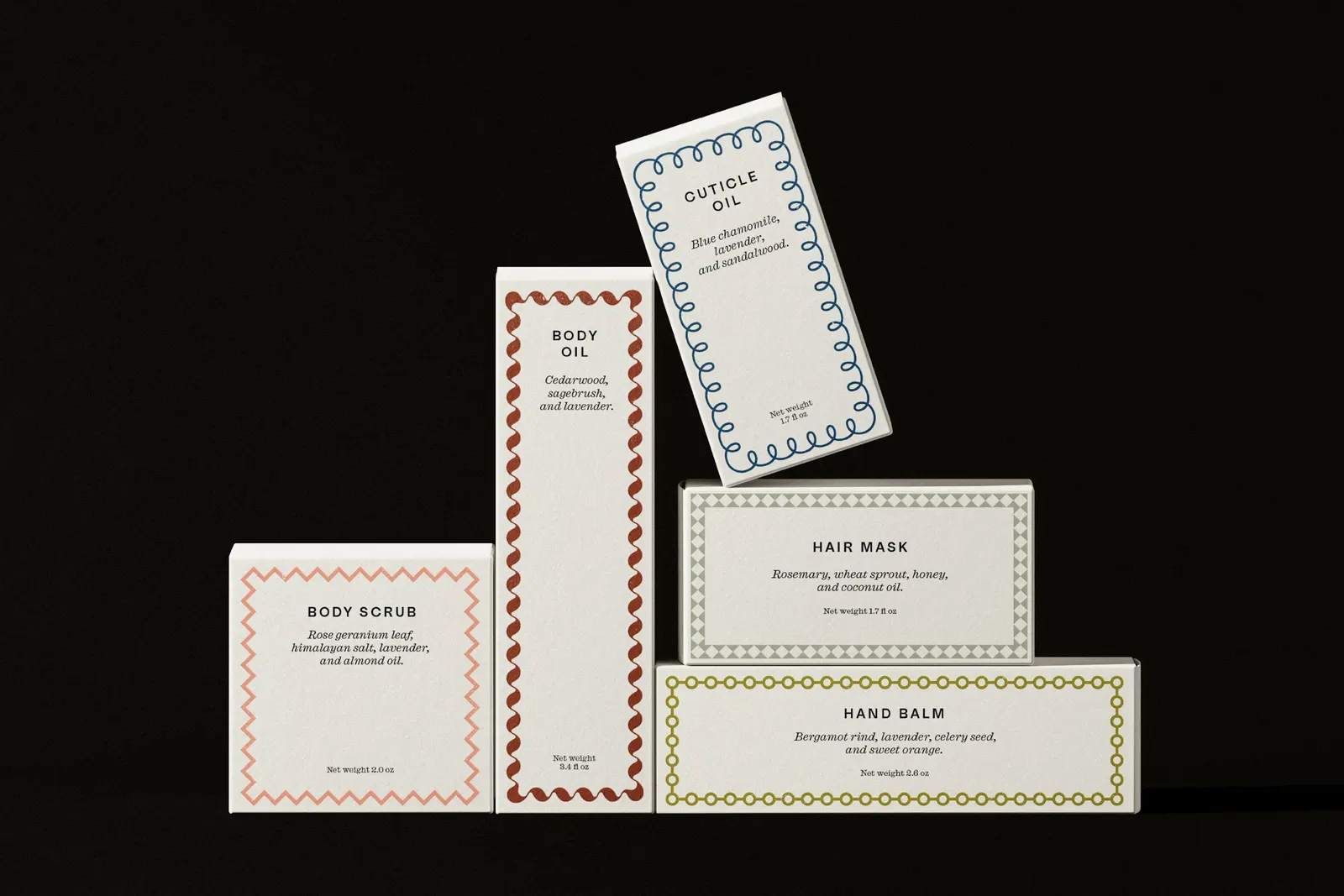
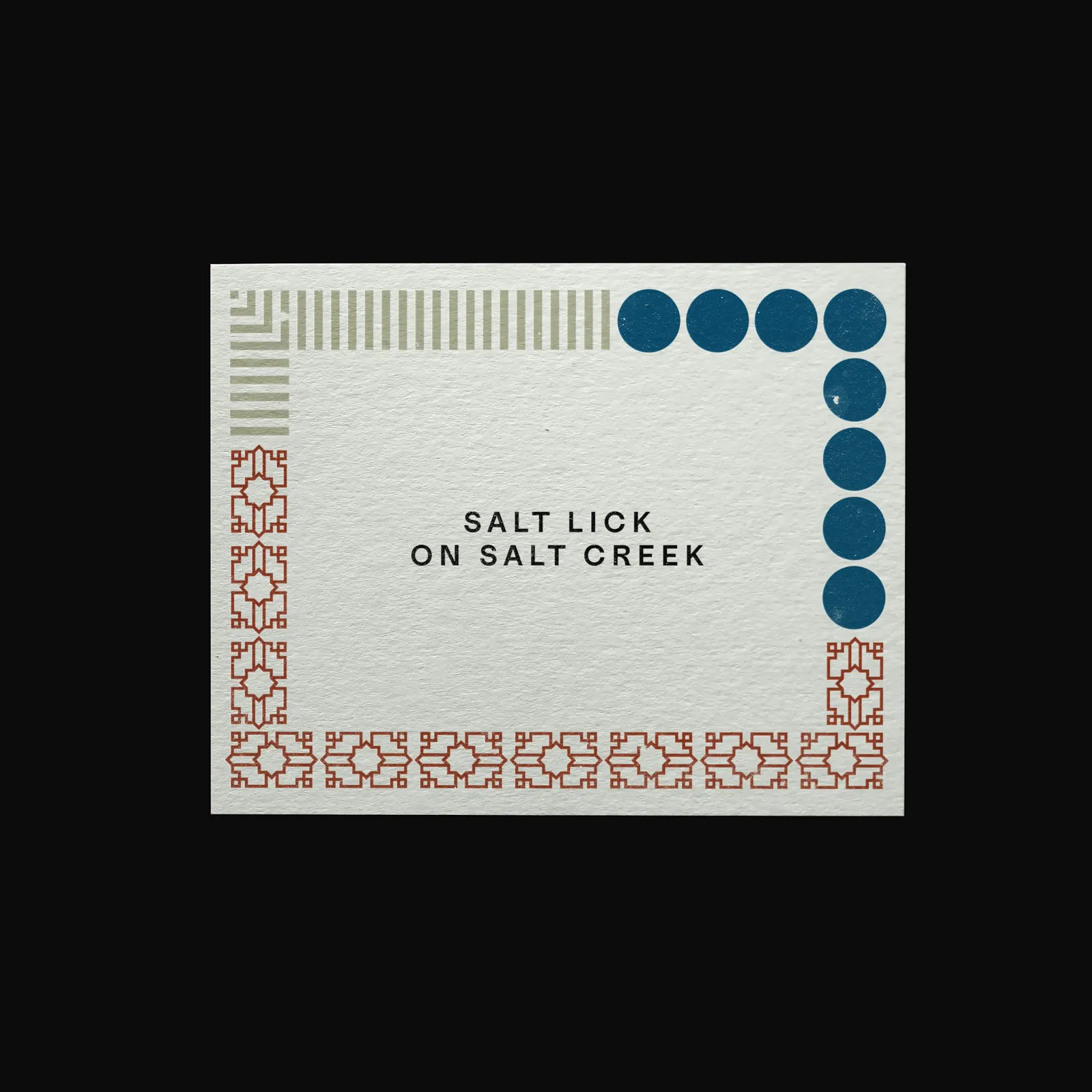
Order digitized more than 50 ornamental borders from the American Type Founders Company's 1900 specimen book and built them to fit together across formats. Medium and Caslon Ionic sit alongside them, and a palette taken from the farm and its menu is paired color by color to hint at each product's scent and flavor. Laurel Warner led design, with Jesse Reed on strategy, Kyle Johnson shooting the black-and-white photography, and Joyful Talk building the site.
Why it works
Lavender branding tends to default to soft purples and delicate botanical line work. Order sidestepped that with sturdy, printshop-style borders that feel closer to the Old West than to a spa, which suits a working farm at altitude. Giving every color equal weight keeps purple from taking over, so each product gets its own mood. The black-and-white photography does something smart too: it withholds, so the full-color shop imagery feels like a reward. Frames also work as a metaphor, since the farm is about curating what you notice.
Logo
Typography


Applications

Images and video from order.design, by Order.